


No hay productos en el carrito.

A great product can lose momentum if the website fails to communicate value quickly. That was the central design challenge behind the Aerlix Shopify storefront: how do you present an ergonomic office chair in a way that feels premium, calm, trustworthy, and conversion-focused without overwhelming the shopper? The answer was not to add more noise. It was to create a cleaner visual system, a more intentional narrative, and a shopping journey that made the product feel easier to understand at every scroll depth.
For this project, the goal was to shape a Shopify storefront that could do more than display a chair. It needed to present a complete lifestyle proposition around comfort, posture support, home-office use, and long-hour productivity. The live site reflects that direction through a product-led homepage, repeated ergonomic benefit messaging, visual feature blocks, trust cues like warranty and shipping reassurance, and educational blog content that supports purchase confidence.
From a design perspective, this kind of project sits at the intersection of branding, merchandising, storytelling, and user experience. The site introduces the Aerlix N09 as the hero product, emphasizes ergonomic positioning, highlights comfort for long desk sessions, and frames the chair for both office and gaming use. It also supports the storefront with helpful sections such as category navigation, policies, contact information, blog content, warranty messaging, and payment trust markers.
In this article, we break down how we approached the page design, how we aligned visual decisions with the customer’s business goals, what challenges shaped the creative process, and how the final Shopify experience supported both brand presentation and product understanding.
| Tiempo de entrega | Categoría | Plataforma de aplicaciones |
| 11days | Ergonomic Seating | shopify |
| Diseñadores implicados | Coste | Efecto |
| Nancy | $320 | Store Entry Rate📈292% |
The current Aerlix storefront is clearly built around a hero product strategy. The homepage gives immediate prominence to the Aerlix N09 ergonomic office chair, then expands that core story through supporting modules focused on posture, fit, reclining modes, comfort, and daily use cases. Instead of splitting attention across too many competing product messages, the page gives one product room to build credibility.
From the beginning, the design objective was straightforward: create a Shopify experience that makes an ergonomic chair feel desirable, understandable, and easy to trust. That required a layout system that could do four things well:
The site needed a visual tone that suggested refinement and quality rather than discount-driven urgency.
Because ergonomic products often include many adjustable features, the page needed to communicate benefits in a simple and digestible way.
Shoppers do not buy office chairs based only on specifications. They also buy relief, focus, comfort, posture support, and a better-looking workspace.
The storefront needed supporting design elements that reinforced trust, such as warranty messaging, shipping reassurance, easy navigation, product highlights, and blog-led education. The live site does this with two-year warranty messaging, delivery support, return information, contact access, and blog articles tied to chair posture and usage guidance.
The homepage structure shows a clear sequence: hero image, ergonomic positioning, feature cards, lifestyle imagery, benefit sections, product spotlight, use-case modules, coupon section, blog content, and reassurance blocks. That kind of sequence matters because it reduces friction. Rather than making visitors hunt for meaning, the page unfolds the product story in an intentional order.
Our goal as designers was to make every section answer a different customer question:
When a Shopify page answers those questions in the right order, it feels more persuasive without becoming pushy.
Aerlix sells ergonomic seating, not flashy tech accessories. The visual direction therefore needed to feel balanced, neutral, and spacious. The live storefront reflects that through clean compositions, light backgrounds, generous white space, soft grayscale imagery, and restrained content pacing. These choices support the idea of comfort and reduce cognitive overload.
The site includes Japanese-language merchandising, policy navigation, product reassurance, category structure, and locally relevant trust messaging, including domestic shipping references and a Japanese-facing store experience. That context matters because good Shopify design should not feel generic. It should feel tailored to the shopper’s expectations, reading habits, and confidence triggers.
Every strong Shopify design project starts with positioning. Before we shape layouts, we identify what the product needs the customer to feel. In this case, the answer was clear: the product needed to feel supportive, restorative, modern, and practical for long work sessions.
An ergonomic office chair is not just furniture. It is a solution to discomfort, posture fatigue, long home-office hours, and workspace dissatisfaction. That insight shaped the page direction. We did not want the storefront to feel like a catalog listing. We wanted it to feel like a guided introduction to a better workday.
Once we understood the emotional and commercial intent, we mapped the content into functional layers:
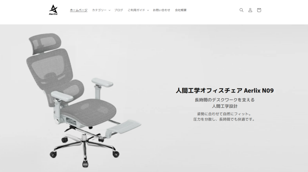
The first screen needed to establish product identity fast. The current homepage does that by naming the Aerlix N09 immediately and pairing it with ergonomic positioning and product imagery.
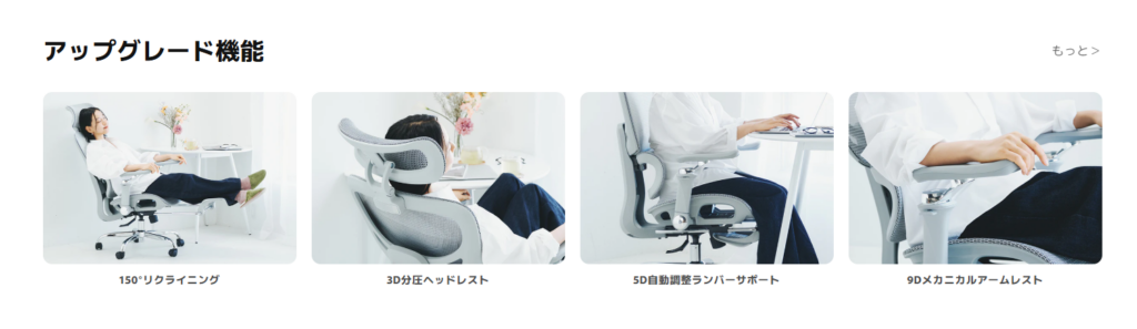
The next sections needed to explain what makes the chair different. The live site uses feature-led content around headrest support, lumbar support, armrests, reclining, mesh seating, and long-hour comfort.
We also needed the product to appear in believable daily contexts. The site includes home-office and relaxation-oriented imagery and sections about work mode, leisure mode, and relax mode, which help the shopper imagine ownership.
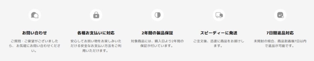
Finally, the page needed closure mechanisms: warranty, shipping confidence, returns, secure payment options, blog content, and contact pathways. The site includes all of these elements in visible supporting modules and footer structure.
From a design perspective, we treated the page less like a static storefront and more like a scroll-based sales narrative. Wireframing focused on rhythm. If too many feature blocks appeared too early, the page would feel technical. If too much branding came before product proof, the page would feel vague. If trust signals appeared too late, the shopper might hesitate.
So the structure aimed for balance: product first, then benefits, then lifestyle, then deeper product proof, then reassurance.
The chair itself has a modern silhouette and a mesh-heavy construction, so the art direction needed to highlight form, breathability, and ergonomics without turning the page into a sterile spec sheet. We leaned into the following design principles:
Large breathing room around images helps premium products look more intentional.
A muted palette supports the wellness and comfort message more effectively than high-saturation retail styling.
Feature cards, lifestyle photos, and product detail blocks create scannability and give the shopper multiple entry points.
Instead of competing graphic devices, the design uses scale, placement, and repetition to guide the eye. The current storefront reflects this through repeated section framing and a steady visual cadence.
Office chairs often come with many adjustable functions. That is a sales advantage, but it is also a design risk. Too many callouts can make the page feel crowded and overly technical.
We focused on translating mechanical complexity into lifestyle clarity. Rather than making the page feel like an engineering manual, we structured sections around outcomes: comfort, support, fit, posture, and flexibility. On the live site, this is visible in the way features are grouped into concise visual modules such as reclining, headrest support, lumbar support, and armrest adjustability, while the copy stays benefit-led.
A chair purchase is practical, but the buying decision is emotional too. Shoppers want performance, but they also want their workspace to feel calmer and better designed.
We built the page around a dual message: ergonomic support plus aesthetic harmony. That is why the storefront pairs chair close-ups and feature callouts with softer interior imagery and messaging about comfort, everyday use, and fitting naturally into home or office spaces.
Many e-commerce sites overload the page with badges and urgency tactics. That can hurt premium perception.
We used a more measured trust design strategy. Instead of dominating the visual experience, reassurance appears in well-placed sections: warranty, shipping, payment methods, contact access, return support, and educational blog content. This keeps the storefront helpful and credible without making it feel aggressive. The current site highlights a two-year warranty, shipping support, contact access, and multiple payment methods, which all reinforce this approach.
Many Shopify stores try to impress with effects. We prefer to make the message legible first. On a product-led storefront, every design decision should improve comprehension. That means the hero needs clear positioning, section sequencing needs logic, and imagery needs to support selling points instead of distracting from them.
Our approach is always rooted in customer psychology. We ask what a shopper needs to know at each point in the scroll. For Aerlix, that meant organizing the visual narrative around comfort, adjustability, posture support, use cases, and reassurance.
A strong Shopify website does not depend on one attractive banner. It depends on consistency across the whole storefront: homepage, featured product areas, supporting sections, article previews, trust blocks, footer navigation, and brand voice. The Aerlix site shows this system thinking through its consistent tone, product-centered hierarchy, repeated ergonomic framing, and integrated blog-plus-store structure.
The homepage immediately communicates the category, hero product, and ergonomic positioning. Visitors do not need to guess what the store sells or what makes the product relevant.
The storefront avoids the crowded feeling common in mass-market furniture retail. Instead, it uses cleaner presentation, measured content blocks, and a more refined visual rhythm. That helps the product feel more elevated.
The page gives the shopper multiple ways to understand the chair: feature highlights, supportive copy, close-up imagery, mode-based use cases, and blog-led education. This layered communication approach is especially valuable for ergonomic categories, where shoppers often need reassurance before they buy. The site’s live blog content further supports that by covering posture, study use, and floor protection topics related to chair ownership.
Because the design system is content-friendly, the site can continue expanding through blog articles, category growth, product storytelling, and future collection merchandising. The current navigation already supports categories like office chairs, gaming chairs, desk chairs, blog content, policies, and customer guidance, which provides a strong foundation for brand growth.
For product-driven brands, design influences how clearly the offer is understood, how premium the brand feels, and how confidently a visitor moves toward purchase. That is especially true in categories like furniture, wellness, home office, and lifestyle hardware, where physical comfort and emotional appeal both matter.
Copy matters, but shoppers make visual judgments first. They notice spacing, hierarchy, image quality, section flow, and trust presentation before they read details. When those elements feel intentional, the site earns attention faster.
A Shopify store feels more credible when the visual language stays coherent from top to bottom. Aerlix benefits from that consistency: the product story, supporting imagery, category framing, warranty cues, blog education, and footer trust signals all work in the same direction.
El Aerlix project shows what thoughtful Shopify design can do for a focused product brand. By building the page around ergonomic storytelling, premium restraint, lifestyle relevance, and trust-centered structure, we helped shape a storefront that communicates comfort and quality with much greater clarity. Instead of relying on clutter or hard-sell tactics, the design lets the product earn attention through better presentation, better sequencing, and better visual communication.
That is the kind of work we believe good e-commerce design should do. It should make the product easier to understand, the brand easier to trust, and the shopping experience easier to enjoy.
En AIRSANG, this is exactly how we approach Shopify design services. We help brands translate products into polished visual stories, build cleaner storefront experiences, and create brand-led pages that feel intentional from the first screen to the final call to action.


