










Keine Produkte im Warenkorb.

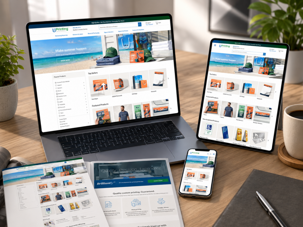
A successful online printing website must do more than display products. It must guide customers from a broad printing need to a confident order decision. For a platform like UPrinting, the design challenge starts with variety: business cards, postcards, stickers, labels, signs, banners, packaging materials, and other custom print products all need clear pathways, strong visuals, and simple decision-making flows.
In this project, our goal was to shape a page experience that made a large printing catalog feel organized, approachable, and conversion-focused. We focused mainly on the homepage, while also considering how product listing pages, product detail pages, category pages, and supporting content could work together as one complete independent website experience.
Rather than treating the site as a simple online catalog, we approached it as a brand-driven sales journey. Every section needed a clear role: attract attention, explain value, organize product choices, build trust, and lead users toward the next action.
| Lieferzeit | Kategorie | Website-Typ |
| 14days | Custom Printing | Selbst erstellte Website |
| Beteiligte Designer | Kosten | Wirkung |
| Lin Zhang | $1700 | Vertrieb📈253% |
UPrinting operates in the online printing space, where customers often arrive with different levels of clarity. Some users know exactly what they need, such as business cards or banners. Others only know they need marketing materials, event signage, packaging, or brand collateral.
That means the website design must support both direct search behavior and guided browsing. The homepage cannot simply look attractive. It must work like a smart entrance that helps visitors choose the right product faster.
The main goal was to create a homepage-led website experience that feels professional, easy to navigate, and trustworthy. The design needed to make custom printing feel simple, even though the product system behind it includes many sizes, materials, formats, finishes, and use cases.
We focused on three major goals:
Customers should quickly understand what the website offers. The homepage needed clear product categories, strong visual blocks, and simple labels that reduce confusion.
Printing involves quality expectations. Customers want to know whether the colors, materials, delivery experience, and final results will meet their needs. The design needed to communicate reliability before users even reached a product detail page.
The layout needed clear calls to action, but it could not feel aggressive. We wanted users to feel guided, not pushed.
A printing website usually contains many product types. If the homepage shows too much at once, users may feel lost. If it shows too little, they may not realize the full range of services.
The challenge was to balance depth and simplicity. We needed to show enough variety to communicate capability while keeping the first screen clean and easy to scan.
Unlike a simple retail product, a printed item often depends on customization. Size, paper type, finish, quantity, turnaround time, and upload options can all affect the buying decision.
Because of that, the design needed to prepare users before they clicked into product pages. The homepage had to explain the value of printing services visually, not through long technical explanations.
Many printing customers are business owners, marketers, event planners, designers, or teams preparing promotional materials. These users often value speed and clarity. They do not want to spend too much time figuring out where to start.
We used design structure to reduce unnecessary thinking. Clear category names, product imagery, benefit-driven copy, and strong hierarchy helped create a more efficient journey.
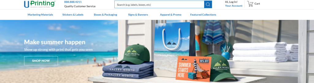
The homepage hero section had to answer three questions immediately:
The headline needed to communicate online printing and custom print products clearly. We avoided vague brand language and focused on a direct message that matched user intent.
The supporting text needed to highlight quality, customization, and business-ready printing solutions. Instead of writing long descriptions, we used concise value statements that fit the homepage rhythm.
The call-to-action buttons needed to guide different user types. One button could lead users to popular print products, while another could guide users toward custom design or product exploration.
For a printing website, the hero section works best when it combines product confidence with visual variety. We would use a clean product composition: business cards, flyers, stickers, packaging, and signage arranged in a polished scene. This instantly communicates the website’s product range without forcing users to read too much.
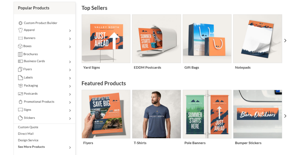
After the hero section, the next key area should help visitors choose a direction. We designed category blocks around common customer needs, not only product names.
Zum Beispiel:
This group can include business cards, postcards, flyers, brochures, and booklets.
This group can guide users toward product labels, roll labels, custom stickers, and packaging stickers.
This group can support users looking for event signage, outdoor banners, posters, and displays.
This group can include boxes, hang tags, envelopes, folders, and other branded materials.
By organizing products around user intent, the homepage becomes easier to navigate. Users do not need to understand the full catalog structure. They only need to identify the situation that matches their need.
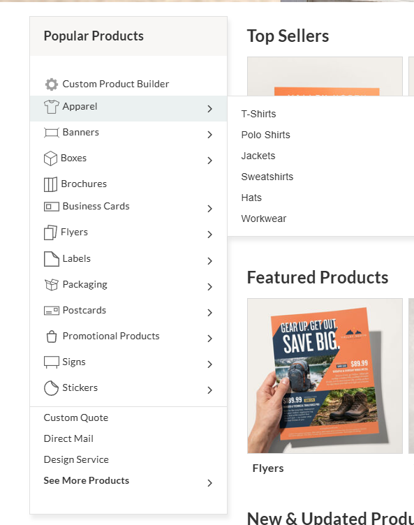
A large independent website needs a shortcut for high-demand products. We designed a “Popular Printing Products” section to help users reach common choices quickly.
This section should include product cards with:
A clean product mockup helps users identify the item instantly.
The title should stay simple and direct.
A short line can explain the product’s use case, such as “Ideal for local promotions” or “Perfect for brand packaging.”
A button like “Explore Options” or “Start Printing” keeps the action easy.
This section works because many users arrive with common needs. When they see familiar products right away, they feel the site understands them.
Although the homepage carries the first impression, the rest of the website must continue the same design logic. A strong homepage cannot fix a confusing product page. We considered the full journey from homepage to order decision.
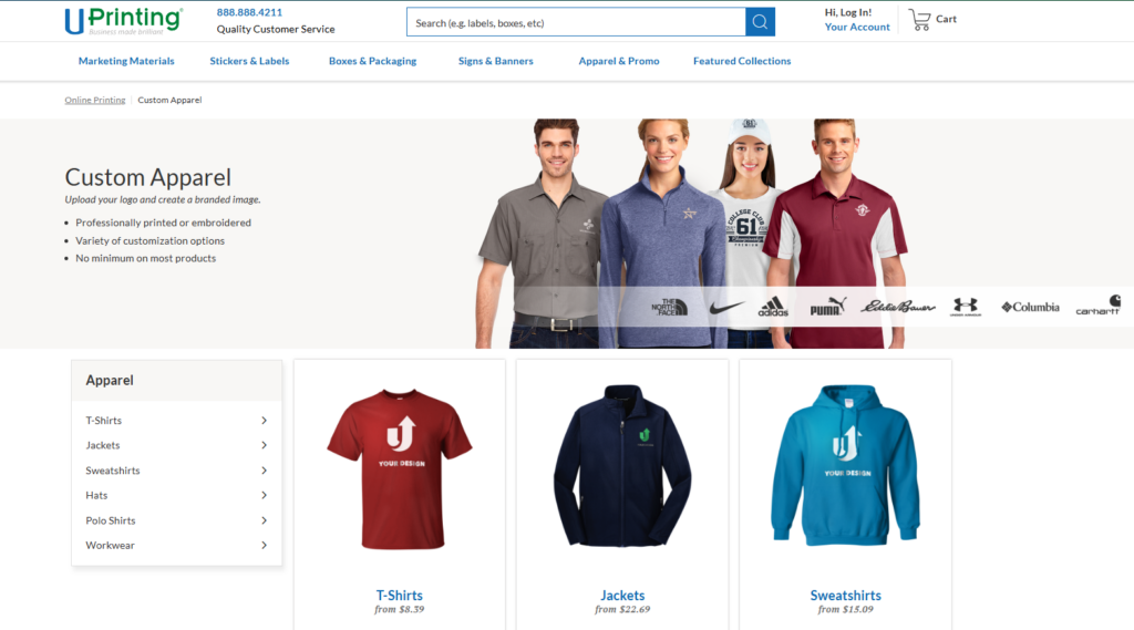
Category pages should help users compare related products. For a printing website, the design should not only list items. It should explain the difference between product types.
A strong category page can include:
This helps users understand what the category includes and who it serves.
Cards should use consistent image ratios, spacing, labels, and CTA placement.
Customers may shop by business need, event type, material, or product format.
Small notes about quality, customization, or production support can reduce hesitation.
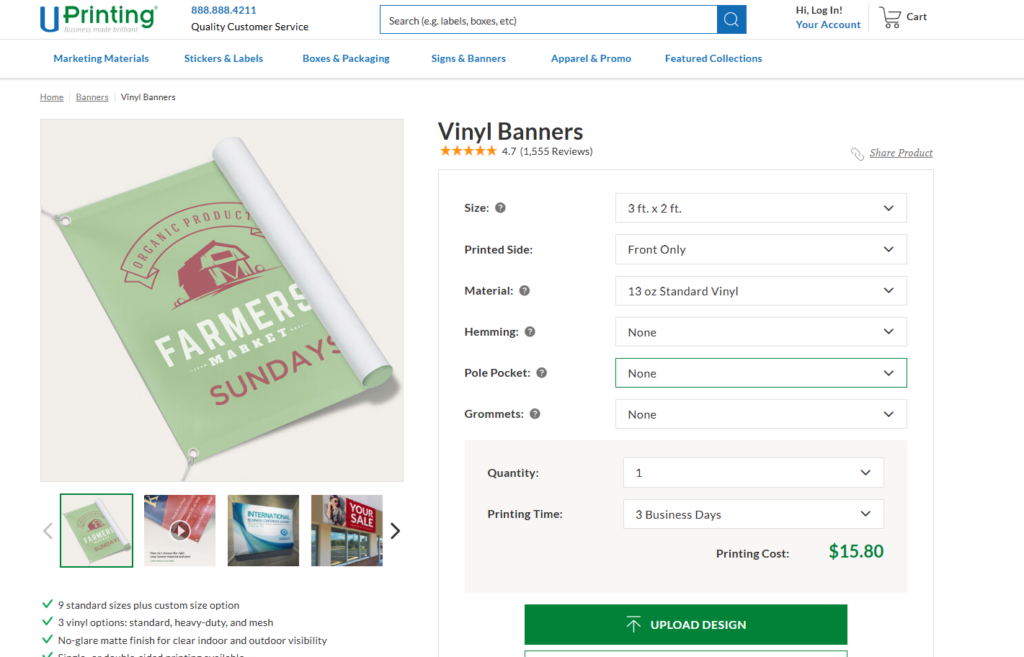
Product pages carry the most conversion pressure. The design must make customization feel manageable.
We would structure a product page with:
Customers need to see how the printed item looks in real-life use. Mockups, close-ups, and lifestyle scenes can make the product feel more tangible.
Size, quantity, paper stock, finish, and turnaround should appear in a logical order. The interface should guide users step by step.
Instead of overwhelming users with technical print language, the page should explain what each product helps them achieve.
Printing decisions often create questions. A simple FAQ section can reduce support friction and improve confidence.
Pages like design services, file upload guidance, shipping information, sample kits, and blog content can support the overall customer journey.
For this type of independent website, content design matters because customers often need education before purchase. A well-structured blog or guide section can help users learn about paper types, print sizes, design preparation, marketing ideas, and packaging choices.
We started by mapping the likely customer paths. A visitor may enter the site with a specific need, such as “custom business cards,” or with a broader goal, such as “promote my event.”
This helped us design navigation around real behavior. We did not want the homepage to behave like a product database. We wanted it to act like a guided shopping experience.
A printing website should feel clean, confident, and creative. Too much decoration can distract from the products. Too little personality can make the brand feel generic.
We created a visual direction based on:
Large spacing, clear grids, and organized sections help customers scan quickly.
Printing products should look sharp and colorful. The visual system should make paper, texture, packaging, and signage feel premium.
The website should feel useful to companies, entrepreneurs, creators, and marketing teams.
Buttons need to stand out without overpowering the design.
We arranged the homepage into a natural conversion flow:
The hero section introduces the service and product range.
Category blocks help users choose where to go.
Quality-focused sections explain why the service matters.
Use-case banners show how printed products support real business goals.
CTA sections encourage users to start exploring or ordering.
This structure keeps the page purposeful. Every section moves the visitor closer to a decision.
For a printing website, small copy choices matter. Labels, buttons, category names, and short descriptions can make the difference between clarity and confusion.
We used direct, active language. For example, instead of “Printing solutions are available,” we would write “Create custom prints for your next campaign.”
This style feels more useful and action-oriented.
Many users browse from mobile devices, even when they complete complex orders later on desktop. The mobile homepage needed to keep product discovery simple.
Wir konzentrierten uns auf:
Mobile users should not scroll through oversized banners before reaching products.
Category cards and buttons need enough space for comfortable tapping.
Two-column or stacked layouts can keep browsing clean.
Important paths should remain accessible without cluttering the screen.
The homepage design creates immediate clarity. Users understand the website’s purpose quickly and see product variety without feeling overwhelmed.
Clear category sections reduce browsing friction. Customers can move from a broad need to a specific product faster.
Professional mockups, consistent product imagery, and structured content help users feel confident about quality.
A conversion-focused layout does not rely on one CTA. It places helpful actions throughout the page, matching different stages of customer intent.
The design approach can support future product categories, seasonal campaigns, business promotions, and educational content without breaking the visual system.
A printing website can easily become crowded. We solved this by grouping products into clear categories and giving each section a specific purpose.
Customization can feel complex. We used visual hierarchy, short explanations, and step-based thinking to make the process feel easier.
Printing is creative, but the website also needs to serve business buyers. We used polished visuals and clean layouts to create a balance between inspiration and practicality.
Some visitors want business cards. Others want banners, labels, packaging, or promotional materials. We designed the homepage so different users could find their path without forcing one single journey.
We designed the homepage as a decision-making tool. Instead of placing random product sections on the page, we organized each area around what users need to understand next.
The product cards, category blocks, and visual sections follow one consistent design language. This gives the website a more professional and reliable feel.
Every image, section, and CTA should reinforce the idea of high-quality custom printing. The design should make users imagine their own business cards, labels, packaging, and marketing materials looking polished and ready for real use.
We used content sections to answer user questions before they became objections. Quality, customization, turnaround, product variety, and business use cases all deserve space in the design.
The final design direction creates a stronger, clearer, and more conversion-focused online printing experience. The homepage becomes more than a visual landing page. It becomes a guide that helps users understand the product range, compare options, and move toward action.
The design also gives the brand more flexibility. New product categories, seasonal promotions, business campaigns, and educational content can fit into the same visual system. This makes the independent website easier to grow over time.
Most importantly, the page experience supports customer confidence. Visitors can quickly see what the website offers, why the products matter, and where to go next.
A strong printing website needs more than attractive visuals. It needs strategy, structure, product clarity, and a smooth customer journey. By focusing on homepage design, category organization, product presentation, and conversion-friendly content, we can turn a complex printing catalog into a simple and professional independent website experience.
This is the kind of design-focused work AIRSANG brings to cross-border brands and service-driven businesses. We help clients create independent websites that look polished, communicate clearly, and guide visitors toward action through thoughtful page design, visual hierarchy, and user-focused structure.