











 Japanese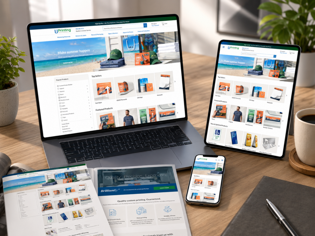
導入
A successful online printing website must do more than display products. It must guide customers from a broad printing need to a confident order decision. For a platform like UPrinting, the design challenge starts with variety: business cards, postcards, stickers, labels, signs, banners, packaging materials, and other custom print products all need clear pathways, strong visuals, and simple decision-making flows.
In this project, our goal was to shape a page experience that made a large printing catalog feel organized, approachable, and conversion-focused. We focused mainly on the homepage, while also considering how product listing pages, product detail pages, category pages, and supporting content could work together as one complete independent website experience.
Rather than treating the site as a simple online catalog, we approached it as a brand-driven sales journey. Every section needed a clear role: attract attention, explain value, organize product choices, build trust, and lead users toward the next action.
| 配達時間 | カテゴリ | ウェブサイトの種類 |
| 14days | Custom Printing | 自作ウェブサイト |
| 関与するデザイナー | 料金 | 効果 |
| リン・チャン | $1700 | Sales📈253% |
プロジェクト概要
The Website Type
UPrinting operates in the online printing space, where customers often arrive with different levels of clarity. Some users know exactly what they need, such as business cards or banners. Others only know they need marketing materials, event signage, packaging, or brand collateral.
That means the website design must support both direct search behavior and guided browsing. The homepage cannot simply look attractive. It must work like a smart entrance that helps visitors choose the right product faster.
The Main Design Goal
The main goal was to create a homepage-led website experience that feels professional, easy to navigate, and trustworthy. The design needed to make custom printing feel simple, even though the product system behind it includes many sizes, materials, formats, finishes, and use cases.
We focused on three major goals:
Make Product Discovery Faster
Customers should quickly understand what the website offers. The homepage needed clear product categories, strong visual blocks, and simple labels that reduce confusion.
Build Trust Before the Product Page
Printing involves quality expectations. Customers want to know whether the colors, materials, delivery experience, and final results will meet their needs. The design needed to communicate reliability before users even reached a product detail page.
Encourage Action Without Pressure
The layout needed clear calls to action, but it could not feel aggressive. We wanted users to feel guided, not pushed.
デザイン上の課題を理解する
A Large Catalog Can Feel Overwhelming
A printing website usually contains many product types. If the homepage shows too much at once, users may feel lost. If it shows too little, they may not realize the full range of services.
The challenge was to balance depth and simplicity. We needed to show enough variety to communicate capability while keeping the first screen clean and easy to scan.
Custom Products Need Clear Visual Logic
Unlike a simple retail product, a printed item often depends on customization. Size, paper type, finish, quantity, turnaround time, and upload options can all affect the buying decision.
Because of that, the design needed to prepare users before they clicked into product pages. The homepage had to explain the value of printing services visually, not through long technical explanations.
Business Buyers Need Efficiency
Many printing customers are business owners, marketers, event planners, designers, or teams preparing promotional materials. These users often value speed and clarity. They do not want to spend too much time figuring out where to start.
We used design structure to reduce unnecessary thinking. Clear category names, product imagery, benefit-driven copy, and strong hierarchy helped create a more efficient journey.
Our Homepage Design Strategy
Hero Section: Clear Value From the First Screen
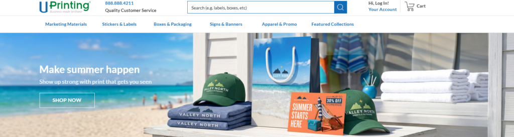
The homepage hero section had to answer three questions immediately:
What does the website offer?
The headline needed to communicate online printing and custom print products clearly. We avoided vague brand language and focused on a direct message that matched user intent.
Why should users trust it?
The supporting text needed to highlight quality, customization, and business-ready printing solutions. Instead of writing long descriptions, we used concise value statements that fit the homepage rhythm.
What should users do next?
The call-to-action buttons needed to guide different user types. One button could lead users to popular print products, while another could guide users toward custom design or product exploration.
For a printing website, the hero section works best when it combines product confidence with visual variety. We would use a clean product composition: business cards, flyers, stickers, packaging, and signage arranged in a polished scene. This instantly communicates the website’s product range without forcing users to read too much.
Category Navigation: Turning Complexity Into Order
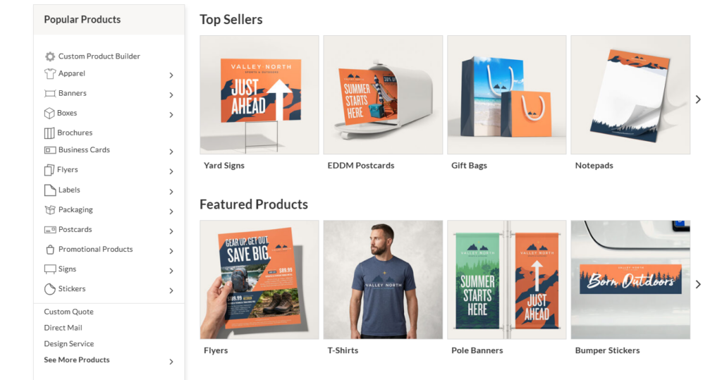
After the hero section, the next key area should help visitors choose a direction. We designed category blocks around common customer needs, not only product names.
例えば:
Marketing Materials
This group can include business cards, postcards, flyers, brochures, and booklets.
Labels and Stickers
This group can guide users toward product labels, roll labels, custom stickers, and packaging stickers.
Signs and Banners
This group can support users looking for event signage, outdoor banners, posters, and displays.
Packaging and Business Essentials
This group can include boxes, hang tags, envelopes, folders, and other branded materials.
By organizing products around user intent, the homepage becomes easier to navigate. Users do not need to understand the full catalog structure. They only need to identify the situation that matches their need.
Popular Product Section: Create a Faster Buying Path
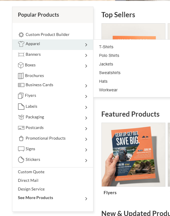
A large independent website needs a shortcut for high-demand products. We designed a “Popular Printing Products” section to help users reach common choices quickly.
This section should include product cards with:
Product Image
A clean product mockup helps users identify the item instantly.
Product Name
The title should stay simple and direct.
Short Benefit
A short line can explain the product’s use case, such as “Ideal for local promotions” or “Perfect for brand packaging.”
Clear CTA
A button like “Explore Options” or “Start Printing” keeps the action easy.
This section works because many users arrive with common needs. When they see familiar products right away, they feel the site understands them.
Designing Beyond the Homepage
Although the homepage carries the first impression, the rest of the website must continue the same design logic. A strong homepage cannot fix a confusing product page. We considered the full journey from homepage to order decision.
Category Pages
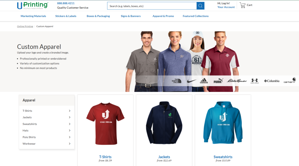
Category pages should help users compare related products. For a printing website, the design should not only list items. It should explain the difference between product types.
A strong category page can include:
A Short Intro Banner
This helps users understand what the category includes and who it serves.
Product Grid With Visual Consistency
Cards should use consistent image ratios, spacing, labels, and CTA placement.
Use-Case Filters
Customers may shop by business need, event type, material, or product format.
信頼要素
Small notes about quality, customization, or production support can reduce hesitation.
Product Detail Pages
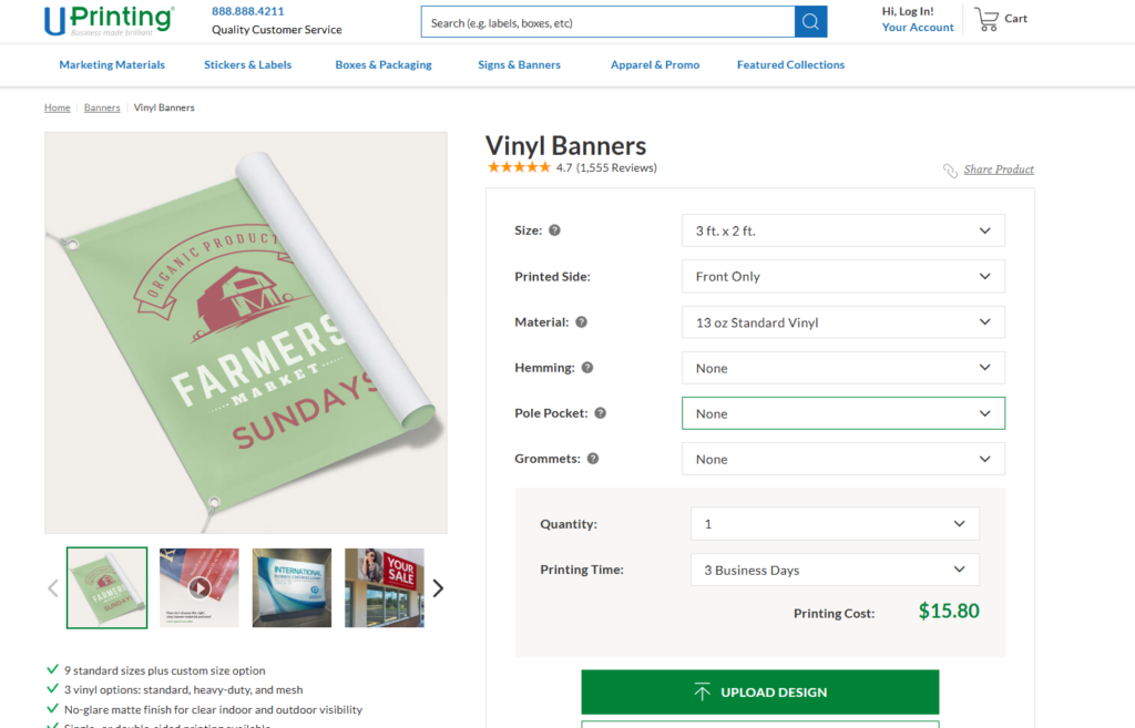
Product pages carry the most conversion pressure. The design must make customization feel manageable.
We would structure a product page with:
Strong Product Gallery
Customers need to see how the printed item looks in real-life use. Mockups, close-ups, and lifestyle scenes can make the product feel more tangible.
Clear Option Layout
Size, quantity, paper stock, finish, and turnaround should appear in a logical order. The interface should guide users step by step.
Benefit-Led Product Copy
Instead of overwhelming users with technical print language, the page should explain what each product helps them achieve.
FAQ and Support Areas
Printing decisions often create questions. A simple FAQ section can reduce support friction and improve confidence.
Supporting Pages
Pages like design services, file upload guidance, shipping information, sample kits, and blog content can support the overall customer journey.
For this type of independent website, content design matters because customers often need education before purchase. A well-structured blog or guide section can help users learn about paper types, print sizes, design preparation, marketing ideas, and packaging choices.
私たちのデザインプロセス
Step 1: Research the Customer Journey
We started by mapping the likely customer paths. A visitor may enter the site with a specific need, such as “custom business cards,” or with a broader goal, such as “promote my event.”
This helped us design navigation around real behavior. We did not want the homepage to behave like a product database. We wanted it to act like a guided shopping experience.
Step 2: Define the Visual Direction
A printing website should feel clean, confident, and creative. Too much decoration can distract from the products. Too little personality can make the brand feel generic.
We created a visual direction based on:
Clean Layouts
Large spacing, clear grids, and organized sections help customers scan quickly.
Bright Product Presentation
Printing products should look sharp and colorful. The visual system should make paper, texture, packaging, and signage feel premium.
Business-Friendly Tone
The website should feel useful to companies, entrepreneurs, creators, and marketing teams.
Strong CTA Contrast
Buttons need to stand out without overpowering the design.
Step 3: Build the Homepage Structure
We arranged the homepage into a natural conversion flow:
Awareness
The hero section introduces the service and product range.
Discovery
Category blocks help users choose where to go.
Confidence
Quality-focused sections explain why the service matters.
インスピレーション
Use-case banners show how printed products support real business goals.
Action
CTA sections encourage users to start exploring or ordering.
This structure keeps the page purposeful. Every section moves the visitor closer to a decision.
Step 4: Refine Copy and Microcopy
For a printing website, small copy choices matter. Labels, buttons, category names, and short descriptions can make the difference between clarity and confusion.
We used direct, active language. For example, instead of “Printing solutions are available,” we would write “Create custom prints for your next campaign.”
This style feels more useful and action-oriented.
Step 5: Design for Mobile First
Many users browse from mobile devices, even when they complete complex orders later on desktop. The mobile homepage needed to keep product discovery simple.
私たちは次の点に焦点を当てました:
Shorter Section Heights
Mobile users should not scroll through oversized banners before reaching products.
Clear Tap Areas
Category cards and buttons need enough space for comfortable tapping.
Simplified Product Grids
Two-column or stacked layouts can keep browsing clean.
Sticky or Easy Navigation
Important paths should remain accessible without cluttering the screen.
Key Design Advantages
Stronger First Impression
The homepage design creates immediate clarity. Users understand the website’s purpose quickly and see product variety without feeling overwhelmed.
Better Product Discovery
Clear category sections reduce browsing friction. Customers can move from a broad need to a specific product faster.
More Trust Through Visual Presentation
Professional mockups, consistent product imagery, and structured content help users feel confident about quality.
高い変換ポテンシャル
A conversion-focused layout does not rely on one CTA. It places helpful actions throughout the page, matching different stages of customer intent.
More Scalable Page System
The design approach can support future product categories, seasonal campaigns, business promotions, and educational content without breaking the visual system.
The Challenges We Solved
Challenge 1: Too Many Products Competing for Attention
A printing website can easily become crowded. We solved this by grouping products into clear categories and giving each section a specific purpose.
Challenge 2: Making Custom Printing Feel Simple
Customization can feel complex. We used visual hierarchy, short explanations, and step-based thinking to make the process feel easier.
Challenge 3: Balancing Creativity and Professionalism
Printing is creative, but the website also needs to serve business buyers. We used polished visuals and clean layouts to create a balance between inspiration and practicality.
Challenge 4: Keeping the Homepage Useful for Different Visitors
Some visitors want business cards. Others want banners, labels, packaging, or promotional materials. We designed the homepage so different users could find their path without forcing one single journey.
当社のソリューション
A Homepage Built Around User Intent
We designed the homepage as a decision-making tool. Instead of placing random product sections on the page, we organized each area around what users need to understand next.
A Product System That Feels Easy to Browse
The product cards, category blocks, and visual sections follow one consistent design language. This gives the website a more professional and reliable feel.
A Visual Experience That Supports the Brand
Every image, section, and CTA should reinforce the idea of high-quality custom printing. The design should make users imagine their own business cards, labels, packaging, and marketing materials looking polished and ready for real use.
A Content Structure That Builds Confidence
We used content sections to answer user questions before they became objections. Quality, customization, turnaround, product variety, and business use cases all deserve space in the design.
Final Result
The final design direction creates a stronger, clearer, and more conversion-focused online printing experience. The homepage becomes more than a visual landing page. It becomes a guide that helps users understand the product range, compare options, and move toward action.
The design also gives the brand more flexibility. New product categories, seasonal promotions, business campaigns, and educational content can fit into the same visual system. This makes the independent website easier to grow over time.
Most importantly, the page experience supports customer confidence. Visitors can quickly see what the website offers, why the products matter, and where to go next.
結論
A strong printing website needs more than attractive visuals. It needs strategy, structure, product clarity, and a smooth customer journey. By focusing on homepage design, category organization, product presentation, and conversion-friendly content, we can turn a complex printing catalog into a simple and professional independent website experience.
This is the kind of design-focused work エアサン brings to cross-border brands and service-driven businesses. We help clients create independent websites that look polished, communicate clearly, and guide visitors toward action through thoughtful page design, visual hierarchy, and user-focused structure.

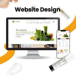
WordPressのウェブサイトや、完全なeコマースシステムを備えたコーポレートサイトをデザイン・構築します。.
価格帯$200.00~$2,500.00custom-requirements-or-special-quotations
元価格は$2.00。.$1.00現在の価格は$1.00。. Amazonホーム理学療法機器のメイン画像デザイン解説
はじめにAmazonで家庭用治療器の信頼できるイメージを構築する Amazonで家庭用治療器のメインイメージをデザインする際、私たちが最も重視するのは...
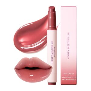
Amazon リップスティックコンバージョンのメイン画像デザイン
はじめにアマゾンで売れる口紅のメイン画像をデザインする アマゾンの口紅のメイン画像をデザインするとき、私たちの責任は...

ハッカーがWordPress管理者のメールアドレスを盗む方法(そしてそれを阻止する方法)
WordPressの管理者メールアドレスは、あなたが思っている以上に公開されているのです。ハッカーはそれが大好きです。彼らにとって、あなたの...
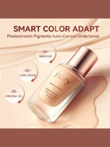
Amazonのリキッドファンデーションのメイン画像がコンバージョンにつながる理由
はじめに Amazonリキッドファンデーションのメイン画像デザインは、単に商品を美しく見せるだけではありません。Amazonでは、メイン画像と….
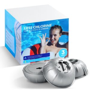
フィルターカートリッジの効果的なAmazonメインイメージのデザイン
はじめに Amazonのメイン画像をデザインする上で、商品を魅力的に見せることは決して重要ではありません。明確さ、信頼性、そして瞬時に理解できることが何よりも重要です。特に….
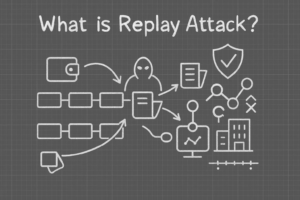
WordPress へのリプレイ攻撃: 本当の脅威か、それとも誇張された神話か?
まず最初に明確にしておきましょう。リプレイ攻撃は見た目には怖くありません。パスワードを破壊したり、緑色のハッカーテキストが飛び交うような悪質なコードを挿入したりもしません。彼らは狡猾なのです…。.
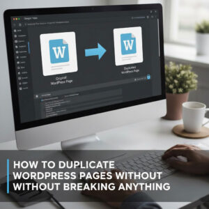
WordPressページを何も壊さずに複製する方法
正直に言って、新しいページを作りたくない時もあるでしょう。同じページを少しだけ変えたいだけなのに。レイアウトもブロックも設定も全部同じ。なぜなら….

ペット向けWordPressテーマ5選を比較
はじめに ペット関連のWordPressテーマを適切に選ぶことは、単なるデザイン上の決定ではありません。使いやすさ、拡張性、そして長期的なビジネスの成長に直接影響します。ペットケアとペット...
5つの水着eコマーステーマを比較
はじめに 水着やランジェリーの独立ストアに適切なテーマを選択することは、見た目だけの問題ではなく、コンバージョン率、拡張性、長期的な効果に直接影響します...
WordPressでコメント機能をオフにする方法(気が狂わずに)
WordPressのコメントについてお話しましょう。理論上は、コメントは素晴らしいものです。議論を促し、コミュニティを築き、ウェブサイトに「活気」を与えてくれます。しかし実際にはどうでしょうか?コメントはしばしば人を惹きつけ….

科学主導のブランドのためのスケーラブルなWordPressウェブサイトの構築:AminoUSAプロジェクト
はじめに 今日のデジタル環境において、ウェブサイトは単なる製品リストを掲載する場所ではありません。規制の厳しい業界や研究重視の業界で事業を展開する科学主導のブランドにとって、ウェブサイトは….
グローバルブレードブランドのためのスケーラブルなShopifyストアの構築:CoolKatanaプロジェクト
はじめに 越境電子商取引において、Shopify の Web サイトは単なる店舗ではありません。ニッチで文化主導のカテゴリーで活動するブランドにとって、Web サイトは単なる店舗以上のものを実現する必要があります...
ポケモンカード向け高コンバージョンShopifyストアの設計
はじめに 収集可能な電子商取引の世界、特にポケモン トレーディング カード ゲーム (TCG) 市場では、Web サイトは単に製品をリストするだけでは不十分です。...
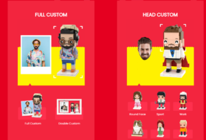
カスタムレンガブランドのための高コンバージョンShopifyデザイン
はじめに 今日の競争の激しいeコマース市場、特にパーソナライズされたギフトやコレクターズアイテムの分野では、Shopifyのウェブサイトは商品を展示する以上の機能を提供する必要があります。それは….
Shopifyサポートへの問い合わせ方法:シンプルでストレスフリーなガイド
Shopifyストアの運営は、混乱するのではなく、ワクワクするものであるべきです。疑問が生じたり、問題が発生して作業が滞ったりした場合でも、Shopifyは状況に応じて複数のサポートパスをご用意しています。.
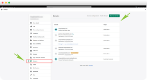
Shopifyストアを非アクティブ化する方法:分かりやすく実践的なガイド
Shopifyストアの無効化はそれほど複雑ではありませんが、多くのマーチャントが見落としている影響があります。このガイドでは、そのプロセスを分かりやすく解説します。.
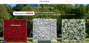
高級花卉ブランド向けShopifyウェブサイトデザイン事例
はじめに 今日の競争の激しいeコマース市場において、Shopifyのウェブサイトは商品を表示する以上の機能を提供する必要があります。ブランド価値を瞬時に伝え、ユーザーを誘導する必要があります….
Shopifyデザインケーススタディ:レトロゲームストア
はじめに 競争の激しいeコマース環境では、視覚的な明瞭さと感情的な繋がりが、訪問者が顧客になるかどうかを左右することがよくあります。これは特に….