


ไม่มีสินค้าในตะกร้า.

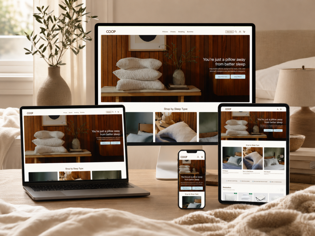
A good sleep product website should never feel like a cold product catalog. It should feel calm, helpful, and easy to understand from the first screen. When we look at the COOP Sleep Goods website, we can see a clear design direction: the brand does not simply sell pillows, sheets, or bedding products. It sells a better sleep experience through warm visuals, guided product selection, trust-building content, and a clean shopping path. The website presents adjustable pillows, bedding, cooling products, sleep quizzes, product reviews, and collection pages in a way that makes the buying process feel simple and personal. The brand also communicates a clear mission around helping people sleep better in the way that suits them best.
From our perspective as designers, this website works well because every section has a clear purpose. The homepage builds emotion. The category areas guide users by sleep type. The bestsellers section reduces choice pressure. The product collection page organizes a large catalog. The product detail page explains value in layers. The About Us page builds brand trust through story and authenticity. Together, these design choices create a complete e-commerce experience that supports both branding and conversion.
| ระยะเวลาจัดส่ง | หมวดหมู่ | Website Type |
| 18 วัน | Sleep Website | shopify |
| นักออกแบบที่เกี่ยวข้อง | ค่าใช้จ่าย | ผล |
| แนนซี่ | $2100 | Sales📈214% |
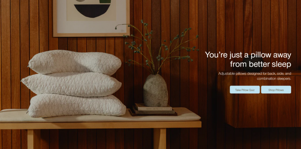
The homepage hero section uses warm wood tones, soft bedding, neutral colors, and a calm bedroom scene. We would design it this way because sleep products require emotional trust. Customers do not only care about price or material. They want to imagine comfort, relaxation, and a better night’s rest.
Instead of placing the product on a plain white background, the website places pillows inside a lived-in sleep environment. This makes the product feel natural and premium. The warm visual tone also reduces the sense of hard selling. It tells the customer, “This is a product made for your daily life.”
The headline focuses on the core promise: better sleep. The supporting copy explains that the pillows serve back, side, and combination sleepers. This structure works because it combines emotion with function. The user first feels the benefit, then understands the product logic.
The two buttons also serve different user types. “Take Pillow Quiz” helps uncertain shoppers who need guidance. “Shop Pillows” supports users who already want to browse products. We would use this dual-action structure because it increases flexibility without making the interface complicated.
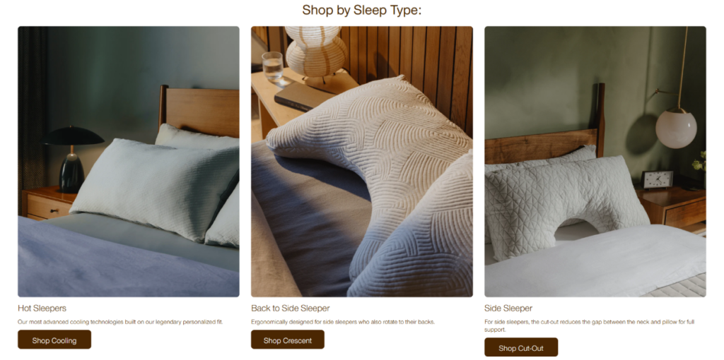
The “Shop by Sleep Type” section is one of the strongest design decisions on the site. Instead of forcing users to compare every product manually, the website groups products by real sleep needs: hot sleepers, back-to-side sleepers, and side sleepers.
We would design it this way because customers often do not know which pillow model they need. They usually know their problem first. They may sleep hot. They may sleep on their side. They may switch positions at night. By organizing the shopping journey around these behaviors, the website feels more helpful and less overwhelming.
Each card uses a large bedroom image, a short title, a simple description, and a direct button. This consistent structure helps users scan quickly. The images also show the pillow in context, which makes the category easier to understand.
The visual design stays clean and spacious. Nothing feels crowded. This is important because sleep-related products should visually communicate calmness. A messy layout would damage the emotional value of the brand.
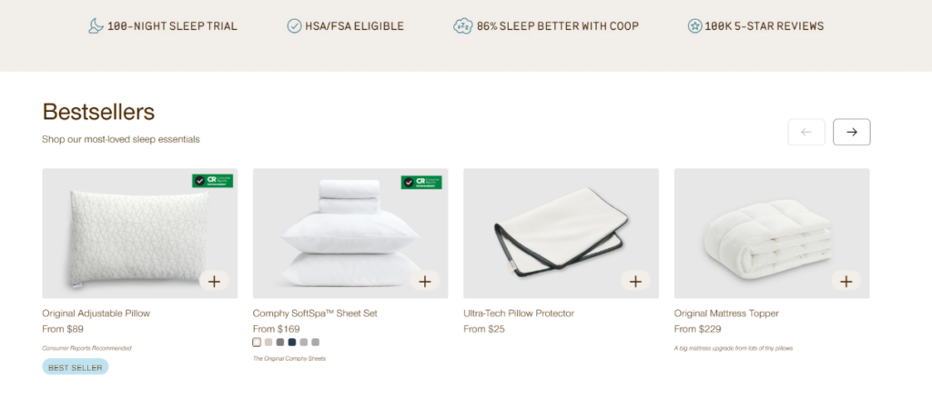
The website places trust messages such as the 100-night sleep guarantee, HSA/FSA eligibility, better sleep claims, and strong review numbers near product sections. We would use this approach because trust signals work best before the user starts making purchase decisions.
When shoppers see reassurance early, they feel safer exploring the products. This is especially important for bedding products because comfort is personal. Customers may worry about whether the pillow will suit them. A sleep trial and strong review presence reduce that concern.
The “Bestsellers” section uses simple product cards with clean images, product names, prices, short notes, labels, and quick-add icons. We would design this section to help users make faster decisions. Bestsellers act as social proof. They tell shoppers, “Many people already chose these products.”
The neutral product backgrounds keep the focus on the item itself. The quick-add icon shortens the path to purchase, while the product notes add just enough information to support comparison. This section balances clarity and conversion very well.
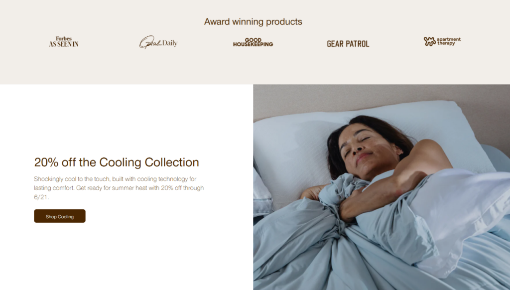
The award-winning products section places media-style logos above a promotional cooling collection banner. This creates a strong sequence: first credibility, then offer. We would use this structure because promotions feel more convincing when the brand has already established authority.
If a customer sees an offer before understanding the brand’s credibility, the discount may feel cheap. But when awards and recognition appear first, the promotion feels like a valuable opportunity from a trusted brand.
The cooling collection banner uses a large image of a person resting in bed. This image does not simply show the product. It shows the desired result: cool, comfortable sleep. We would use this kind of lifestyle image because customers buy the outcome, not just the object.
The left side presents the offer clearly, while the right side creates emotional desire. This two-column layout keeps the message organized and visually balanced.
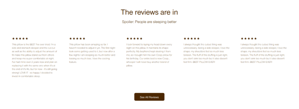
The review section uses a centered title, a short friendly subtitle, star ratings, and multiple customer quotes. We would keep this section clean because reviews should feel trustworthy, not forced.
The headline “The reviews are in” feels casual and confident. The subtitle adds personality. The multi-column layout allows visitors to scan several opinions at once, which creates a sense of volume and consistency.
The large white space around the reviews makes the section easier to read. It also gives the page a premium rhythm. We would avoid placing reviews inside heavy boxes or loud graphics because that can make the section feel like aggressive advertising. Here, the design lets the customer voices speak naturally.
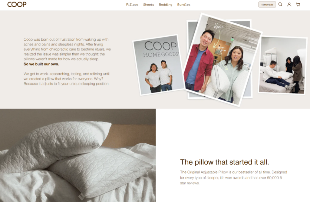
The About Us page uses founder-style imagery, brand story content, product visuals, and shopping sections together. We would design it this way because an About page should not only explain who the brand is. It should also connect the story to the product experience.
The top section shows real people and brand development moments. This makes the company feel human. The story explains that the product was created from frustration with poor sleep and uncomfortable pillows. That origin gives the product a stronger reason to exist.
The page does not stop at storytelling. It introduces the original pillow, shows best-selling adjustable pillows, presents sheet products, and includes a sleep quiz banner. This is smart because brand trust can quickly become shopping interest.
We would use this structure because users who visit an About page often want reassurance. Once the page gives them that reassurance, it should make the next step easy. The product carousels and quiz create a smooth path from belief to action.
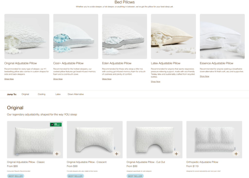
The product collection page includes multiple pillow families such as Original, Cool+, Eden, Latex, and Down Alternative. The website also presents different product shapes, including Classic, Crescent, and Cut-Out options on several pillow lines.
We would organize the page this way because a large product catalog can easily overwhelm customers. Clear product families help shoppers compare by function, material, cooling ability, comfort level, and support type.
Each product card follows the same structure: image, name, price, feature tags, and add icon. This repetition is intentional. Consistency helps users compare faster. When every card behaves the same way, the customer does not have to relearn the layout.
The page also uses small tags such as cooling, premium, sustainable, bestseller, or discount labels. These badges act as quick decision cues. They help users identify product differences without reading long descriptions.
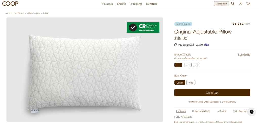
On the product detail page, the large product gallery sits on the left, while the purchase panel sits on the right. We would design it this way because users need both visual confidence and buying information at the same time.
The product gallery shows the pillow from multiple angles, including shape, surface texture, internal fill, and lifestyle usage. This matters because pillow shoppers care about softness, support, loft, and material feel. The right-side purchase area keeps the product name, price, reviews, options, and add-to-cart button easy to access.
The product page includes close-up material shots, filling details, design diagrams, FAQ content, related products, and customer reviews. This layered structure works because each section answers a different question.
First, the customer sees the product. Then they understand the materials. Then they learn the design benefits. Then they read common questions. Then they see related products. Finally, reviews confirm the product experience. This sequence supports a confident purchase decision.
เดอะ COOP Sleep Goods website succeeds because it treats e-commerce design as a complete customer journey, not just a visual layout. It uses warm lifestyle imagery to create emotional comfort, clear category design to guide product discovery, trust signals to reduce hesitation, product cards to simplify comparison, and detailed product pages to support confident buying.
As designers, we would describe this approach as conversion-focused but still calm and brand-driven. The website never feels too aggressive. It guides users step by step, from interest to trust, from trust to product understanding, and from product understanding to purchase. This is exactly the kind of design thinking that helps an online store move beyond selling individual products and start building a real brand experience. For businesses that want a similar independent website experience with stronger structure, better product storytelling, and clearer conversion paths, AIRSANG can help plan and design this type of brand-focused e-commerce website.


