


ไม่มีสินค้าในตะกร้า.

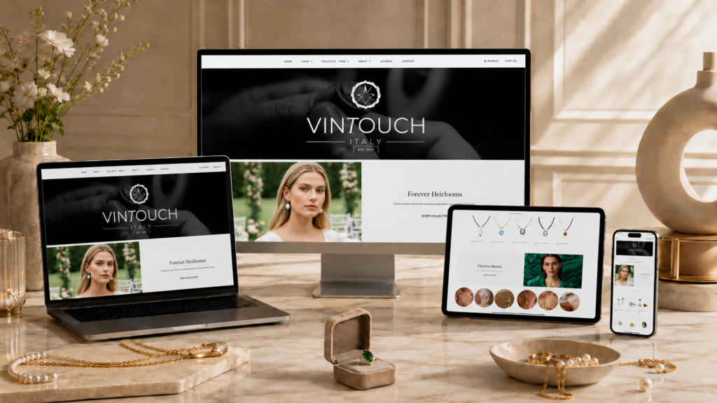
A luxury jewelry website must do more than display products. It needs to create emotion, communicate craftsmanship, guide shoppers through a clear buying journey, and make every product feel worthy of attention. For a handcrafted jewelry brand like Vintouch Jewels, the design challenge goes beyond building a beautiful Shopify storefront. The website needs to express Italian artistry, highlight handmade details, support gifting and bridal shopping, and create a premium brand experience from the homepage to the product page.
Vintouch Jewels presents a clear brand story around handcrafted jewelry made in Italy, with pieces produced in its workshop in Torre del Greco, Naples. The brand emphasizes “no mass production, no dropshipping, no industrial processes,” which gives the website a strong emotional foundation for visual storytelling.
| ระยะเวลาจัดส่ง | หมวดหมู่ | แพลตฟอร์มแอปพลิเคชัน |
| 19 วัน | Jewelry | shopify |
| นักออกแบบที่เกี่ยวข้อง | ค่าใช้จ่าย | ผล |
| หลิน จาง | $1700 | Sales📈305% |
This Shopify design project focused on turning a jewelry brand’s handmade identity into a polished eCommerce experience. The goal was not simply to place products into a standard template. The goal was to design a visual system that could support luxury, trust, romance, heritage, and conversion at the same time.
The homepage became the main storytelling gateway. It needed to introduce the brand, show the craftsmanship behind the jewelry, feature key collections, guide visitors toward shopping categories, and create a refined feeling that matched the value of the products.
Other pages also played an important role. Collection pages needed to feel easy to browse. Product pages needed to support decision-making. About and story-driven pages needed to explain why handmade Italian jewelry carries more emotional value than mass-produced accessories.
The design direction followed a clean, elegant, and emotionally rich style. Instead of using heavy decorative elements, the page design relied on strong photography, generous spacing, refined typography, soft contrast, and clear section hierarchy.
For a jewelry brand, this approach works especially well because the product itself carries detail, texture, shine, and craftsmanship. A crowded layout would distract from the jewelry. A quiet and premium layout allows each piece to breathe.
The first goal was to make the website feel premium within seconds. Jewelry shoppers often make emotional judgments quickly. If the first screen feels generic, cluttered, or low-end, the visitor may not trust the price, the craftsmanship, or the brand story.
The homepage therefore needed a strong hero area. It had to create atmosphere before pushing products too aggressively. The visual language needed to say: this is handmade, refined, romantic, and worth exploring.
Vintouch Jewels has a strong identity around Italian handmade jewelry. The brand describes its pieces as made in-house in Torre del Greco and rooted in art and history. This story became one of the most important design anchors.
The design needed to show craft, not just commerce. That meant using layout sections that could present process, materials, workshop heritage, and product details in a calm and credible way.
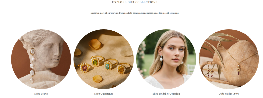
Luxury design should never make the buying process confusing. The page needed to look artistic, but shoppers still needed clear paths to necklaces, earrings, rings, bracelets, bridal pieces, best sellers, and gift-ready items.
A strong Shopify website balances emotion and usability. The design must inspire visitors, then make the next step obvious.
The website also needed a design structure that could grow with the brand. New collections, seasonal campaigns, bridal edits, gift guides, and story pages should fit naturally into the same visual system. This kind of flexible design foundation helps a Shopify brand stay consistent over time.
Many jewelry websites use similar formulas: a large hero image, product grids, basic collection tiles, and a simple footer. That structure can work, but it often fails to express what makes a brand different.
For Vintouch Jewels, the website needed to avoid looking like a basic catalog. The handmade Italian story, cameo jewelry, pearls, gemstones, and bridal positioning all required a more emotional design approach.
The brand has a soft, romantic, heirloom-inspired feeling. At the same time, Shopify visitors still need to shop easily. The design had to avoid becoming too editorial or too abstract.
Every visual section needed a purpose. A beautiful image should lead to a collection. A brand statement should build trust. A product grid should encourage browsing. A product page should reduce hesitation.
Jewelry products often include small details that matter: materials, stones, finishes, scale, color, symbolism, and occasion. Vintouch Jewels highlights collections such as gemstone jewelry, cameo jewelry, pearls, and bridal pieces. Its gemstone collection, for example, emphasizes genuine gemstones, pearls, traditional techniques, and Italian craftsmanship.
The design needed to help shoppers understand those details without overwhelming them.
Luxury shoppers want confidence. They want to know where a product comes from, how it is made, and whether the brand is real. But too much text can slow the shopping experience.
The design solution needed to use short copy blocks, trust sections, visual storytelling, and page rhythm to communicate credibility naturally.
The homepage became the most important page in the design system. It had to work like a luxury brand introduction and a shopping guide at the same time.
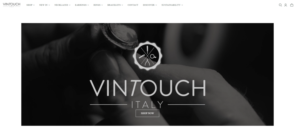
The hero section needed to create an immediate emotional tone. A strong visual, minimal headline, and clear call-to-action helped position the brand as premium and intentional. Instead of overloading the first screen with too many messages, the design focused on one clear idea: handmade jewelry with heritage and feeling.
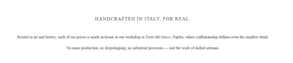
After the hero area, the page needed to explain what makes the brand different. This section introduced the handmade Italian story in a clean editorial layout. The copy stayed short, but the message stayed strong: the jewelry is not mass-produced, and every piece carries artisan value.
The homepage also needed clear shopping entrances. We designed collection sections that could guide users toward key product families such as cameo jewelry, gemstone jewelry, necklaces, earrings, bridal pieces, and best sellers.
This structure helps visitors who arrive without a specific product in mind. Instead of forcing them to search, the page gives them curated directions.
Jewelry often sells through emotion and occasion. Bridal, gifting, personal milestones, and everyday elegance all create reasons to buy. A Shopify jewelry homepage should not only say “shop now.” It should help visitors imagine when and why they would wear the piece.
For that reason, lifestyle sections became important. They gave the website a stronger editorial feeling and helped products connect with real customer moments.
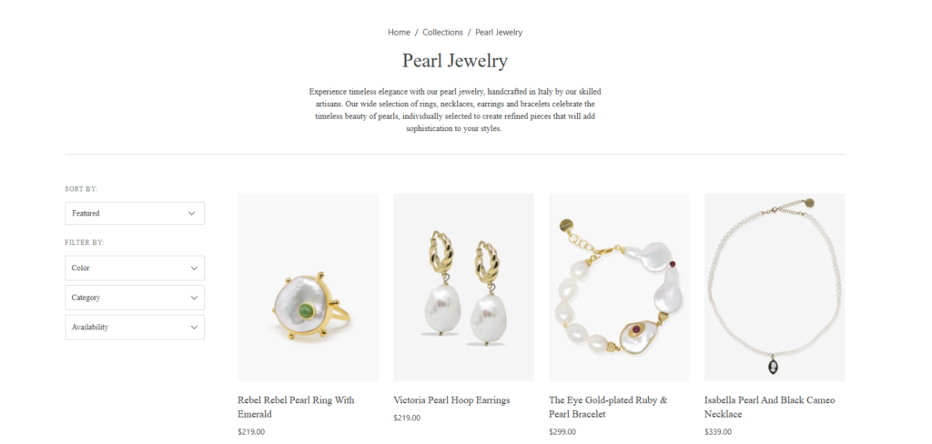
Collection pages needed to feel refined, but also practical. Shoppers should be able to compare products quickly, understand categories, and move through the catalog without friction.
The product grid used a simple structure with strong product imagery, clear product names, and pricing visibility. This works well for jewelry because shoppers need to compare shapes, stones, colors, and styles visually.
Vintouch Jewels has many collection paths, including best sellers, bridal and occasion, cameo jewelry, bracelets, necklaces, earrings, and more. A strong collection structure helps customers browse by intent, not just by product type.
A premium design still needs practical shopping tools. Filter and sort areas help shoppers narrow choices by category, color, availability, or price range. These tools should feel clean and unobtrusive, not heavy or technical.
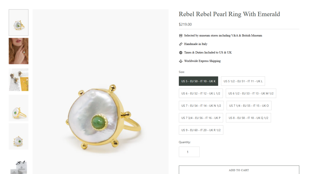
The product page is where emotion turns into action. For a jewelry brand, this page must make the product feel desirable and trustworthy.
The product image area should be generous. Jewelry needs close-up views, lifestyle views, and detail shots. The layout should allow the shopper to study texture, shape, stone color, and finish.
The product title, price, product options, and call-to-action need strong hierarchy. Luxury design should not hide the buying path. The “Add to Cart” area should feel natural and easy to find.
The product page should also support storytelling. For handcrafted jewelry, material notes, artisan details, care information, and origin details can increase confidence. Vintouch’s About page explains that pieces are individually handmade in Italy and often use a bezel-set technique, which supports the brand’s one-of-a-kind product narrative.
Shipping, warranty, returns, handmade notes, and customer support details should appear in a calm, organized way. These details reduce purchase hesitation without making the page feel crowded.
The typography direction needed to feel elegant, soft, and editorial. A refined serif style works well for headlines because it creates a luxury tone. A clean sans-serif style works well for body text because it keeps product information readable.
The key was contrast. Headlines could feel romantic and brand-led, while product details needed clarity. This combination helps the website feel premium without sacrificing usability.
The color palette needed to support jewelry photography instead of competing with it. Soft neutrals, warm whites, muted beige, light taupe, and deep accent tones create a timeless luxury base. These colors allow pearls, gemstones, gold finishes, and cameo details to stand out.
A restrained color system also helps the Shopify store feel more expensive. Luxury websites often use fewer colors, better spacing, and stronger image direction rather than loud visual effects.
Spacing plays a major role in premium website design. A luxury jewelry site should not feel compressed. Each section needs breathing room so visitors can slow down, focus, and appreciate the products.
The homepage rhythm followed a simple pattern: emotional visual, brand message, shopping path, product discovery, story reinforcement, and final conversion prompt. This rhythm keeps the user moving without feeling rushed.
Image direction shaped the whole experience. Product images needed to look sharp and consistent. Lifestyle images needed to feel romantic, natural, and high-end. Workshop or craft-related visuals needed to build authenticity.
For a handcrafted jewelry brand, imagery should not look overly artificial. It should feel warm, tactile, and close to the making process.
We first studied the brand’s positioning, product categories, visual tone, and likely customer motivations. The customer is not only buying jewelry. They may be buying a wedding piece, a meaningful gift, a handmade object, or a personal heirloom.
This understanding shaped the design language. We avoided a cold, overly commercial layout and focused on warmth, craft, and emotional storytelling.
Next, we planned the website structure around customer intent. The homepage needed to serve new visitors, returning customers, gift shoppers, bridal shoppers, and product-focused buyers.
We organized the page so visitors could quickly understand the brand, then move into the right shopping path. The design did not depend on one single call-to-action. It created multiple natural entry points.
The homepage design focused on first impression, brand education, and collection discovery. Each section had a clear role.
The hero section created desire. The brand story section built trust. Collection blocks guided shopping. Product features encouraged browsing. Lifestyle sections added emotion. The final call-to-action helped visitors continue their journey.
After the homepage direction felt clear, we extended the same visual language to collection and product pages. This created consistency across the Shopify store.
A visitor should not feel like the homepage is beautiful but the shopping pages are basic. The full experience needs to feel connected.
Mobile design matters heavily for Shopify stores. Jewelry shoppers often discover products through social media, ads, or mobile browsing. The mobile version needed to keep the same luxury feeling while making shopping easy.
We focused on readable text, strong image cropping, clear buttons, smooth section flow, and simple navigation. A premium mobile experience should feel elegant, not squeezed.
A polished Shopify design makes the brand feel more trustworthy and valuable. For handmade jewelry, this is especially important because shoppers need to believe in the craftsmanship before they buy.
Clear collection sections help users find the right category faster. This improves the shopping experience and encourages deeper browsing.
Story-led design helps visitors connect with the products. When shoppers understand the origin, craft, and feeling behind a piece, they can see it as more than an accessory.
Good design supports conversion by reducing confusion. Clear calls-to-action, organized product pages, strong imagery, and trust details all help move shoppers toward purchase.
A well-planned design system can support future campaigns, seasonal launches, new collections, and editorial content. This gives the brand more flexibility as it grows.
The final Shopify design direction created a refined jewelry shopping experience with a strong handmade identity. The homepage introduced the brand with emotion and clarity. The collection pages made browsing easier. The product pages supported trust and purchase decisions. The visual system gave the brand a consistent, premium, and romantic presence across the store.
Most importantly, the design helped connect the product value with the customer experience. Handmade Italian jewelry deserves a website that feels thoughtful, elegant, and personal. This project showed how Shopify design can transform a product catalog into a full brand experience.
A successful Shopify jewelry website needs more than attractive images. It needs strategy, structure, visual consistency, emotional storytelling, and a clear shopping journey. For Vintouch Jewels, the design approach focused on craftsmanship, Italian heritage, refined product presentation, and a smoother path from discovery to purchase.
This is the kind of Shopify design work AIRSANG helps brands create: premium, conversion-focused, visually polished, and built around the customer experience rather than unnecessary technical complexity.


