


การแนะนำ
In the competitive arena of global footwear, the digital storefront serves as the primary gateway between a brand’s philosophy and its global audience. For a brand like Xero Shoes, which champions the revolutionary concept of natural movement and “barefoot” living, the website must do more than simply list products. It must communicate an entire lifestyle, a scientific health benefit, and a tactile sensation through a digital medium. This article explores the intricate design journey we undertook to elevate the Xero Shoes Shopify experience, focusing exclusively on the power of visual communication, user interface (UI) artistry, and the strategic design thinking that drives conversion without relying on technical code.
| ระยะเวลาจัดส่ง | หมวดหมู่ | แพลตฟอร์มแอปพลิเคชัน |
| 19 วัน | shoe | shopify |
| นักออกแบบที่เกี่ยวข้อง | ค่าใช้จ่าย | ผล |
| หลิน จาง | $1800 | Sales📈320% |
The Vision: Designing for Natural Movement
Every successful design begins with a deep understanding of the brand’s soul. Xero Shoes is built on the belief that “Life is better feet first.” Our creative challenge was to translate this visceral, physical experience into a visual design system that resonates with both elite athletes and health-conscious casual walkers. We moved away from the cluttered layouts often seen in traditional footwear e-commerce and embraced a philosophy of “Minimalist Vitality.”
Establishing the Visual Language
The first step in our design methodology was defining a cohesive visual language. We selected a palette of earthy, organic tones—deep greens, slate greys, and warm terracottas—complemented by high-energy accent colors like vibrant orange. This combination reflects the brand’s connection to nature while injecting a sense of athletic performance. Our team focused on “Dynamic Whitespace,” a technique where the negative space isn’t just empty; it’s a structural element that guides the user’s eye toward the most critical information: the product’s unique features and the brand’s core benefits.
Our Comprehensive Design Process
Design is a deliberate discipline, not a series of accidents. To ensure the Xero Shoes website stood out among Shopify’s vast ecosystem, we followed a rigorous, design-first process that prioritized user empathy and aesthetic harmony.
Discovery and Aesthetic Auditing
We began with an extensive aesthetic audit. We didn’t just look at what competitors were doing; we looked at what they were missing. Many footwear sites feel heavy and industrial. For Xero Shoes, the design needed to feel light and flexible, mirroring the product itself. We analyzed how light interacted with footwear materials in photography and how different font weights affected the perceived “heaviness” of the page. This stage was about finding the perfect balance between professional sports performance and approachable wellness.
The Science of Visual Hierarchy
In the design phase, we meticulously mapped out the visual hierarchy. Using eye-tracking principles like the F-Pattern and the Z-Pattern, we positioned key visual elements to ensure maximum impact. We placed the most critical value propositions—such as the “Wide Toe Box” and “Flexible Sole”—in high-visibility zones. This allows users to grasp the unique selling points (USPs) of the brand within seconds of landing on the page, even before they begin to read the detailed copy.
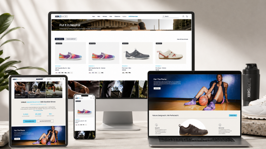
The Home Page: A Digital Performance Masterpiece
The Home Page of a Shopify store is its most valuable real estate. It is the digital equivalent of a flagship store in Manhattan. For Xero Shoes, we designed a Home Page that functions as a narrative journey.
The Hero Section: Movement and Motivation
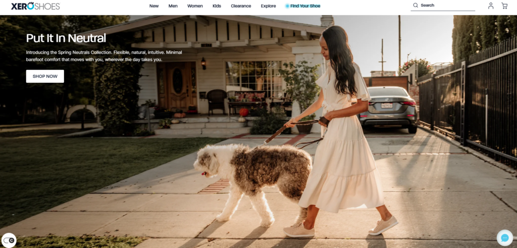
The hero section is designed to stop the scroll. We utilized high-fidelity lifestyle imagery that shows the product in its natural habitat—the trail, the gym, and the street. By choosing images that depict active movement, we tap into the user’s aspirations. The typography in the hero section was designed to be bold yet elegant, using a custom font scale that ensures the message remains powerful across all device dimensions.The call-to-action (CTA) buttons were given a subtle shadow and a distinct color to provide “visual affordance,” signaling to the user exactly where to click to start their journey.
Deep Dive: Beyond the Front Page
A website’s success is often decided in the details of its inner pages. We extended the same design rigor to the Collection and Product Detail Pages (PDP).
Collection Page Strategy: Visual Efficiency
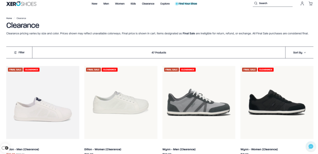
For the Collection pages, we prioritized “visual scanning.” We designed a grid system that highlights the unique silhouettes of the shoes. By ensuring that the background of each product shot is consistent and neutral, we allow the product’s colors to pop. We also designed interactive hover states—where a user can see a side-view or a sole-view simply by moving their cursor—reducing the cognitive load required to find the right pair of shoes.
The Product Page: Sensory Translation
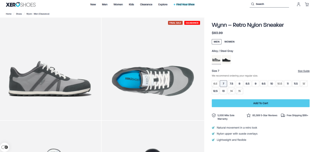
Since the user cannot physically try on the shoes, the design must provide a “virtual touch.” We achieved this through extreme close-up photography and a layout that emphasizes texture. We designed custom iconography to represent the “Xero DNA”—the features that make the shoes unique. These icons were designed with a clean, thin-line style to maintain the minimalist feel of the brand. Every element on the PDP, from the size selector to the “Add to Cart” button, was designed with “clickability” in mind, using spacing and color to remove any friction from the buying process.”Design is the silent ambassador of your brand. It speaks when you are not there, and it convinces when words are not enough.”
Overcoming Design Challenges
Redesigning a high-traffic Shopify site like Xero Shoes presents unique creative challenges. One of the primary obstacles was the volume of educational content. The “barefoot” concept requires explanation, but too much text can kill a design’s momentum.
The Challenge: Balancing Education and Aesthetics
How do you explain the complex mechanics of the human foot without making a website look like a textbook? This was the central design puzzle. If we used too much text, we risked boring the user. If we used too little, they might not understand why they should buy these shoes over traditional sneakers.
The Solution: Visual Infographics and Modular Design
Our solution was to transform the data into “visual bites.” We designed a series of modular infographics that break down the foot’s anatomy and the shoe’s construction. We used a “progressive disclosure” design technique—showing the most important information first and allowing curious users to click for more. This keeps the layout clean and fast-paced while still providing the necessary depth for those who want to learn.We also utilized video backgrounds to show the sole’s flexibility, proving the product’s value through motion rather than just words.
The Advantages of a Design-First Approach
By focusing purely on design and UI, we provide our clients with several distinct advantages. First, a design-first approach ensures that the brand remains the hero. We don’t get bogged down in the technical “how”; we focus on the “what” and the “why.” This leads to a more creative, less restricted visual outcome.
Optimizing the Emotional User Journey
We design for emotion. We know that shoppers make decisions based on how a brand makes them feel. For Xero Shoes, we designed a journey that feels empowering, healthy, and liberating. This emotional resonance is what turns a one-time buyer into a brand advocate. Every curve of a button and every choice of line-height is aimed at creating a sense of “premium comfort.”
The Result: A Global Standard of Excellence
The final design of the Xero Shoes Shopify store is a testament to the power of visual storytelling. By stripping away the unnecessary and focusing on the core brand values, we created a digital experience that is as functional as the shoes themselves. The site now stands as a benchmark for the footwear industry, proving that with the right design strategy, a ช็อปฟี่ store can compete with any high-end custom-built platform in the world.
Our Commitment to Design Excellence
ที่ AIRSANG, we understand that your website is the most important asset your business owns. Our mission is to transform that asset into a masterpiece of design and user experience. As a specialist design firm, we provide the creative vision and the strategic UI expertise that modern Shopify brands need to thrive in a global market. We don’t just design pages; we design connections. We don’t just build layouts; we build legacies. Our partnership with brands like Xero Shoes showcases our ability to translate complex brand philosophies into beautiful, high-converting digital realities. By choosing AIRSANG, you are choosing a partner who values aesthetics as much as you value your business. Let us help you tell your story through the power of world-class design.


ออกแบบและสร้างเว็บไซต์ WordPress หรือเว็บไซต์องค์กรพร้อมระบบอีคอมเมิร์ซครบวงจรสำหรับคุณ.
ช่วงราคา: $200.00 ถึง $2,500.00ข้อกำหนดเฉพาะหรือใบเสนอราคาพิเศษ
ราคาเดิมคือ: $2.00.$1.00ราคาปัจจุบันคือ: $1.00. ภาพหลักสำหรับการออกแบบอุปกรณ์กายภาพบำบัดที่บ้านของ Amazon (อธิบายรายละเอียด)
บทนำ: การสร้างภาพลักษณ์ที่น่าเชื่อถือสำหรับอุปกรณ์บำบัดที่บ้านบน Amazon เมื่อออกแบบภาพหลักสำหรับอุปกรณ์บำบัดที่บ้านบน Amazon สิ่งสำคัญอันดับแรกของเราคือ...

ภาพหลักสำหรับการแปลงลิปสติกเป็นสินค้าสำหรับ Amazon
บทนำ: การออกแบบภาพหลักลิปสติกที่ขายได้บน Amazon เมื่อเราออกแบบภาพหลักสำหรับลิปสติกบน Amazon ความรับผิดชอบของเราไม่ได้จำกัดอยู่แค่...

แฮกเกอร์ขโมยอีเมลผู้ดูแลระบบ WordPress ได้อย่างไร (และวิธีป้องกัน)
มาเริ่มกันด้วยความจริงที่ไม่น่าสบายใจ: อีเมลแอดมิน WordPress ของคุณอาจเปิดเผยต่อสาธารณะมากกว่าที่คุณคิด และแฮกเกอร์? พวกเขาชอบมาก สำหรับพวกเขา...

อะไรทำให้รองพื้นชนิดเหลวของ Amazon (ภาพหลัก) ขายดี?
บทนำ การออกแบบภาพหลักสำหรับรองพื้นชนิดเหลวบน Amazon ไม่ใช่แค่การทำให้ผลิตภัณฑ์ดูสวยงามเท่านั้น บน Amazon ภาพหลักและ...

การออกแบบภาพหลัก Amazon ที่มีประสิทธิภาพสำหรับตลับกรอง
บทนำ การออกแบบภาพหลักสำหรับ Amazon ไม่ใช่แค่การทำให้สินค้าดูน่าดึงดูดเท่านั้น แต่ยังเกี่ยวกับความชัดเจน ความน่าเชื่อถือ และความเข้าใจได้ในทันที โดยเฉพาะอย่างยิ่งสำหรับ...

การโจมตีแบบ Replay Attack บน WordPress: ภัยคุกคามจริงหรือแค่เรื่องที่ถูกพูดเกินจริง?
ก่อนอื่นขอชี้แจงให้ชัดเจนก่อน การโจมตีแบบ Replay Attack นั้นดูไม่น่ากลัว มันไม่ได้ทำลายรหัสผ่าน มันไม่ได้แทรกโค้ดที่เป็นอันตรายพร้อมข้อความแฮ็กเกอร์สีเขียวกระจัดกระจายไปทั่ว มันแนบเนียนกว่า...

วิธีคัดลอกหน้าเว็บ WordPress โดยไม่ทำให้ระบบเสียหาย
ยอมรับกันเถอะ บางครั้งคุณอาจไม่อยากสร้างหน้าเว็บใหม่ คุณแค่อยากได้หน้าเว็บเดิม...แต่แตกต่างไปเล็กน้อย รูปแบบเหมือนเดิม บล็อกเหมือนเดิม การตั้งค่าเหมือนเดิม เพราะ...

เปรียบเทียบธีม WordPress สำหรับสัตว์เลี้ยง 5 แบบ
บทนำ การเลือกธีม WordPress ที่เหมาะสมสำหรับธุรกิจเกี่ยวกับสัตว์เลี้ยงนั้นไม่ใช่แค่เรื่องของการออกแบบเท่านั้น แต่ยังส่งผลโดยตรงต่อการใช้งาน ความสามารถในการขยายขนาด และการเติบโตของธุรกิจในระยะยาว การดูแลสัตว์เลี้ยงและ...

เปรียบเทียบธีมอีคอมเมิร์ซชุดว่ายน้ำ 5 แบบ
บทนำ การเลือกธีมที่เหมาะสมสำหรับร้านค้าอิสระที่จำหน่ายชุดว่ายน้ำหรือชุดชั้นในนั้นไม่ใช่แค่การตัดสินใจด้านภาพลักษณ์เท่านั้น แต่ยังส่งผลโดยตรงต่ออัตราการเปลี่ยนลูกค้าให้เป็นผู้ซื้อ ความสามารถในการขยายธุรกิจ และความยั่งยืนในระยะยาว...

วิธีปิดการแสดงความคิดเห็นใน WordPress (โดยไม่ต้องเสียสติ)
มาพูดถึงระบบแสดงความคิดเห็นของ WordPress กันดีกว่า ในทางทฤษฎีแล้ว ความคิดเห็นนั้นยอดเยี่ยมมาก มันช่วยกระตุ้นการสนทนา สร้างชุมชน และทำให้เว็บไซต์ของคุณดูมีชีวิตชีวา แต่ในความเป็นจริงแล้ว มันมักจะเป็นเหมือนแม่เหล็กดึงดูด...

การสร้างเว็บไซต์ WordPress ที่ปรับขนาดได้สำหรับแบรนด์ที่ขับเคลื่อนด้วยวิทยาศาสตร์: โครงการ AminoUSA
บทนำ ในยุคดิจิทัลปัจจุบัน เว็บไซต์เป็นมากกว่าแค่สถานที่สำหรับแสดงรายการสินค้า สำหรับแบรนด์ที่ขับเคลื่อนด้วยวิทยาศาสตร์ซึ่งดำเนินงานในอุตสาหกรรมที่มีการควบคุมหรือเน้นการวิจัย...

สร้างร้านค้า Shopify ที่ปรับขนาดได้สำหรับแบรนด์ใบมีดระดับโลก: โครงการ CoolKatana
บทนำ ในธุรกิจอีคอมเมิร์ซข้ามพรมแดน เว็บไซต์ Shopify เป็นมากกว่าแค่หน้าร้าน สำหรับแบรนด์ที่ดำเนินธุรกิจในกลุ่มเฉพาะหรือกลุ่มที่ขับเคลื่อนด้วยวัฒนธรรม เว็บไซต์ต้องทำมากกว่านั้น...

การออกแบบร้านค้า Shopify ที่มีอัตราการแปลงสูงสำหรับขายการ์ดโปเกมอน
บทนำ ในโลกของอีคอมเมิร์ซสินค้าสะสม โดยเฉพาะอย่างยิ่งในตลาดเกมการ์ดโปเกมอน (TCG) เว็บไซต์จะต้องทำมากกว่าแค่แสดงรายการสินค้า...

ดีไซน์ Shopify ที่เพิ่มยอดขายสำหรับแบรนด์อิฐสั่งทำพิเศษ
บทนำ ในสภาพแวดล้อมการแข่งขันอีคอมเมิร์ซในปัจจุบัน โดยเฉพาะอย่างยิ่งในตลาดของขวัญส่วนบุคคลและของสะสม เว็บไซต์ Shopify ต้องทำมากกว่าแค่แสดงสินค้า...

วิธีติดต่อฝ่ายสนับสนุนของ Shopify: คู่มือที่ง่ายและไม่ยุ่งยาก
การบริหารร้านค้า Shopify ควรเป็นเรื่องที่น่าตื่นเต้น ไม่ใช่เรื่องที่ทำให้สับสน เมื่อมีคำถามหรือปัญหาเกิดขึ้น Shopify มีช่องทางการสนับสนุนหลายช่องทาง ขึ้นอยู่กับสถานการณ์...

วิธีปิดใช้งานร้านค้า Shopify: คู่มือที่ชัดเจนและใช้งานได้จริง
การปิดใช้งานร้านค้า Shopify นั้นไม่ซับซ้อน แต่ก็มีผลกระทบหลายอย่างที่ผู้ขายหลายรายมองข้ามไป คู่มือนี้จะอธิบายขั้นตอนอย่างละเอียดและเข้าใจง่าย...

กรณีศึกษาการออกแบบเว็บไซต์ Shopify สำหรับแบรนด์ดอกไม้ระดับพรีเมียม
บทนำ ในสภาพแวดล้อมการแข่งขันอีคอมเมิร์ซในปัจจุบัน เว็บไซต์ Shopify ต้องทำมากกว่าแค่แสดงสินค้า มันต้องสื่อสารคุณค่าของแบรนด์ได้ทันที และแนะนำผู้ใช้...

กรณีศึกษาการออกแบบร้านค้า Shopify: ร้านค้าเกมย้อนยุค
บทนำ ในสภาพแวดล้อมอีคอมเมิร์ซที่มีการแข่งขันสูง ความชัดเจนทางด้านภาพและการเชื่อมโยงทางอารมณ์มักเป็นตัวกำหนดว่าผู้เยี่ยมชมจะกลายเป็นลูกค้าหรือไม่ โดยเฉพาะอย่างยิ่งใน...