


ไม่มีสินค้าในตะกร้า.

แข็งแกร่ง ช็อปฟี่ website does more than display products. It helps shoppers understand a brand, feel the value behind each item, and move through the buying journey with confidence. For a spiritual jewelry brand like Buddha & Karma, the design challenge is especially unique because the products are not only visual accessories. They carry emotional meaning, symbolic value, and personal intention.
The website needs to sell bracelets, necklaces, and spiritual items, but it also needs to tell a deeper story. Customers are not simply shopping for jewelry. They are looking for protection, healing, abundance, peace, confidence, or a meaningful gift. That means every page must balance beauty, clarity, trust, and conversion.
For this Shopify page design project, our goal was to create a shopping experience that felt calm, premium, meaningful, and easy to use. We focused mainly on the homepage because it sets the tone for the entire brand, but we also considered how product pages, collection pages, navigation, and supporting content could work together as one complete eCommerce experience.
The result is a Shopify website design approach that connects spiritual storytelling with clear shopping structure, helping the brand present its products with stronger emotion, better usability, and a more conversion-friendly layout.
| ระยะเวลาจัดส่ง | หมวดหมู่ | แพลตฟอร์มแอปพลิเคชัน |
| 20 วัน | Jewelry | shopify |
| นักออกแบบที่เกี่ยวข้อง | ค่าใช้จ่าย | ผล |
| แนนซี่ | $2200 | Sales📈221% |
Buddha & Karma is positioned around meaningful spiritual jewelry, including Feng Shui bracelets, protection bracelets, healing pieces, abundance-focused accessories, and intention-based designs. The visible website content emphasizes ideas such as “Style + Intention,” “Designed to Support Your Intention,” and product categories connected to wealth, protection, healing, success, and peace of mind.
From a design perspective, this gave us a clear direction. The website could not feel like a generic jewelry store. It needed to feel purposeful, spiritual, modern, and trustworthy.
Shopify eCommerce website design
Spiritual jewelry, Feng Shui accessories, intention-based jewelry, lifestyle eCommerce
Homepage design, product storytelling, collection presentation, trust-building layout, mobile shopping experience, conversion-focused page structure
Create a Shopify website experience that helps customers understand the meaning behind the products while making the shopping journey simple, beautiful, and purchase-ready.
The first major challenge was translating spiritual meaning into a clean digital shopping experience. A brand like Buddha & Karma carries many emotional and symbolic themes: energy, protection, wealth, healing, balance, and intention. These ideas are powerful, but they can become confusing if the page design lacks structure.
Our design needed to make these meanings easy to understand. Instead of overwhelming visitors with long explanations at the start, we organized the homepage so shoppers could quickly see the brand promise, explore bestsellers, understand the deeper purpose, and continue browsing with confidence.
Many jewelry websites focus heavily on product photography, pricing, and discounts. That works for some brands, but Buddha & Karma needs a more emotional shopping experience. Customers want to know what each item represents, why it matters, and how it fits into their personal life.
At the same time, the website still needs to sell. The design must guide visitors toward products, collections, reviews, and calls to action. Our challenge was to keep the emotional atmosphere while still creating a direct eCommerce path.
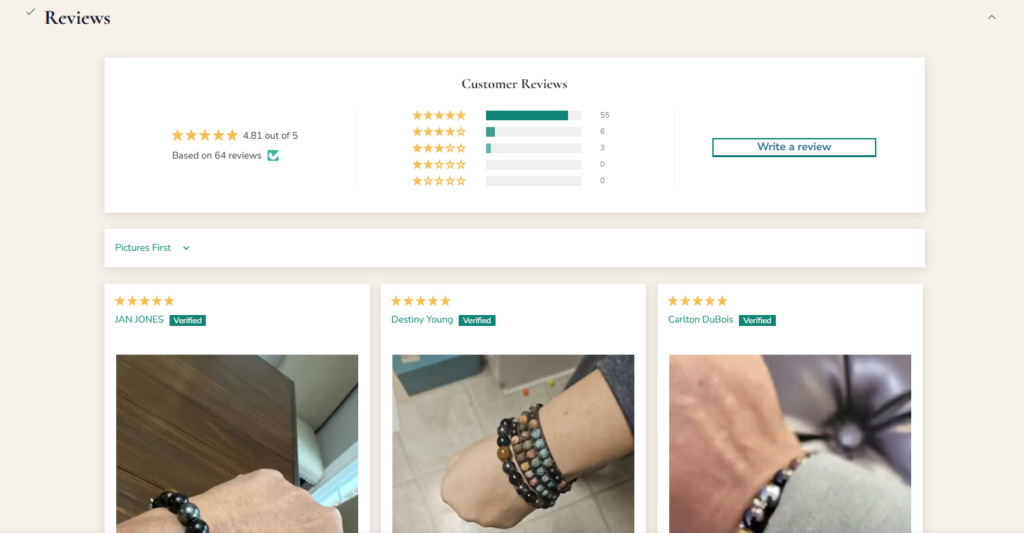
Spiritual jewelry shoppers often need reassurance before buying. They want to feel that the brand understands the meaning behind its pieces. They also want practical trust signals such as reviews, customer feedback, visible product options, clear prices, and easy navigation.
The homepage includes trust-building elements such as customer reviews, bestsellers, product ratings, and community-oriented messaging. The website also mentions that more than 50,000 customers worldwide wear Buddha & Karma bracelets, which supports credibility when used carefully in the layout.
A Shopify store must work beautifully on mobile. Jewelry shoppers often discover products through social media, email campaigns, ads, or search. Many of them enter the site from a phone, scroll quickly, and decide within seconds whether the brand feels trustworthy.
That means the mobile layout cannot simply shrink the desktop page. It needs clear spacing, readable typography, strong image hierarchy, and easy product discovery.
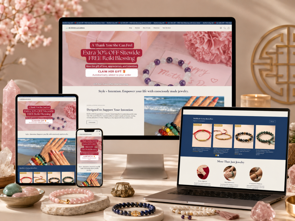
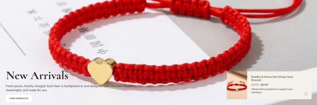
The homepage needed to communicate the brand identity immediately. We wanted the first screen to feel spiritual, modern, and emotionally warm. Instead of using a loud sales-first layout, we focused on a clean hero section with meaningful messaging and strong lifestyle-driven product presentation.
The hero message should help visitors understand the brand in seconds. A phrase like “Style + Intention” works because it connects fashion with purpose. It tells shoppers that the products are not only decorative. They are designed to support a personal intention.
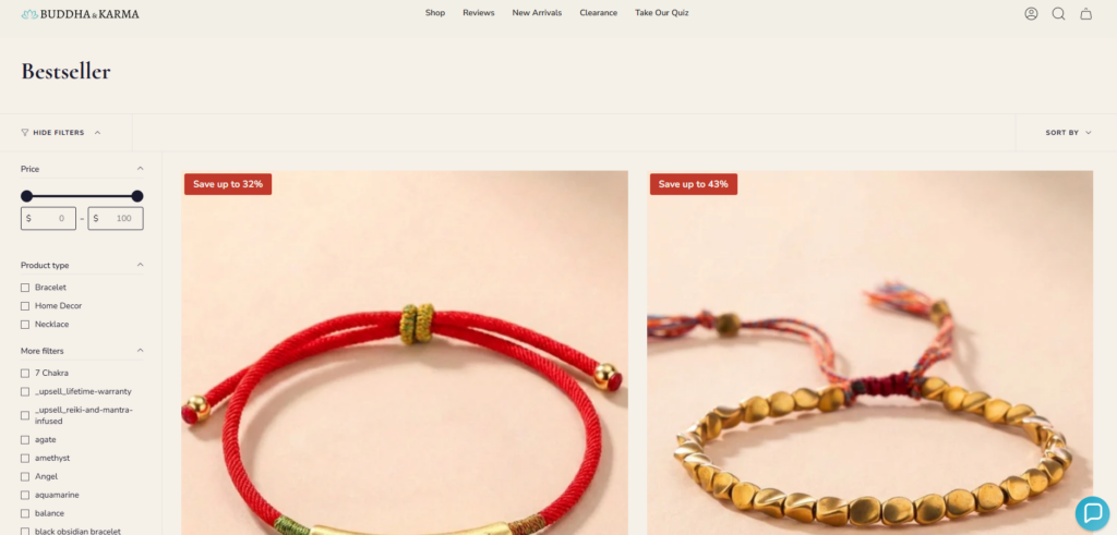
A strong Shopify homepage should help visitors shop without friction. For Buddha & Karma, we structured the homepage around clear discovery sections such as bestsellers, new arrivals, featured product categories, and intention-based messaging.
This allows different types of shoppers to find their path. Some visitors may want a bestselling bracelet. Some may want a product for protection. Others may be browsing for a meaningful gift. The page design needs to support all of these journeys without making the experience feel complicated.
The website design needed to explain why Buddha & Karma is different from a standard jewelry store. The “Why Buddha & Karma” section plays an important role here because it explains ideas such as energy alignment, purpose-driven wearing, and a community of believers.
From a design perspective, this section works best when it uses short copy, strong imagery, and clear content blocks. Instead of placing brand storytelling in one long paragraph, we divided the message into easy-to-scan points.
The goal was not to make the website feel pushy. Spiritual jewelry brands need a softer sales rhythm. We used product cards, review sections, clear calls to action, and benefit-led sections to guide visitors naturally.
This approach lets shoppers feel informed instead of pressured. It also keeps the website aligned with the calm, intentional feeling of the brand.
Before designing page sections, we first studied the brand’s emotional position. Buddha & Karma speaks to customers who value spiritual meaning, personal energy, symbolism, and daily intention.
This audience does not only ask, “Does this bracelet look good?” They also ask:
These questions shaped the design direction. We needed to build a Shopify website that felt visually attractive but also emotionally clear.
The homepage is the most important brand entry point. It needs to introduce the store, show products, communicate meaning, build trust, and create shopping momentum.
We designed the homepage with a layered structure:
This structure keeps the page easy to follow. It also creates a natural flow from emotion to product discovery to trust.
For the visual style, we focused on a calm, premium, and spiritual look. The design needs to feel warm and intentional without becoming too traditional or overly mystical.
A clean Shopify jewelry design should leave space for the products to shine. Bracelets, stones, beads, charms, and symbolic details need room to breathe. We used a layout direction that supports product imagery with clean spacing, soft visual rhythm, and readable text blocks.
The goal was to make the website feel modern enough for today’s eCommerce market while still respecting the spiritual identity behind the products.
Good page design depends on strong hierarchy. Every section should answer one simple question for the shopper.
The hero section answers: “What is this brand about?”
The bestseller section answers: “What should I shop first?”
The brand value section answers: “Why does this jewelry matter?”
The new arrivals section answers: “What is fresh or new?”
The review section answers: “Can I trust this store?”
By giving each section a clear role, the website becomes easier to browse and more effective at guiding customers toward action.
Product cards are one of the most important elements in any Shopify jewelry store. They must show the product clearly, communicate value quickly, and encourage shoppers to click.
สำหรับ Buddha & Karma, product cards need to do more than display images and prices. Many products include symbolic meanings, such as wealth, healing, protection, or calming energy. The product title should make that meaning easy to understand.
We designed product display areas to support:
This helps shoppers compare products quickly while still understanding the intention behind each item.
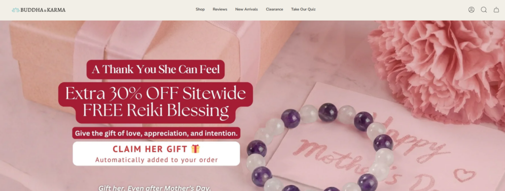
The hero section creates the first emotional impression. For Buddha & Karma, this area should not feel like a random product banner. It should communicate the core promise of the brand.
A message like “Style + Intention” immediately gives the page a strong direction. It combines fashion with purpose and creates a bridge between jewelry design and spiritual meaning.
The visual design should support that message with clean product imagery, a calm background, and a direct call to action. The goal is to make visitors feel that they have entered a meaningful store, not just another accessories website.
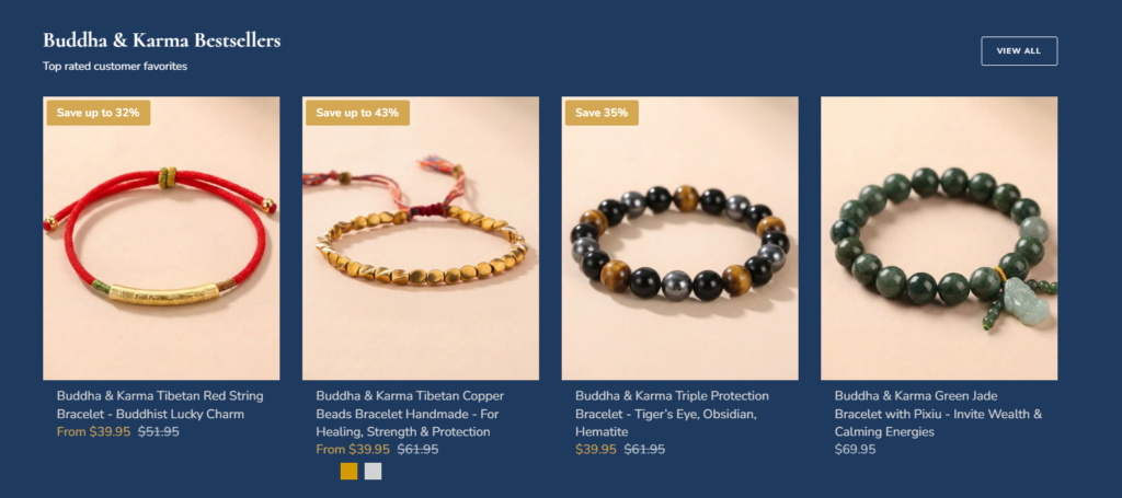
Bestsellers help new visitors make decisions faster. When shoppers do not know where to start, customer favorites provide a clear path.
The Buddha & Karma homepage includes a bestseller area with top-rated customer favorites, which is a smart eCommerce design choice because it combines product discovery with trust.
From a design perspective, we would keep this section visually clean and product-focused. The section title should be simple, the product grid should feel organized, and sale labels should be visible without overwhelming the spiritual tone of the brand.
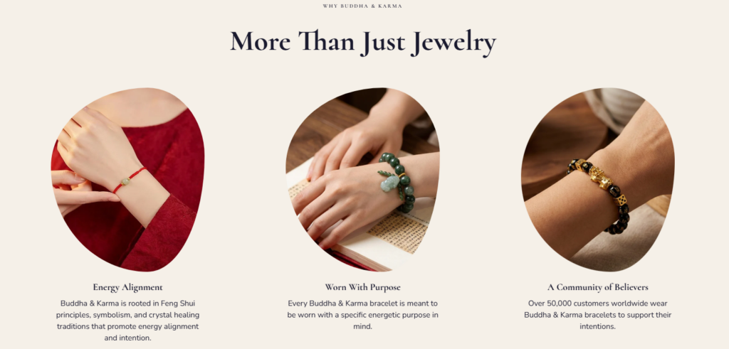
The “Why” section is essential for this type of Shopify store. Many competitors can sell bracelets, but not every brand can communicate purpose.
The visible website content highlights ideas such as energy alignment, wearing jewelry with purpose, and a worldwide community of believers. These points help shoppers understand the brand’s deeper value.
We designed this kind of section to work like a short brand education area. Each point should be paired with strong imagery and concise text. The layout should feel calm, balanced, and easy to scan.
New arrivals create a sense of movement. They show that the store is active and regularly updated.
For a spiritual jewelry brand, new arrivals can also introduce fresh intentions, new materials, or seasonal energy themes. A clean new arrivals section helps repeat visitors quickly see what has changed.
The design should give each product enough visual space while keeping the section connected to the overall page flow.
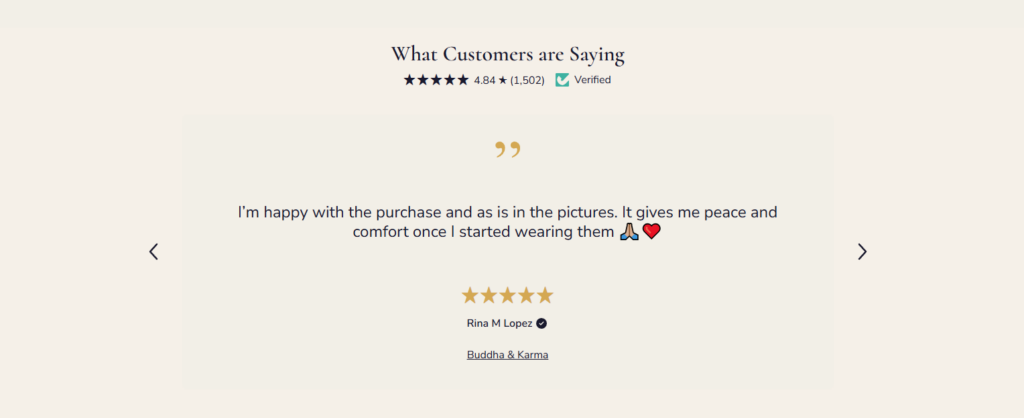
Reviews are especially important for spiritual products because shoppers want reassurance from real customers. The Buddha & Karma page displays customer feedback and a visible rating area, which strengthens confidence before purchase.
We placed this kind of section after visitors have already seen the brand story and products. That timing matters. Reviews work best when they appear after the shopper understands what the brand offers.
While the homepage introduces the brand, product pages do the heavy lifting for conversion. A Shopify product page for Buddha & Karma should explain the product’s meaning, show the item clearly, and help the shopper decide confidently.
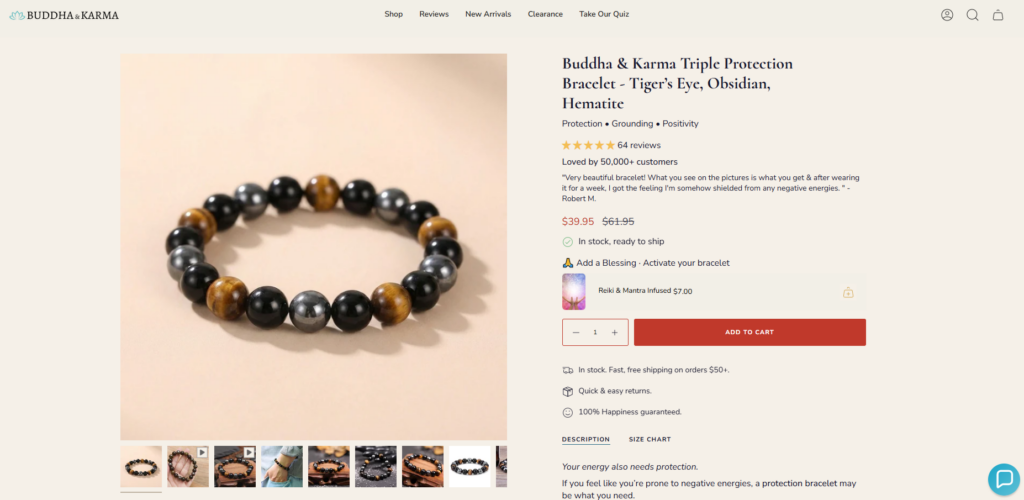
Spiritual jewelry products need detailed imagery. Shoppers should see the beads, stones, charms, colors, texture, size, and how the piece looks when worn.
The product image area should feel clean and easy to browse. If the product has multiple colors or variations, the design should make those options simple to compare.
The product page should not only describe materials. It should explain the intention behind the piece.
For example, a bracelet connected to wealth, protection, or calming energy should have copy that makes the purpose clear. The page should answer both practical and emotional questions.
This content style helps the product feel more valuable.
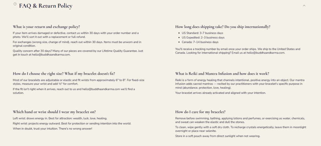
A strong product page should also include reviews, shipping information, return details, product benefits, and related recommendations. These elements reduce hesitation and make the purchase feel safer.
The design should keep this information organized so the shopper does not feel overwhelmed.
Collection pages help shoppers browse by intention, product type, or theme. For Buddha & Karma, this is especially important because customers may shop based on personal goals rather than only product categories.
A shopper may look for:
The collection page design should make these paths easy to understand. Filters, product grids, clean category titles, and short collection descriptions can help visitors choose faster.
The goal is to create browsing pages that feel organized and emotionally relevant.
We did not treat the website as a set of separate pages. We designed it as a complete journey.
A visitor might enter from the homepage, click a bestseller, read the product meaning, check reviews, add the item to the cart, and continue exploring related products. Every step should feel connected.
This is why page structure, visual consistency, and content hierarchy matter so much in Shopify design.
Spiritual jewelry needs storytelling. Without meaning, a bracelet becomes only another accessory. With the right design and copy structure, the product becomes a personal symbol.
We used the website layout to support that story. The homepage introduces the brand purpose. Product cards hint at intention. Product pages explain meaning in more detail. Reviews confirm customer trust.
Together, these elements make the shopping experience feel more valuable.
A spiritual brand still needs a practical eCommerce experience. Customers should never struggle to find products, understand pricing, or complete a purchase.
We focused on clean navigation, simple product sections, readable typography, strong calls to action, and mobile-friendly spacing. This makes the website feel polished while supporting sales.
One of the biggest mistakes in spiritual or lifestyle eCommerce design is adding too many visual effects, symbols, banners, and long text blocks. That can make the website feel cluttered.
For Buddha & Karma, we kept the layout focused. Each section has a purpose. Each message supports the brand. Each product area helps visitors move forward.
The design helps Buddha & Karma feel like a meaningful spiritual jewelry brand rather than a basic accessories store. The combination of calm visuals, intention-led messaging, and structured product presentation gives the brand a more memorable identity.
Customers can understand what the products represent more quickly. This is important because meaning drives the purchase decision.
When a shopper sees a bracelet connected to protection, wealth, healing, or peace of mind, the design should make that value easy to absorb.
The homepage guides visitors from brand promise to bestsellers, brand values, new arrivals, and reviews. This flow supports both emotional connection and practical shopping.
Trust elements such as reviews, community messaging, top-rated products, and clear product presentation help customers feel more confident before buying.
A clean mobile layout allows shoppers to browse products, read key messages, and move toward purchase without friction. For Shopify stores, this is essential because mobile traffic often plays a major role in eCommerce sales.
The final Shopify page design direction gives Buddha & Karma a stronger online presence built around meaning, clarity, and conversion.
The homepage introduces the brand with a calm and purposeful first impression. Bestseller sections help customers start shopping quickly. Brand value blocks explain the deeper purpose behind the products. New arrivals keep the store fresh. Review areas build trust. Product and collection pages support a more complete shopping journey.
Most importantly, the website design connects product beauty with emotional intention. It helps customers understand not only what they are buying, but why it matters.
This is what makes a Shopify design effective for a spiritual jewelry brand. It does not rely only on attractive images. It creates a complete brand experience that guides, educates, reassures, and converts.
การออกแบบ ช็อปฟี่ เว็บไซต์สำหรับ Buddha & Karma required more than arranging product images on a page. It required a thoughtful design strategy that connected spiritual meaning, jewelry presentation, customer trust, and eCommerce usability.
Through a clear homepage structure, meaningful product storytelling, organized collection browsing, and conversion-focused visual design, the website can present the brand in a stronger and more memorable way. It gives shoppers a calm place to explore spiritual jewelry while making the purchase journey simple and confident.
For brands that want to build a Shopify store with stronger visual identity, better product storytelling, and a more polished customer experience, AIRSANG brings design-focused Shopify expertise that helps turn brand meaning into a high-converting online shopping experience.


