


การแนะนำ
Anime merchandise is an emotional purchase as much as a practical one. Fans do not visit a store like Crunchyroll Store just to browse products. They arrive with anticipation, curiosity, and a strong connection to the worlds, characters, and series they love. That means the website experience cannot feel generic. It needs to feel energetic, curated, and instantly relevant while still making shopping easy.
For this project, our design goal was to create a storefront experience inspired by the visual merchandising strength of Crunchyroll Store while shaping it into a conversion-focused independent site experience. We approached the page as a brand environment, not just a product catalog. Every section needed to balance excitement with clarity, promotional energy with visual hierarchy, and fandom culture with retail discipline.
Rather than focusing on technical development, this article explains the design thinking behind the page: how we structured the user journey, how we translated a content-heavy anime retail model into a clean visual system, what challenges we faced, and how our design process helped create a page that feels immersive, organized, and ready to sell.
| ระยะเวลาจัดส่ง | หมวดหมู่ | แพลตฟอร์มแอปพลิเคชัน |
| 9 วัน | Anime | Salesforce Commerce Cloud |
| นักออกแบบที่เกี่ยวข้อง | ค่าใช้จ่าย | ผล |
| แนนซี่ | $300 | flow📈258% |
ภาพรวมโครงการ
A Storefront Built for Fandom and Fast Decisions
The reference direction came from a highly visual anime merchandise store environment. The page had to support a wide variety of content types, including:
- seasonal promotions
- collectible figures
- manga and home video
- franchise-led navigation
- membership value messaging
- social proof and community touchpoints
The challenge was not simply to make the page colorful or entertaining. The challenge was to design a page that could hold a large volume of information without overwhelming the user.
What the Client Needed
The client wanted a page design that could do five things well:
1. Communicate category breadth immediately
Users needed to understand within seconds that the store offered more than one type of anime merchandise.
2. Highlight promotions without feeling cheap
Discount banners had to stand out, but the overall store still needed to feel premium and trustworthy.
3. Make franchise discovery effortless
Anime shoppers often enter through series loyalty, not product type. The design had to support both behaviors.
4. Keep the page visually exciting
The page needed the energy of anime culture without becoming chaotic.
5. Support repeat browsing
Collectors and fans return often. The design had to encourage exploration beyond a single purchase session.
Our Design Objective
We defined the project as a visual commerce problem.
The store needed to feel like a destination, not a listing page. That meant we focused on emotional engagement, category navigation, campaign storytelling, and retail clarity all at once. Our objective was to create a page that could attract first-time visitors, reassure them quickly, and move them toward high-interest collections, promotional offers, and licensed merchandise.
We did not treat the homepage as a static billboard. We treated it as a guided experience with clear stages:
- capture attention
- establish promotional relevance
- introduce product depth
- organize discovery by fandom and category
- reinforce trust
- create reasons to return
That sequence shaped every design decision we made.
กระบวนการออกแบบของเรา
Discovery and Brand Reading
Before designing, we studied how anime fans shop and how entertainment merchandise differs from standard ecommerce behavior.
Understanding the Audience Mindset
Anime retail customers usually shop in one of three modes:
The collector mindset
These users look for figures, limited editions, exclusives, and display-worthy items.
The fan loyalty mindset
These users shop by series first. They care less about the product type and more about the franchise universe.
The gift or casual browsing mindset
These shoppers need faster orientation, stronger guidance, and clearer category cues.
Our page design had to serve all three audiences without splitting the experience into disconnected paths.
Understanding the Visual Language of the Category
Anime commerce uses bold imagery, recognizable characters, and campaign-driven excitement. But if every section competes for attention, nothing wins. We mapped out where high-intensity visuals should appear and where the layout should calm down.
This helped us establish a rhythm:
- high-energy hero areas
- structured product rows
- strong category blocks
- cleaner trust and membership sections
- lighter social and footer zones
That rhythm became essential to the overall usability of the page.
Information Architecture and Page Strategy
A large anime store can easily feel crowded. We solved that by building a clear hierarchy around user intent.
The Top-of-Page Experience
The first screen needed to answer three questions immediately:
- What is this store about?
- What promotion is happening now?
- Where should I click first?
We designed the top section to combine navigation, promotional urgency, and a visual hero with clear shopping direction. Instead of relying on text-heavy explanations, we let bold campaign graphics and concise messaging create immediate momentum.
The visual strategy here was simple: one strong promotional focus, one clean action path, and one clear sense of category identity.
Product Discovery Without Clutter
Once the hero had done its job, the page needed to shift from campaign mode into browsing mode. This is where many stores lose structure. They introduce too many equal-weight sections, and the user no longer knows what matters most.
We avoided that by designing discovery layers.
Layer one: promotional products
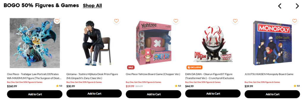
We placed deal-driven product groupings early to convert price-sensitive visitors while interest was still high.
Layer two: category-led shopping
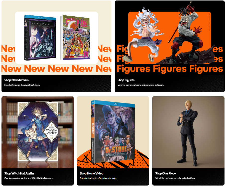
We used larger visual blocks for major merchandise families like manga, figures, and home video. These sections functioned like storefront departments.
Layer three: series-led exploration
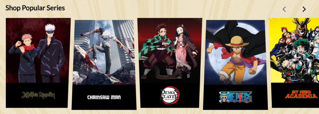
Because anime fans often identify with a title before a category, we included brand-style entry points by franchise.
Layer four: trust and membership value
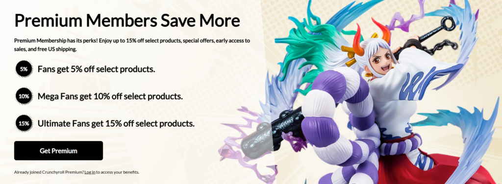
After excitement and discovery, we shifted into reassurance. This helped the page feel complete rather than purely promotional.
This structure kept the page moving in a logical direction.
Visual Design Decisions
Designing for Energy Without Chaos
Anime visuals are naturally expressive, colorful, and character-driven. The risk is that the page becomes noisy. Our job as designers was to manage intensity.
We did that through contrast and containment.
Bright orange promotional accents, strong black anchors, and lighter neutral areas created separation between sections. This allowed colorful product imagery to stand out without making the entire page feel visually overloaded.
We also made sure that highly saturated areas had breathing room. Large campaign banners worked because surrounding sections gave them space. Product cards remained readable because the layout framed them consistently.
The Role of Repetition in Store Design
One of the smartest things a content-heavy retail page can do is repeat structure even when the content changes. We used repetition intentionally across:
- card proportions
- image behavior
- heading scale
- CTA styling
- spacing systems
- section sequencing
This gave the page a dependable visual rhythm. Users could move quickly because they did not need to relearn the interface in every section.
Designing for Franchise Recognition
Series identity is one of the most powerful conversion drivers in anime retail. We treated franchise browsing as a visual branding system rather than a simple logo strip.
Each series needed to feel recognizable at a glance. That meant prioritizing clean presentation, adequate contrast, and enough visual isolation for each title mark or artwork to register quickly. This was important not only for returning fans but also for users who skim rapidly across the page.
Our Method for Turning Browsing Into Action
We Designed for Scanning First
Most homepage visitors do not read from top to bottom. They scan. We designed accordingly.
Instead of packing each section with explanation, we used:
- short labels
- direct headings
- visual category cues
- strong grouping
- obvious CTAs
This reduced friction and helped users identify a path within seconds.
We Used Section Roles, Not Just Sections
Every homepage block had a job. We never added a section just because it looked good in a retail layout.
ตัวอย่างเช่น:
ป้ายโฆษณาประชาสัมพันธ์
Their role was urgency and seasonal relevance.
Featured product rows
Their role was quick engagement and action.
Category blocks
Their role was navigation and merchandising.
Series strips
Their role was emotional relevance and fandom-led entry.
Membership and benefits sections
Their role was value reinforcement and retention.
Social content blocks
Their role was community connection and lifestyle credibility.
This role-based design process made the page more intentional and more effective.
Key Challenges We Faced
Challenge One: Too Much Content Competing at Once
Anime retail pages often have a lot happening at the same time: promotions, collectibles, new arrivals, franchise tiles, exclusive items, social content, membership offers, and informational messaging.
If we gave every section the same visual intensity, the page would feel exhausting.
Our solution
We assigned different levels of emphasis to different sections. Some areas were designed to shout. Others were designed to guide. Others were designed to reassure. This created a pace that felt more controlled and premium.
Challenge Two: Balancing Commerce and Entertainment
The store needed to feel fun, but not disorganized. It needed to feel branded, but not theatrical. It needed to feel immersive, but still easy to shop.
Our solution
We treated entertainment as a visual layer and commerce as the structural layer. The visuals created desire. The layout created clarity. This distinction helped us keep the page engaging without sacrificing usability.
Challenge Three: Serving Multiple Shopping Behaviors
A manga shopper, a figure collector, and a casual anime fan do not browse in the same way.
Our solution
We built multiple entry points into the same page. Users could enter through promotions, merchandise type, series identity, or premium membership messaging. The page did not force one browsing pattern. It supported several.
Challenge Four: Protecting Brand Trust in a Promotional Environment
Discount-heavy pages can easily start to feel low value. That would have hurt the perceived quality of the merchandise.
Our solution
We balanced promotional messaging with cleaner section design, consistent visual standards, and trust signals such as official licensing, secure shopping, and member benefits. This helped preserve credibility while still supporting campaign-driven sales.
The Results We Designed For
Our work aimed to improve the overall shopping experience in measurable, design-led ways.
Stronger First Impressions
The page communicates purpose quickly. Users understand what the store sells, what is currently featured, and where they can go next.
Better Browsing Flow
The content now follows a logical progression instead of feeling like disconnected promotional blocks. That improves both usability and depth of visit.
Higher Perceived Value
Even in a highly promotional retail setting, the store feels curated and intentional. That matters for collectibles, licensed goods, and fandom-based purchasing.
More Flexible Merchandising
Because the design system is structured, the page can support seasonal swaps, franchise campaigns, new launches, and featured collections without losing coherence.
Stronger Brand Positioning
The page does more than display products. It creates a branded shopping environment that reflects the energy of anime culture while maintaining retail clarity.
Why This Matters for Independent Store Design
This project reflects a larger truth about independent ecommerce design: people do not convert because a site contains enough products. They convert because the experience makes those products feel relevant, trustworthy, and exciting.
For brands in entertainment, fandom, collectibles, lifestyle, and culture-driven retail, good design is not decoration. It is strategy. It shapes discovery. It reduces friction. It increases perceived value. It builds loyalty.
That is especially important for independent websites, where the page needs to do more than list inventory. It needs to communicate identity, guide the shopper, and support long-term brand growth.
A strong independent storefront should answer all of these questions clearly:
- Why should I stay here?
- What should I look at first?
- Is this store trustworthy?
- Does this brand understand what I want?
- Is there a reason to come back?
When design answers those questions well, the site becomes far more effective.
Our Approach to Design-Led Ecommerce Projects
We approach every store design project with the same mindset: the homepage is not just a layout exercise. It is a brand and conversion system.
Our process typically includes:
Strategic visual positioning
We define how the brand should feel before we define how the sections should look.
User journey planning
We shape the page around attention, discovery, trust, and action.
Merchandising-aware layout design
We design for product storytelling, category clarity, and campaign flexibility.
Conversion-focused page hierarchy
We help users move naturally from interest to engagement to purchase intent.
Brand consistency across the experience
We make sure the store feels cohesive from the first banner to the final footer.
This is why our design work fits independent brands so well. We do not treat websites as generic templates. We design them as sales environments built around the way real customers browse.
บทสรุป
Designing a storefront inspired by the strengths of Crunchyroll Store required more than colorful visuals and product placement. It required a clear point of view on how fans shop, how brands communicate through layout, and how a homepage can support both excitement and conversion at the same time.
By organizing the experience around hierarchy, emotional relevance, franchise recognition, visual rhythm, and trust-building, we created a page design that feels energetic without losing control. The result is a stronger independent store experience: one that can showcase promotions, support discovery, and help the brand feel more memorable in a competitive market.
This is the kind of work we focus on at AIRSANG. We help brands shape independent ecommerce experiences through strategic website design, visual storytelling, and conversion-aware page planning. If your brand needs a storefront that looks sharper, feels clearer, and aligns design with business goals, AIRSANG is built to help.


ออกแบบและสร้างเว็บไซต์ WordPress หรือเว็บไซต์องค์กรพร้อมระบบอีคอมเมิร์ซครบวงจรสำหรับคุณ.
ช่วงราคา: $200.00 ถึง $2,500.00custom-requirements-or-special-quotations
ราคาเดิมคือ: $2.00.$1.00ราคาปัจจุบันคือ: $1.00. ภาพหลักสำหรับการออกแบบอุปกรณ์กายภาพบำบัดที่บ้านของ Amazon (อธิบายรายละเอียด)
บทนำ: การสร้างภาพลักษณ์ที่น่าเชื่อถือสำหรับอุปกรณ์บำบัดที่บ้านบน Amazon เมื่อออกแบบภาพหลักสำหรับอุปกรณ์บำบัดที่บ้านบน Amazon สิ่งสำคัญอันดับแรกของเราคือ...

ภาพหลักสำหรับการแปลงลิปสติกเป็นสินค้าสำหรับ Amazon
บทนำ: การออกแบบภาพหลักลิปสติกที่ขายได้บน Amazon เมื่อเราออกแบบภาพหลักสำหรับลิปสติกบน Amazon ความรับผิดชอบของเราไม่ได้จำกัดอยู่แค่...

แฮกเกอร์ขโมยอีเมลผู้ดูแลระบบ WordPress ได้อย่างไร (และวิธีป้องกัน)
มาเริ่มกันด้วยความจริงที่ไม่น่าสบายใจ: อีเมลแอดมิน WordPress ของคุณอาจเปิดเผยต่อสาธารณะมากกว่าที่คุณคิด และแฮกเกอร์? พวกเขาชอบมาก สำหรับพวกเขา...

อะไรทำให้รองพื้นชนิดเหลวของ Amazon (ภาพหลัก) ขายดี?
บทนำ การออกแบบภาพหลักสำหรับรองพื้นชนิดเหลวบน Amazon ไม่ใช่แค่การทำให้ผลิตภัณฑ์ดูสวยงามเท่านั้น บน Amazon ภาพหลักและ...

การออกแบบภาพหลัก Amazon ที่มีประสิทธิภาพสำหรับตลับกรอง
บทนำ การออกแบบภาพหลักสำหรับ Amazon ไม่ใช่แค่การทำให้สินค้าดูน่าดึงดูดเท่านั้น แต่ยังเกี่ยวกับความชัดเจน ความน่าเชื่อถือ และความเข้าใจได้ในทันที โดยเฉพาะอย่างยิ่งสำหรับ...

การโจมตีแบบ Replay Attack บน WordPress: ภัยคุกคามจริงหรือแค่เรื่องที่ถูกพูดเกินจริง?
ก่อนอื่นขอชี้แจงให้ชัดเจนก่อน การโจมตีแบบ Replay Attack นั้นดูไม่น่ากลัว มันไม่ได้ทำลายรหัสผ่าน มันไม่ได้แทรกโค้ดที่เป็นอันตรายพร้อมข้อความแฮ็กเกอร์สีเขียวกระจัดกระจายไปทั่ว มันแนบเนียนกว่า...

วิธีคัดลอกหน้าเว็บ WordPress โดยไม่ทำให้ระบบเสียหาย
ยอมรับกันเถอะ บางครั้งคุณอาจไม่อยากสร้างหน้าเว็บใหม่ คุณแค่อยากได้หน้าเว็บเดิม...แต่แตกต่างไปเล็กน้อย รูปแบบเหมือนเดิม บล็อกเหมือนเดิม การตั้งค่าเหมือนเดิม เพราะ...

เปรียบเทียบธีม WordPress สำหรับสัตว์เลี้ยง 5 แบบ
บทนำ การเลือกธีม WordPress ที่เหมาะสมสำหรับธุรกิจเกี่ยวกับสัตว์เลี้ยงนั้นไม่ใช่แค่เรื่องของการออกแบบเท่านั้น แต่ยังส่งผลโดยตรงต่อการใช้งาน ความสามารถในการขยายขนาด และการเติบโตของธุรกิจในระยะยาว การดูแลสัตว์เลี้ยงและ...

เปรียบเทียบธีมอีคอมเมิร์ซชุดว่ายน้ำ 5 แบบ
บทนำ การเลือกธีมที่เหมาะสมสำหรับร้านค้าอิสระที่จำหน่ายชุดว่ายน้ำหรือชุดชั้นในนั้นไม่ใช่แค่การตัดสินใจด้านภาพลักษณ์เท่านั้น แต่ยังส่งผลโดยตรงต่ออัตราการเปลี่ยนลูกค้าให้เป็นผู้ซื้อ ความสามารถในการขยายธุรกิจ และความยั่งยืนในระยะยาว...

วิธีปิดการแสดงความคิดเห็นใน WordPress (โดยไม่ต้องเสียสติ)
มาพูดถึงระบบแสดงความคิดเห็นของ WordPress กันดีกว่า ในทางทฤษฎีแล้ว ความคิดเห็นนั้นยอดเยี่ยมมาก มันช่วยกระตุ้นการสนทนา สร้างชุมชน และทำให้เว็บไซต์ของคุณดูมีชีวิตชีวา แต่ในความเป็นจริงแล้ว มันมักจะเป็นเหมือนแม่เหล็กดึงดูด...

การสร้างเว็บไซต์ WordPress ที่ปรับขนาดได้สำหรับแบรนด์ที่ขับเคลื่อนด้วยวิทยาศาสตร์: โครงการ AminoUSA
บทนำ ในยุคดิจิทัลปัจจุบัน เว็บไซต์เป็นมากกว่าแค่สถานที่สำหรับแสดงรายการสินค้า สำหรับแบรนด์ที่ขับเคลื่อนด้วยวิทยาศาสตร์ซึ่งดำเนินงานในอุตสาหกรรมที่มีการควบคุมหรือเน้นการวิจัย...

สร้างร้านค้า Shopify ที่ปรับขนาดได้สำหรับแบรนด์ใบมีดระดับโลก: โครงการ CoolKatana
บทนำ ในธุรกิจอีคอมเมิร์ซข้ามพรมแดน เว็บไซต์ Shopify เป็นมากกว่าแค่หน้าร้าน สำหรับแบรนด์ที่ดำเนินธุรกิจในกลุ่มเฉพาะหรือกลุ่มที่ขับเคลื่อนด้วยวัฒนธรรม เว็บไซต์ต้องทำมากกว่านั้น...

การออกแบบร้านค้า Shopify ที่มีอัตราการแปลงสูงสำหรับขายการ์ดโปเกมอน
บทนำ ในโลกของอีคอมเมิร์ซสินค้าสะสม โดยเฉพาะอย่างยิ่งในตลาดเกมการ์ดโปเกมอน (TCG) เว็บไซต์จะต้องทำมากกว่าแค่แสดงรายการสินค้า...

ดีไซน์ Shopify ที่เพิ่มยอดขายสำหรับแบรนด์อิฐสั่งทำพิเศษ
บทนำ ในสภาพแวดล้อมการแข่งขันอีคอมเมิร์ซในปัจจุบัน โดยเฉพาะอย่างยิ่งในตลาดของขวัญส่วนบุคคลและของสะสม เว็บไซต์ Shopify ต้องทำมากกว่าแค่แสดงสินค้า...

วิธีติดต่อฝ่ายสนับสนุนของ Shopify: คู่มือที่ง่ายและไม่ยุ่งยาก
การบริหารร้านค้า Shopify ควรเป็นเรื่องที่น่าตื่นเต้น ไม่ใช่เรื่องที่ทำให้สับสน เมื่อมีคำถามหรือปัญหาเกิดขึ้น Shopify มีช่องทางการสนับสนุนหลายช่องทาง ขึ้นอยู่กับสถานการณ์...

วิธีปิดใช้งานร้านค้า Shopify: คู่มือที่ชัดเจนและใช้งานได้จริง
การปิดใช้งานร้านค้า Shopify นั้นไม่ซับซ้อน แต่ก็มีผลกระทบหลายอย่างที่ผู้ขายหลายรายมองข้ามไป คู่มือนี้จะอธิบายขั้นตอนอย่างละเอียดและเข้าใจง่าย...

กรณีศึกษาการออกแบบเว็บไซต์ Shopify สำหรับแบรนด์ดอกไม้ระดับพรีเมียม
บทนำ ในสภาพแวดล้อมการแข่งขันอีคอมเมิร์ซในปัจจุบัน เว็บไซต์ Shopify ต้องทำมากกว่าแค่แสดงสินค้า มันต้องสื่อสารคุณค่าของแบรนด์ได้ทันที และแนะนำผู้ใช้...

กรณีศึกษาการออกแบบร้านค้า Shopify: ร้านค้าเกมย้อนยุค
บทนำ ในสภาพแวดล้อมอีคอมเมิร์ซที่มีการแข่งขันสูง ความชัดเจนทางด้านภาพและการเชื่อมโยงทางอารมณ์มักเป็นตัวกำหนดว่าผู้เยี่ยมชมจะกลายเป็นลูกค้าหรือไม่ โดยเฉพาะอย่างยิ่งใน...