


การแนะนำ
In the travel industry, a website does more than present information—it shapes the entire perception of a destination and determines whether a visitor becomes a traveler. When users explore train travel options across China, they expect a platform that feels trustworthy, intuitive, and visually immersive. A well-designed travel website must balance storytelling, usability, and clear booking pathways.
The China Trains section of the China Highlights website serves as a crucial gateway for travelers planning rail journeys across China. The goal of this project was to design a page that simplifies complex travel information while creating a compelling visual experience that encourages users to explore routes, understand the benefits of train travel, and confidently move toward booking.
This case study explains how the page was strategically designed from a ช็อปฟี่ user-experience and visual-structure perspective, focusing on layout clarity, travel inspiration, and conversion-driven navigation.
| ระยะเวลาจัดส่ง | หมวดหมู่ | แพลตฟอร์มแอปพลิเคชัน |
| 21days | Travel | shopify |
| นักออกแบบที่เกี่ยวข้อง | ค่าใช้จ่าย | ผล |
| หลิน จาง | $1000 | Store traffic📈217% |
Understanding the Project Goals
Before beginning any design work, it was important to understand the objectives behind the China Trains page.
วัตถุประสงค์หลัก
- Present China’s high-speed rail system in a clear and accessible format
- Inspire travelers to consider train journeys as part of their itinerary
- Simplify route exploration and travel planning
- Build trust through visual credibility and structured information
- Guide users toward tour planning and booking actions
Target Audience
The page primarily targets:
- First-time travelers to China
- International tourists planning multi-city trips
- Travelers interested in scenic train routes
- Users researching transportation between major destinations
These audiences often arrive with limited knowledge about China’s rail system, so the design needed to act as both an educational resource and a booking entry point.
Our Shopify Design Philosophy
Designing travel websites requires a unique balance between visual inspiration and functional clarity. Users want to imagine their future trip while also finding practical information quickly.
Our design approach focused on three core principles:
1. Visual Storytelling
Travel websites must evoke emotion. Strong imagery and clean layouts help visitors imagine themselves in the experience.
2. Information Hierarchy
Travel planning often involves large amounts of information. Clear structure ensures users can absorb details without feeling overwhelmed.
3. Conversion-Focused Navigation
Every page should guide visitors toward meaningful actions such as exploring tours or requesting travel planning support.
These principles informed every design decision throughout the project.
The Design Process
Creating a successful travel page requires a structured design workflow that combines research, layout planning, and visual storytelling.
Discovery and Research
The first stage focused on understanding the existing travel brand and how visitors interact with travel planning pages.
Key insights included:
- Many visitors search for transportation guidance before booking tours
- Travelers often compare multiple destinations and routes
- Clear visuals help users understand travel distances and options faster
These insights shaped the structure of the page.
UX Planning and Layout Structure
The design needed to guide visitors through several stages of travel planning.
Stage 1: Inspire Curiosity
Introduce China’s rail network and highlight its advantages.
Stage 2: Provide Practical Guidance
Explain routes, travel times, and key destinations.
Stage 3: Encourage Exploration
Lead users toward tours and personalized trip planning.
To achieve this flow, the page was structured into several carefully designed sections.
Key Design Sections of the Page
Hero Section: Immediate Travel Inspiration
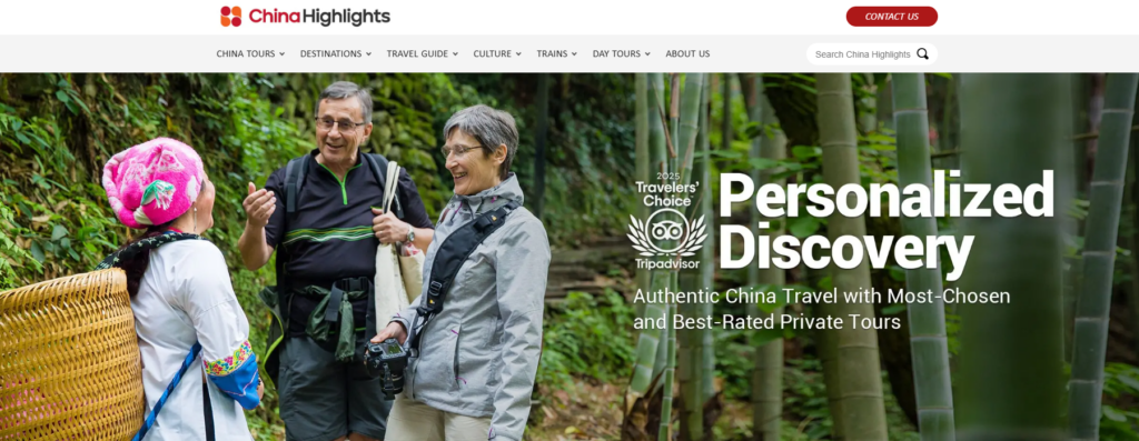
The hero section serves as the first emotional touchpoint for the visitor.
Design priorities included:
- A large lifestyle image showing real travel moments
- Clear messaging that highlights personalized travel experiences
- Strong visual hierarchy to immediately communicate value
The headline communicates exploration and discovery, reinforcing the idea that travel planning can be personalized and seamless.
Supporting design elements include:
- Minimal navigation distraction
- Strong contrast for readability
- Clear focal points guiding the eye from headline to content
This section creates the first emotional connection with the traveler.
Trust Signals and Authority
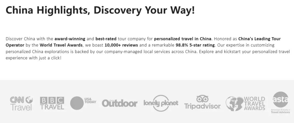
Travel decisions require a high level of trust. The page integrates several credibility elements early in the layout.
These include:
- Media mentions
- Travel awards
- Trusted travel platforms
- Industry recognition
From a design perspective, these elements are placed in a clean horizontal row, allowing visitors to quickly recognize authority without disrupting the visual flow.
Trust badges function as subtle reassurance that the brand is reputable and experienced.
Travel Information Highlights
One challenge of designing travel websites is presenting important updates and policies clearly.
For example, visa policies or travel announcements must be noticeable but not overwhelming.
The solution was a highlight information box that:
- Uses subtle borders and background contrast
- Keeps typography clean and readable
- Allows quick scanning
This ensures important travel updates remain visible without interrupting the browsing experience.
Tour Exploration Section
The Top China Tours section was designed to encourage discovery.
Each tour card contains:
- A strong destination image
- Tour duration
- Key cities included in the itinerary
- A clear “View More” action
From a design standpoint, the grid layout serves multiple purposes:
- Makes comparisons easy
- Creates visual rhythm
- Encourages browsing
The card design balances visual inspiration and practical information, helping travelers quickly identify tours that match their interests.
Social Proof and Traveler Reviews
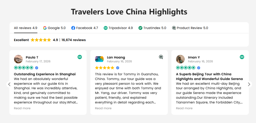
User-generated reviews are powerful persuasion tools.
The review section was designed to showcase real traveler experiences while maintaining visual cleanliness.
องค์ประกอบการออกแบบประกอบด้วย:
- Star ratings for immediate credibility
- Reviewer avatars for authenticity
- Short testimonial excerpts for readability
The layout uses card-based design, allowing multiple testimonials to appear without overwhelming the page.
This section strengthens trust while reinforcing the brand’s reliability.
Destination Discovery Grid
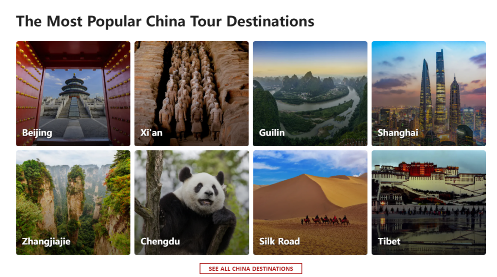
Travelers often begin planning by exploring destinations rather than tours.
The destination grid section was created to support this behavior.
Key design features include:
- High-impact destination photography
- Clear labels for each location
- Grid layouts that feel modern and scannable
Destinations such as Beijing, Shanghai, Guilin, and Tibet are displayed in a visually engaging format.
This section acts as a visual travel map, helping visitors imagine potential routes and travel experiences.
Educational Travel Content
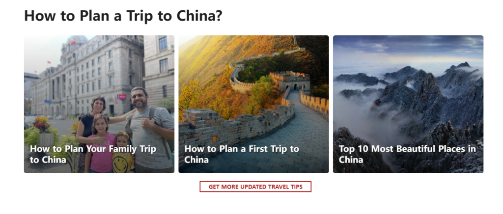
Many travelers need guidance before committing to a trip.
The design therefore includes a section dedicated to travel planning articles.
ตัวอย่างเช่น:
- Planning a first trip to China
- Family travel advice
- Scenic destination guides
From a UX perspective, this section supports content-driven discovery, allowing visitors to continue exploring without leaving the ecosystem of the website.
Conversion Section: Encouraging Action
After guiding users through inspiration, information, and exploration, the design shifts toward conversion.
A clear call-to-action invites visitors to start planning a personalized trip.
Design considerations included:
- Strong contrast button colors
- Centered layout for emphasis
- Minimal surrounding distractions
This section acts as a decision point, encouraging travelers to take the next step.
Newsletter Engagement
Travel planning often takes weeks or months.
The newsletter section was designed to capture interest from users who may not be ready to book immediately.
Key design features:
- Scenic background imagery
- Clear benefit messaging
- Simple signup interaction
This ensures the brand can continue engaging with potential travelers over time.
ความท้าทายและแนวทางแก้ไขในการออกแบบ
Challenge 1: Complex Travel Information
Train travel across China involves numerous routes and destinations.
สารละลาย:
Organize information into clearly defined sections that prioritize readability and visual scanning.
Challenge 2: Balancing Inspiration and Practicality
Travel websites must inspire users while still providing practical guidance.
สารละลาย:
Use a combination of:
- Lifestyle photography
- structured information cards
- educational content modules
Challenge 3: Encouraging Exploration Without Overwhelming Users
Too many options can confuse visitors.
สารละลาย:
Implement modular layouts and curated content blocks that guide users step-by-step.
The Final Design Outcome
The redesigned page delivers several key improvements:
Clear Visual Hierarchy
Visitors can quickly understand:
- what the page offers
- how to explore tours
- where to plan their trip
Strong Travel Storytelling
Immersive imagery helps visitors imagine real travel experiences across China.
Intuitive Navigation
Each section naturally leads to the next stage of the traveler’s journey.
Improved User Engagement
Visitors can:
- browse destinations
- explore tours
- read travel advice
- start planning trips
All within a single cohesive experience.
Why Strategic Shopify Design Matters
In modern travel eCommerce, a website must function as both a content hub and a booking platform.
A thoughtful Shopify design strategy ensures:
- seamless exploration
- clear travel information
- engaging storytelling
- strong conversion pathways
When these elements work together, the website becomes more than a booking tool—it becomes part of the travel experience itself.
บทสรุป
การออกแบบ China Trains page required a careful balance between inspiration, usability, and trust-building. Through strategic layout planning, strong visual storytelling, and conversion-focused structure, the page now provides travelers with a clear and engaging way to explore rail journeys across China.
Projects like this highlight how thoughtful Shopify design can transform complex travel information into an intuitive digital experience that encourages exploration and builds confidence in travel planning.
For businesses seeking professional ช็อปฟี่ design that blends storytelling, usability, and conversion strategy, the team at AIRSANG specializes in crafting high-impact eCommerce experiences tailored to global audiences.


ออกแบบและสร้างเว็บไซต์ WordPress หรือเว็บไซต์องค์กรพร้อมระบบอีคอมเมิร์ซครบวงจรสำหรับคุณ.
ช่วงราคา: $200.00 ถึง $2,500.00custom-requirements-or-special-quotations
ราคาเดิมคือ: $2.00.$1.00ราคาปัจจุบันคือ: $1.00. ภาพหลักสำหรับการออกแบบอุปกรณ์กายภาพบำบัดที่บ้านของ Amazon (อธิบายรายละเอียด)
บทนำ: การสร้างภาพลักษณ์ที่น่าเชื่อถือสำหรับอุปกรณ์บำบัดที่บ้านบน Amazon เมื่อออกแบบภาพหลักสำหรับอุปกรณ์บำบัดที่บ้านบน Amazon สิ่งสำคัญอันดับแรกของเราคือ...

ภาพหลักสำหรับการแปลงลิปสติกเป็นสินค้าสำหรับ Amazon
บทนำ: การออกแบบภาพหลักลิปสติกที่ขายได้บน Amazon เมื่อเราออกแบบภาพหลักสำหรับลิปสติกบน Amazon ความรับผิดชอบของเราไม่ได้จำกัดอยู่แค่...

แฮกเกอร์ขโมยอีเมลผู้ดูแลระบบ WordPress ได้อย่างไร (และวิธีป้องกัน)
มาเริ่มกันด้วยความจริงที่ไม่น่าสบายใจ: อีเมลแอดมิน WordPress ของคุณอาจเปิดเผยต่อสาธารณะมากกว่าที่คุณคิด และแฮกเกอร์? พวกเขาชอบมาก สำหรับพวกเขา...

อะไรทำให้รองพื้นชนิดเหลวของ Amazon (ภาพหลัก) ขายดี?
บทนำ การออกแบบภาพหลักสำหรับรองพื้นชนิดเหลวบน Amazon ไม่ใช่แค่การทำให้ผลิตภัณฑ์ดูสวยงามเท่านั้น บน Amazon ภาพหลักและ...

การออกแบบภาพหลัก Amazon ที่มีประสิทธิภาพสำหรับตลับกรอง
บทนำ การออกแบบภาพหลักสำหรับ Amazon ไม่ใช่แค่การทำให้สินค้าดูน่าดึงดูดเท่านั้น แต่ยังเกี่ยวกับความชัดเจน ความน่าเชื่อถือ และความเข้าใจได้ในทันที โดยเฉพาะอย่างยิ่งสำหรับ...

การโจมตีแบบ Replay Attack บน WordPress: ภัยคุกคามจริงหรือแค่เรื่องที่ถูกพูดเกินจริง?
ก่อนอื่นขอชี้แจงให้ชัดเจนก่อน การโจมตีแบบ Replay Attack นั้นดูไม่น่ากลัว มันไม่ได้ทำลายรหัสผ่าน มันไม่ได้แทรกโค้ดที่เป็นอันตรายพร้อมข้อความแฮ็กเกอร์สีเขียวกระจัดกระจายไปทั่ว มันแนบเนียนกว่า...

วิธีคัดลอกหน้าเว็บ WordPress โดยไม่ทำให้ระบบเสียหาย
ยอมรับกันเถอะ บางครั้งคุณอาจไม่อยากสร้างหน้าเว็บใหม่ คุณแค่อยากได้หน้าเว็บเดิม...แต่แตกต่างไปเล็กน้อย รูปแบบเหมือนเดิม บล็อกเหมือนเดิม การตั้งค่าเหมือนเดิม เพราะ...

เปรียบเทียบธีม WordPress สำหรับสัตว์เลี้ยง 5 แบบ
บทนำ การเลือกธีม WordPress ที่เหมาะสมสำหรับธุรกิจเกี่ยวกับสัตว์เลี้ยงนั้นไม่ใช่แค่เรื่องของการออกแบบเท่านั้น แต่ยังส่งผลโดยตรงต่อการใช้งาน ความสามารถในการขยายขนาด และการเติบโตของธุรกิจในระยะยาว การดูแลสัตว์เลี้ยงและ...

เปรียบเทียบธีมอีคอมเมิร์ซชุดว่ายน้ำ 5 แบบ
บทนำ การเลือกธีมที่เหมาะสมสำหรับร้านค้าอิสระที่จำหน่ายชุดว่ายน้ำหรือชุดชั้นในนั้นไม่ใช่แค่การตัดสินใจด้านภาพลักษณ์เท่านั้น แต่ยังส่งผลโดยตรงต่ออัตราการเปลี่ยนลูกค้าให้เป็นผู้ซื้อ ความสามารถในการขยายธุรกิจ และความยั่งยืนในระยะยาว...

วิธีปิดการแสดงความคิดเห็นใน WordPress (โดยไม่ต้องเสียสติ)
มาพูดถึงระบบแสดงความคิดเห็นของ WordPress กันดีกว่า ในทางทฤษฎีแล้ว ความคิดเห็นนั้นยอดเยี่ยมมาก มันช่วยกระตุ้นการสนทนา สร้างชุมชน และทำให้เว็บไซต์ของคุณดูมีชีวิตชีวา แต่ในความเป็นจริงแล้ว มันมักจะเป็นเหมือนแม่เหล็กดึงดูด...

การสร้างเว็บไซต์ WordPress ที่ปรับขนาดได้สำหรับแบรนด์ที่ขับเคลื่อนด้วยวิทยาศาสตร์: โครงการ AminoUSA
บทนำ ในยุคดิจิทัลปัจจุบัน เว็บไซต์เป็นมากกว่าแค่สถานที่สำหรับแสดงรายการสินค้า สำหรับแบรนด์ที่ขับเคลื่อนด้วยวิทยาศาสตร์ซึ่งดำเนินงานในอุตสาหกรรมที่มีการควบคุมหรือเน้นการวิจัย...

สร้างร้านค้า Shopify ที่ปรับขนาดได้สำหรับแบรนด์ใบมีดระดับโลก: โครงการ CoolKatana
บทนำ ในธุรกิจอีคอมเมิร์ซข้ามพรมแดน เว็บไซต์ Shopify เป็นมากกว่าแค่หน้าร้าน สำหรับแบรนด์ที่ดำเนินธุรกิจในกลุ่มเฉพาะหรือกลุ่มที่ขับเคลื่อนด้วยวัฒนธรรม เว็บไซต์ต้องทำมากกว่านั้น...

การออกแบบร้านค้า Shopify ที่มีอัตราการแปลงสูงสำหรับขายการ์ดโปเกมอน
บทนำ ในโลกของอีคอมเมิร์ซสินค้าสะสม โดยเฉพาะอย่างยิ่งในตลาดเกมการ์ดโปเกมอน (TCG) เว็บไซต์จะต้องทำมากกว่าแค่แสดงรายการสินค้า...

ดีไซน์ Shopify ที่เพิ่มยอดขายสำหรับแบรนด์อิฐสั่งทำพิเศษ
บทนำ ในสภาพแวดล้อมการแข่งขันอีคอมเมิร์ซในปัจจุบัน โดยเฉพาะอย่างยิ่งในตลาดของขวัญส่วนบุคคลและของสะสม เว็บไซต์ Shopify ต้องทำมากกว่าแค่แสดงสินค้า...

วิธีติดต่อฝ่ายสนับสนุนของ Shopify: คู่มือที่ง่ายและไม่ยุ่งยาก
การบริหารร้านค้า Shopify ควรเป็นเรื่องที่น่าตื่นเต้น ไม่ใช่เรื่องที่ทำให้สับสน เมื่อมีคำถามหรือปัญหาเกิดขึ้น Shopify มีช่องทางการสนับสนุนหลายช่องทาง ขึ้นอยู่กับสถานการณ์...

วิธีปิดใช้งานร้านค้า Shopify: คู่มือที่ชัดเจนและใช้งานได้จริง
การปิดใช้งานร้านค้า Shopify นั้นไม่ซับซ้อน แต่ก็มีผลกระทบหลายอย่างที่ผู้ขายหลายรายมองข้ามไป คู่มือนี้จะอธิบายขั้นตอนอย่างละเอียดและเข้าใจง่าย...

กรณีศึกษาการออกแบบเว็บไซต์ Shopify สำหรับแบรนด์ดอกไม้ระดับพรีเมียม
บทนำ ในสภาพแวดล้อมการแข่งขันอีคอมเมิร์ซในปัจจุบัน เว็บไซต์ Shopify ต้องทำมากกว่าแค่แสดงสินค้า มันต้องสื่อสารคุณค่าของแบรนด์ได้ทันที และแนะนำผู้ใช้...

กรณีศึกษาการออกแบบร้านค้า Shopify: ร้านค้าเกมย้อนยุค
บทนำ ในสภาพแวดล้อมอีคอมเมิร์ซที่มีการแข่งขันสูง ความชัดเจนทางด้านภาพและการเชื่อมโยงทางอารมณ์มักเป็นตัวกำหนดว่าผู้เยี่ยมชมจะกลายเป็นลูกค้าหรือไม่ โดยเฉพาะอย่างยิ่งใน...