Project Overview
For Lash & Wigs’ Shopyy website, we connected styled beauty imagery with practical product details. Model collages introduce the category, followed by hair bundles, lashes, and worn-product photography within one merchandising system. Model banners, white product grids, and a black footer connect collection browsing, catalog comparisons, and individual products.
| Services | Industry | Platform |
| Shopyy Website Design & Development | Beauty & Personal Care | Shopyy |
| Project Requirements | Target Market | Design Style |
| Connect styled beauty imagery with product details | English-language storefront with prices in US dollars | Model collage banners, white product grids, and a black footer |
| Project Quote | Deliverables | Delivery Time |
| CNY 6,800 | Homepage, category structure, product details, responsive layouts, and brand and contact pages | 15 days |
Design Challenge
Wigs and lashes need to show both the overall beauty look and the specific product shape. Model imagery establishes the style, while clear product photography explains curl patterns, lengths, and packaging. Each image type has a distinct information role.
Design Strategy: Connect Beauty Imagery with Product Details
Model collages establish the category, followed by hair bundles, lashes, and worn-product images in a consistent display system. The homepage sets direction, categories support comparison, and product pages explain appearance and specifications. Navigation and content links connect these levels.
Poppins is the main interface typeface, with Helvetica used for some descriptions. Type size, weight, and paragraph width organize headings, navigation, and body copy. Model collages, white grids, and a black footer continue across the main pages. Compact groups and larger section gaps give imagery, descriptions, and controls their own space.
Motion and Functionality: Supporting the Current Choice
Product pages use angle thumbnails and length options to support decisions. Mobile retains image numbers and compact navigation. Interactions focus on inspecting products and choosing lengths, while image-and-text sections and scrolling establish the page rhythm.
Homepage: Beauty Looks Lead into Products
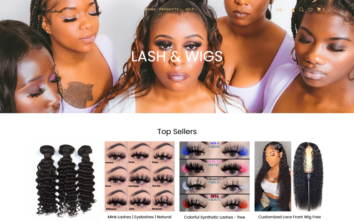
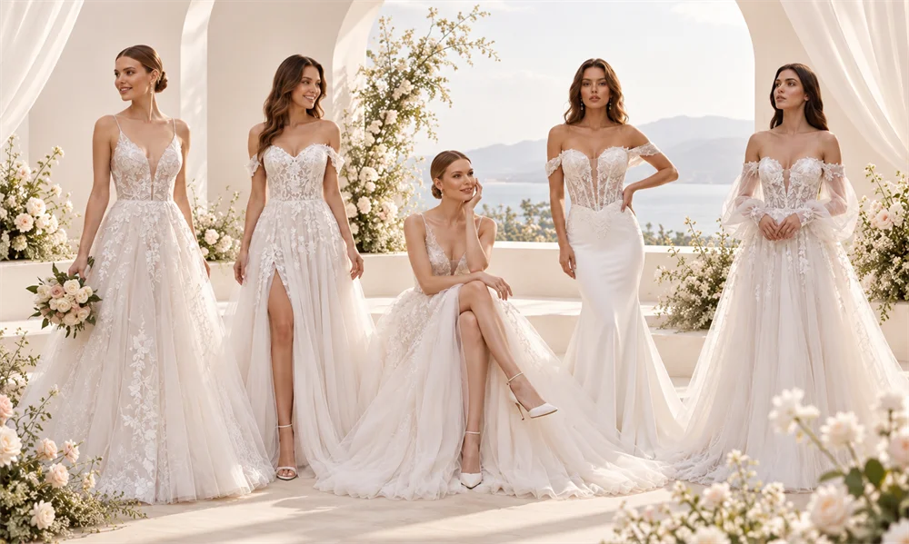
A wide collage combines several models’ hair and makeup looks, with LASH & WIGS centered to identify the category. Top Sellers follows immediately, bringing curly hair bundles, lashes, and worn-product images into one merchandise section.
White lettering overlays the model photography within a simple header structure. Images establish the style before the white product list introduces specific items, creating a progression from inspiration to selection.
Top Sellers: Give Different Product Forms Their Own Space
The bestseller section places hair bundles, lash sets, and model photos side by side in equally wide cards. Names and prices appear below, helping readers confirm the product after examining its shape.
A white background and even card spacing keep the list clear. Dark curls have a distinct outline, and colorful lash packaging remains recognizable within the same grid.
Lash Category: Compare Styles with Consistent Image Sizes
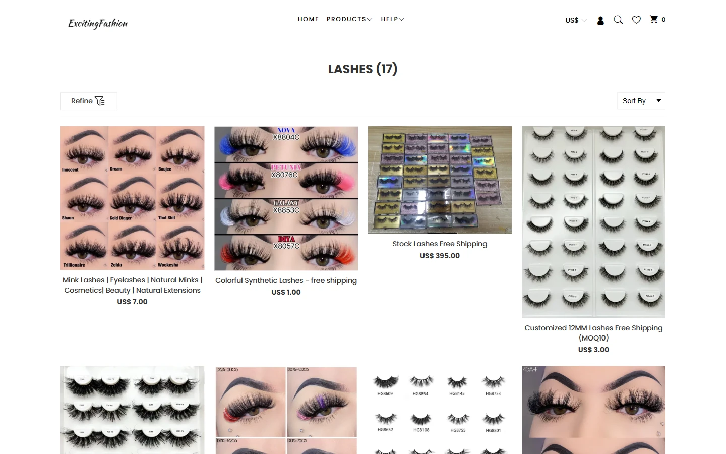
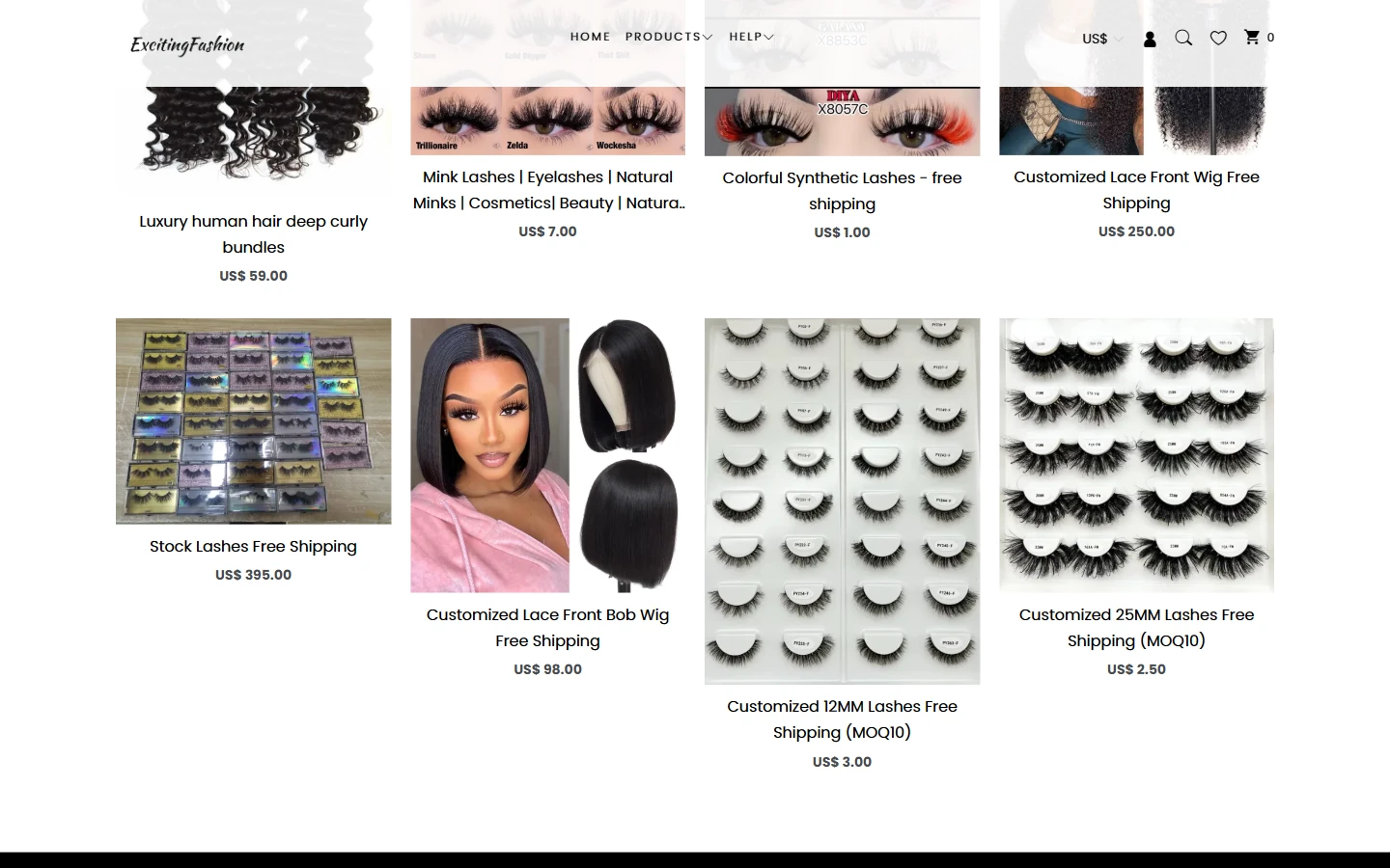
The lash category organizes worn looks, packaged sets, and individual styles in a regular grid. A category title and catalog tools above establish the scope before visitors compare products across the page.
Brief names and prices sit below each image. Information within cards stays compact, with larger gaps between rows. Black-and-white text and a light background make lash silhouettes and packaging colors the main comparison cues.
Hair Bundle Details: Curl Photography Beside Length Options
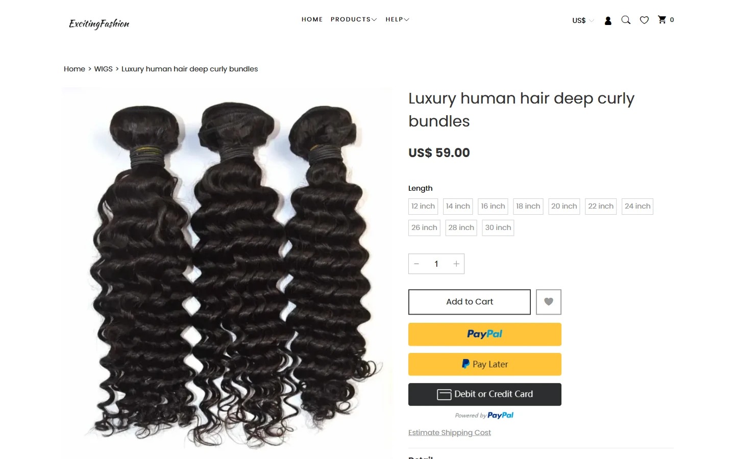
A large deep-curl bundle image occupies the left side. The right presents the name, price, length choices, and controls. The product silhouette receives most of the image area, while length buttons stay together in one information block.
A large sans-serif title introduces the item, and light borders distinguish length choices. A yellow payment entry point adds a local accent below without merging the image and specification reading areas.
Details and Descriptions: Explain Curls and Product Use
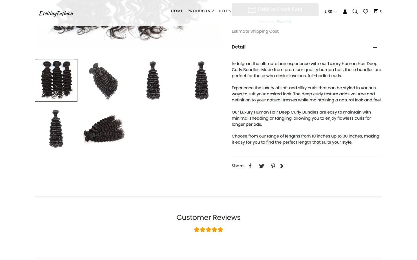
The lower section retains the main bundle photo and multiple-angle thumbnails, with short product descriptions on the right. Photography and text continue in the same two-column structure before the reviews section below.
Thumbnails use consistent gaps, while subheadings and paragraph spacing group the copy. Dark hair remains clearly outlined on white, allowing visitors to move from overall shape into closer details.
About Page: Explain the Business Briefly
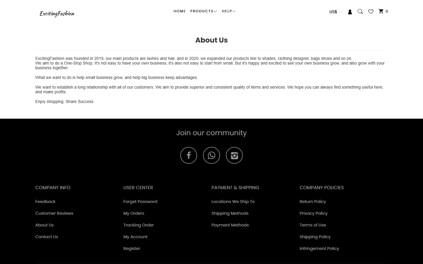
The About Us page introduces ExcitingFashion’s business background in a few short paragraphs. It keeps the product-page header and ends with a black community and navigation footer, creating clear upper and lower boundaries.
Light font weights and generous paragraph spacing keep the white main area simple. This page adds background rather than repeating product imagery, giving each page a clearer purpose.
Contact Page: Bring Communication Channels Together
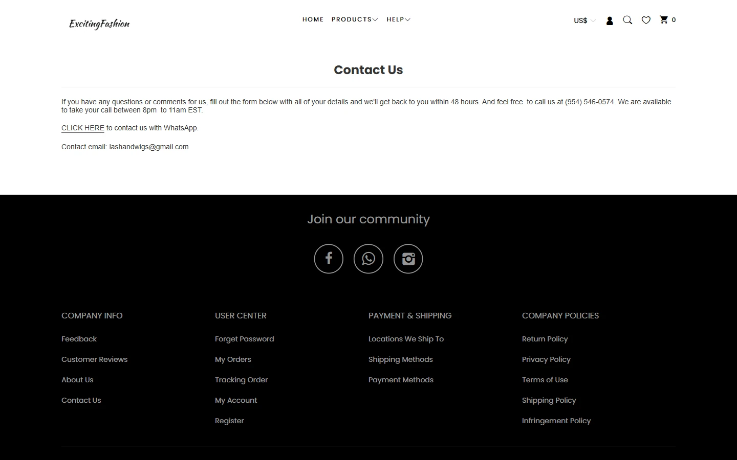
Below its heading, the contact page groups introductory information, a WhatsApp entry point, and email in a simple text structure. Visitors can review the channels together and choose a suitable way to get in touch.
White body content and a black footer separate the areas. Left-aligned text and clear line spacing prioritize quick information retrieval, with a lighter visual rhythm than the product pages.
Mobile Homepage: Preserve the Banner and Product Sequence
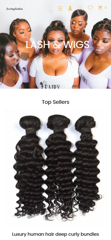
Mobile starts with the model collage, followed by Top Sellers and large product images. The desktop category theme remains, helping narrow-screen visitors understand the beauty direction first.
Header navigation becomes an icon entry point, and product images use more of the available width. Vertical space between banner, heading, and products gives each section its own reading area.
Mobile Details: Show Hair Texture First
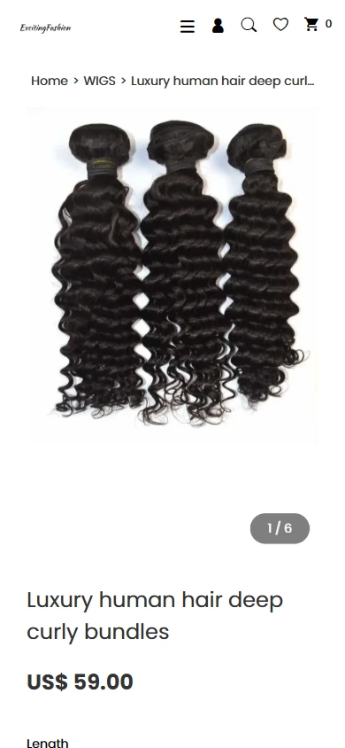
The mobile product page begins with the large hair-bundle image and image number, followed by the name, price, and length information. Curl patterns and strand outlines have enough space for visitors to inspect the shape first.
Text wraps to the narrow screen, with clear separation between title and price. Desktop columns become a vertical sequence while preserving the path from imagery to specifications.
Design Summary: Connect the Theme to Practical Details
For Lash & Wigs, the connection between beauty looks and product details guides model collages, white product grids, and a black footer across homepage, category, and product layouts. Images communicate the theme, text explains specifics, and catalog and option controls support the next action. Mobile retains the sequence for a consistent experience.
Plan a Clear Shopyy Website for Your Brand
Share your current website, brand assets, and required pages. We will review your products, target market, and content priorities to plan suitable pages, visuals, and functionality together.