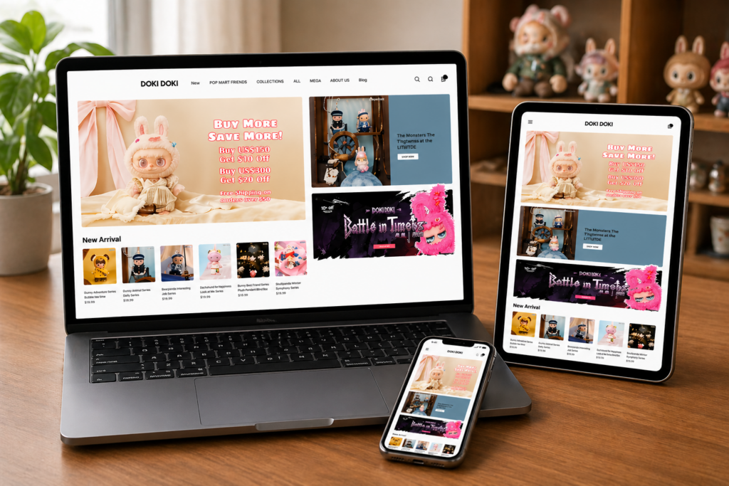
Introdução
In today’s competitive eCommerce landscape, a visually compelling and strategically structured Shopify store is no longer optional—it’s essential. A well-designed website not only captures attention but also builds trust, guides user behavior, and ultimately drives conversions.
O Whoopea Shopify store is a strong example of how thoughtful design can elevate a brand’s online presence. By focusing on clarity, usability, and visual storytelling, we helped transform the site into a high-performing digital storefront. This case study explores how design—not code—played a central role in shaping a seamless and conversion-focused shopping experience.
| Prazo de entrega | Categoria | Plataforma de Aplicação |
| 19 dias | doll | shopify |
| Designers envolvidos | Custo | Efeito |
| Lin Zhang | $2100 | Sales📈257% |
Understanding the Brand and Goals
Before any design work began, it was critical to understand Whoopea’s positioning, audience, and business objectives.
Posicionamento da marca
Whoopea operates in a product-driven niche where visual appeal and usability directly impact purchasing decisions. The brand needed a storefront that could:
- Communicate product value instantly
- Build trust with first-time visitors
- Support mobile-first shopping behavior
- Create a consistent and memorable brand identity
Project Goals
Objetivos principais
- Improve homepage clarity and structure
- Increase product discoverability
- Strengthen visual hierarchy and branding
- Enhance mobile user experience
- Drive higher conversion rates
Secondary Objectives
- Create scalable design systems for future growth
- Align all pages with a unified visual language
- Improve customer journey flow from entry to checkout
Design Strategy Overview
A Design-First Approach
Rather than focusing on technical complexity, we approached this project with a design-first mindset. Every decision was guided by how users interact with the interface and how design can influence behavior.
Key Principles Applied
- Clarity over complexity
- Visual hierarchy drives attention
- A consistência constrói confiança.
- Mobile-first thinking improves conversions
- Storytelling enhances product perception
Homepage Design: The Core Conversion Engine
The homepage is the most critical entry point for any Shopify store. For Whoopea, we redesigned it to function as a structured sales funnel.
Hero Section Optimization
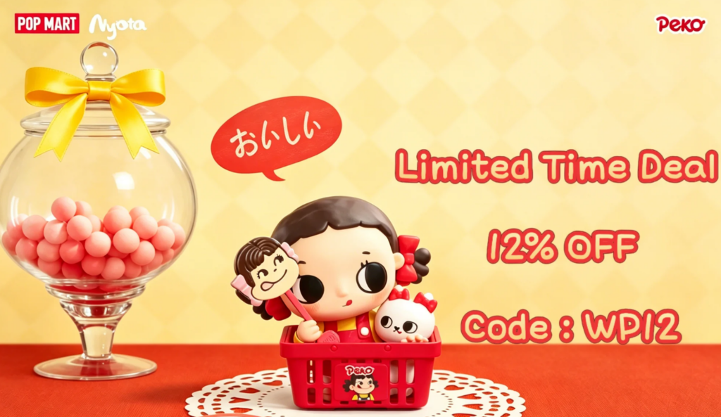
Desafios
- Lack of clear messaging
- Weak visual focus
- No immediate value proposition
Design Solutions
- Introduced bold, high-impact lifestyle imagery
- Added concise headline communicating core value
- Included clear call-to-action (CTA) buttons
- Applied contrast and spacing for readability
Results
- Faster user understanding of brand offering
- Increased engagement with CTA elements
Product Discovery Layout
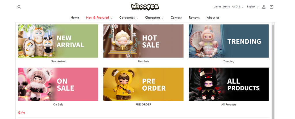
Desafios
- Users struggled to find key products
- Categories lacked visual distinction
Design Solutions
- Created visually distinct category blocks
- Used consistent card-based layouts
- Integrated hover effects to enhance interaction
- Highlighted bestsellers and trending items
Results
- Melhoria na clareza da navegação
- Increased product exploration
Trust-Building Elements
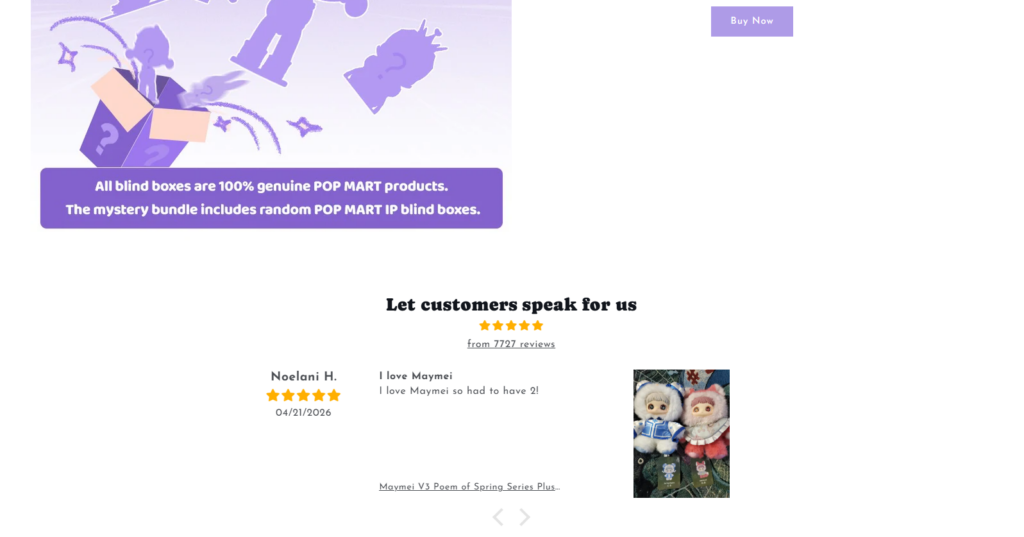
Desafios
- Limited credibility signals
- No reinforcement of product quality
Design Solutions
- Added customer reviews and ratings
- Introduced trust badges and guarantees
- Highlighted shipping and service benefits
Results
- Stronger user confidence
- Reduced hesitation during purchase decisions
Design de página de produto: influenciando as decisões de compra
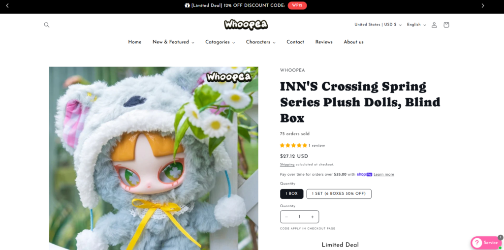
While the homepage attracts users, product pages convert them. We optimized these pages to remove friction and enhance persuasion.
Visual Presentation
Design Enhancements
- Large, high-resolution product images
- Multiple angles and contextual usage shots
- Clean background for focus
Information Hierarchy
Structure Improvements
- Clear product titles and pricing
- Bullet-point feature highlights
- Easy-to-scan descriptions
Conversion Elements
Key Additions
- Botões "Adicionar ao carrinho" em destaque
- Urgency indicators (e.g., limited stock)
- Social proof integration
Results
- Higher add-to-cart rates
- Improved decision-making speed
Otimização da experiência móvel
Mobile traffic dominates modern eCommerce, so optimizing for smaller screens was essential.
Desafios
- Cluttered layouts on mobile
- Difficult navigation
- Poor spacing and readability
Design Solutions
- Simplified layouts with vertical flow
- Increased button sizes for touch interaction
- Optimized typography for readability
- Reduced unnecessary elements
Results
- Smoother mobile browsing experience
- Increased mobile conversion rates
Design System and Consistency
Consistency is a critical factor in building trust and scalability.
Desenvolvimento da linguagem visual
We established a unified design system including:
- Hierarquia tipográfica
- Color palette usage
- Button styles
- Spacing rules
Benefícios
- Cohesive brand identity
- Easier future updates
- Improved user familiarity
Nosso processo de design
A structured design process ensured efficiency and clarity throughout the project.
Etapa 1: Pesquisa e Análise
- Competitor benchmarking
- User behavior insights
- Brand positioning evaluation
Step 2: Wireframing
- Defined layout structures
- Focused on user flow
- Prioritized key elements
Step 3: Visual Design
- Applied branding elements
- Designed high-fidelity UI
- Ensured visual consistency
Etapa 4: Iteração e Refinamento
- Tested usability
- Adjusted layouts based on feedback
- Optimized for performance and clarity
Key Challenges and Solutions
Challenge 1: Overloaded Homepage
Solução: Simplified layout and improved hierarchy
Challenge 2: Weak Product Presentation
Solução: Enhanced imagery and structured content
Challenge 3: Low User Engagement
Solução: Introduced interactive elements and clear CTAs
Challenge 4: Inconsistent Branding
Solução: Built a unified design system
Resultados e impacto
The design improvements delivered measurable business outcomes.
Performance Improvements
- Increased time on site
- Higher product page engagement
- Improved conversion rates
User Experience Gains
- Easier navigation
- Faster decision-making
- Stronger trust perception
Business Outcomes
- More consistent sales performance
- Better customer retention
- Enhanced brand positioning
Why Design Matters in Shopify Success
This project reinforces a key insight: design is not just about aesthetics—it’s a strategic business tool.
Design Drives:
- First impressions
- Confiança do usuário
- Purchase decisions
- Diferenciação da marca
A well-designed Shopify store acts as a silent salesperson, guiding users seamlessly from discovery to conversion.
Our Approach to Shopify Design
We focus on creating design systems that are:
- Conversion-driven
- Brand-aligned
- Escalável
- User-focused
Rather than relying on technical complexity, we prioritize clarity, usability, and visual storytelling to deliver real business results.
Conclusão
O Whoopea Shopify project demonstrates how strategic design can transform an online store into a high-performing sales platform. By focusing on user experience, visual clarity, and structured layouts, we created a website that not only looks professional but also converts effectively.
From homepage optimization to product page refinement and mobile experience enhancement, every design decision contributed to a more seamless and engaging shopping journey.
Em AIRSANG, we specialize in turning Shopify stores into conversion-focused digital assets through design-first thinking, helping brands build stronger online presence and sustainable growth.