


Introdução
Designing effective main images for Ozônio is not about decoration. It is about translating product value into instant visual understanding within strict marketplace rules. When we designed the main image system for these Bluetooth headphones, our goal was clear: communicate functionality, quality, and everyday usability at a glance, while maintaining a clean, premium, and trustworthy look that performs well in Ozon’s competitive feed.
In this article, we walk through every uploaded image one by one, explaining our design logic from a professional designer’s perspective. Each image plays a specific role in the conversion funnel—from first impression and feature recognition to trust building and purchase confidence. This breakdown reflects how we strategically use main image design for Ozon to help Bluetooth headphone products stand out, communicate clearly, and convert efficiently.
| Prazo de entrega | Categoria | Plataforma de Aplicação |
| 8 dias | Fones de ouvido Bluetooth | Ozônio |
| Designers envolvidos | Custo | Efeito |
| Lin Zhang | $110 | Number of orders📈342% |
Image 1: Core Product Identity and First Impression
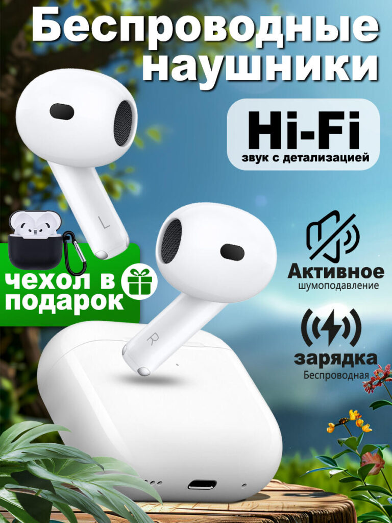
The first image functions as the primary Ozon main image, and its job is singular: make the product immediately understandable and attractive.
We placed the Bluetooth headphones front and center, using a clean white colorway to signal modernity, simplicity, and compatibility with a wide range of devices. The earbuds and charging case are shown together to avoid ambiguity—buyers instantly understand what is included. The slightly angled positioning adds depth without distorting the product’s real proportions, which is critical for Ozon compliance and customer trust.
The natural background with soft greenery contrasts with the white product, helping it visually pop in Ozon’s crowded grid. This approach avoids aggressive artificial gradients while still adding lifestyle warmth. We deliberately kept the composition balanced, allowing the product to dominate the frame while guiding the viewer’s eye naturally from the earbuds to the case.
Text elements highlight wireless functionality, Hi-Fi sound, active noise cancellation, and wireless charging, but they remain secondary to the product itself. The typography is bold, readable, and structured to work even on mobile screens. This ensures that key selling points are visible within the first second of viewing—an essential requirement for high-performing Ozon main images.
Image 2: Noise Cancellation and Listening Modes Explained Visually

The second image focuses on noise control modes, one of the most important decision factors for Bluetooth headphone buyers.
Instead of relying on technical explanations, we designed this image to visually explain how the product adapts to different environments. A close-up of the earbud highlights the microphone and speaker grille, reinforcing the idea of intelligent sound processing. The green information blocks clearly separate noise reduction and transparency (clarity) modes, making the benefits easy to understand even for non-technical users.
The background remains consistent with the first image, maintaining brand and listing continuity. Checkmark icons and concise phrases reinforce ease of use: instant connection and automatic ear detection. These details help reduce buyer hesitation by answering common questions before they are asked.
From a design perspective, this image builds trust. It reassures the customer that these Bluetooth headphones are not just basic wireless earbuds but a smart audio device designed for real-world scenarios.
Image 3: Internal Structure and Sound Quality Storytelling
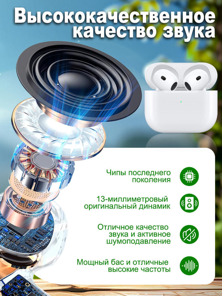
Sound quality is invisible, which makes it one of the hardest features to sell visually. In the third image, we solved this by using a cutaway exploded-view illustration.
This image reveals the internal driver structure, emphasizing the 13 mm speaker, advanced chips, and sound engineering. The visual language communicates depth, power, and precision without overwhelming the viewer with technical jargon. Blue sound-wave accents subtly reinforce the idea of clarity and dynamic range.
We paired the technical illustration with a real product image on the right to maintain realism. This balance ensures that buyers do not feel misled by overly conceptual graphics. Bullet points summarize the benefits: powerful bass, clear highs, active noise cancellation, and next-generation chips.
This image is designed to appeal to more rational, comparison-driven shoppers. It supports premium positioning and justifies value by visually proving that the product is built for performance, not just appearance.
Image 4: Waterproof Protection and Outdoor Usability

Durability and reliability are major concerns for everyday Bluetooth headphone users. In the fourth image, we focused on IPX4 water resistance.
We showed the earbuds with visible water droplets to immediately communicate protection against moisture. The design makes it clear that these headphones are suitable for light rain, wind, and workouts. Icons reinforce usage scenarios without cluttering the layout.
The headline emphasizes protection, while the supporting text clarifies microphone shielding for clear calls even in windy conditions. This is a critical trust signal, especially for buyers who plan to use the headphones outdoors or during exercise.
Visually, the image maintains consistency in color palette and lighting, reinforcing the product’s reliability and design cohesion across the entire image set.
Image 5: Touch Control and User Interaction
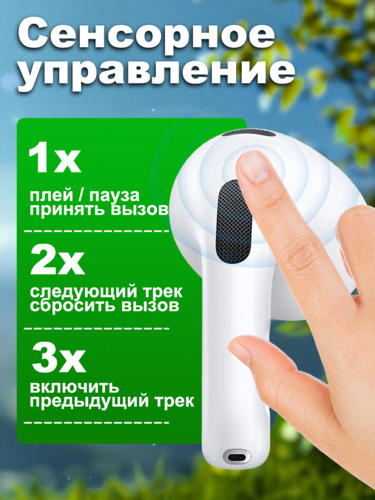
Ease of control directly affects perceived product quality. In the fifth image, we showcased touch control functionality using a human interaction visual.
A finger gently touching the earbud creates an immediate connection between product and user. This makes the feature feel intuitive and accessible. The green information panel clearly explains gesture controls: single tap, double tap, and triple tap functions.
This image reduces learning anxiety. By visually mapping gestures to actions, we help users feel confident that they can operate the Bluetooth headphones without constantly checking instructions. The clean layout ensures that information is easy to scan, even on smaller screens.
From a design standpoint, this image humanizes the product. It shifts the narrative from specifications to everyday convenience.
Image 6: Bluetooth Connectivity and Compatibility
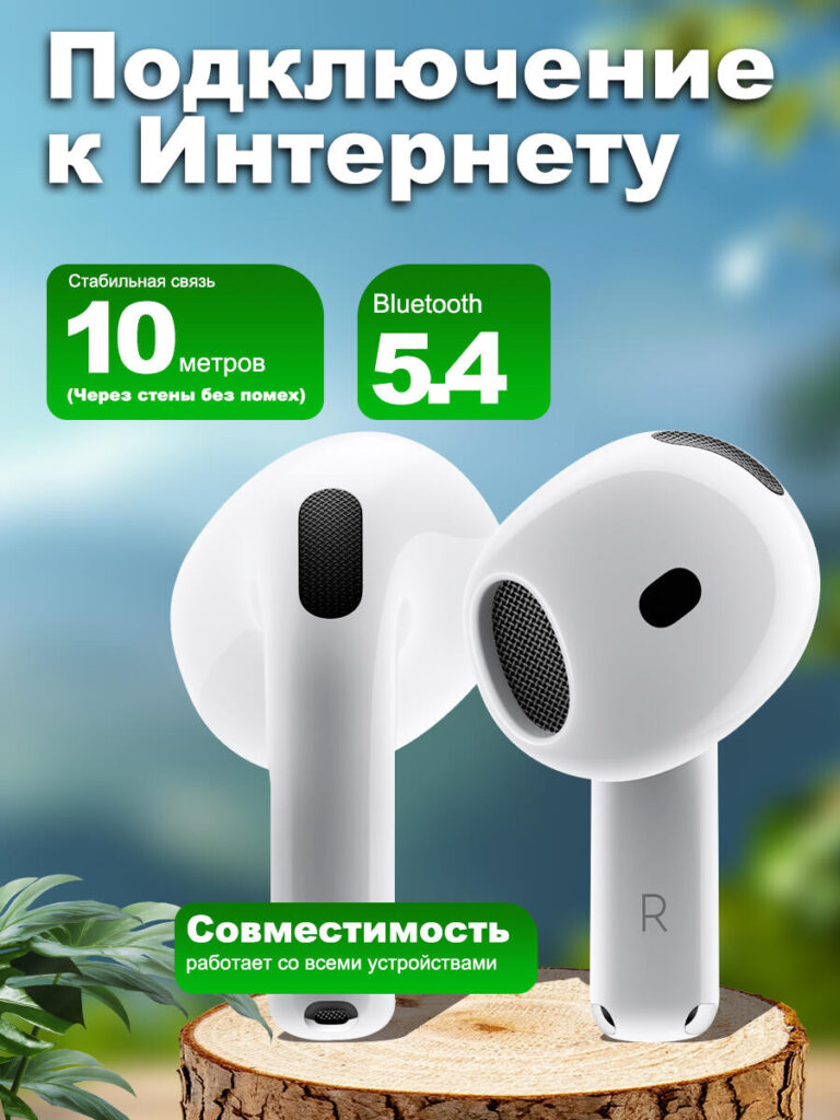
The final image focuses on connectivity and stability, two critical concerns for wireless audio products.
We highlighted Bluetooth 5.4 and a stable 10-meter connection range, using clear numeric blocks to attract attention. The earbuds are shown prominently, reinforcing the idea of reliable signal transmission and seamless pairing.
A compatibility message reassures buyers that the Bluetooth headphones work with all major devices. This reduces uncertainty and eliminates compatibility-related objections before purchase.
The composition is clean and confident. There is no unnecessary decoration—only information that directly supports the buying decision.
Estratégia de design geral para o ozônio
Across all images, we followed a consistent strategy:
- Prioritize product clarity over decoration
- Use visual hierarchy to guide attention
- Combine lifestyle context with technical credibility
- Ensure readability on mobile-first Ozon layouts
- Maintain consistent color language and iconography
Each image serves a distinct role, but together they form a coherent visual narrative. This is essential for Ozon listings, where users swipe quickly and make decisions based on cumulative visual signals rather than long descriptions.
Our approach ensures that these Bluetooth headphones are not just seen, but understood. That understanding builds trust, and trust drives conversions.
Conclusão
Design de imagem principal eficaz para Ozônio Bluetooth headphones is not about adding more graphics or text. It is about structuring information visually, reducing friction, and guiding the buyer step by step toward confidence.
By carefully designing each image to address specific buyer questions—what it is, how it sounds, how it works, and where it can be used—we create a listing that performs not just aesthetically, but commercially.
This image system reflects our professional design methodology and deep understanding of marketplace behavior. It is the same strategic approach we apply to all cross-border eCommerce visual projects at AIRSANG, where design is always aligned with conversion goals and platform logic.


Conceber e construir um sítio Web WordPress ou um sítio empresarial com um sistema de comércio eletrónico completo para si.
Faixa de preço: $200.00 a $2,500.00Requisitos personalizados ou orçamentos especiais
O preço original era: $2.00.$1.00O preço atual é: $1.00. Explicação do design da imagem principal para o dispositivo de fisioterapia doméstica da Amazon
Introdução: Construindo uma imagem confiável para dispositivos de terapia doméstica na Amazon Ao projetar a imagem principal de um dispositivo de terapia doméstica na Amazon, nosso principal...

Design da imagem principal para conversão de batom da Amazon
Introdução: Conceber uma imagem principal de batom que vende na Amazon Quando concebemos uma imagem principal para um batom da Amazon, a nossa responsabilidade vai muito além...

O que faz uma base líquida da Amazon converter a imagem principal?
Introdução: Criar uma imagem principal para a base líquida da Amazon não se resume apenas a deixar o produto bonito. Na Amazon, a imagem principal e...

Como projetar uma imagem principal eficaz para cartuchos de filtro Amazon
Introdução: Criar uma imagem principal para a Amazon nunca se resume apenas a tornar um produto atraente. Trata-se de clareza, confiança e compreensão imediata — especialmente para...

Comparativo de cinco temas WordPress para animais de estimação
Introdução Escolher o tema WordPress certo para o seu negócio de animais de estimação é mais do que uma decisão de design — afeta diretamente a usabilidade, a escalabilidade e o crescimento a longo prazo. Cuidados com animais de estimação e...

Criando um site WordPress escalável para uma marca voltada para a ciência: o projeto AminoUSA
Introdução No cenário digital atual, um website é mais do que um lugar para listar produtos. Para marcas com foco em ciência que atuam em setores regulamentados ou voltados para pesquisa, um...

Construindo uma loja Shopify escalável para uma marca global de lâminas: O Projeto CoolKatana
Introdução No comércio eletrônico internacional, um site Shopify é muito mais do que uma vitrine. Para marcas que atuam em nichos de mercado e categorias culturais específicas, o site precisa fazer muito mais do que...

Criando uma loja Shopify de alta conversão para cartas Pokémon.
Introdução No mundo do comércio eletrônico de itens colecionáveis, especialmente no mercado do Pokémon Trading Card Game (TCG), um site precisa fazer mais do que simplesmente listar produtos...

Design Shopify de alta conversão para uma marca de tijolos personalizada.
Introdução No cenário competitivo do comércio eletrônico atual, especialmente no segmento de presentes personalizados e itens colecionáveis, um site Shopify precisa fazer muito mais do que simplesmente exibir produtos. Ele...

Estudo de caso de design de website Shopify para uma marca de flores premium
Introdução No cenário competitivo do comércio eletrônico atual, um site Shopify precisa fazer muito mais do que exibir produtos. Ele precisa comunicar o valor da marca instantaneamente, guiar os usuários...

Estudo de Caso de Design da Shopify: Loja de Jogos Retrô
Introdução Em um ambiente de comércio eletrônico altamente competitivo, a clareza visual e a conexão emocional muitas vezes determinam se um visitante se torna um cliente. Isso é especialmente verdadeiro em...

Estudo de Caso de Design da Shopify: Marca de Resgate Tático
Introdução Um site Shopify robusto faz mais do que exibir produtos — ele comunica propósito, constrói confiança e guia os usuários para decisões de compra seguras. Isso é especialmente verdadeiro...

Estudo de caso de design de website Shopify para uma marca de bicicletas elétricas
Introdução No competitivo mercado de bicicletas elétricas atual, um site Shopify precisa fazer mais do que exibir produtos — ele precisa contar uma história, construir confiança e guiar os usuários...

E-commerce escalável no Shopify para uma marca criativa
Introdução: Quando marcas criativas crescem, seus sites muitas vezes têm dificuldade em acompanhar o ritmo. À medida que as linhas de produtos se expandem, o conteúdo aumenta e o tráfego cresce, muitas marcas com foco visual...

Estudo de caso de design de website Shopify para uma marca de decoração de interiores
Introdução No mercado altamente competitivo de decoração de interiores, a identidade visual não se resume mais à estética — ela influencia diretamente a confiança, o comportamento de navegação e as decisões de compra. Para...

Estudo de caso: Construindo um site de assinatura WordPress escalável
Introdução Para as marcas de e-commerce modernas, um website não é mais apenas uma vitrine digital. É o motor que sustenta assinaturas, narrativa de conteúdo, construção de confiança...

Design WordPress de Alta Conversão para Marcas Adultas
Introdução Em mercados de comércio eletrônico altamente competitivos, recursos visuais atraentes por si só não são suficientes. Um site WordPress de sucesso deve guiar os visitantes por uma jornada clara e intencional — uma jornada que...

Site de comércio eletrônico de bonecas sexuais escalável em WordPress
Introdução Lançar um site de comércio eletrônico transfronteiriço de alto desempenho nunca se resume apenas a colocar produtos online. Para marcas que operam em mercados altamente competitivos e visualmente orientados, o site...