


Keine Produkte im Warenkorb.

In the wedding industry, visual storytelling matters as much as the products themselves. Couples planning their special day are drawn to elegance, emotion, and atmosphere. A website that sells wedding décor must therefore do more than display products—it must create an immersive experience that helps customers imagine their perfect moment.
Der Shopify store for RoseMorning was designed with this philosophy in mind. The goal was to build a refined and visually cohesive shopping experience that reflects the beauty of luxury floral installations and wedding décor. Rather than overwhelming visitors with product listings, the design focuses on curated storytelling, emotional imagery, and elegant layout structures that guide customers naturally through the brand.
This article explores how the site design was structured, the design strategy behind each section, the challenges encountered during the process, and how thoughtful visual design ultimately helped transform the website into a powerful conversion-driven brand experience.
Before any design work began, it was essential to understand the core positioning of the brand.
RoseMorning specializes in luxury faux flower walls and wedding décor, often used for weddings, proposals, bridal showers, and upscale events. The products are inherently visual and emotional—they are designed to create unforgettable backdrops for meaningful life moments.
Because of this positioning, the website design had to achieve several objectives simultaneously.
Instead of functioning purely as an e-commerce catalog, the website needed to feel more like a digital wedding showroom.
The design language was intentionally built around a soft neutral palette that mirrors wedding aesthetics.
Key visual elements include:
These choices ensure that the products remain the focal point while still creating a calming, premium environment.
Because floral walls are highly visual products, imagery became the primary storytelling tool. The homepage relies heavily on large hero imagery, lifestyle scenes, and real event photography.
This approach allows visitors to immediately imagine how the product could appear in their own wedding or event.
A successful Shopify homepage needs to do more than look beautiful—it must guide visitors through a journey.
The homepage was structured to mirror how couples typically shop for wedding décor:
Each section was intentionally designed to support this flow.
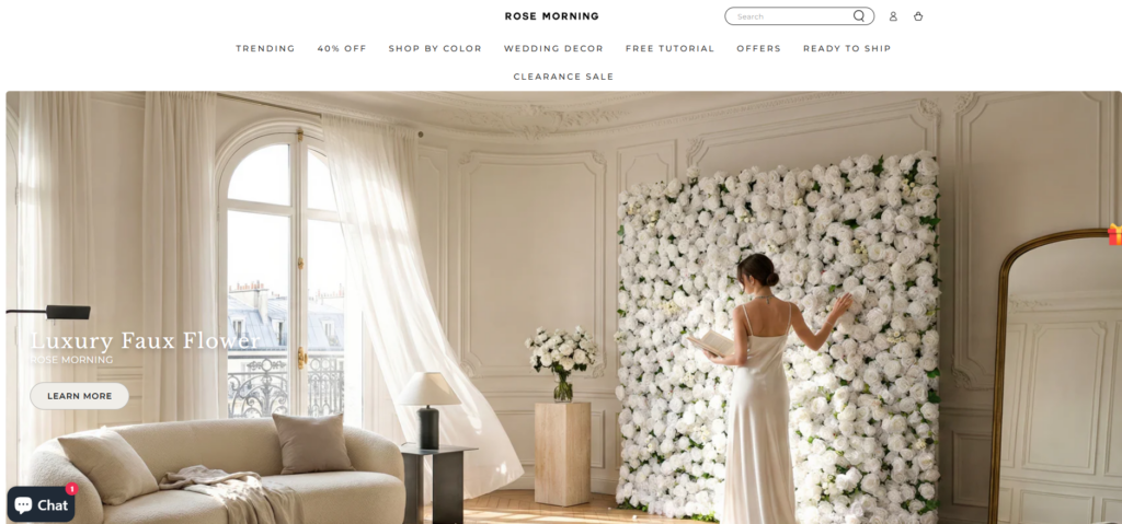
The hero section sets the emotional tone of the website immediately.
Instead of displaying a typical product grid, the opening scene features a beautifully styled lifestyle image showing a bride interacting with a flower wall in an elegant interior setting.
This approach helps visitors understand the brand within seconds and immediately positions the product as part of a luxury wedding environment.
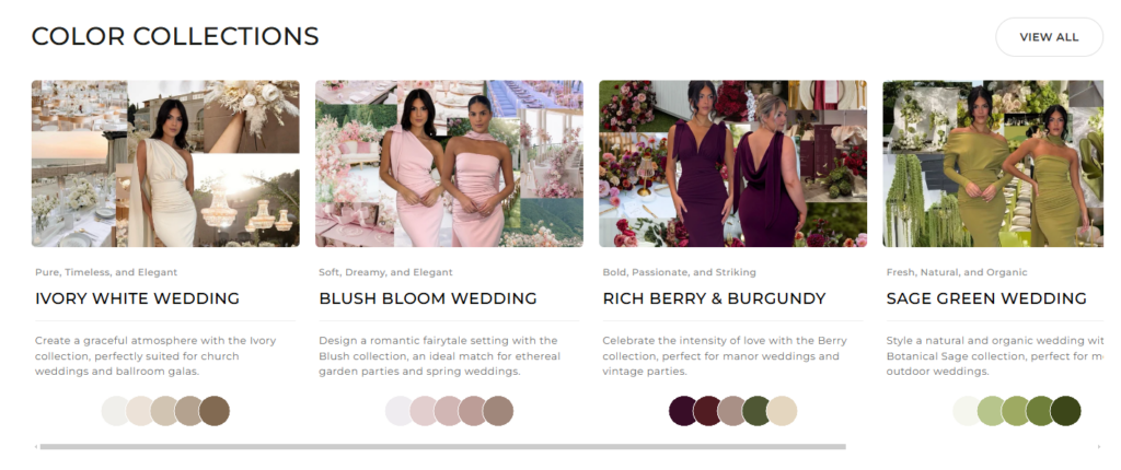
Wedding décor shopping often begins with color theme selection. Instead of forcing visitors to browse generic categories, the design introduces curated color collections.
Couples typically plan weddings around color palettes. Organizing products by color immediately aligns the browsing experience with real wedding planning behavior.
Each color collection card uses lifestyle imagery combined with subtle color swatches to visually communicate the theme.
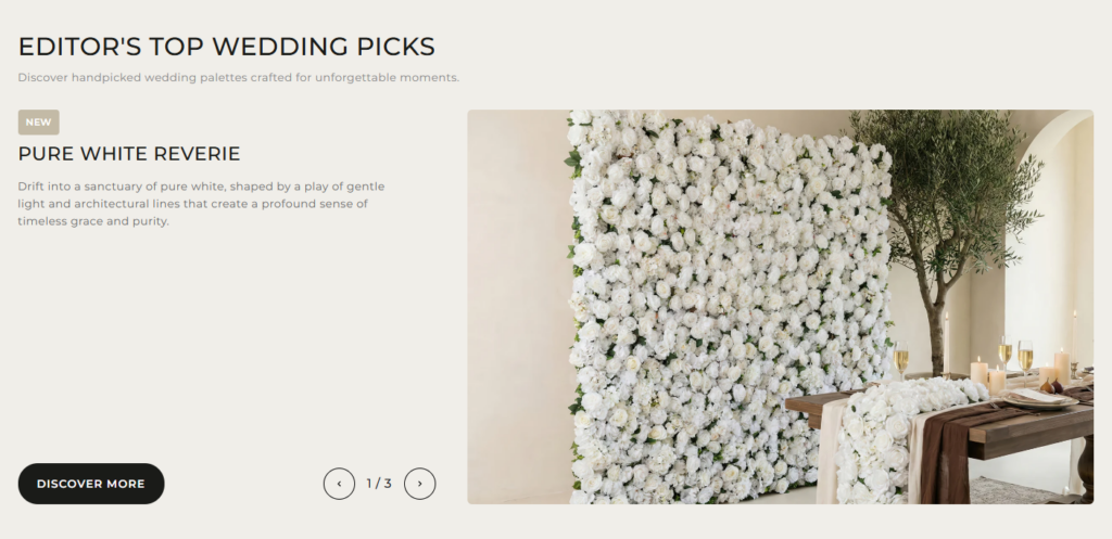
Instead of presenting products in a conventional grid, the site uses editorial-style showcase sections.
These sections blend product imagery with real wedding styling scenes.
This storytelling method significantly improves emotional engagement because customers see how the product transforms an event space.
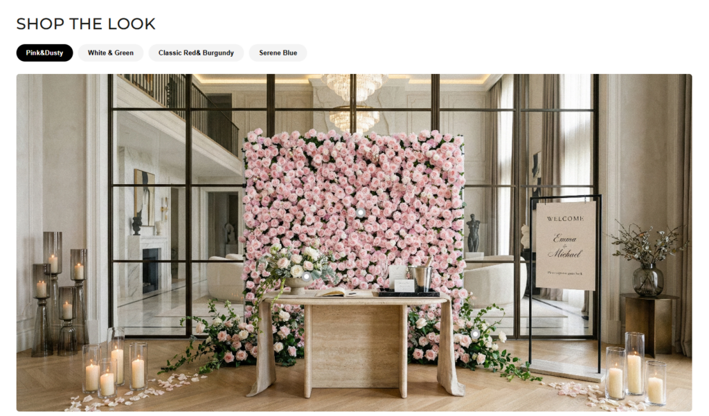
One of the most important design features on the homepage is the “Shop the Look” section.
Rather than isolating products, this section presents a complete styled scene that integrates multiple décor elements.
This type of section is extremely effective for wedding and lifestyle brands because it mirrors the way people plan real events.
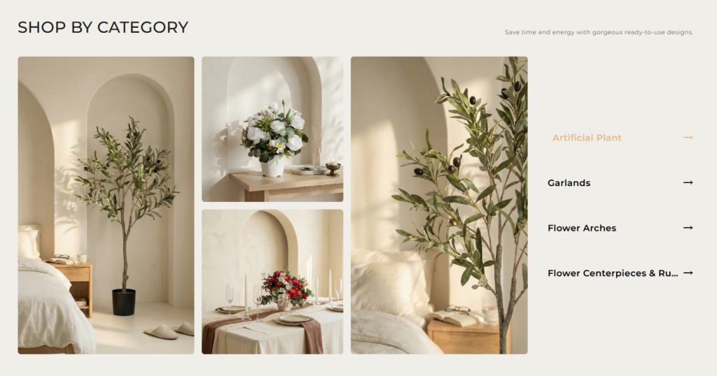
The category section was designed with simplicity and visual balance in mind.
Instead of overwhelming users with dozens of product thumbnails, the layout highlights:
Each category is supported by soft editorial imagery that blends seamlessly with the site’s aesthetic.
The layout prioritizes clarity and elegance, both of which are essential for luxury wedding brands.
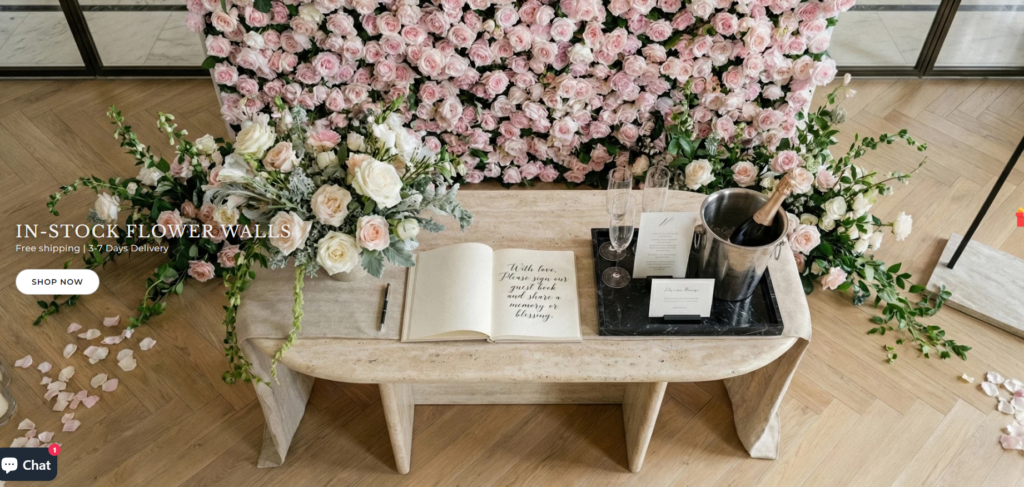
Social proof plays a critical role in the wedding industry. Couples want reassurance that the décor will look beautiful at real events.
The Customer Showcase section highlights real photos submitted by customers and event planners.
Real wedding photography also strengthens the emotional storytelling of the site.
The design of the website followed a structured approach that prioritizes user experience and brand storytelling.
The first step involved analyzing:
This research helped define the visual language needed for the brand.
Next, the homepage architecture was mapped to create a logical user journey.
The layout sequence included:
Every section was designed to naturally guide visitors toward purchase.
Once the structure was finalized, the focus shifted to visual execution.
Design elements included:
The result is a site that feels calm, elegant, and premium.
Designing an e-commerce website for wedding décor introduced several unique challenges.
Wedding shoppers want inspiration before they want to buy.
A typical product-first layout would not have created the emotional connection necessary for this audience.
Floral imagery can quickly become overwhelming if not carefully arranged.
Too many colors and textures can distract from the products themselves.
Luxury brands must maintain visual consistency across every section of the site.
Even small design inconsistencies can weaken the brand perception.
To solve these challenges, several strategic design decisions were implemented.
Instead of standard product grids, editorial layouts were used to create storytelling moments throughout the homepage.
Soft neutral backgrounds allow colorful floral installations to stand out naturally.
Large hero imagery establishes emotional context, while smaller images provide browsing options.
Rather than showing too many items at once, the design highlights carefully selected products and collections.
The final design achieves several important outcomes for the brand.
Visitors immediately understand the product’s purpose within a wedding environment.
The site feels premium and aligned with luxury wedding aesthetics.
The homepage guides users from inspiration to discovery and finally to product exploration.
Customer event photos demonstrate that the products work beautifully in real-world weddings.
Designing an effective Shopify store requires more than arranging products on a page. It involves understanding the brand’s story, the emotional motivations of the audience, and the visual language needed to bring the experience to life.
Der RoseMorning website demonstrates how thoughtful design can transform a standard e-commerce store into an immersive brand environment. By focusing on storytelling, curated layouts, and elegant visual presentation, the site invites visitors to imagine their own wedding moments while naturally guiding them toward product discovery.
This project highlights how strategic Shopify design can elevate a brand’s identity, improve the customer journey, and create a memorable shopping experience that resonates with its audience.
For brands looking to build visually compelling Shopify experiences that combine aesthetic storytelling with conversion-focused structure, AIRSANG specializes in crafting elegant e-commerce design solutions tailored to modern online businesses.


