


Keine Produkte im Warenkorb.

Designing a high-converting main image for a Wireless electric impact drill on Ozon requires far more than simply placing a product on a white background. Ozon shoppers make decisions quickly, often scanning dozens of similar tools within seconds. Our goal with this project was to transform technical specifications into instantly readable visual information, while maintaining a bold, professional aesthetic that communicates power, durability, and reliability at first glance.
From typography hierarchy to color contrast, from product angle selection to feature callouts, every image in this set was intentionally designed to reduce buyer hesitation and improve click-through and conversion rates. Below, we break down the full visual strategy behind each image and explain why this Main image design for Ozon Wireless electric impact drill works so effectively in a competitive marketplace.
| Lieferzeit | Kategorie | Anwendungsplattform |
| 7 Tage | Wireless electric impact drill | Ozon |
| Beteiligte Designer | Kosten | Wirkung |
| Lin Zhang | $110 | Sales📈302% |
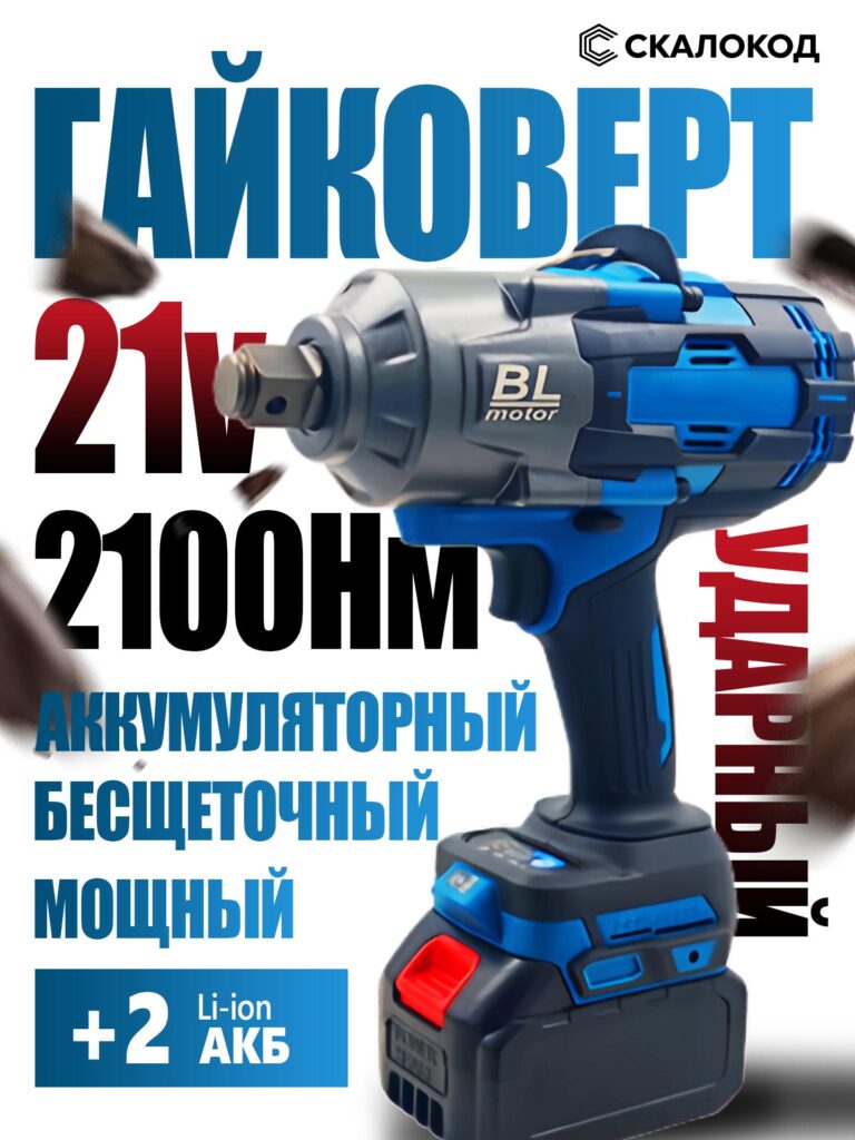
The first image serves as the primary Ozon main image, and its role is immediate impact. The drill is positioned at a strong three-quarter angle, slightly elevated, which visually emphasizes the metal head, shaft, and brushless motor housing. This angle communicates torque and strength without needing excessive text.
Large typography highlights key selling points such as voltage, torque rating, and brushless motor technology. The text hierarchy is carefully controlled: the product name dominates the top, while numerical specs anchor the center of the composition. Motion elements—subtle debris and directional blur—reinforce the idea of raw power in action, making the drill feel dynamic rather than static.
Color selection plays a critical role here. The blue-gray palette conveys industrial reliability, while red accents draw attention to performance numbers. This contrast ensures readability even on smaller mobile screens, which is essential for Ozon traffic.
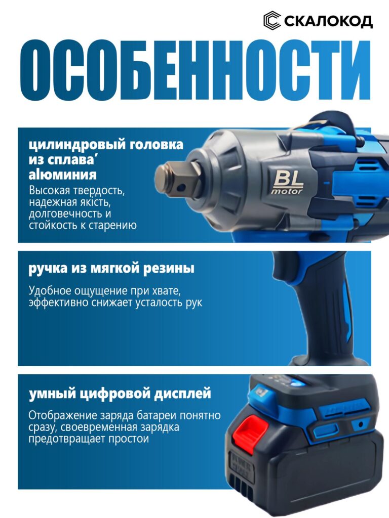
The second image transitions from power to build quality and usability. Instead of overwhelming the viewer with specs, we focused on three core physical advantages: the aluminum head, the soft rubber grip, and the digital display.
Each feature is presented in a horizontal block layout, allowing the eye to move naturally from top to bottom. Close-up crops highlight texture and material quality—particularly the metallic finish of the head and the ergonomic curvature of the grip. These details help the customer imagine long-term use, not just raw performance.
From a design perspective, this image builds trust. It answers silent buyer questions: Will this tool last? Is it comfortable? Can I monitor battery life easily? By visualizing these answers, we reduce friction before the buyer even scrolls to the description.
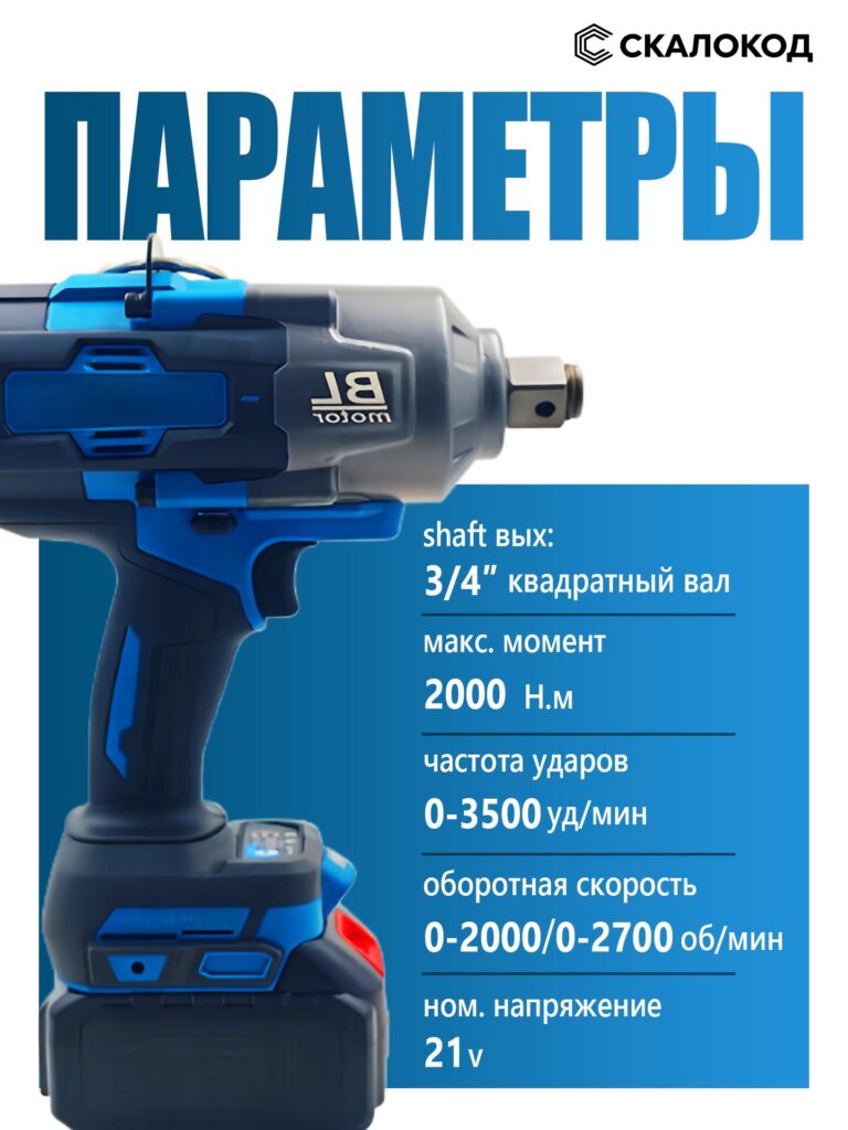
This image is dedicated entirely to technical specifications, which are critical for tool buyers on Ozon. Instead of hiding specs in dense text, we structured them into a clear vertical list: shaft size, maximum torque, impact frequency, rotation speed, and voltage.
The drill is shown in a perfectly horizontal side profile, ensuring that nothing visually competes with the data. This layout prioritizes clarity and professionalism, making the product feel engineered rather than generic.
Spacing and alignment are intentional. Each specification is separated by subtle dividers, allowing users to scan quickly. This is especially effective for experienced buyers who compare tools by numbers rather than marketing language.
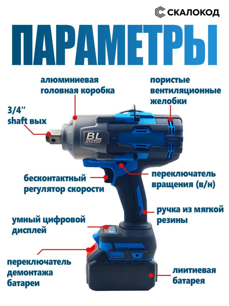
In this image, we introduce annotated callouts that label the drill’s structural components. Red markers connect text directly to physical parts of the tool, eliminating ambiguity.
This approach is highly effective for Ozon because it mimics an in-store explanation. Customers can instantly identify features like the speed regulator, ventilation channels, rotation switch, and battery release mechanism.
Visually, this image balances technical depth with accessibility. Even buyers without professional experience can understand what each component does and why it matters. From a design standpoint, this image positions the product as thoughtfully engineered rather than mass-produced.
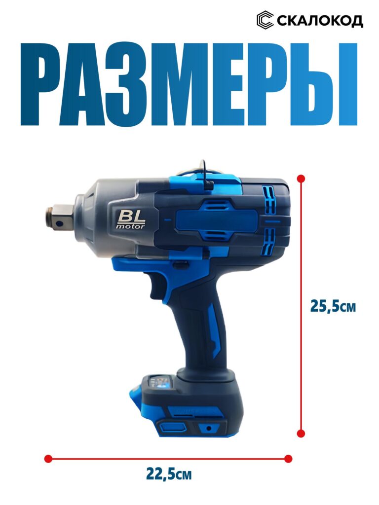
Dimensions are often overlooked, yet they significantly influence purchase decisions. This image focuses solely on physical size, presenting height and length measurements with bold red guide lines.
The drill is isolated on a clean background, ensuring that proportions are easy to understand. This helps buyers mentally compare the tool to their workspace, toolbox, or existing equipment.
By including this image, we reduce post-purchase regret and returns. Customers know exactly what they are getting, which builds confidence and improves long-term seller metrics on Ozon.
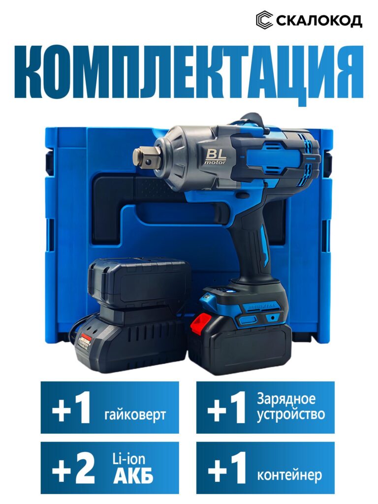
Here, we shift focus from the tool itself to the value of the full package. The drill is shown alongside its batteries, charger, and carrying case in a structured, symmetrical composition.
This image communicates completeness and professionalism. Buyers immediately see that this is not a bare tool but a ready-to-use kit. Icon blocks reinforce the quantity of each item, making the offer feel generous and well-organized.
From a visual strategy standpoint, this image targets value-driven buyers who compare bundles rather than individual tools.
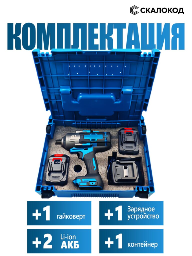
The final image reveals the kit inside the case, showcasing organization and protection. Foam cutouts precisely hold each component, reinforcing the idea of durability and care in packaging.
This image works on an emotional level. It reassures the buyer that the product will arrive safely, neatly stored, and easy to transport. It also subtly elevates the perceived price point, making the product feel premium without changing the actual cost.
Ending the image sequence with this visual leaves a strong final impression—order, reliability, and readiness for work.
This Main image design for Ozon Wireless electric impact drill succeeds because it follows a logical visual narrative:
Each image answers a specific buyer question, and together they eliminate uncertainty. The design is not decorative—it is strategic, data-driven, and tailored to how Ozon users actually shop.
Effective product imagery is not about aesthetics alone. It is about communication efficiency. This project demonstrates how thoughtful composition, typography, and sequencing can transform a Wireless electric impact drill into a compelling, trustworthy product listing on Ozon.
If you’re looking to elevate your marketplace visuals and convert technical products into high-performing listings, this is exactly the type of image system we build at AIRSANG.


