


Keine Produkte im Warenkorb.

In hart umkämpften Märkten wie Ozon, the main image is not just a visual placeholder — it is the first decision point. Shoppers scroll quickly, compare instinctively, and rely on visual clarity more than lengthy descriptions. As designers, we approach Ozon main image design with a clear goal: help customers instantly understand the product, trust its quality, and feel confident clicking into the listing.
This article breaks down a complete set of Ozon main image designs created for different consumer product categories, including home appliances, bathroom accessories, electronics, tools, lifestyle items, and pet products. Each image follows Ozon’s platform logic while adapting visual hierarchy, color language, and information density to the product’s specific use case.
Rather than applying a single template, we intentionally designed each image around how real users evaluate products in that category. Below, we explain the reasoning behind every visual decision — from layout structure and typography to icon systems and background environments — so you can clearly see how strategic design directly supports conversion.
| Lieferzeit | Kategorie | Anwendungsplattform |
| 8 Tage | Product main image | Ozon |
| Beteiligte Designer | Kosten | Wirkung |
| Lin Zhang | $130 | Store purchase rate📈210% |
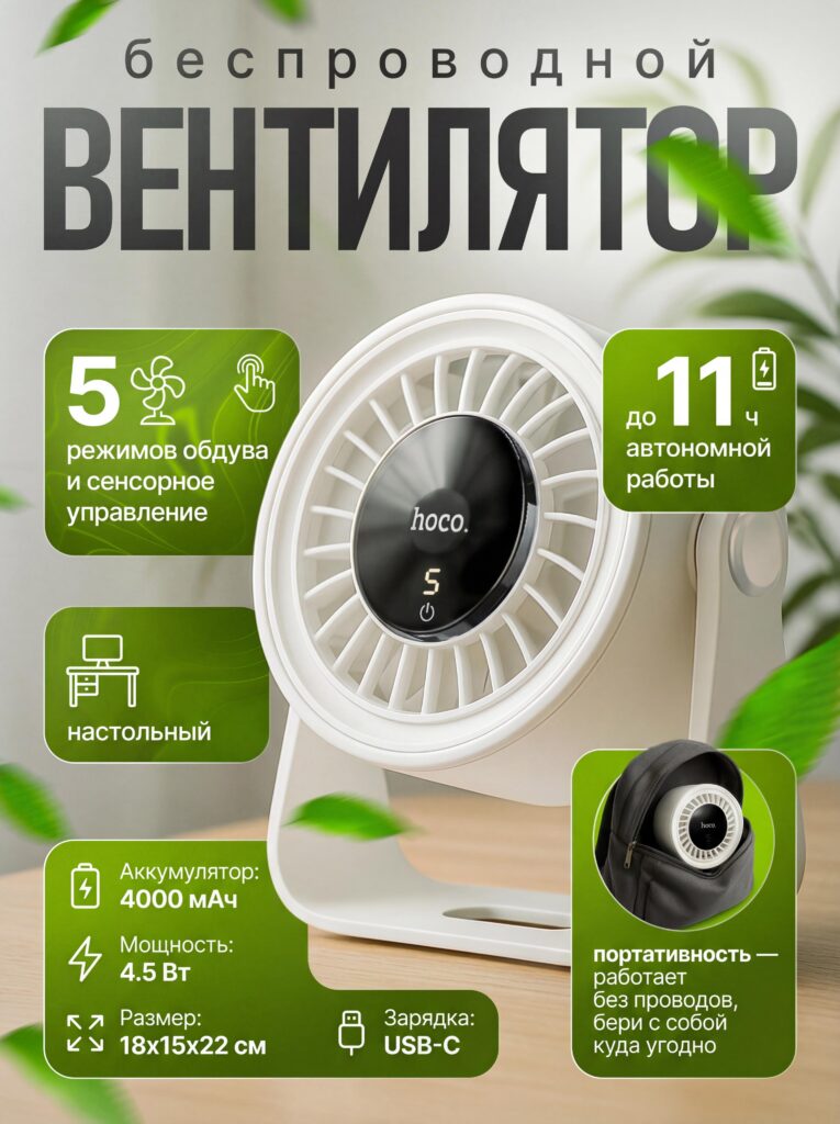
For the wireless desk fan main image, we centered the design around three key selling points: portability, battery life, and ease of control. We placed the product at a three-quarter angle to show depth and structure, while keeping the front grill and digital display clearly visible. This instantly communicates that the fan is compact yet functional.
The soft green background with floating leaves reinforces freshness and airflow without distracting from the product. We chose green intentionally because it visually aligns with concepts of cooling, comfort, and eco-friendliness — a strong emotional cue for summer-related items.
Information blocks appear as rounded cards with clear icons, allowing shoppers to scan features such as “5 modes,” “touch control,” and “up to 11 hours of battery life” within seconds. On Ozon, customers often compare multiple similar products side by side, so this structured information layout gives the fan a clear advantage during fast visual comparison.
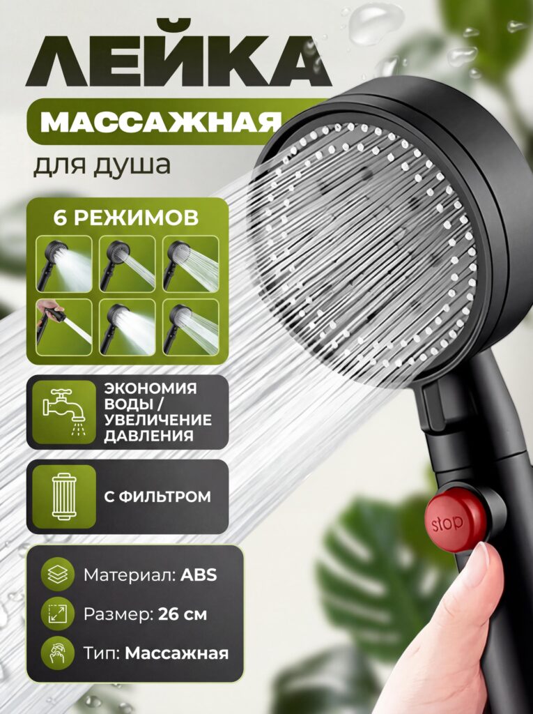
With the massage shower head, static imagery alone would not communicate value. We needed to visually represent water pressure, spray modes, and comfort. That is why we emphasized dynamic water streams as the central visual element.
We positioned the product diagonally to create motion and energy, allowing the water flow to guide the viewer’s eye across the image. The six spray modes are presented as small visual thumbnails, making the feature tangible instead of abstract. This approach reduces hesitation by letting customers “see” the functionality before reading details.
The color palette balances dark hardware tones with fresh green accents, signaling both durability and wellness. Icons highlight water-saving and filtration features — two decision-making factors that matter strongly in bathroom product categories on Ozon.
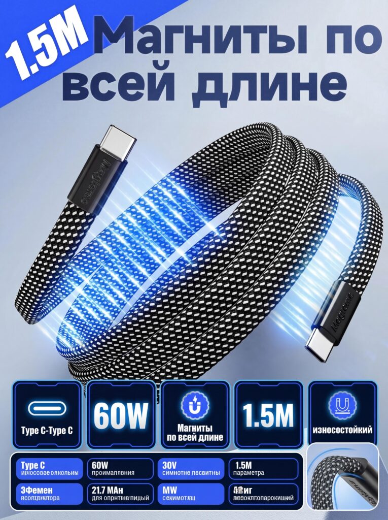
Magnets are difficult to explain through text alone, so this main image relies on visual storytelling. We used glowing blue light effects along the cable length to represent continuous magnetic attraction. This instantly differentiates the product from standard charging cables.
The cable is arranged in a curved, floating position to emphasize flexibility and strength at the same time. We clearly displayed the 1.5-meter length and 60W power capability in bold, high-contrast blocks, ensuring these specs remain readable even on mobile screens.
On Ozon, electronics shoppers often look for quick reassurance of compatibility and durability. By visualizing magnetism instead of simply labeling it, we reduce cognitive load and make the feature memorable.
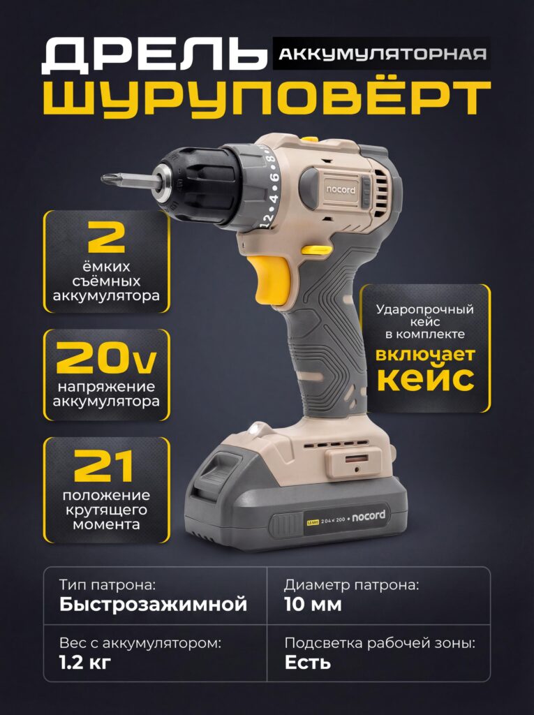
For the cordless drill main image, the priority was authority and reliability. We chose a dark, neutral background to let the tool’s shape and color accents stand out sharply. The drill appears upright and centered, reinforcing stability and control.
We structured the layout to guide the viewer from top to bottom: product name, power specifications, battery details, and supporting features such as torque settings and quick-release chuck. This vertical hierarchy mirrors how users naturally scan tool listings on Ozon.
Yellow highlight blocks draw attention to key selling points without overwhelming the image. The goal was not to show everything, but to show the right things — enough to convince both DIY users and professionals that this tool delivers dependable performance.
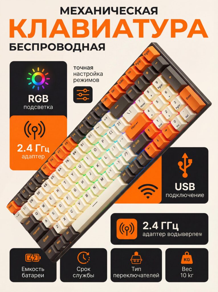
Mechanical keyboards are lifestyle products as much as functional tools. For this design, we emphasized visual personality while maintaining technical clarity. The keyboard is displayed at an angle that shows keycap profiles, RGB lighting, and layout simultaneously.
We used warm orange accents against a clean background to create contrast and energy. This color choice attracts attention in crowded Ozon listings while reinforcing the keyboard’s modern, enthusiast-oriented identity.
Feature icons — such as RGB lighting, wireless connectivity, and USB support — appear in modular blocks around the product. This layout allows users to quickly confirm compatibility and customization options without searching through text-heavy descriptions.
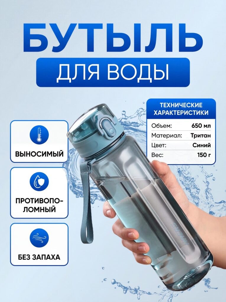
For the water bottle main image, clarity and trust were essential. We used a light blue background and water splash elements to visually communicate freshness, hydration, and safety. The bottle is held naturally in a human hand to provide instant scale reference.
Instead of overwhelming the image with technical data, we highlighted essential features: BPA-free material, odor resistance, and portability. These benefits matter most to users choosing a daily-use item.
Typography remains clean and spacious, reinforcing the product’s hygienic and minimal positioning. On Ozon, lifestyle shoppers respond strongly to visuals that feel honest and uncomplicated — this design supports that expectation.
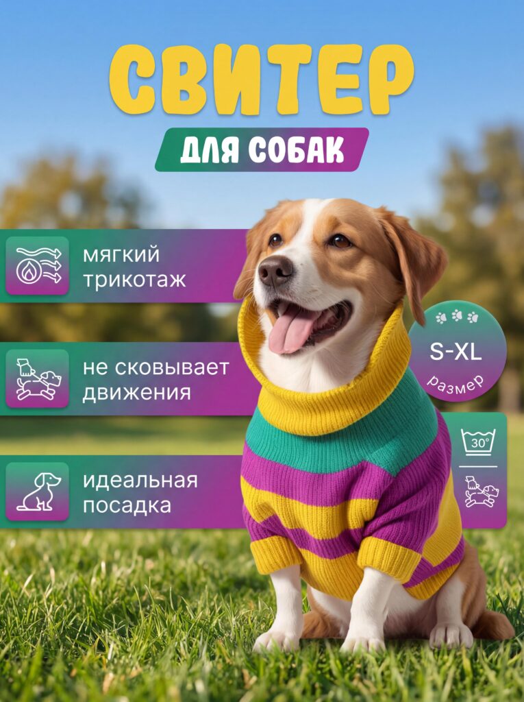
Pet products sell through emotion before logic. For the dog sweater main image, the smiling dog wearing the product becomes the focal point. The outdoor setting reinforces comfort, freedom of movement, and everyday usability.
We used colorful yet balanced typography to communicate softness, fit, and size range. Feature labels appear alongside icons, keeping the tone friendly and approachable rather than technical.
By letting the dog’s expression carry the emotional message, we reduce resistance and help pet owners imagine their own dog enjoying the product. This emotional clarity is critical for apparel categories on Ozon.
Although each product category required a different visual strategy, we maintained consistent design principles across all images:
This balance between consistency and customization ensures each listing feels professional while remaining tailored to its market segment.
Ozon shoppers do not read first — they scan. Main images must communicate value instantly, without confusion. Every design decision shown here serves a specific purpose: reduce hesitation, increase trust, and guide attention toward conversion.
Well-designed main images also reduce return rates by setting accurate expectations. When users clearly understand what they are buying, satisfaction increases after purchase.
Wirksam Ozon main image design is not about decoration. It is about clarity, psychology, and strategic communication. By aligning visual language with platform behavior and customer expectations, we transform product images into conversion tools.
These designs demonstrate how thoughtful structure, controlled information density, and category-specific storytelling elevate listings beyond basic compliance. When design speaks clearly, customers listen — and click.
This is exactly the approach we apply at AIRSANG, where we specialize in conversion-focused design for cross-border eCommerce, helping brands stand out on platforms like Ozon through strategic visuals, not guesswork.


