


Keine Produkte im Warenkorb.

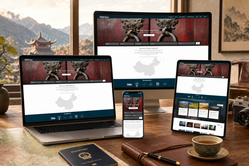
A luxury travel website must do more than display beautiful destinations. It must create desire, build trust, answer practical questions, and make the visitor feel that the journey has already begun. The WildChina WordPress website does this through a careful mix of cinematic imagery, editorial storytelling, structured navigation, cultural depth, and conversion-focused page design. From the first full-screen visual to the detailed blog article page, every section works together to present China as a place of human stories, landscapes, food, history, and discovery.
As designers, we see this website as a strong example of how a premium travel brand can balance emotion and function. The design does not rely only on luxury language or polished photography. Instead, it builds a complete browsing journey: first inspiring the visitor, then explaining the brand promise, then proving credibility, then offering specific trip options, then inviting deeper reading and inquiry. This makes the site feel immersive, trustworthy, and commercially effective.
| Lieferzeit | Kategorie | Website-Typ |
| 21days | travel | WordPress |
| Beteiligte Designer | Kosten | Wirkung |
| Lin Zhang | $2300 | Sales📈305% |
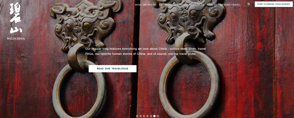
The homepage begins with a powerful hero section featuring traditional Chinese door knockers on deep red wooden doors. As designers, we chose to read this image as more than decoration. It functions as a visual metaphor. A door suggests entry, invitation, privacy, and discovery. For a luxury travel brand, this matters because the visitor is not simply buying transportation or sightseeing. They are looking for access to places, stories, and experiences they cannot easily find alone.
Instead of opening with a predictable skyline, mountain, or tourist landmark, the design uses a close-up cultural detail. This creates immediate texture and personality. The aged red wood, metal carvings, and symmetrical door elements communicate history, craftsmanship, and depth. The image feels tactile, almost cinematic, and it gives the brand a more distinctive first impression.
The white vertical logo on the left stands out clearly against the dark red background. This placement gives the brand a strong identity without crowding the center of the screen. The navigation sits across the top in a light, minimal style, allowing users to access major sections such as travel offers, inspiration, resources, reasons to choose the brand, and beyond-travel services. The official site also organizes journeys by destination, length, interest, and group style, which supports a broad range of visitor intentions on the same platform (WildChina).
We designed the call-to-action button, “Start Planning Your Journey,” to appear clear and confident. It does not interrupt the visual experience, but it stays visible for users who arrive with high intent. This creates a useful balance between storytelling and conversion.
The hero copy introduces the travelogue as a place for culture deep-dives, travel FAQs, human stories, and travel picks. We placed this message in the center because it gives visitors a fast understanding of the content direction. The button “Read Our Travelogue” creates a simple next step. This is important because travel content can easily become passive. Here, the design turns curiosity into action.
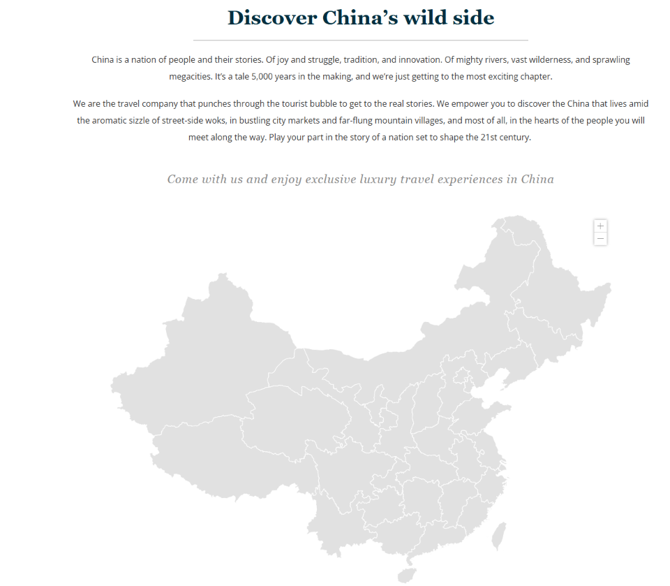
The “Discover China’s wild side” section shifts the visitor from visual impact into brand philosophy. The headline feels direct and memorable. It suggests that China is not only a destination of monuments and famous cities, but also a living place filled with people, landscapes, food, local markets, and remote villages.
As designers, we would intentionally give this section a clean white background to slow down the user experience after the dramatic hero. The page needs breathing room. The centered typography, horizontal divider, and carefully spaced paragraphs create an editorial tone. This makes the brand feel thoughtful rather than overly commercial.
The large pale map of China works as a quiet visual anchor. It helps users understand scale without turning the page into a technical travel map. The map suggests range: megacities, wilderness, mountains, rivers, villages, and regional cultures. It also supports the brand’s positioning as a travel company with deep on-the-ground knowledge across China.
The map uses a soft gray tone, so it does not compete with the written story. This restraint is important. A luxury website should not always shout. Sometimes the strongest design choice is to let the content feel spacious and considered.
The italic sentence, “Come with us and enjoy exclusive luxury travel experiences in China,” adds a more emotional and elevated tone. It feels like an invitation rather than a sales pitch. This is a subtle but effective design decision. The visitor does not feel pushed into buying. They feel welcomed into a curated world.
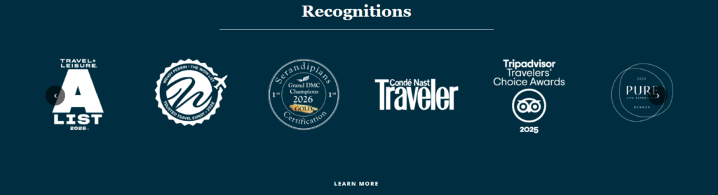
The recognition section presents major awards and media mentions in one clean row. For a luxury travel website, this kind of third-party validation matters because the purchase decision is high-value and trust-driven. Visitors need confidence before they inquire, especially when they are considering a custom international trip.
The site displays recognitions from respected travel and lifestyle names, including Travel + Leisure, Condé Nast Traveler, Tripadvisor, PURE, and other industry networks. By grouping these marks together, the design makes credibility immediately visible without requiring long explanation. WildChina’s own website also includes an awards and press pathway under its “Why Us” section, reinforcing this trust layer as part of the broader brand architecture (WildChina Awards and Press).
We used a deep teal background to make the white logos feel refined and consistent. This color choice supports a premium tone while avoiding the harshness of pure black. It also connects visually with the brand’s wider color system, which appears across buttons, footer areas, and trust-building modules.
The centered “Recognitions” heading and thin divider line create symmetry and calm. The layout feels like an editorial page in a luxury magazine, not a noisy badge wall. This restraint makes the awards feel more valuable.
The “Learn More” call-to-action appears below the logos, giving users a path to explore credibility in more detail. We kept this button simple because the section’s primary job is reassurance. The design does not need a loud sales message here. It simply needs to make the visitor feel, “This company is trusted.”
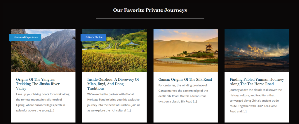
The “Our Favorite Private Journeys” section introduces individual trip cards. As designers, we treat this as the moment where inspiration begins to turn into product exploration. The heading uses the word “Favorite,” which feels curated and human. It suggests that the brand’s experts have selected these journeys because they represent something special.
The dark background creates a gallery-like environment. It helps the scenic images stand out and gives the section a cinematic quality. Each card includes a destination image, title, and short description. This structure helps users compare options quickly while still feeling emotionally drawn into each route.
The four-column card layout gives the page rhythm and order. Travel experiences can become complex because every route includes geography, culture, activities, logistics, and personal taste. The card system simplifies that complexity. Users can quickly scan themes such as trekking, ethnic traditions, the Silk Road, and the Tea Horse Road.
The white card bodies create contrast against the black background, improving readability. The images sit at the top of each card, which matches how users naturally browse travel content. First they react to the visual. Then they read the title. Then they decide whether to learn more.
Labels such as “Featured Experience” and “Editor’s Choice” help visitors understand priority. These labels create an editorial hierarchy. They do not merely decorate the cards; they tell users where to look first. The blue label color also adds a modern accent to the traditional and cinematic visual language.
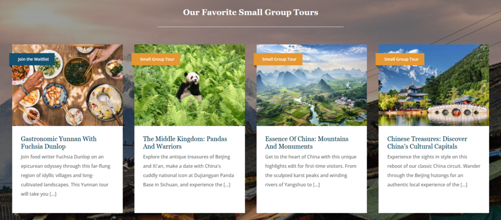
The “Our Favorite Small Group Tours” section shifts the offer from private, custom journeys to more social travel options. The official site describes small group tours as limited to 12 people, bringing together discerning travelers who want discovery, friendships, and deeper destination understanding (WildChina). This is a different purchase motivation from private travel, so the design needs a slightly different emotional tone.
The background image creates an immersive atmosphere, while the white cards keep the trip information readable. This section feels warmer and more approachable than the private journeys module, which fits the product type.
The cards highlight different experiences: food culture in Yunnan, pandas and heritage sites, mountains and monuments, and cultural capitals. This variety helps users quickly understand that small group travel is not one fixed style. It can be culinary, nature-based, classic, cultural, or first-time friendly.
The images carry the emotional load. Food photography suggests social connection. Panda imagery creates warmth and recognition. Scenic landscapes communicate wonder. Cultural architecture suggests depth and history. Together, the cards make the product range feel broad and well-curated.
The “Join the Waitlist” and “Small Group Tour” labels make the experience status clear. We would design these labels in strong colors because users need to identify availability and category quickly. This helps reduce confusion and supports faster decision-making.
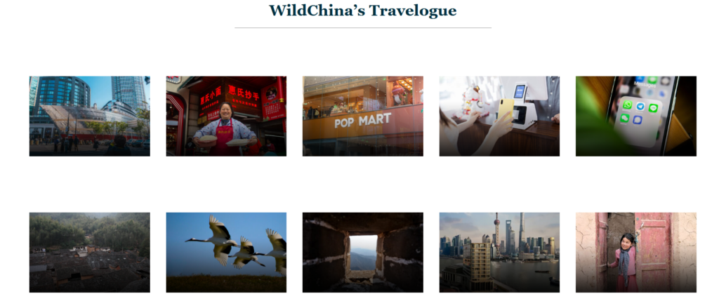
The “WildChina’s Travelogue” section presents a grid of stories rather than a standard blog list. This design choice matters because content helps luxury travel brands build authority. A visitor may not be ready to inquire immediately, but they may want to understand the brand’s perspective on China.
The official site describes the travelogue as a place for culture deep-dives, travel FAQs, human stories, and top travel picks (WildChina). The grid reflects that promise visually. It shows cities, people, retail culture, digital tools, villages, birds, architecture, and local life. This variety tells visitors that the brand understands China beyond postcard landmarks.
The white background and generous spacing make the section feel editorial. We avoided heavy borders, dense text, and over-designed cards because the images already carry strong narrative value. Each image has enough space to breathe. This makes the grid feel premium and calm.
The centered title and divider line maintain consistency with earlier sections. Repetition of these visual patterns strengthens the website’s design language. Users may not consciously notice this, but they feel the site becoming more coherent.
This grid is not a hard conversion section. It invites curiosity. That is a smart design move for travel because users often need time to imagine, compare, and trust. By offering useful stories and cultural insights, the site keeps visitors engaged even before they contact the team.
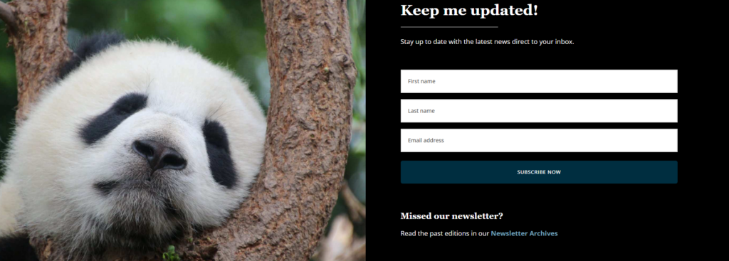
The newsletter section uses a large panda image on the left and a dark form area on the right. This pairing works because it combines emotion and action. The panda creates immediate warmth, charm, and cultural recognition. It reminds users that travel can include rare encounters and natural wonder.
The right side focuses on the form. The black background removes distraction, while the white input fields create strong contrast. The headline “Keep me updated!” feels friendly and direct. It does not sound corporate. It sounds like a simple invitation to stay connected.
The form asks for first name, last name, and email address. These fields feel manageable. We designed the button to span the form width so the action feels obvious. The teal color connects back to the site’s premium brand palette and gives the page a consistent visual system.
The “Missed our newsletter?” archive link below the form is also useful. It gives returning visitors another path and shows that the newsletter has history and substance. This makes the subscription feel more valuable.
Placing the newsletter after travel inspiration and services makes sense. By this point, users have seen the brand’s story, credibility, tours, and content. They may not be ready to plan, but they may want to stay in the brand’s world. The newsletter captures that softer intent.
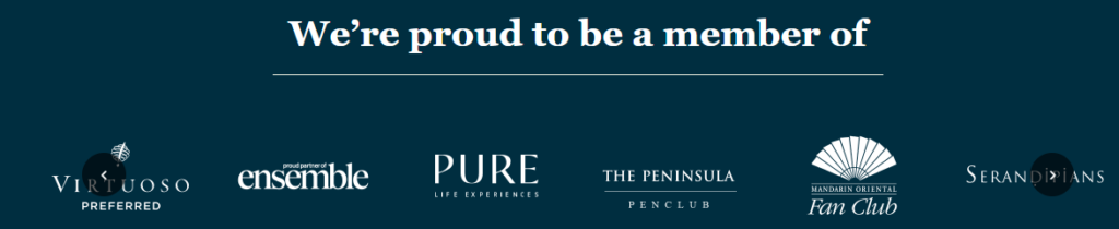
The membership section states, “We’re proud to be a member of,” followed by a row of partner and luxury travel network logos. As designers, we use this section to reinforce prestige without over-explaining it. These logos act as social proof for users who understand the luxury travel space.
The design uses the same deep teal background and white logo treatment seen in the recognition section. This creates visual continuity. It also keeps the focus on the marks themselves. The section feels like a trust statement, not an advertisement.
The evenly spaced logos create a sense of order and confidence. In luxury design, spacing often communicates quality. Crowded layouts can make even strong brands feel less premium. Here, the generous spacing gives each membership mark room to carry its own authority.
The centered heading and divider line continue the editorial structure used throughout the page. This consistency makes the website feel intentionally designed rather than assembled from separate modules.
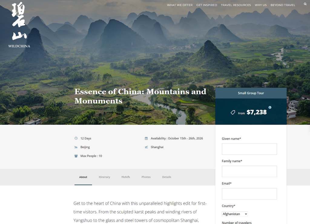
The blog single page for “Essence of China: Mountains and Monuments” uses a wide scenic hero image to place the reader inside the journey immediately. The landscape image does the emotional work first. The title overlay then gives the image meaning. This is important because a travel article should not feel like a generic post. It should feel like the beginning of a route.
The navigation remains visible at the top, which supports usability. Even when users enter through a blog article, they can still explore journeys, resources, or planning options. This is especially important for SEO traffic because many visitors may arrive directly from search.
The main article area uses headings, paragraphs, maps, itinerary sections, hotel recommendations, image galleries, inclusions, exclusions, guest notes, and related content. This layered structure turns the article into a complete planning resource. Readers can move from inspiration to practical detail without leaving the page.
As designers, we would organize the content this way because long travel information can overwhelm users if it appears as one continuous wall of text. Headings break the page into digestible sections. Maps help readers understand geography. Accordion-style itinerary blocks allow users to open details when they need them. This keeps the page readable while still supporting depth.
The map section is a practical design element. It helps users visualize where the journey happens and how the route connects across China. For international travelers, this is especially valuable because place names may feel abstract. A map makes the trip more concrete.
The map also reinforces the brand’s expertise. It suggests that the company understands the route from a planner’s perspective, not just a storyteller’s perspective.
The sidebar inquiry form appears beside the main article content. This is a smart conversion decision. When readers become interested in the route, they do not need to search for a contact page. The form is already available. This reduces friction and captures intent while the user is emotionally engaged.
The page also uses related articles and related tours near the bottom. These modules extend the user journey. If the current article is not the perfect match, visitors can continue exploring similar stories or trips.
The dark footer completes the page with navigation links, useful information, contact details, addresses, social channels, and WeChat access. For a travel brand operating across markets, this footer does more than close the page. It reassures users that the company has real locations, real contact channels, and a broader support structure.
The strongest part of this website is its balance. Many travel websites look beautiful but fail to guide users. Others focus heavily on booking and lose emotional depth. This WordPress site does both. It inspires through imagery and storytelling, then supports action through buttons, cards, forms, maps, and structured navigation.
The site feels closer to a high-end travel publication than a simple booking platform. Centered titles, thin divider lines, spacious layouts, and carefully chosen photography all support that feeling. This editorial approach helps the brand appear thoughtful, experienced, and culturally informed.
The design avoids reducing China to a checklist of famous landmarks. It shows food, villages, markets, mountains, animals, hotels, city life, technology, and human moments. This visual range supports the brand message that travel should move beyond the tourist bubble and into real stories.
Different users arrive with different goals. Some want private luxury travel. Some want small group tours. Some want travel resources. Some want cultural inspiration. Some want to plan immediately. The website gives each visitor a path. This is why the navigation, content grid, journey cards, blog pages, newsletter form, and inquiry forms all matter.
Der WildChina WordPress website succeeds because it treats travel design as a complete journey, not a collection of isolated pages. The hero image opens a cultural doorway. The brand story section explains the purpose. The recognition and membership areas build trust. The private and small group tour sections turn inspiration into options. The travelogue grid expands the brand’s authority. The newsletter captures long-term interest. The blog detail page transforms storytelling into practical trip planning.
As designers, we see this as a strong model for premium travel website design: emotional visuals, clear information hierarchy, credible social proof, thoughtful content architecture, and conversion points placed at the right moments. For brands that want to present high-value travel, cultural experiences, or cross-border services with the same level of clarity and atmosphere, this is exactly the type of independent website design thinking AIRSANG can help create.


