


Keine Produkte im Warenkorb.

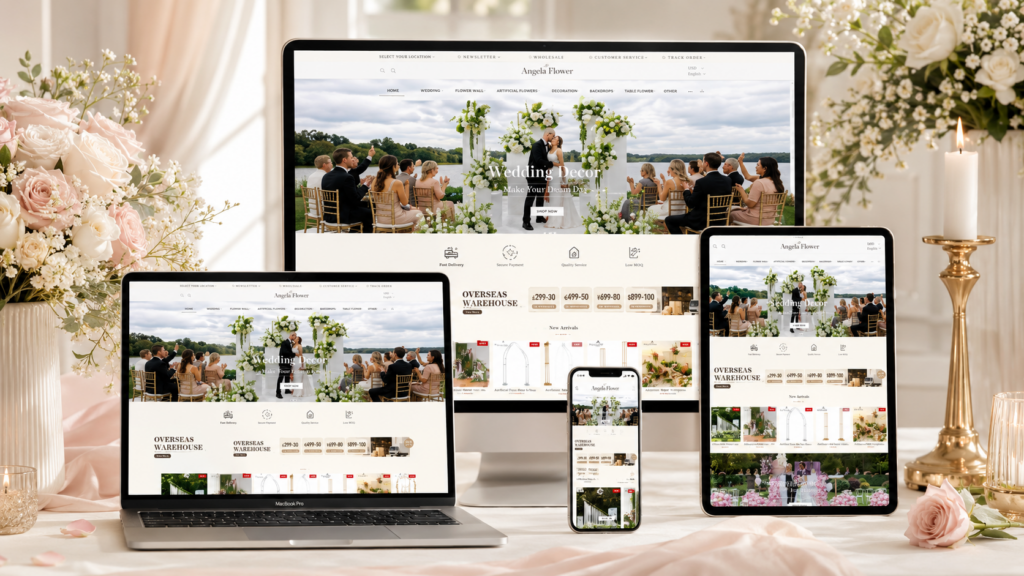
A successful wedding decor website must do more than display products. It needs to create emotion, build trust, guide customers through many visual choices, and make the shopping process feel simple. Angela Flower’s Shopify website achieves this by combining romantic lifestyle imagery, clear product organization, practical service messages, customer proof, and detailed product education.
As designers, we look at this website as a complete shopping journey. Each section plays a specific role. The homepage creates desire, the collection pages support product comparison, the About Us page builds credibility, and the product detail page answers purchase concerns. The design does not rely on one single visual moment. Instead, it uses a layered structure that moves customers from inspiration to trust, then from trust to purchase.
| Lieferzeit | Kategorie | Website Type |
| 21days | Floral Art | shopify |
| Beteiligte Designer | Kosten | Wirkung |
| Nancy | $2400 | Sales📈276% |
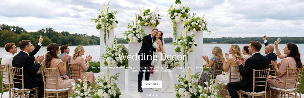
The first hero banner uses a wedding ceremony scene as the strongest visual entry point. As designers, we chose this type of image because wedding decor buyers are not only purchasing flowers, arches, or backdrops. They are purchasing an atmosphere for one of the most meaningful moments in life.
The bride and groom sit at the center of the composition, surrounded by guests, floral arches, white and green arrangements, and an open lakeside background. This creates an immediate emotional connection. Customers can imagine how the decor may appear in a real wedding setting instead of seeing it as an isolated product.
The centered headline creates strong category recognition. The text does not compete with the scene. It simply supports the image and tells users what they are viewing. The “Shop This” button appears below the message, creating a natural conversion path without making the banner feel overly commercial.
The white and green color palette also supports the brand’s wedding identity. White suggests purity and elegance, while green adds freshness and natural beauty. This visual language makes the page feel refined, romantic, and trustworthy from the first second.
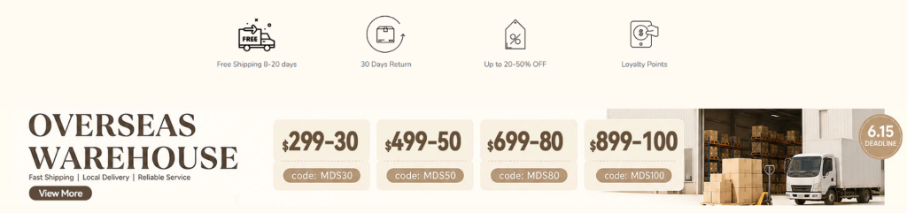
After the emotional introduction, the website quickly shifts to practical reassurance. The service icon row highlights benefits such as free shipping, returns, discounts, and loyalty points. As designers, we placed these points near the top because customers need to understand the store’s advantages before they spend time browsing.
Wedding decor products can be large, delicate, and time-sensitive. Buyers often worry about delivery, returns, and cost. By presenting service benefits early, the website reduces uncertainty and helps users continue shopping with more confidence.
The “Overseas Warehouse” banner strengthens this trust message. Instead of presenting shipping as a small note, the design turns it into a major visual section. The large headline on the left communicates reliability, while the coupon cards in the center give customers clear promotional value.
The warehouse and truck image on the right visually supports the promise of delivery strength. This makes the service claim feel more concrete. The beige background keeps the section soft and premium, which matches the wedding category. The result is a section that balances emotional branding with commercial confidence.
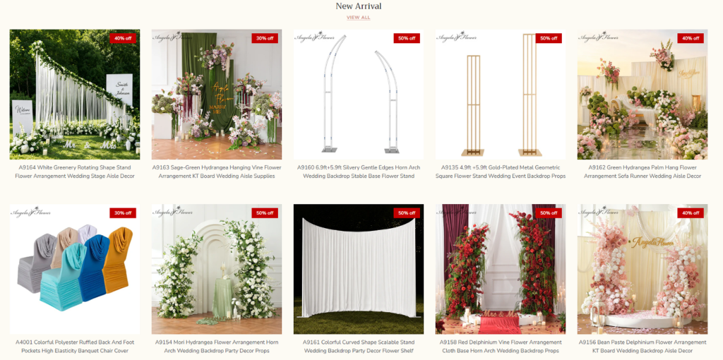
The “New Arrival” section introduces fresh products through a clean grid layout. As designers, we used this structure because wedding decor products vary greatly in shape, scale, color, and use case. A grid allows customers to compare multiple items quickly without feeling lost.
Each product card gives the image the most space. This decision is important because wedding buyers often make decisions based on visual effect. They need to see how an arch, flower wall, chair cover, or aisle arrangement may look in an event environment.
The red discount badges create urgency and draw attention to promotional value. We placed them in the upper corner of each image so they remain visible without disrupting the product photo. Customers can instantly recognize new styles and discounted opportunities at the same time.
The “View All” link above the product grid gives users a simple next step. It does not force them into a purchase immediately. Instead, it invites further browsing, which is especially important for customers planning large events with many decor needs.
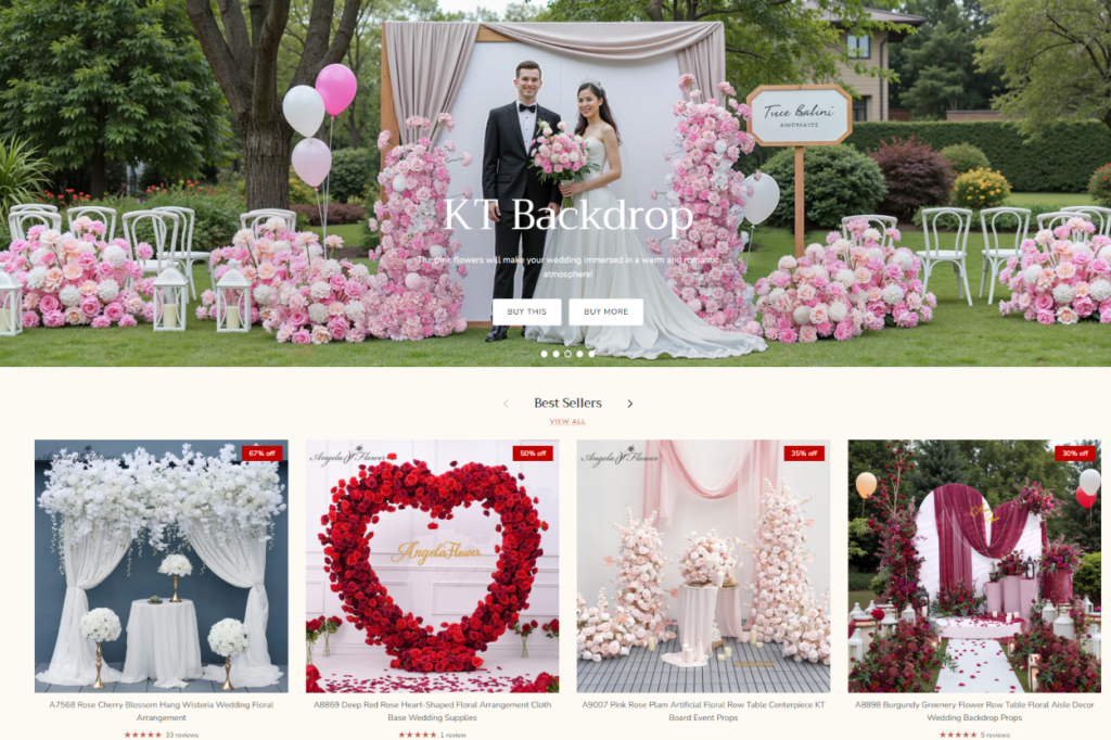
The KT Backdrop hero section uses a romantic outdoor setup with pink floral arrangements, balloons, chairs, and a couple at the center. As designers, we used this scene to show customers how a backdrop can become the emotional focus of an event.
The design does not only show a product. It shows a complete celebration. This helps users understand how the product fits into proposals, weddings, birthdays, and photo moments.
Below the hero banner, the “Best Sellers” section gives customers a shortcut to popular products. When buyers see products with ratings, reviews, and discount labels, they feel more confident. Popularity becomes a form of social proof.
The product images are large and clear, while the layout remains simple. This helps users compare products without distraction. The section works especially well because it follows an emotional hero banner. First, the customer feels inspired. Then, the website shows them proven products that other customers already like.
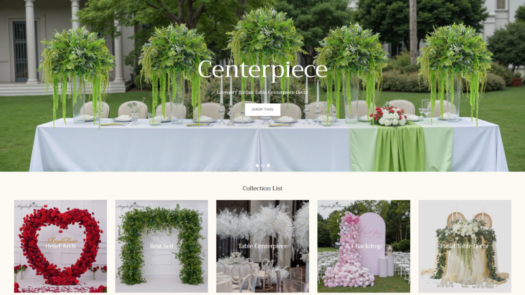
The centerpiece section uses a wide table arrangement scene with greenery placed across a formal outdoor dining table. As designers, we chose this image because centerpieces are difficult to evaluate from isolated product shots. Customers need to understand height, scale, table coverage, and atmosphere.
The greenery creates a fresh and natural visual tone. It also shows that wedding decor does not always need to rely on heavy floral colors. A green centerpiece can feel elegant, organic, and suitable for outdoor celebrations.
Below the banner, the collection list helps customers browse by category and event style. The cards include heart arches, best sellers, table centerpieces, KT backdrops, and head table decor. This structure turns a large catalog into a more guided experience.
Each collection card works as a visual shortcut. Customers do not need to read long explanations. They can recognize the style they want through images and click directly into the relevant category. This improves navigation and reduces decision fatigue.
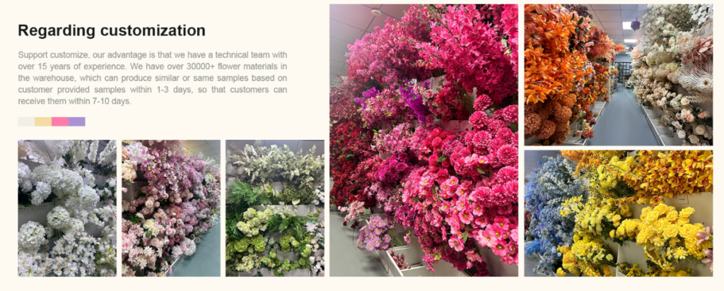
The customization section plays a very important trust-building role. As designers, we did not want this area to look like a generic service statement. Instead, we used real warehouse and material photos to prove the brand’s production capability.
The left side explains customization support, experience, inventory, sample production, and delivery timing. The right side uses colorful flower material images to show scale and variety. This combination makes the message more believable.
Customers who order wedding decor often have specific color themes, venue requirements, and event concepts. They may need customized flowers, special sizes, or matching arrangements. Real material photos help them believe that the brand can support those requests.
The collage layout also creates energy. Different flower colors appear together, showing flexibility and creative possibility. At the same time, the section remains structured, so it does not feel messy. This balance between abundance and organization is essential for a customization-focused brand.
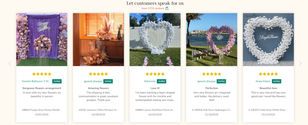
The review carousel shifts the message from brand claims to customer experience. As designers, we created this section to reduce hesitation. Wedding decor purchases can feel risky because customers need the final result to look beautiful on an important day.
Real customer photos help solve this problem. They show floral arches, backdrops, and arrangements in real event settings. This makes the products feel more authentic than studio images alone.
The star ratings, verified badges, names, review dates, and short comments all support trust. The card-based layout keeps every review easy to scan. The carousel arrows also suggest that more customer stories are available, which increases credibility.
This section is not only about praise. It is about proof. When visitors see that other customers used these products successfully, they become more comfortable making their own purchase.
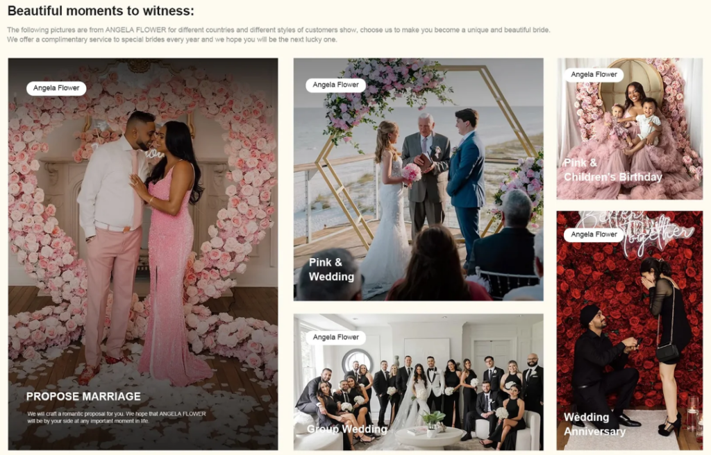
The “Beautiful Moments to Witness” section uses a masonry-style layout to show proposals, weddings, anniversaries, birthdays, and group celebrations. As designers, we built this section to show that the products are not limited to one event type.
The large proposal image creates the strongest emotional anchor. Smaller images then expand the story into beach weddings, family celebrations, anniversary scenes, and group wedding moments.
This section helps customers imagine their own memories. Instead of asking users to think only about product specifications, the design invites them to think about love, celebration, family, and photography.
The category labels make the layout easy to understand, while the real event photography creates authenticity. This part of the website works like an inspiration gallery. It helps customers move from “What product should I buy?” to “What moment do I want to create?”
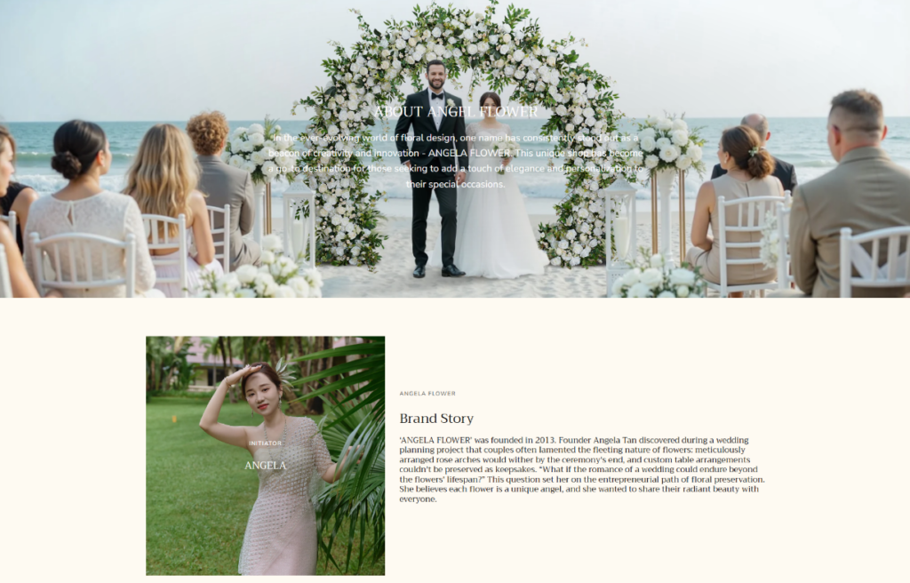
The About Us page extends the brand story beyond products. The top banner uses a wedding ceremony scene to keep the emotional tone consistent with the homepage. This immediately reminds users that the brand exists to support real celebrations.
Below the banner, the founder story gives the brand a human identity. As designers, we included this type of section because customers often trust a brand more when they understand its origin, values, and purpose.
The company information section uses images of sample development, material selection, and the production workshop. These visuals show that the brand has real operational strength behind the website.
This is especially important for a wedding decor business. Customers need to know that the company can create samples, manage materials, and support production. The page also includes social media proof, honor sharing, team imagery, and a “Why Choose Us” message. Together, these sections make the brand feel active, experienced, and reliable.
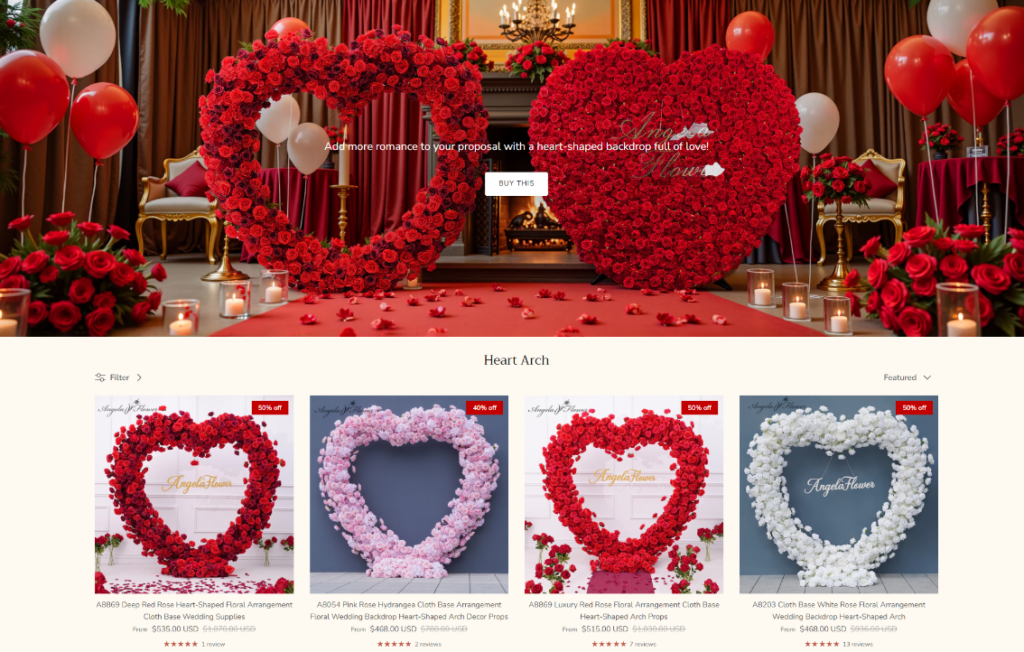
The heart arch collection page uses a dramatic red hero banner to define the mood of the category. Red roses, candles, balloons, and warm lighting create a romantic atmosphere suitable for proposals, weddings, and anniversaries.
As designers, we used this bold visual because the collection itself is highly emotional. A heart-shaped floral arch is not a neutral product. It represents love, celebration, and dramatic visual impact. The banner sets that expectation immediately.
Below the hero image, the product grid presents many heart arch options. Each card includes a product photo, discount label, product title, price, color options, ratings, and reviews. This structure supports comparison across style, color, price, and popularity.
The page also includes simple filtering and sorting tools. We kept these controls minimal because the main focus should remain on the products. The soft background and consistent spacing prevent the page from feeling crowded, even though it displays many items.
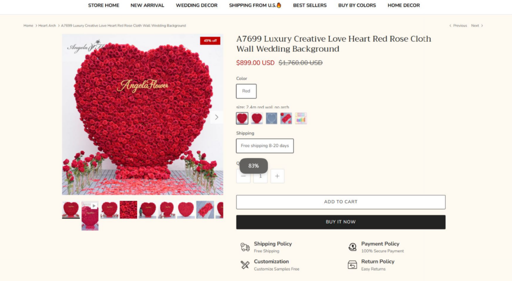
The product detail page is designed to answer questions and guide customers toward purchase. At the top, the main product image appears on the left, while the product name, price, color options, shipping information, quantity selector, and purchase buttons appear on the right.
This layout is familiar and efficient. Customers can evaluate the product visually and make purchase decisions without searching for key information.
The thumbnail gallery allows users to review different angles, colors, and detail images. This matters because large floral products require more visual confirmation than small everyday items. Customers need to understand texture, scale, shape, and real-scene effect.
Further down the page, the product description, lifestyle image, assembly instructions, package information, FAQs, and reviews answer practical concerns. The assembly section is especially useful because large wedding backdrops can feel difficult to install. By showing clear steps, the page makes the product feel more manageable.
The page also includes “Frequently Bought Together,” collection links, recommended products, wedding color collections, and additional collection lists. These sections increase browsing depth and support larger orders.
For wedding decor customers, one product often leads to related needs. A heart arch may require matching flowers, table decor, aisle pieces, or color-themed accessories. By recommending related products, the page helps customers build a complete event look.
Angela Flower’s Shopify website succeeds because it treats wedding decor as both an emotional and practical purchase. The design starts with romantic inspiration, then builds trust through service messages, customer reviews, customization proof, company storytelling, organized collections, and detailed product education.
Every section has a clear purpose. Hero banners create desire. Product grids support comparison. Collection cards improve navigation. Review sections build trust. Customization visuals prove capability. Product pages reduce uncertainty and guide users toward checkout.
As designers, we see this website as a strong example of how a wedding decor brand can combine beauty, structure, and conversion strategy. It does not simply sell floral arrangements. It helps customers imagine unforgettable moments and then gives them the confidence to purchase the products that can bring those moments to life.
For brands that want to build this kind of emotional, trustworthy, and conversion-focused independent website experience, AIRSANG can help create a professional design strategy that turns visual storytelling into stronger customer engagement and better online sales.


