Introduction
Creating a powerful digital presence for a modern e-bike brand requires more than just attractive visuals—it demands a seamless balance between structure, storytelling, and performance. For TENWAYS, a fast-growing electric bike brand with a strong focus on urban mobility and sustainability, the goal was to build a WordPress website that could support both brand storytelling and conversion-driven experiences.
This project centered on building a scalable WordPress foundation while crafting a clean, premium design language that resonates with a global audience. From the homepage experience to product-focused pages and supporting content, every element was carefully structured to reflect the brand’s identity while ensuring usability across devices.
| Deliver Time | Category | Application Platform |
| 22days | e-bike | WordPress |
| Designers Involved | Cost | Effect |
| Lin Zhang | $2100 | flow📈271% |
Understanding the Project Goals
Before starting the build, we aligned closely with the brand’s vision and business objectives. TENWAYS needed a website that could:
- Clearly communicate its brand story and positioning in the competitive e-bike market
- Showcase multiple product lines in a structured and easy-to-navigate format
- Support global users with a mobile-first experience
- Establish trust through design, content hierarchy, and user flow
- Enable future scalability for campaigns, launches, and content expansion
Rather than approaching the website as a static showcase, we treated it as a dynamic platform that evolves alongside the brand.
Our WordPress Website Building Approach
Structuring a Scalable Foundation
We began by building a flexible WordPress framework that allows the brand to expand effortlessly. The focus was not on complex backend customization, but on creating a modular structure that supports:
- Reusable page sections
- Consistent layout patterns
- Easy content updates for marketing teams
- Clear separation between product, brand, and editorial content
This approach ensures that as TENWAYS grows, the website can adapt without requiring constant redesign.
Mobile-First Layout Planning
Given that a large portion of users browse on mobile devices, we prioritized mobile responsiveness from the start. Instead of designing for desktop first and scaling down, we structured layouts that naturally adapt upward.
This included:
- Simplified navigation systems
- Optimized spacing and typography
- Touch-friendly interaction zones
- Streamlined content hierarchy
The result is a smooth and intuitive browsing experience across all devices.
Homepage Design: First Impression That Converts
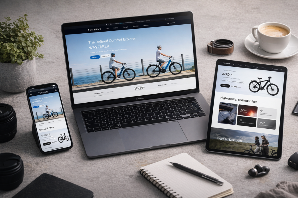
Hero Section: Lifestyle Meets Function

The homepage opens with a strong hero banner featuring lifestyle cycling imagery. This immediately connects the product with freedom, movement, and urban life.
Key elements include:
- Clean typography with clear messaging
- Strong visual hierarchy
- Minimal distractions to guide user attention
This section sets the tone for the entire website experience.
Product Highlights with Clear Segmentation

Instead of overwhelming users with too many options, we structured product sections to highlight key models in a digestible format.
Each product block includes:
- Clean product visuals
- Key benefits and differentiators
- Direct pathways to product detail pages
This helps users quickly understand the lineup without friction.
Trust and Brand Authority Sections

To build credibility, we integrated sections that reinforce trust:
- Media mentions and professional reviews
- Brand story and mission
- Sustainability messaging
These elements are strategically placed to support decision-making without interrupting the browsing flow.
Product Pages: Designed for Clarity and Conversion
Structured Content Hierarchy
Each product page is designed to guide users through a clear journey:
- Visual introduction
- Key features and benefits
- Technical highlights (presented simply, not overwhelmingly)
- Lifestyle imagery
- Supporting trust elements
This structure ensures that users receive the right information at the right time.
Visual-Driven Storytelling
Rather than relying on heavy text, we used:
- High-quality product imagery
- Contextual lifestyle scenes
- Clean icon-based feature highlights
This approach keeps the pages engaging while maintaining clarity.
Comparison-Friendly Layouts
We also ensured that users can easily compare different models by:
- Keeping consistent layout structures
- Standardizing key information placement
- Highlighting differentiators clearly
This reduces decision fatigue and improves conversion potential.
Supporting Pages That Strengthen the Experience

Category and Navigation Pages
We designed category pages to act as guided pathways rather than simple listings. Each page:
- Groups products logically (e.g., city, hybrid, cargo)
- Provides quick context for each category
- Maintains visual consistency
This helps users find the right product faster.
Brand Story and Content Pages
To deepen engagement, we structured content pages that highlight:
- Brand philosophy
- Sustainability efforts
- Community and lifestyle elements
These pages play a key role in building emotional connection with the audience.
Service and Support Sections
Trust is further reinforced through well-structured support pages, including:
- Delivery and service information
- Warranty messaging
- FAQs and help sections
Clear layout and concise content ensure users can easily find answers.
Design System and Visual Consistency
Clean and Premium Aesthetic
We adopted a design language that reflects modern urban mobility:
- Generous white space
- Neutral color palette with strong accents
- Minimalist typography
This creates a premium feel that aligns with the brand’s positioning.
Consistent UI Components
To maintain consistency across the site, we established:
- Reusable section templates
- Standardized button styles
- Unified spacing and alignment rules
This ensures a cohesive experience regardless of the page.
Challenges We Faced
Balancing Storytelling and Conversion
One of the key challenges was finding the right balance between brand storytelling and conversion-focused design. Too much storytelling can slow down decision-making, while too little can weaken brand identity.
Managing Product Complexity
With multiple product lines and variations, structuring information without overwhelming users required careful planning.
Ensuring Global Usability
Designing for an international audience meant creating layouts and content structures that are universally intuitive.
Our Solutions
Modular Content Strategy
We solved complexity by breaking content into modular sections that can be rearranged and reused. This approach:
- Simplifies content management
- Maintains consistency
- Supports future scalability
Clear Information Hierarchy
We prioritized clarity by:
- Limiting text density
- Using visual cues to guide users
- Structuring content in logical sequences
Conversion-Oriented Design Thinking
Every design decision was made with conversion in mind:
- Clear call-to-action placement
- Smooth navigation paths
- Reduced friction in user journeys
Results and Impact
The final WordPress website delivers:
- A strong and cohesive brand presence
- Improved user navigation and engagement
- Clear product communication
- A scalable structure for future growth
Most importantly, the website successfully bridges the gap between storytelling and performance, creating an experience that both inspires and converts.
Our Methodology in Action
This project reflects our broader approach to WordPress website building:
- Start with structure, not decoration
- Design with user flow in mind
- Build flexible systems for long-term growth
- Focus on clarity and usability
- Align every element with business goals
By combining these principles, we create websites that are not only visually appealing but also strategically effective.
Conclusion
Building a high-performing WordPress website for a modern e-bike brand like TENWAYS requires more than design—it requires a deep understanding of structure, user behavior, and brand positioning. From the initial framework to the final visual execution, every step of this project was guided by clarity, scalability, and conversion.
At the end of the day, a successful website is one that grows with the brand, supports its goals, and delivers a seamless experience for users worldwide.
That’s exactly the kind of result we strive for at AIRSANG, where we specialize in crafting conversion-driven websites and visual systems tailored for global eCommerce brands.