Introduction
Designing a Main image for Amazon is never just about making a product look attractive. It is about clarity, trust, and instant understanding—especially for functional products like a filter cartridge system. On Amazon, shoppers often make decisions in seconds. If the main image and supporting image set fail to explain what the product does, how it works, and why it matters, the product loses before the customer even scrolls.
For this Amazon Filter Cartridge project, our goal was to design a complete, conversion-focused visual system that educates, reassures, and persuades—without overwhelming. The product itself relies on a dual-cartridge concept (silver and mineral filtration), timed replacement cycles, and visible physical cues such as flipping behavior. That complexity demanded a carefully structured image sequence, where each image answers one clear question in the customer’s mind.
Below, we walk through every image in the set, explaining why it exists, how it supports the main image design, and how the full system works together to increase confidence and conversions on Amazon.
| Deliver Time | Category | Application Platform |
| 9days | Filter cartridge | Amazon |
| Designers Involved | Cost | Effect |
| Lin Zhang | $150 | Exposure rate📈312% |
Image 1: Packaging and Product Overview — Establishing Trust at First Glance
The first image focuses on the product packaging and physical cartridges together. This is a critical trust-building step.
We deliberately showed:
- The branded retail box
- The silver filter cartridges outside the box
- Clean lighting and neutral background
This approach immediately communicates that the product is complete, retail-ready, and professionally manufactured. The packaging reinforces legitimacy, while the cartridges themselves are clearly visible so customers know exactly what they are receiving.
From a main image design perspective, this image does three things:
- Confirms the product is a filter cartridge system, not a single loose component
- Reinforces replacement frequency messaging (“less chlorine,” “replace every 3–4 weeks”)
- Creates a strong, premium first impression suitable for Amazon’s competitive environment
This image is not about features yet—it is about credibility.

Image 2: Mineral vs. Silver Cartridge — Explaining the Dual System
The second image introduces one of the most important concepts: two cartridges, two roles.
We visually separated:
- The blue mineral cartridge (lasting up to four months)
- The silver cartridge (lasting 3–4 weeks)
Placing them side by side with clear labels eliminates confusion instantly. Customers no longer need to guess how the system works or why replacement timing differs.
From a design standpoint, this image simplifies complexity. Instead of long text explanations, we used visual contrast—color, placement, and duration labels—to tell the story at a glance. On Amazon, this kind of clarity dramatically reduces hesitation and pre-sale questions.
This image exists to answer one question:
“Why are there two different filter cartridges?”
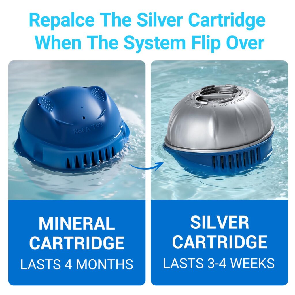
Image 3: 3-Pack Replacement Display — Communicating Value
In the third image, we focused on quantity and value.
By clearly displaying three silver replacement cartridges, we reinforced that this is not a one-time-use product. Customers can immediately understand:
- They are purchasing a multi-pack
- The product supports ongoing maintenance
- There is built-in convenience and cost efficiency
We paired this with a close-up of the adjustable dial to subtly introduce the next concept: control.
For Amazon shoppers comparing options, visible quantity often influences perceived value more than price. This image ensures that value is instantly obvious—without reading a single bullet point.
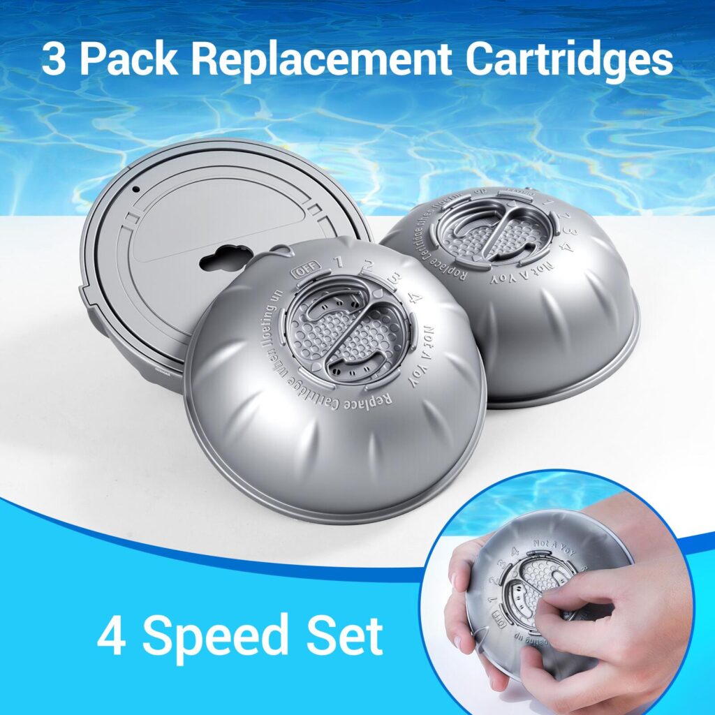
Image 4: Complete Maintenance System — Positioning the Product as a Solution
This image zooms out from individual components and reframes the product as a complete system.
The silver and mineral cartridges are shown working together in water, supported by four icon-based benefit highlights:
- Reduced chemical use
- Less frequent shocking
- Gentler water feel
- Simplified visual monitoring
From a main image design strategy perspective, this image shifts the conversation from parts to outcomes. Customers no longer see cartridges—they see easier maintenance, cleaner water, and fewer hassles.
This image is essential because many Amazon buyers are not experts. They want reassurance that the product solves a real problem without adding complexity.

Image 5: Flip-Over Indicator — Visualizing Replacement Timing
One of the most powerful features of this filter cartridge system is its physical flip-over behavior. The fifth image exists solely to explain that.
We showed the cartridge gradually flipping over in water, paired with a clear “3–4 weeks replace” indicator. This visual storytelling removes guesswork from maintenance.
Instead of relying on timers, apps, or memory, the product physically signals when it is time to replace the silver cartridge.
From a design standpoint, this image reduces perceived effort. Customers can immediately understand that maintenance is intuitive, not technical. That reassurance is a major conversion driver on Amazon, especially for first-time buyers.
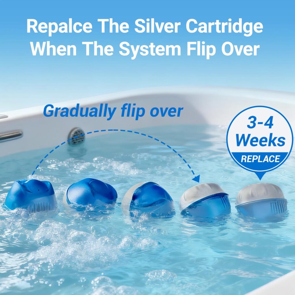
Image 6: Lifestyle Usage — Making the Benefit Personal
This image introduces a real person using the product in a relaxed water environment. The purpose here is emotional, not technical.
By showing the cartridge being held comfortably and confidently, we communicate:
- Ease of use
- Safety
- A more natural water experience
The supporting message emphasizes softer, gentler water, reinforcing the earlier benefit claims in a human, relatable way.
In Amazon main image design systems, lifestyle images like this are crucial. They help customers imagine ownership—not just functionality.

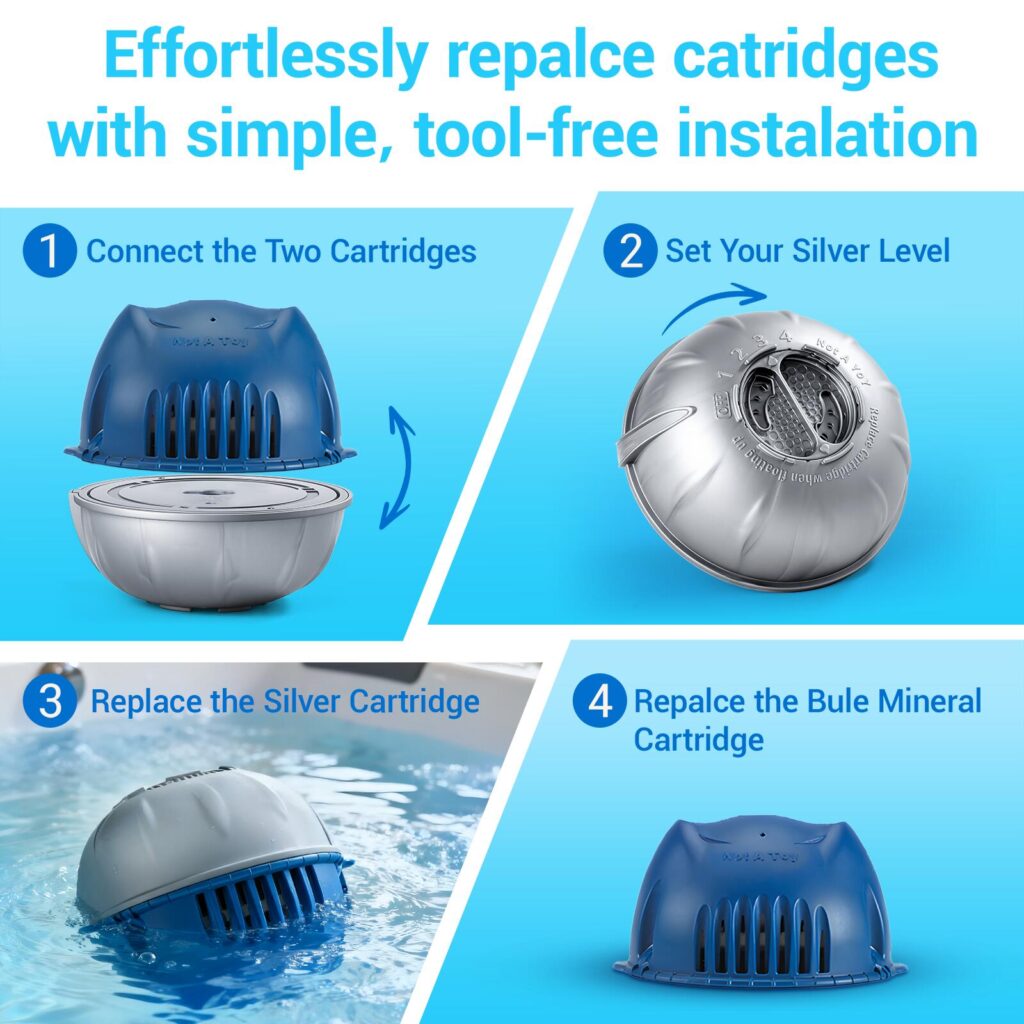
Image 7: Tool-Free Installation — Reducing Friction
The seventh image breaks the installation process into four simple steps:
- Connect the two cartridges
- Set the silver level
- Replace the silver cartridge
- Replace the mineral cartridge
We intentionally designed this as a tool-free, step-by-step visual guide. Each step is self-explanatory, supported by arrows and clean layouts.
This image addresses one of the most common Amazon objections:
“Is this complicated to use?”
By visually proving that installation is simple, we remove a major barrier to purchase.
How the Image Set Works Together
Each image in this Amazon Filter Cartridge main image design system has a specific role:
- Image 1 builds trust
- Image 2 explains structure
- Image 3 highlights value
- Image 4 positions the solution
- Image 5 demonstrates smart replacement logic
- Image 6 creates emotional connection
- Image 7 removes usability fears
Together, they form a narrative that moves the customer from awareness to confidence—without relying on long text descriptions.
This is the core philosophy behind effective Amazon main image design: every image answers one question, and no image tries to answer everything.
Why This Approach Converts on Amazon
Amazon shoppers skim. They scroll. They compare. This design system respects that behavior.
By structuring the image sequence around clarity, progression, and reassurance, we ensured that:
- The product’s complexity feels manageable
- The benefits feel tangible
- The maintenance feels effortless
The result is a visual experience that supports trust, reduces returns, and increases conversion rates.
Final Thoughts
A successful Main image design for Amazon Filter Cartridge products is not about visual decoration. It is about communication. When each image is designed with intent—explaining, guiding, and reassuring—the product speaks for itself.
This project demonstrates how thoughtful visual storytelling can transform a functional filter cartridge into a clear, compelling Amazon listing that educates customers before they ever read a single word.
At the end of the day, this is the standard we hold ourselves to: design that does not just look good, but works.
Designed and executed with conversion, clarity, and real user behavior in mind — AIRSANG.