Project overview
The client of this project mainly sells microneedles, microcrystalline needles, beauty equipment consumables and related personal care products. It hopes to enhance the product presentation and brand credibility of Shopee stores through more professional visual design. After the customer found us, he hoped that we would reorganize the product selling points for different models, specifications and adapted equipment, and design a set of store posters that take into account professionalism, beauty technology and sales conversion. We designed around product quantity, compatibility, material technology, usage scenarios and series specifications, allowing consumers to quickly understand product information on mobile devices while strengthening the store’s professional image in the personal care and beauty equipment categories.
| Services | Industry | Platform |
| shopee store design | Beauty and personal care | shopee |
| Project requirements | target market | design style |
| Improve click-through rate | Global | Professional cleanliness, luxury medical beauty, and sophisticated technology |
| project budget | Delivery content | Delivery time |
| ¥450 | 6 posters | 4 working days |
Project Challenges
The main challenge of this project is how to make microneedle and beauty consumables, which are smaller in size and similar in structure, clearly different on the Shopee page, while taking into account the sense of professionalism, hygiene and sales appeal. In the early stage of design, we first sorted out the different models, number of needles, number of packages, adapted equipment and core selling points, and analyzed the browsing habits of users in the personal care category and the visual performance of competing products. On this basis, we re-planned the information level, scene style and product display method of each poster to avoid duplication of selling points. At the same time, we focused on solving problems such as difficult to distinguish specifications, unintuitive compatibility, and difficult to reflect the professional value of the product, so that the entire set of visuals is unified and each has a clear sales task.
The first one: Use transparent texture and quantity to display enhanced consumable properties
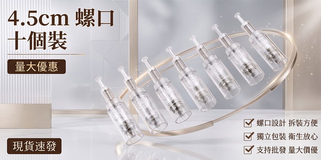
The first poster mainly displays the 4.5cm screw microneedle consumables and highlights the core sales message of “ten packs”.
This type of product is small in size. If it is just neatly placed on a white background, it will easily look ordinary, and it will not reflect the sophistication that beauty consumables should have. Therefore, we placed ten transparent microneedle consumables in an oblique arrangement on the right side of the center of the picture, and surrounded the products with circular golden lines, making the originally smaller consumables form a more complete and visually impactful main body.
For the background, we did not use a complex real beauty salon, but used light gray and white space, geometric walls and glass texture. This processing can reduce the interference of background information on transparent products, while using soft highlights to further enhance the details of the plastic shell and metal needle.
On the left side, we use large fonts to display core purchasing information such as “4.5cm screw mouth” and “ten packs”, so that users can directly identify the specifications and packaging quantity after entering the page. Below, the product value is supplemented by selling points such as “screw design”, “independent packaging” and “wholesale support”.
The whole poster is designed with a very clear purpose: to quickly communicate specifications, quantities and purchasing advantages. This structure is especially suitable for Shopee, because consumers usually slide product pictures quickly, and we need to let users judge whether the product meets their needs in a very short time.
Picture 2: Establishing brand class through professional beauty space
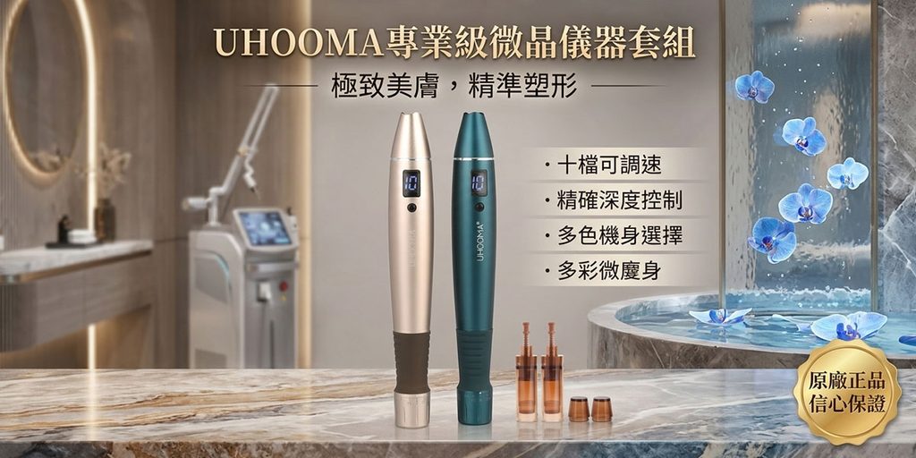
The second poster shows a microcrystalline beauty instrument set. Different from the first consumable product, this picture needs to emphasize the “equipment-level professionalism”.
Therefore, we set the scene in a high-end beauty care space and created an environmental association with a beauty salon or medical beauty care institution through elements such as marble countertops, warm-colored walls, beauty equipment, mirrors, and water features.
Two beauty instruments of different colors are placed in the center of the screen, making the products the absolute visual center. We did not add too many small products, but highlighted the body shape, display screen and overall proportions by placing them upright. Only a small amount of consumables are kept next to it as a supporting display to let consumers understand that this is a complete beauty care system.
The title “Professional grade microcrystalline instrument set” is responsible for the first layer of information transmission. Next, selling points such as “ten-speed adjustable speed”, “precise depth control” and “multi-color body selection” are used to help consumers understand the functional differences.
The biggest design focus of this piece is “scene endorsement”.
Beauty equipment is not an ordinary daily necessities, consumers will pay more attention to professionalism and credibility. Therefore, we did not choose an ordinary home bedroom or makeup table, but put the product into an environment closer to a professional beauty institution to visually improve the product positioning. Blue orchids, waterscapes and warm golden lights add a soft and beautiful feel to the cold and hard instrument atmosphere, making the picture professional without appearing too medical.
The third picture: Use cleanliness to highlight sterility and professional technology
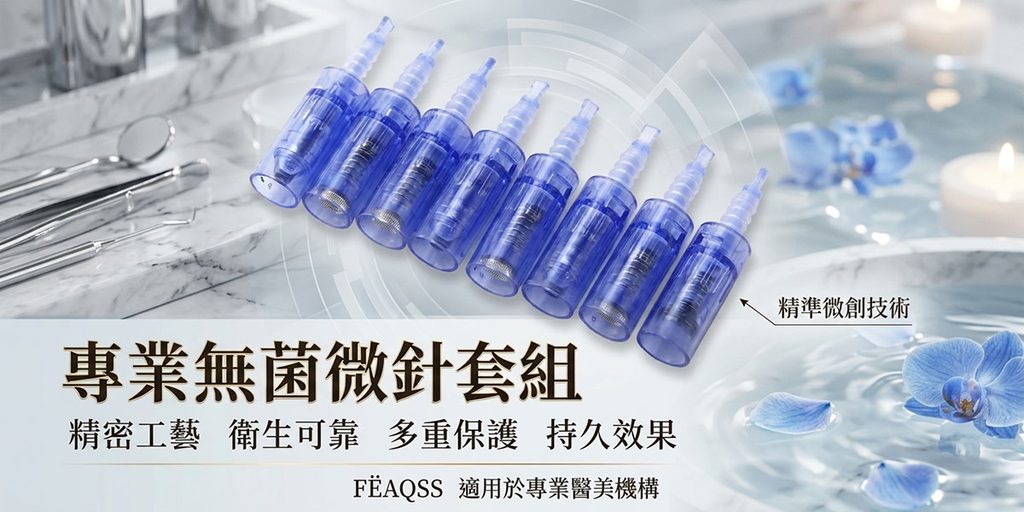
The third poster continues to show off microneedle supplies, but we switch the overall color palette significantly to icy blue and white.
This is because the theme of this picture is no longer the packaging quantity, but “professional sterile microneedle set” and “precision minimally invasive technology”. Since consumers are concerned about hygiene, safety, craftsmanship and reliability, we need to strengthen the sense of cleanliness through graphic language.
In the background, we add marble countertops, professional care tools, a soft focus beauty environment, and blue orchids. Cool colors can naturally convey the visual psychology of cleanliness, technology and professionalism, while not being as stiff as pure medical blue.
The product itself is made of blue transparent material, so we arranged multiple consumables at an angle and expressed the structural details through a larger proportion of the product. The transparent shell, internal spring and metal needle are clearer on the light background, so consumers can intuitively see the product structure.
The big title on the lower left assumes the visual focus. We use larger black and brown fonts to establish a sense of stability, and then combine it with information such as “precision craftsmanship, hygienic reliability, multiple protections, and long-lasting effects” to transform the product’s advantages from visual perception into clear selling points.
The label of “Precise Minimally Invasive Technology” on the right further emphasizes the professional use of the product.
This picture does not simply pursue beauty, but helps consumers establish a very important impression: this is a professional, sophisticated beauty consumable that pays attention to hygiene and safety.
Picture 4: Directly solve the compatibility issues that consumers are most concerned about
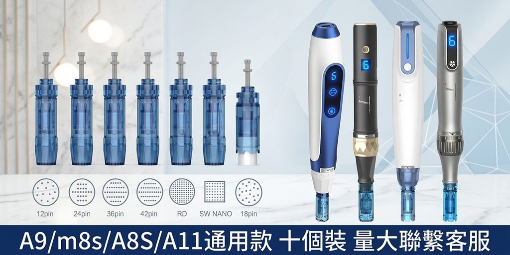
The fourth poster is completely different from the previous ones. It is a typical “Specifications and Compatibility Chart”.
When consumers purchase microneedle consumables, they often encounter a question: Can this needle be installed on their own beauty equipment?
If we only show the appearance of the product, consumers will still need to read a lot of product details, and may even abandon the purchase due to uncertainty. Therefore, this picture directly puts different specifications of microneedle consumables and multiple beauty pens on the same screen, visually telling consumers the product’s adaptability range.
The left side shows various needle types, including 12pin, 24pin, 36pin, 42pin, RD, SW NANO and 18pin specifications. We not only arrange the actual products, but also add corresponding needle cross-sections below so that users can judge the product from two dimensions: appearance and number of needles.
The right side displays different types of beauty instruments, reinforcing the concept of “universal adaptation” through the juxtaposition of multiple devices.
The amount of information in this picture is obviously greater, so we chose a very refreshing light blue geometric background and controlled the reading order through left and right partitions. The background is not responsible for emotional expression, but serves to display information.
The dark blue horizontal bar at the bottom further strengthens the core information such as “A9, M8S, A8S, A11 universal model”. The large dark area can quickly catch the eye and echo the blue elements on the product.
For Shopee product details, this one is very important because it directly solves the “adaptation doubts” in purchasing decisions, can reduce user consultation costs, and also helps reduce after-sales problems caused by buying the wrong model.
Picture 5: Highlighting the ten items and stable quality through simple display
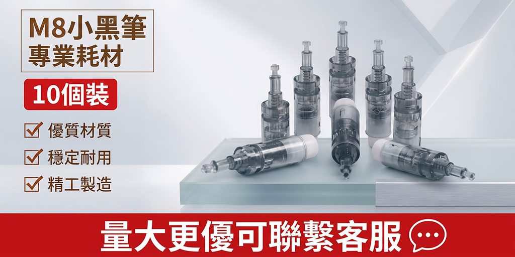
The fifth picture shows M8 small black pen professional consumables, also emphasizing the “10-pack”, but we did not repeat the suspended composition of the first picture, but switched to a more stable product display method.
On the right side of the screen, multiple transparent black consumables are placed on a three-dimensional exhibition stand, forming layers through the difference in height between the front and back. Some products are placed vertically and some horizontally. This combination can help consumers observe the consumable structure from different angles and make the picture more natural.
The background continues to use a light gray and ice blue system, and a few geometric lines are added to maintain the overall sense of technology.
On the left, we use a larger brown title to highlight “M8 Small Black Pen Professional Consumables”, and below we use a red “10 Pack” label to reinforce the quantity. Red is highly attention-grabbing in this relatively low-saturated visual set, quickly reminding consumers that this is a bulk-packaged product.
Further down, we use three concise check-box messages to emphasize “high-quality material”, “stable and durable” and “precision manufacturing” to help consumers quickly understand the quality selling points.
The large red area at the bottom is responsible for promotion and customer service guidance. “For larger quantities, please contact customer service” is not only a visual CTA, but also directly serves bulk purchasing users.
The core of this image is not to create a sense of luxury, but to convey stability, clarity and procurement efficiency. For consumable products, this design is often more effective than overly complex beauty scenes.
Picture 6: Enhance the impression of professional product lines through serialized displays
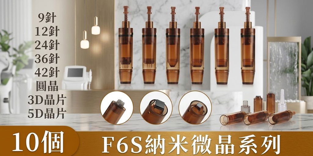
The sixth poster shows the F6S nanocrystalline series, which is the most informative product series picture in the entire set of visuals.
We first display products with different pin numbers and structures, including 9-pin, 12-pin, 24-pin, 36-pin, 42-pin, round wafer, 3D wafer, 5D wafer, etc. Through the vertical text list on the left, users can quickly understand the scope of the product series.
Six upright products are used as the main display in the center of the screen, giving the product models a sense of series. The brown-gold transparent material itself has a certain sense of luxury, so we did not use a cold blue background, but chose a warmer beauty space to unify the product color with the environment.
Elements such as beauty equipment, lamps, marble and green plants are still retained in the background, allowing consumers to understand the actual application areas of the product.
The three circular partial enlargements below are very critical. The biggest difference in microcrystalline consumables is often concentrated in the structure of the needle and chip. If only the complete product is displayed, it will be difficult for consumers to see the details clearly. Therefore, we show different working end structures through circular close-ups to make the product differences clear at a glance.
Some scattered consumables are added to the lower right corner to enhance the feeling of “complete series” and “multiple specifications to choose from”.
The brown-gold horizontal bar at the bottom highlights “10 F6S Nanocrystalline Series” in large fonts, which not only summarizes the product, but also forms a stable visual finish.