Introduction
Wholesale eCommerce requires a fundamentally different approach from traditional retail design. Instead of appealing to impulse-driven shoppers, wholesale buyers prioritize efficiency, clarity, pricing transparency, and trust. When designing the Shopify experience for Everful Wholesale, our goal was to create a digital environment that feels professional, easy to navigate, and optimized for bulk purchasing behavior.
Rather than focusing purely on aesthetics, we approached this project through the lens of usability, conversion flow, and buyer psychology. Every visual decision—from layout structure to product presentation—was carefully crafted to reduce friction and guide users toward inquiry or purchase.
This article explores how we designed the Everful Wholesale Shopify store, highlighting our design process, strategic thinking, challenges, and the final results achieved.
| Deliver Time | Category | Application Platform |
| 26days | Jewelry | shopify |
| Designers Involved | Cost | Effect |
| Nancy | $2800 | flow📈272% |
Understanding the Brand and Project Goals
Defining the Target Audience
The first step in our design process was identifying the core audience: wholesale buyers, distributors, and small business owners. Unlike retail customers, these users:
- Prefer quick access to product catalogs
- Require clear pricing structures
- Value trust signals and reliability
- Often browse with intent, not curiosity
This understanding shaped every design decision moving forward.
Establishing Key Objectives
We aligned the project around several core goals:
- Create a clean, scalable Shopify layout
- Improve product discoverability
- Highlight wholesale advantages (pricing, MOQ, shipping)
- Build trust through structured content
- Ensure a seamless mobile experience
Homepage Design Strategy
Creating a Strong First Impression
The homepage acts as the digital storefront. For Everful Wholesale, we designed a hero section that immediately communicates:
- What the brand offers
- Who it serves
- Why it’s different
We used bold lifestyle imagery combined with concise messaging to establish credibility within seconds.
Structuring for Clarity and Flow
Instead of overwhelming users, we organized the homepage into a logical flow:
1. Hero Section
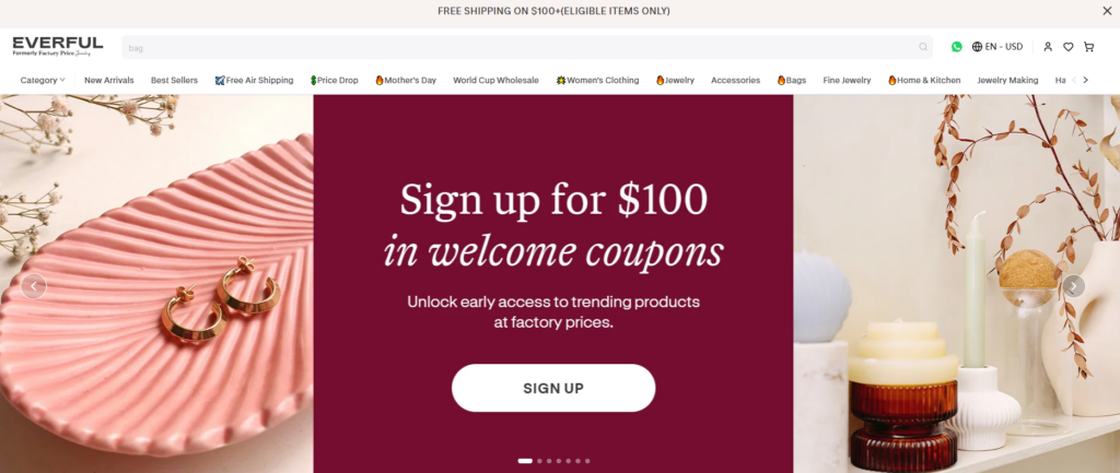
Clear headline + supporting text + strong CTA
2. Category Navigation
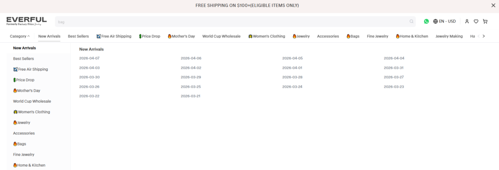
We introduced visually distinct product categories, allowing users to jump directly into relevant collections.
3. Value Proposition Section

We highlighted key wholesale benefits such as:
- Competitive pricing
- No minimum order requirements
- Fast global shipping
4. Featured Products
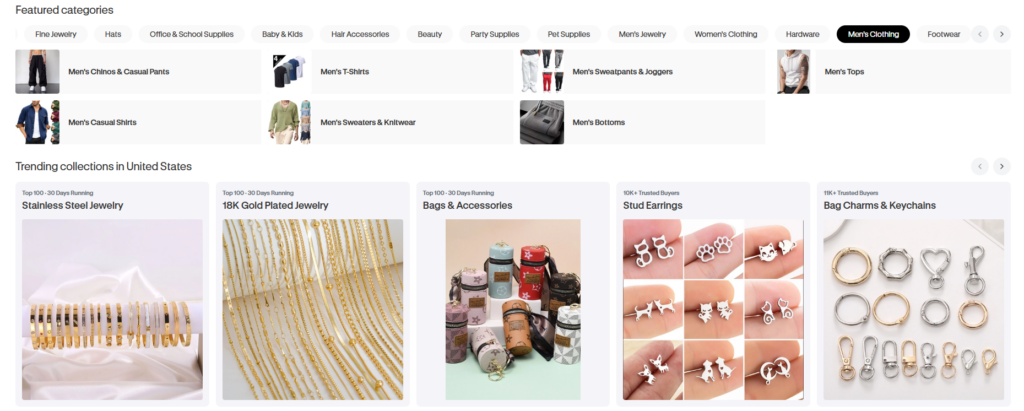
Carefully selected items with clean layouts to maintain visual consistency.
5. Trust Signals
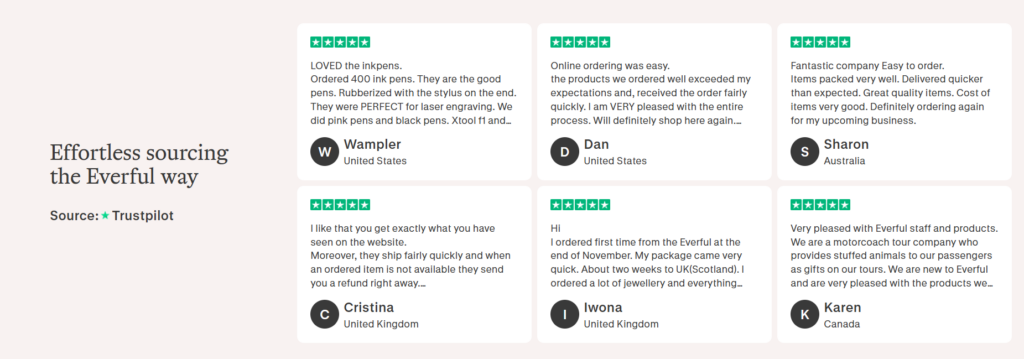
Customer testimonials, brand story, and business credibility elements were integrated to build confidence.
Visual Design Approach
We intentionally avoided overly decorative elements. Instead, we focused on:
- Neutral color palettes for a professional tone
- Consistent spacing to enhance readability
- Clear typography hierarchy
- High-quality product imagery
This approach ensures the design feels modern, reliable, and easy to scan.
Collection and Product Page Optimization
Improving Product Discovery
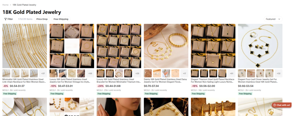
Wholesale buyers often browse large inventories. To support this behavior, we designed collection pages that:
- Use clean grid layouts
- Emphasize product thumbnails
- Maintain consistent spacing and alignment
We ensured that users can quickly scan multiple products without visual fatigue.
Product Page Design Principles
The product page is where conversion happens. Our design focused on:
Clear Information Hierarchy
We structured content to highlight:
- Product name
- Pricing details
- Key features
- Bulk purchase incentives
Visual Emphasis
Large product images allow users to evaluate quality and details.
Simplified Decision-Making
We minimized distractions and ensured that the “Add to Cart” or inquiry actions remain highly visible.
Designing for Wholesale Buyer Behavior
Reducing Friction in Navigation
Wholesale users value speed. We optimized navigation by:
- Keeping menus simple and structured
- Reducing unnecessary clicks
- Ensuring consistent layout patterns
Enhancing Trust Through Design
Trust is critical in wholesale transactions. We incorporated:
- Clean “About” and brand story sections
- Clear shipping and policy pages
- Consistent branding across all pages
Mobile Experience Optimization
A significant portion of users browse on mobile devices. We ensured:
- Responsive layouts
- Touch-friendly navigation
- Optimized image scaling
Our Design Process
Research and Benchmarking
We analyzed leading wholesale Shopify stores to identify:
- Best practices in layout structure
- Effective visual hierarchy
- Common user pain points
This research informed our design direction.
Wireframing and Structure Planning
Before moving into visual design, we created structured wireframes to:
- Map out user journeys
- Define content placement
- Ensure logical flow across pages
Visual Design Execution
We translated wireframes into a polished design by:
- Applying consistent typography
- Selecting cohesive color schemes
- Designing reusable components
This ensured scalability and consistency throughout the site.
Challenges We Faced
Balancing Simplicity and Information Density
Wholesale websites require a lot of information, but too much content can overwhelm users. We addressed this by:
- Prioritizing essential information
- Using visual hierarchy to guide attention
- Breaking content into digestible sections
Maintaining Brand Identity While Optimizing UX
We needed to ensure the design reflects the brand while still being conversion-focused. This required careful alignment between:
- Visual style
- Content tone
- Functional layout
Handling Large Product Catalogs
Organizing a wide range of products without clutter was a key challenge. We solved this through:
- Structured category systems
- Consistent product card design
- Clear navigation pathways
Our Solutions and Design Methodology
Modular Design System
We developed a flexible design system that allows:
- Easy content updates
- Consistent styling across pages
- Scalable expansion for future products
Conversion-Focused Layouts
Every section was designed with a purpose:
- Guide users
- Reduce hesitation
- Encourage action
Content-Driven Design
Instead of relying on visual effects, we emphasized:
- Clear messaging
- Structured content
- Strategic placement of CTAs
Results and Impact
After implementing the new design, the Shopify store achieved:
- Improved navigation clarity
- Enhanced product visibility
- Stronger brand perception
- Better mobile usability
Most importantly, the site now provides a smoother and more intuitive experience for wholesale buyers, aligning with their expectations and behaviors.
Conclusion
Designing a Shopify wholesale store requires more than visual appeal—it demands a deep understanding of user behavior, business goals, and conversion strategy. Through a structured approach focused on clarity, usability, and trust, we successfully transformed Everful Wholesale into a high-performing digital storefront.
At AIRSANG, we specialize in designing conversion-driven Shopify experiences tailored for cross-border eCommerce brands. From homepage strategy to product presentation, our focus is always on helping businesses build scalable, user-friendly, and high-converting online stores.