


Giỏ hàng hiện không có sản phẩm nào.

Creating a successful Shopify store is not only about selling products. It is about building an experience that emotionally connects with visitors, guides them naturally through the website, and turns curiosity into trust.
For collectible and designer toy brands, this challenge becomes even more important. The audience is highly visual, emotionally driven, and deeply connected to aesthetics, community culture, and product presentation. A generic storefront cannot create the excitement or emotional engagement these customers expect.
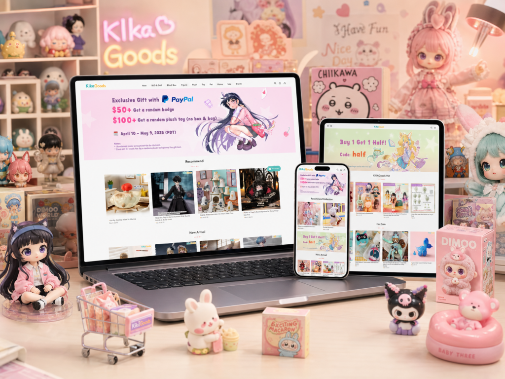
When working on the design direction for KikaGoods, the goal was to create a Shopify shopping experience that felt immersive, playful, premium, and easy to explore. Instead of relying on aggressive sales tactics or cluttered layouts, the website needed to guide visitors through collections naturally while reinforcing the personality of the brand.
This project focused heavily on visual storytelling, homepage structure, collection organization, product discovery, and overall user experience design. Every section was carefully planned to help the brand feel more memorable while improving the shopping journey across desktop and mobile devices.
In this article, we will break down how the Shopify design process was approached, the challenges we faced, the methods used to improve the experience, and how the final result aligned with modern eCommerce design expectations.
| Thời gian giao hàng | Loại | Nền tảng ứng dụng |
| 17 ngày | Decorative Figurines | shopify |
| Các nhà thiết kế tham gia | Trị giá | Tác dụng |
| Nancy | $1700 | Sales📈244% |
Before designing any Shopify store, the first step is understanding the brand itself.
For this project, the visual identity already carried a strong personality. The products featured collectible toys, blind boxes, designer figures, and anime-inspired merchandise. These products naturally appeal to audiences who enjoy creativity, discovery, and visual excitement.
Because of this, the website could not feel overly corporate or minimal in a cold way. At the same time, it also needed enough structure and organization to avoid becoming visually overwhelming.
The challenge was finding the balance between:
This balance became the foundation for the entire Shopify design strategy.
The homepage needed to instantly communicate the brand personality.
For highly visual eCommerce brands, users often decide within seconds whether the website feels trustworthy and interesting. Because of this, the opening visual experience became one of the most important parts of the project.
The design needed to:
Instead of overcrowding the homepage with too many competing sections, the structure focused on rhythm and visual flow.
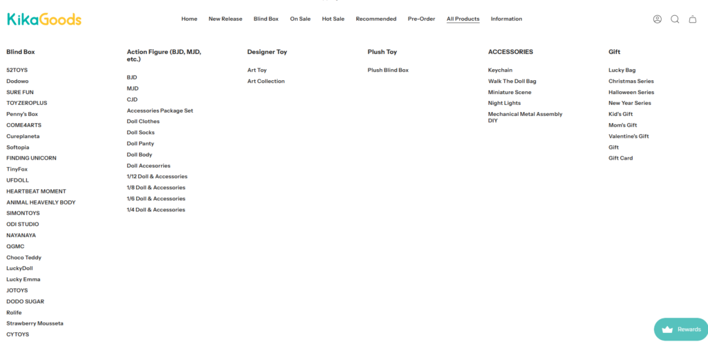
One of the biggest challenges for collectible-focused Shopify stores is organization.
Large product catalogs can quickly feel chaotic if the customer cannot easily browse categories, themes, or product styles.
To solve this, the design direction emphasized:
This helped customers move through the website more naturally without feeling overwhelmed.
A collectible store should feel exciting.
Customers browsing these products are not simply buying necessities. They are exploring hobbies, interests, aesthetics, and emotional purchases.
Because of this, the website experience needed moments of visual excitement throughout the shopping journey.
The Shopify design approach focused on:
These details helped the website feel energetic without sacrificing usability.
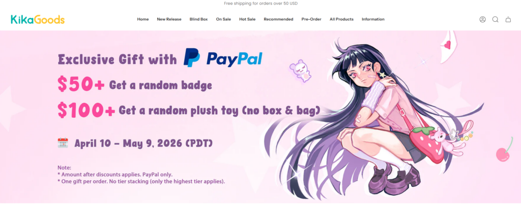
The homepage banner became the emotional entry point of the website.
Instead of creating a static and overly simple opening section, the visual direction focused on energy, color, and promotional clarity.
The hero section was designed to achieve several goals at once:
Large campaign visuals helped showcase:
This allowed visitors to immediately understand what was important on the website.
The homepage layout intentionally guided the eye downward.
Spacing, visual layering, banners, and product previews were arranged in a way that encouraged users to continue exploring instead of bouncing after viewing the first screen.
This approach helped improve the browsing experience naturally.
Many collectible stores make the mistake of becoming visually overloaded.
Too many colors, banners, animations, and products can quickly make a website feel chaotic.
For this Shopify design, the visual hierarchy remained controlled through:
This balance helped maintain excitement while preserving usability.
Collection pages play a critical role in Shopify user experience.
For this project, collection pages needed to feel:
The product grids were designed with strong consistency in:
This consistency helped improve the overall browsing rhythm.
Rather than allowing all products to blend together, the website introduced stronger category identity.
Different collections used:
This helped customers understand product categories more quickly while creating a more curated shopping experience.
A large percentage of Shopify traffic now comes from mobile devices.
Because of this, mobile responsiveness became a major design priority throughout the project.
The mobile collection experience focused on:
The goal was making browsing feel smooth without overwhelming smaller screens.
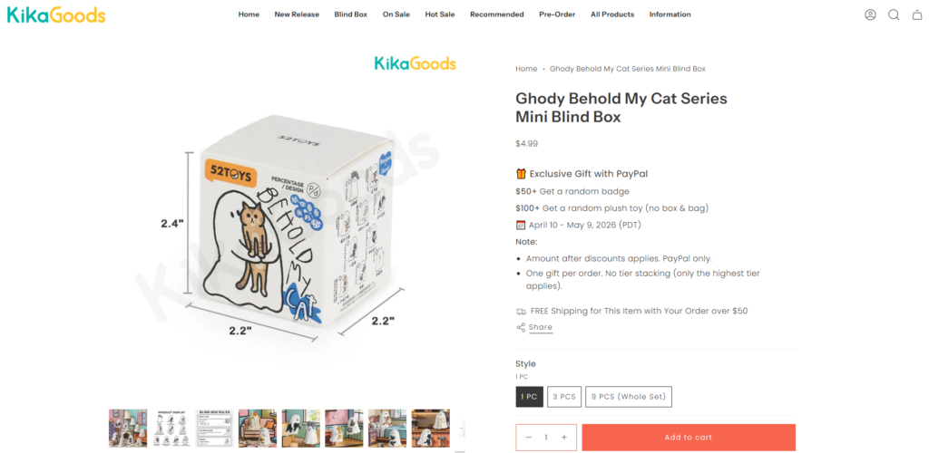
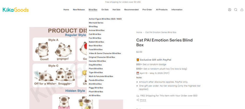
Product pages are where browsing turns into purchasing decisions.
For this reason, product page clarity became extremely important.
Instead of overcrowding the layout with excessive distractions, the product page structure focused on:
This helped users focus on the products themselves.
Collectible products rely heavily on presentation quality.
The design direction emphasized:
This approach helped products feel more premium while giving shoppers more confidence.
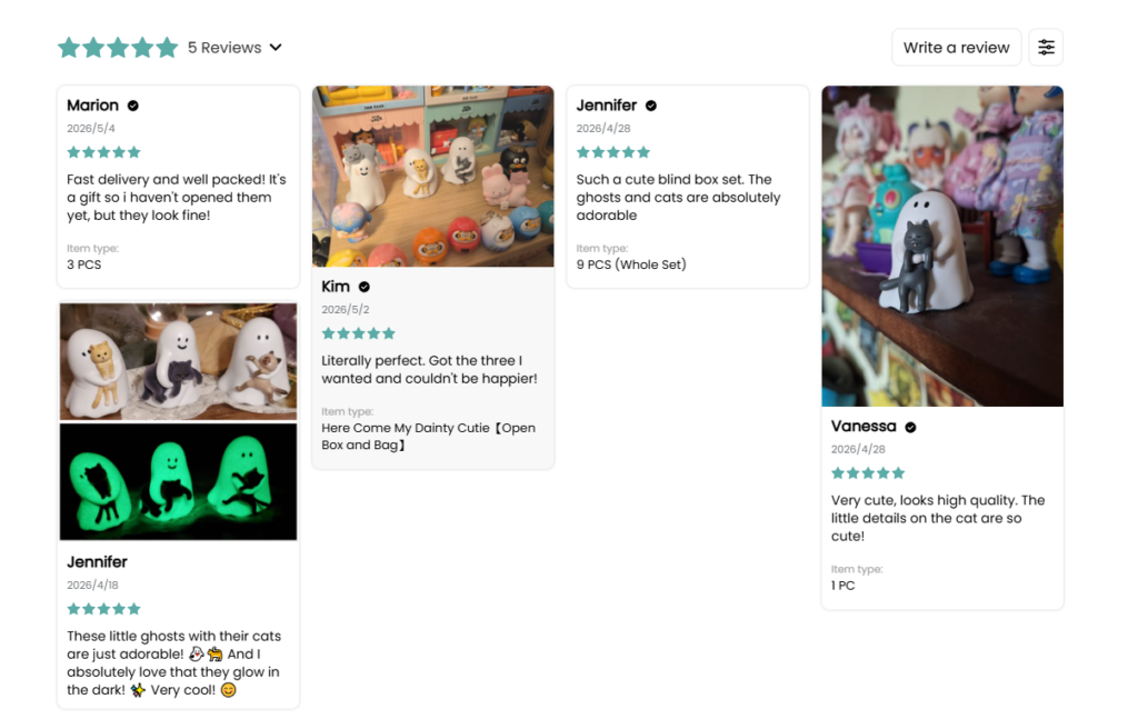
Many collectible purchases are emotional rather than purely practical.
Because of this, the product pages also needed to support excitement and anticipation.
The design helped accomplish this through:
These details helped reinforce the feeling of exclusivity and discovery.
The website navigation needed to remain easy to understand despite having many categories and product types.
The header experience focused on:
This helped users find products more quickly while reducing friction.
Search is especially important for collectible-focused stores because customers often browse for specific characters, themes, or product lines.
The search experience was designed to feel:
This improved overall usability and helped customers reach products more efficiently.
The visual direction avoided making every section compete aggressively for attention.
Instead, colors were used strategically to:
This approach created a more comfortable browsing experience.
Typography played an important role throughout the Shopify design process.
The website needed fonts that felt:
Typography hierarchy helped visitors quickly identify:
This improved both aesthetics and usability.
One major challenge was balancing visual excitement with organization.
Because collectible stores naturally contain:
…the risk of visual overload was high.
The solution focused on:
This helped maintain clarity while preserving the brand personality.
Another challenge involved keeping the experience visually consistent across:
Consistency became essential for making the website feel more premium and trustworthy.
To solve this, the design system maintained:
The final Shopify website experience achieved several important outcomes.
The new design helped create:
Most importantly, the website now feels aligned with the emotional expectations of collectible-focused audiences.
Instead of functioning only as a product catalog, the Shopify store became a branded experience that encourages exploration, discovery, and engagement.
Modern Shopify stores compete heavily on experience.
Customers no longer judge websites only by product quality. They also evaluate:
This is especially true for visually driven industries like collectibles, fashion, lifestyle products, and designer merchandise.
A strong Shopify design can:
That is why thoughtful design strategy matters far beyond aesthetics alone.
Thiết kế một Shopify experience for a collectible-focused brand requires more than attractive visuals. It requires understanding how customers browse, what emotionally engages them, and how visual storytelling can support purchasing behavior naturally.
For this project, every section was carefully structured to balance creativity, usability, and product presentation. From the homepage flow to collection organization and product page clarity, the goal remained consistent: create a shopping experience that feels immersive, exciting, and easy to explore.
At the end of the process, the website became more than just an online store. It became a visual experience that reflects the brand personality while supporting long-term eCommerce growth.
This type of strategic Shopify design approach is exactly what AIRSANG focuses on — helping brands create visually engaging, conversion-friendly online stores that feel modern, memorable, and professionally crafted.


