Project overview
The client wanted to create a set of store posters with a more branded and summer atmosphere for his SHEIN platform women’s shoe store, so he approached us for overall visual design. The client mainly sells women’s sandals, slippers, high heels, casual shoes and other footwear products. It hopes to get rid of the traditional way of simply displaying products in e-commerce pictures and enhance the attractiveness of the store through a more scenic and fashionable visual. Combining SHEIN’s young, fashionable, and fast-browsing platform features, we designed around summer vacations, coastal life, and women’s outfits. We integrated different shoe styles into unified model shapes, Mediterranean architecture, and natural light scenes. We also took into account product display, category shopping guides, and series promotions to make the entire store visually more unified, refined, and recognizable.
| บริการ | Industry | แพลตฟอร์ม |
| shein store design | Shoes and bags | เชอิน |
| Project requirements | target market | design style |
| Improve click-through rate | ระดับโลก | Mediterranean vacation feeling|light luxury and elegance|natural relaxation |
| project budget | Delivery content | Delivery time |
| ¥600 | 7 posters | 5 working days |
Project Challenges
The challenge of this project is that the client has many styles of women’s shoes. It is necessary to highlight the differences in different shoe types and colors, and to avoid the entire set of SHEIN store posters from appearing visually cluttered and repetitive. We need to simultaneously solve product recognition, naturalness of model outfits, scene unity, and rhythm changes between different posters. In the early stage, we first sorted out the shoe categories, target consumer groups and platform browsing habits, and then unified the visual direction of summer vacation and the Mediterranean coast, and planned the colors, fonts, model shapes, scene elements and the display focus of each poster to ensure that the subsequent design not only maintains a unified brand sense, but also allows each picture to assume different product display and shopping guide functions.
The first picture: Summer Signature – using two models to establish a summer brand impression
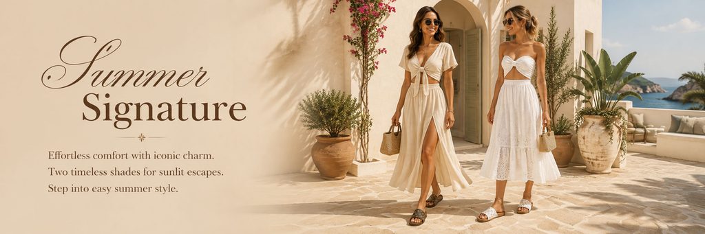
The first poster serves as the “main visual” in the entire set of visuals, so we did not directly use a large-area product still life, but chose two female models to appear together.
The scene is set in a Mediterranean-style seaside vacation home. Beige building walls, arched door openings, clay pots, green plants, flowers and distant sea views together create a rich but not overly complicated summer vacation atmosphere. Sunlight enters the picture from the side of the building, forming natural plant projections on the walls and ground, making the entire scene more realistic and giving the picture a richer spatial hierarchy.
We arranged the two models in the right area, allowing the characters to assume the main visual focus, while leaving a large clean space on the left side for typesetting titles and auxiliary copy.
“Summer Signature” features an elegant serif and handwritten font combination. The curves of “Summer” are softer and more romantic, while “Signature” maintains a strong sense of stability. The two fonts form an obvious visual hierarchy.
The models’ clothing was in white and beige tones that harmonized with the background while preventing the clothing from taking away attention from the shoes. The two models were paired with sandals of different colors and styles. Through real on-foot display, consumers can quickly understand the actual wearing effect of the shoes in scenes such as vacation, travel, and beach walks.
We wanted the first image to first establish a feeling – this is not simply selling a pair of shoes, but selling a relaxed, sophisticated, sun-filled summer lifestyle.
The second picture: Effortless Style for Sunny Days——Enhance the real sense of wear of a single shoe
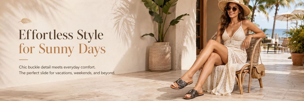
The second poster further moves from the brand atmosphere to the expression of a single product.
We chose a composition with a model sitting on a wicker chair to make the character’s posture more relaxed. Compared with the standing model, the sitting position can naturally shorten the distance between the shoes and the visual center, and at the same time, the leg lines form an obvious visual guide, making it easier for consumers to notice the sandals on their feet.
The scene still continues the Mediterranean resort style, but we reduced the architectural elements and focused the visual focus on the sun, wicker chairs, palm trees, and open seaside terraces.
The title “Effortless Style for Sunny Days” directly strengthens the three core keywords of “relaxation, sunshine, and daily life”.
In terms of fonts, we continue to use serif fonts with a fashionable magazine feel. At the same time, we create a slight color distinction through brown and light caramel colors, so that the text has a sense of presence without destroying the soft texture of the background.
This image focuses on black printed sandals. The dark upper creates a clear contrast with the overall light-colored scene, so the product can naturally become the visual focus even if it is not exaggerated.
Through this design, we hope to make consumers realize that this pair of shoes is not only suitable for the beach, but also suitable for weekends, travel, vacations and daily leisure scenes, thereby expanding users’ imagination of the scope of product use.
The third picture: Summer Ease – expressing lightness and comfort through dynamic composition
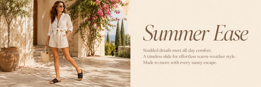
The third poster adopts the visual method of left and right columns.
On the left side is a walking model, and on the right side, a large area of white space is used to display the “Summer Ease” title and product copy.
Compared with the previous two, the biggest change in this poster is the “dynamic sense”.
The model does not stand still, but is in a natural walking state. The hem, hair, leg movements, and body posture all work together to create the feeling of effortless movement. Such visual processing can help us strengthen the “comfortable” and “lightweight” attributes of the shoes.
The background continues to maintain a uniform warm color stone, flowers, green plants and seascape, but we control the complexity of the picture to a low level so that consumers can quickly focus on the characters and shoes.
Use minimal white space on the right side to provide visual breathing space for the picture.
“Summer Ease” uses a larger serif font and adds a feminine sense of fashion through the slanted font. The copy below is kept in a smaller font size to allow the title, product selling points and scenes to form a clear information hierarchy.
This composition is particularly suitable for the brand display area in the middle of the store, because it can reduce the visual density during continuous browsing, change the rhythm of the page, and avoid fatigue caused by all posters using similar compositions.
Photo 4: Coastal Charm – truly integrating shoes into coastal lifestyle
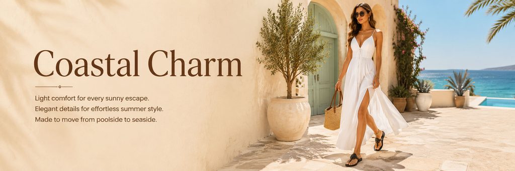
The fourth poster further strengthens the visual theme of “Coastal Vacation”.
We chose a more open seascape environment, allowing the blue water to become the obvious color in the picture for the first time.
With the extensive use of off-white and warm brown throughout the series, adding an appropriate amount of ocean blue can bring visual refreshment while further emphasizing summer, seaside and travel attributes.
The model wore a white dress and black flower-decorated sandals as she walked naturally in front of the seaside building. Black shoes contrast sharply with a pure white dress, so consumers can quickly observe the shape of the shoes.
The title “Coastal Charm” is placed on the left side in a large serif font, with a large amount of soft wall next to it as the text background.
We did not add complex product selling point icons, nor did we use eye-catching price, discount or promotion labels, because this stage is more important to establish a sense of product value.
For women’s footwear products, when consumers can associate the product with life scenes such as “seaside travel”, “resort hotel”, “swimming pool” and “summer dress”, the attractiveness of the product itself will often be significantly enhanced.
Therefore, we tell the story of the product through the environment, rather than simply explaining the product using words.
The fifth picture: Shop by Category – a natural transition from atmospheric visuals to product navigation
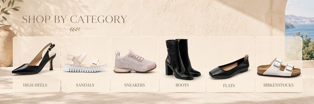
The fifth poster has different functions from the previous model scene.
This one is mainly used for classified navigation of women’s shoe stores.
We put the six major footwear categories of High Heels, Sandals, Sneakers, Boots, Flats and Birkenstocks on the same page so that consumers can quickly understand the product structure after entering the store.
In order to be consistent with the entire set of posters, we did not use the pure white background product classification common on traditional e-commerce websites, but continued to retain warm-colored walls, natural projections, clay pots, plants and distant sea views.
The six products are placed on separate cards with rounded corners, and each card maintains uniform size, white space, and product proportions.
This design can solve two problems.
First, it establishes a clear information structure that allows users to quickly differentiate between different footwear types.
Second, it makes the category navigation itself a visual content, rather than a module that is overly functional and lacks a sense of branding.
We kept the sunlight and plant shadows in the background, while using translucent light-colored cards to give the entire classification area a certain level without looking crowded.
“SHOP BY CATEGORY” uses larger word spacing and slim serif fonts to further enhance the quality of the image.
This type of classification vision is especially important for SHEIN stores, because users often have clear purchasing purposes. Clear category entrances can reduce the time of searching for products and help products of different styles gain more direct traffic entrances.
Picture 6: Sunlit Ease—Establishing a sense of series through multiple product displays
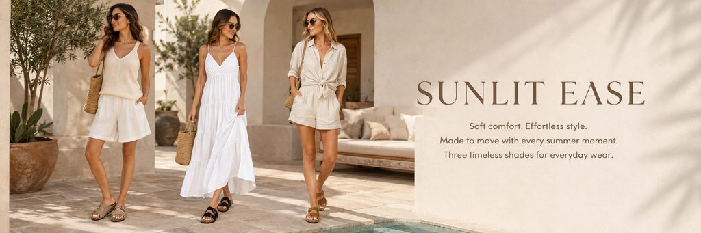
The sixth poster uses three models simultaneously to display women’s shoes in different colors and styles.
Throughout the series, this image serves as a “product series display”.
If only a single shoe model is constantly displayed, users will easily think that the store product selection is limited. So we used three models, three different outfits and three pairs of shoes in different colors to show that the brand has a richer product portfolio.
The three models wore beige, white and light khaki clothing respectively, keeping the whole picture unified while creating changes through different dressing methods.
Keep an appropriate distance between the characters and adopt natural standing postures, so that the picture will not have the rigid feeling of traditional “merchandise display”.
On the right side, a large area of wall is reserved for presenting copywriting such as “Sunlit Ease” and “Soft comfort. Effortless style.”
We deliberately control the number of words, letting the title bear the emotional expression, letting the model bear the product display, and letting the environment bear the brand atmosphere.
This division of labor can make the message clearer.
At the same time, the edge of the pool appears at the bottom of the frame, hinting at a resort setting through a small area of teal. Compared with directly adding large seascapes, this kind of detail is more restrained and makes the picture look more like a real brand advertisement.
The seventh picture: Petals of Summer——Use highly saturated colors to complete the visual ending
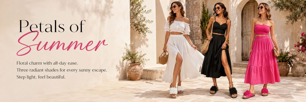
In the last poster, we added more obvious color changes while maintaining a unified overall style.
The first three models wore white, black and bright pink outfits respectively, with floral sandals of corresponding colors.
This design allows the product color to directly participate in the composition of the picture.
The previous posters mainly use off-white, brown and black to establish an elegant and comfortable summer tone, while the last one uses bright pink to create a visual memory point, so that the entire series will not appear dull due to too uniform colors.
The word “Summer” in “Petals of Summer” is written in a bright pink handwritten font, creating a visual echo with the pink garment and pink floral sandals on the right.
This kind of design does not simply add bright colors, but establishes a unified color logic through copywriting, clothing and products.
The three models displayed shoes of different colors respectively, allowing consumers to quickly understand the multi-color options of the same series of products.
We made the characters stand in the same Mediterranean architectural environment, and continued to use green plants, clay pots, stones and natural sunlight to ensure that even with the addition of highly saturated pink, the entire picture still belongs to the same visual system.
This poster can not only be used as a series of product promotion pictures, but also very suitable as the end of the summer theme visual of the entire store.