Project overview
The client is a cross-border ecommerce brand that specializes in pet supplies. Its products cover multiple categories such as pet leashes, harnesses, cat interactive toys, plush toys, and pet cleaning supplies. As Shopee’s store products continue to enrich, the original visual lacks a unified brand expression, and it is difficult to intuitively present the usage scenarios and core selling points of different products. Therefore, the customer came to us and hoped to redesign a set of more attractive store posters. We focus on the browsing and consumption characteristics of the Shopee platform, with real pet life scenes as the core, integrating owner interaction, product functions and purchase needs into the picture. At the same time, we establish differentiated color matching and layout for different categories, so that the entire store can maintain a unified and warm pet brand tone and help consumers quickly understand the value of the product.
| บริการ | Industry | แพลตฟอร์ม |
| shopee store design | pet supplies | ช้อปปี้ |
| Project requirements | target market | design style |
| Improve click-through rate | ระดับโลก | Warmth · Natural · Vitality |
| project budget | Delivery content | Delivery time |
| ¥450 | 6 shopee posters | 4 working days |
Project Challenges
The core challenge of this project is to establish a unified Shopee store vision with a large number of product categories, while allowing different products such as leashes, harnesses, pet toys and cleaning products to have clear selling points. In the early stage of design, we first sorted out the customer’s existing product information, functional features and target consumer groups, and analyzed the usage scenarios of pet products and the browsing habits of Shopee users. Then, we refined the core selling points for each product, planned the interaction between characters, pets, and products, and determined the scene, color matching, fonts, information level, and CTA position in advance, focusing on solving problems such as unprominent products, disconnection between scenes and functions, inconsistent poster styles, and overcrowding of information.
1. Pet retractable leash: Use real walking scenes to establish first-attraction attraction
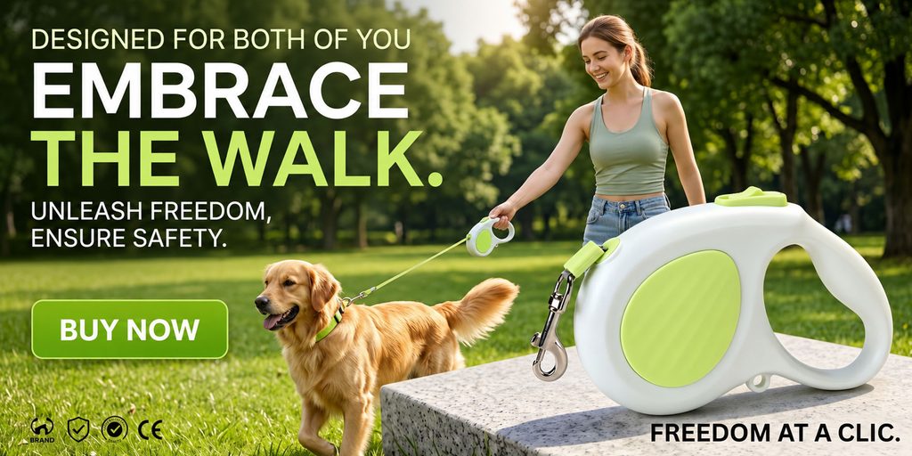
The first poster shows a pet retractable leash. We did not choose the conventional product display on a white background, but directly put the owner, golden retriever dog and leash into a sunny outdoor park.
For traction rope products, what consumers really care about is “how it feels when using it.” Therefore, we let young women take their dogs for a walk naturally, and connected the pet’s movements through characters holding tractors and leashes, so that consumers can understand the purpose of the product without reading a lot of instructions.
The main body of the traction rope is further enlarged on the right side of the screen, making the product the second visual center. This kind of processing solves common problems in scene graphs: if you only emphasize people and pets, the product will be easily overwhelmed by the environment; if you only zoom in on the product, it will lack a real sense of use. Therefore, we use a combination of “real usage scenarios + large product close-ups”, taking into account both emotional expression and product display.
In terms of color, we extracted the fluorescent green of the product itself and extended it into the title “THE WALK” and the purchase button. The greenery naturally echoes with the park grass and trees, giving the entire picture a distinct outdoor feel.
“EMBRACE THE WALK” is processed in large bold font. We hope that consumers will first feel the core concept of “freedom to walk” when entering the page, instead of first facing complicated parameter descriptions. “BUY NOW” at the bottom uses a highly saturated green button to establish an action entrance through obvious color blocks.
This poster actually plays a very important role in guiding emotions in the store: first, let consumers imagine themselves walking with their pets, and then further focus on the traction product itself.
2. Funny Cat Stick Poster: Let interactive actions directly explain product value
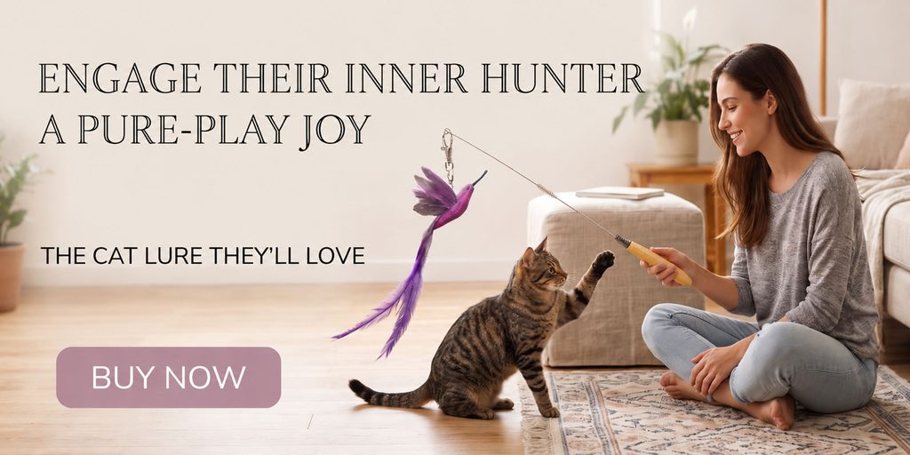
The second poster shows an interactive cat wand.
We chose a bright, soft home environment for this product, and arranged for the owner to sit on the carpet and interact with the cat. Compared with displaying the cat tea stick alone, this scene makes it easier for consumers to understand the companionship experience that the product can bring.
In the picture, the cat raised its front paws and actively pounced on the feather toy, while the owner interacted with it holding a cat teasing stick. This action is crucial because it directly expresses the core value of the product – stimulating the cat’s instinct to hunt and chase.
We did not add a large number of selling point icons to the screen, but retained a large left blank area and used the title “ENGAGE THEIR INNER HUNTER” as the main visual information. The title uses an elegant, high-contrast serif font, which is a clear departure from the first outdoor leash poster.
This font choice also strengthens the home feel and lifestyle attributes of the picture.
The entire background uses cream white, light wood colors and soft gray to minimize environmental interference, making the purple feathers the most eye-catching small area of color in the picture. Consumers’ eyes will naturally move from the title to the feathers, and then to the interacting cat and owner.
We treated the purchase button in a low-saturated pink-purple color to associate it with the color of the feathers, while preventing the button from being too commercial and destroying the soft life atmosphere.
For cat toys, what consumers need to see is not an isolated product, but “cats really want to play”. Therefore, this poster completes the product description through the action itself, allowing the visual to take on more sales communication tasks.
3. Pet plush toys: Use four products to establish a sense of series
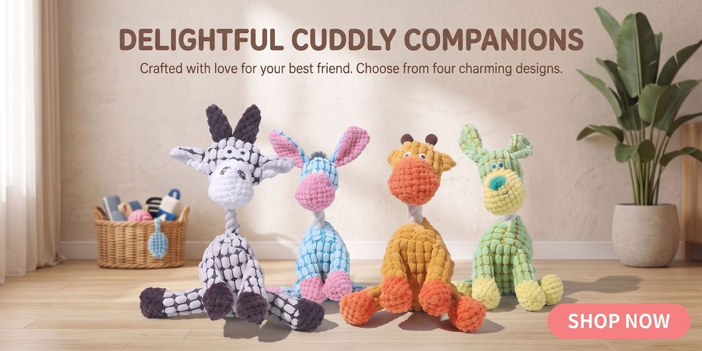
The biggest difference between the third poster and the first two is that we shifted the focus from character interaction to product series display.
This set of pet plush toys comes in four different shapes and colors, so we made the four products sit in the center of the picture at the same time, establishing a sense of series through a neat but not rigid arrangement.
The background continues to be a warm domestic space, but we deliberately reduced the number of furniture, retaining only curtains, storage baskets, green plants and wooden floors. This not only tells consumers that these products are suitable for home use, but also does not let complicated backgrounds steal the attention of the products.
The four toys already have rich colors such as gray and white, blue and pink, orange, and green, so we did not add a lot of decorative elements, but used off-white walls as a visual buffer.
The title “DELIGHTFUL CUDDLY COMPANIONS” is located at the top center and is finished in a warm brown color. The subtitle further informs consumers of the four different designs they can choose from, naturally directing their attention to the four products below.
In terms of composition, we let the four toys occupy a large area in the lower half of the picture and maintained a stable horizontal rhythm through size and spacing. Even if consumers quickly swipe the Shopee store page, they can immediately recognize that “this is a set of pet toys, and there are multiple styles.”
The coral pink “SHOP NOW” button is used in the lower right corner to add visual focus to the overall neutral space, while keeping in line with the lively attributes of the product.
The core of this poster is not to explain complex functions, but to strengthen the purchase impression of “cute, soft, and multiple options”.
4. Pet hair removal brush: Put the function demonstration into the visual center
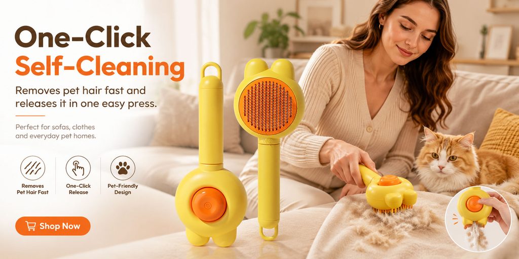
The fourth poster shows a pet hair cleaning tool, so we have a completely different logic for organizing the information.
Cleaning tools rely more on functional explanations than toy products. Consumers will care about how to use it, whether it is convenient, and whether it can clean hair quickly. Therefore, we adopt the combination of “functional title + product structure + actual use + local operation”.
The left side first emphasizes the one-click self-cleaning function through “One-Click Self-Cleaning”, in which “Self-Cleaning” uses highly saturated orange to quickly establish the core selling point.
The following further supplements the product for sofas, clothing and daily pet-raising households, and summarizes quick hair removal, one-click release and pet-friendly design through three simple icons.
The yellow product is enlarged in the middle area so that consumers can clearly see the brush head, handle and button structure. Yellow and orange are highly recognizable on their own, so we kept the entire scene creamy white and light brown, using color contrast to highlight the products.
On the right side, the owner is actually cleaning pet hair on the sofa, and the cat next to it further strengthens the context of “pet-raising family”.
We also added a partial enlargement of the button operation in the lower right corner to show the process of cleaning hair with one click through close-up actions. This kind of partial close-up can reduce the cost for consumers to understand the product mechanism.
For Shopee product visuals, this kind of “you’ll understand it when you see it” information is very important. Consumers tend not to stay for a long time to read the instructions, so we try to make one screen answer the three questions of “what is it, how to use it, and what are the benefits” at the same time.
5. Pet harness: use soft colors to enhance comfort and safety

The fifth poster shows a pet harness.
Harnesses are different from ordinary pet toys. In addition to paying attention to appearance, consumers also attach great importance to comfort, adjustment capabilities and whether the fixation is firm. Therefore, we set the core theme of this poster as “Comfort Meets Every Walk”.
We chose light purple as the main brand visual color because the product itself is a combination of purple, pink and fluorescent yellow. If you continue to use strong orange or green colors, it will destroy the color characteristics of the product itself.
The large purple serif headline on the left establishes a soft, light visual feel, and three selling point modules introduce the padded fit, adjustable shoulder straps and safety buckle design.
The three function points are matched with feather, adjustment and shield icons respectively, allowing consumers to quickly establish an information path of “comfort-adjustable-safety”.
In the center of the picture, we zoom in on the harness body so that consumers can directly observe the shoulder strap structure, adjustment buckles, metal rings and material details.
On the right side, a small dog wearing the same harness is arranged to interact with its owner. We deliberately make the products displayed separately and the products on pets appear at the same time, because consumers need to see the product structure clearly and know the effect of wearing it on pets.
The entire outdoor scene uses soft natural light, with a small amount of green plants and pink buildings as the background. Instead of using a complex street view, we kept the background with a shallow depth of field to keep the visual focus on the product, the pet, and the owner.
Through gentle colors and intimate interactions, this poster transforms “safety products” from cold functional descriptions into warmer daily companionship.
6. Roly-poly cat toy: expressing interest through dynamic composition
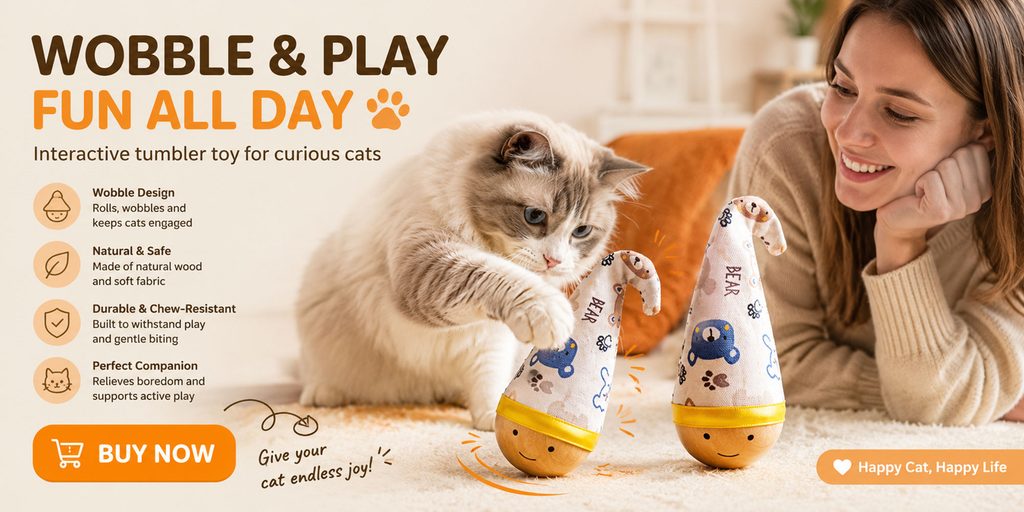
The final poster shows an interactive roly-poly cat toy.
The most important question for this type of product is: How can consumers understand at a glance that it “can move, play, and attract cats”?
Therefore, we did not use static product display, but let the cat stretch out its front paw to pat the toy. At the same time, we added a slight dynamic trajectory and orange action line at the bottom of the product to simulate the toy swinging left and right.
The title “WOBBLE & PLAY / FUN ALL DAY” directly takes “swing” and “play” as the core concepts. The orange color echoes the yellow color at the bottom of the product, keeping the entire image lively and unified.
Four groups of icons are further used on the left to illustrate product features such as swing interaction, natural and safe materials, bite resistance and durability, and boredom relief. We control the length of each group of text so that consumers can quickly browse it instead of facing long product descriptions.
Two roly-poly toys are displayed in the middle of the picture, and one of them has obvious interaction with the cat. The owner on the right is lying on the carpet watching the cat play, adding a sense of life through natural expressions.
We used off-white, light brown and orange as the main visual combination. Combined with the cat’s coat color, wooden products and home environment, the picture forms a warm and unified family atmosphere.
The orange “BUY NOW” button at the bottom has strong visual weight and can naturally take the purchase action after the user browses the product selling points.
The point of this poster is not to write out all the product parameters, but to allow consumers to quickly make an intuitive judgment: this is a fun toy that allows cats to actively participate and continue to interact.