


การแนะนำ
In the fast-growing retro gaming market, design plays a critical role in shaping user perception, engagement, and ultimately, conversion. When working on the ช็อปฟี่ store for LITNXT, our primary objective was to create a seamless digital experience that bridges nostalgia with modern usability.
Rather than overwhelming users with excessive features or complex interactions, we focused on clarity, emotional storytelling, and structured navigation. The result is a Shopify store that not only showcases products effectively but also builds trust and encourages purchase decisions across global audiences.
This case study explores how we approached the design of the LITNXT store—from homepage structure to product presentation—highlighting our design methodology, challenges, and outcomes.
| ระยะเวลาจัดส่ง | หมวดหมู่ | แพลตฟอร์มแอปพลิเคชัน |
| 26days | เครื่องเล่นเกมคอนโซล | shopify |
| นักออกแบบที่เกี่ยวข้อง | ค่าใช้จ่าย | ผล |
| แนนซี่ | $2800 | flow📈272% |
Understanding the Brand and Objectives
Defining the Core Direction
LITNXT operates in a niche that blends retro gaming culture with modern handheld technology. This meant the design needed to achieve two things simultaneously:
- Evoke nostalgia for classic gaming
- Deliver a clean, high-performance shopping experience
We identified early on that the site should not feel outdated or overly “retro-themed.” Instead, it needed a balanced aesthetic—modern layout with subtle nostalgic cues.
Key Goals
- Improve product discoverability
- Reduce friction in navigation
- Strengthen brand trust through visual clarity
- Optimize the mobile shopping experience
- Support global conversion behavior
Our Design Approach
Designing for Clarity Over Complexity
One of the most common issues in niche eCommerce stores is overloading the interface with too much content. For LITNXT, we intentionally simplified the layout to guide users through a clear journey:
- Immediate visual impact
- Quick understanding of product categories
- Easy access to best-selling products
- Strong call-to-action pathways
Visual Hierarchy and Focus
We structured the page using a strong visual hierarchy:
- Bold hero section to capture attention
- Clear section separation using whitespace
- Consistent typography for readability
- Strategic use of product imagery to drive engagement
This approach ensures users always know where to look and what to do next.
กลยุทธ์การออกแบบหน้าแรก
Hero Section: First Impression Matters
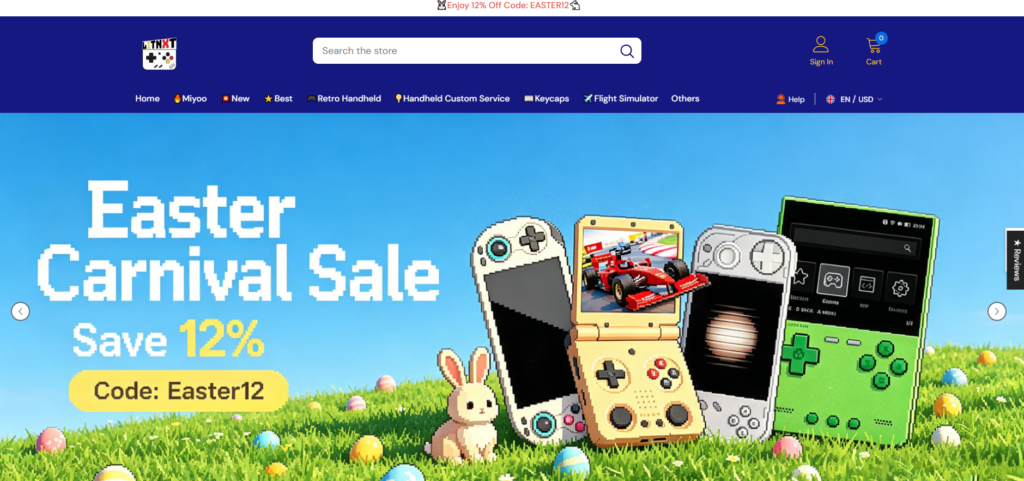
The homepage hero plays a critical role in setting expectations.
We designed the hero section to:
- Highlight flagship products like handheld consoles
- Use immersive visuals that resonate with gaming culture
- Include concise messaging that communicates value instantly
Rather than adding multiple sliders or distractions, we kept the hero focused and impactful.
Category Navigation: Simplifying Exploration

We implemented a clean category structure that allows users to quickly browse:
- Handheld consoles
- เครื่องประดับ
- Bundles
- สินค้าใหม่
Each category is visually distinct, making scanning effortless.
Best Sellers and Featured Products
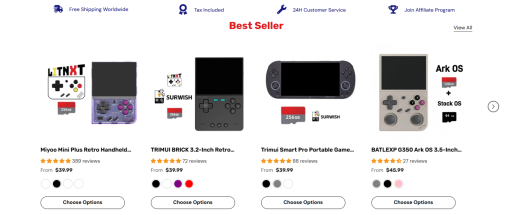
Instead of overwhelming users with all products, we curated sections like:
- Best Sellers
- Trending Products
- Recommended Items
This reduces decision fatigue and increases conversion likelihood.
Product Page Design
Emphasizing Product Experience
The product page is where decisions happen. Our design focused on:
- High-quality product imagery
- Clear pricing and purchase options
- Simplified product descriptions
- Easy-to-read specifications
We avoided clutter and ensured the most important information appears first.
สร้างความไว้วางใจผ่านการออกแบบ
To improve credibility, we incorporated:
- Customer reviews and ratings
- Clean layout for product details
- ระยะห่างและการจัดเรียงที่สม่ำเสมอ
- Visual cues for reliability (badges, guarantees)
These elements help users feel confident in their purchase.
ข้อควรพิจารณาในการออกแบบโดยคำนึงถึงอุปกรณ์พกพาเป็นหลัก
Why Mobile Matters
A significant portion of traffic for gaming products comes from mobile devices. Therefore, mobile optimization was not an afterthought—it was a priority.
Key Mobile Enhancements
- เมนูนำทางที่เรียบง่าย
- Optimized image ratios for smaller screens
- Larger tap targets for buttons
- Faster loading layouts with minimal visual clutter
We ensured the mobile experience mirrors the desktop experience in quality, while being tailored for usability.
ความท้าทายและแนวทางแก้ไขในการออกแบบ
Challenge 1: Balancing Nostalgia and Modern UI
ปัญหา: Too much retro styling can feel outdated.
สารละลาย: We used modern layouts with subtle retro-inspired visuals, such as color accents and product imagery.
Challenge 2: Avoiding Product Overload
ปัญหา: Large product catalogs can overwhelm users.
สารละลาย: We structured content into curated sections like “Best Sellers” and “Featured,” reducing cognitive load.
Challenge 3: Maintaining Visual Consistency
ปัญหา: Inconsistent layouts reduce trust.
สารละลาย: We established a consistent design system for spacing, typography, and component structure.
Challenge 4: Enhancing Conversion Without Aggressive Tactics
ปัญหา: Overusing pop-ups and promotions can harm user experience.
สารละลาย: We relied on clean design, strong visuals, and clear CTAs instead of intrusive elements.
กระบวนการออกแบบของเรา
Step 1: Research and Benchmarking
We analyzed:
- Competitor websites
- User behavior patterns in gaming niches
- Conversion-focused Shopify store structures
This helped us define what works—and what to avoid.
Step 2: Wireframing and Layout Planning
We created structured layouts that prioritize:
- ขั้นตอนการใช้งาน
- Content hierarchy
- Visual balance
This stage ensures the foundation is strong before moving into visual design.
Step 3: Visual Design Execution
We translated the wireframes into a polished interface:
- Clean typography
- Balanced color usage
- High-impact imagery
Every design decision was made with conversion in mind.
Step 4: Iteration and Refinement
After initial deployment, we reviewed:
- User interaction behavior
- Visual clarity
- Section effectiveness
We refined layouts based on real-world usage.
ผลลัพธ์และผลกระทบ
ประสบการณ์การใช้งานที่ดีขึ้น
- Faster navigation
- Clearer product discovery
- Reduced confusion during browsing
Increased Engagement
- Users spend more time exploring products
- Higher interaction with featured sections
Stronger Conversion Potential
- Simplified purchase journey
- Better trust through clean design
- Mobile-friendly experience driving sales
Why Design Matters in Shopify Stores
This project reinforces a key principle:
Good design is not about decoration—it’s about decision-making.
For Shopify stores, especially in niche markets like retro gaming, design directly impacts:
- ความไว้วางใจของผู้ใช้
- Product perception
- อัตราการแปลง
- เอกลักษณ์ของแบรนด์
A well-structured store can outperform competitors—even with similar products.
บทสรุป
Designing the LITNXT ช็อปฟี่ store was about more than aesthetics—it was about creating a focused, conversion-driven experience that aligns with both the brand and its audience.
By prioritizing clarity, usability, and emotional engagement, we transformed the store into a platform that not only showcases products but also builds trust and drives action.
At the end of the day, successful eCommerce design comes down to understanding users and guiding them effortlessly toward a purchase.
If you’re looking to build or improve a high-performing ช็อปฟี่ store with a strong focus on design, brand positioning, and conversion strategy, this is exactly where AIRSANG delivers value—helping brands turn ideas into results-driven digital experiences.


ออกแบบและสร้างเว็บไซต์ WordPress หรือเว็บไซต์องค์กรพร้อมระบบอีคอมเมิร์ซครบวงจรสำหรับคุณ.
ช่วงราคา: $200.00 ถึง $2,500.00ข้อกำหนดเฉพาะหรือใบเสนอราคาพิเศษ
ราคาเดิมคือ: $2.00.$1.00ราคาปัจจุบันคือ: $1.00. ภาพหลักสำหรับการออกแบบอุปกรณ์กายภาพบำบัดที่บ้านของ Amazon (อธิบายรายละเอียด)
บทนำ: การสร้างภาพลักษณ์ที่น่าเชื่อถือสำหรับอุปกรณ์บำบัดที่บ้านบน Amazon เมื่อออกแบบภาพหลักสำหรับอุปกรณ์บำบัดที่บ้านบน Amazon สิ่งสำคัญอันดับแรกของเราคือ...

ภาพหลักสำหรับการแปลงลิปสติกเป็นสินค้าสำหรับ Amazon
บทนำ: การออกแบบภาพหลักลิปสติกที่ขายได้บน Amazon เมื่อเราออกแบบภาพหลักสำหรับลิปสติกบน Amazon ความรับผิดชอบของเราไม่ได้จำกัดอยู่แค่...

แฮกเกอร์ขโมยอีเมลผู้ดูแลระบบ WordPress ได้อย่างไร (และวิธีป้องกัน)
มาเริ่มกันด้วยความจริงที่ไม่น่าสบายใจ: อีเมลแอดมิน WordPress ของคุณอาจเปิดเผยต่อสาธารณะมากกว่าที่คุณคิด และแฮกเกอร์? พวกเขาชอบมาก สำหรับพวกเขา...

อะไรทำให้รองพื้นชนิดเหลวของ Amazon (ภาพหลัก) ขายดี?
บทนำ การออกแบบภาพหลักสำหรับรองพื้นชนิดเหลวบน Amazon ไม่ใช่แค่การทำให้ผลิตภัณฑ์ดูสวยงามเท่านั้น บน Amazon ภาพหลักและ...

การออกแบบภาพหลัก Amazon ที่มีประสิทธิภาพสำหรับตลับกรอง
บทนำ การออกแบบภาพหลักสำหรับ Amazon ไม่ใช่แค่การทำให้สินค้าดูน่าดึงดูดเท่านั้น แต่ยังเกี่ยวกับความชัดเจน ความน่าเชื่อถือ และความเข้าใจได้ในทันที โดยเฉพาะอย่างยิ่งสำหรับ...

การโจมตีแบบ Replay Attack บน WordPress: ภัยคุกคามจริงหรือแค่เรื่องที่ถูกพูดเกินจริง?
ก่อนอื่นขอชี้แจงให้ชัดเจนก่อน การโจมตีแบบ Replay Attack นั้นดูไม่น่ากลัว มันไม่ได้ทำลายรหัสผ่าน มันไม่ได้แทรกโค้ดที่เป็นอันตรายพร้อมข้อความแฮ็กเกอร์สีเขียวกระจัดกระจายไปทั่ว มันแนบเนียนกว่า...

วิธีคัดลอกหน้าเว็บ WordPress โดยไม่ทำให้ระบบเสียหาย
ยอมรับกันเถอะ บางครั้งคุณอาจไม่อยากสร้างหน้าเว็บใหม่ คุณแค่อยากได้หน้าเว็บเดิม...แต่แตกต่างไปเล็กน้อย รูปแบบเหมือนเดิม บล็อกเหมือนเดิม การตั้งค่าเหมือนเดิม เพราะ...

เปรียบเทียบธีม WordPress สำหรับสัตว์เลี้ยง 5 แบบ
บทนำ การเลือกธีม WordPress ที่เหมาะสมสำหรับธุรกิจเกี่ยวกับสัตว์เลี้ยงนั้นไม่ใช่แค่เรื่องของการออกแบบเท่านั้น แต่ยังส่งผลโดยตรงต่อการใช้งาน ความสามารถในการขยายขนาด และการเติบโตของธุรกิจในระยะยาว การดูแลสัตว์เลี้ยงและ...

เปรียบเทียบธีมอีคอมเมิร์ซชุดว่ายน้ำ 5 แบบ
บทนำ การเลือกธีมที่เหมาะสมสำหรับร้านค้าอิสระที่จำหน่ายชุดว่ายน้ำหรือชุดชั้นในนั้นไม่ใช่แค่การตัดสินใจด้านภาพลักษณ์เท่านั้น แต่ยังส่งผลโดยตรงต่ออัตราการเปลี่ยนลูกค้าให้เป็นผู้ซื้อ ความสามารถในการขยายธุรกิจ และความยั่งยืนในระยะยาว...

วิธีปิดการแสดงความคิดเห็นใน WordPress (โดยไม่ต้องเสียสติ)
มาพูดถึงระบบแสดงความคิดเห็นของ WordPress กันดีกว่า ในทางทฤษฎีแล้ว ความคิดเห็นนั้นยอดเยี่ยมมาก มันช่วยกระตุ้นการสนทนา สร้างชุมชน และทำให้เว็บไซต์ของคุณดูมีชีวิตชีวา แต่ในความเป็นจริงแล้ว มันมักจะเป็นเหมือนแม่เหล็กดึงดูด...

การสร้างเว็บไซต์ WordPress ที่ปรับขนาดได้สำหรับแบรนด์ที่ขับเคลื่อนด้วยวิทยาศาสตร์: โครงการ AminoUSA
บทนำ ในยุคดิจิทัลปัจจุบัน เว็บไซต์เป็นมากกว่าแค่สถานที่สำหรับแสดงรายการสินค้า สำหรับแบรนด์ที่ขับเคลื่อนด้วยวิทยาศาสตร์ซึ่งดำเนินงานในอุตสาหกรรมที่มีการควบคุมหรือเน้นการวิจัย...

สร้างร้านค้า Shopify ที่ปรับขนาดได้สำหรับแบรนด์ใบมีดระดับโลก: โครงการ CoolKatana
บทนำ ในธุรกิจอีคอมเมิร์ซข้ามพรมแดน เว็บไซต์ Shopify เป็นมากกว่าแค่หน้าร้าน สำหรับแบรนด์ที่ดำเนินธุรกิจในกลุ่มเฉพาะหรือกลุ่มที่ขับเคลื่อนด้วยวัฒนธรรม เว็บไซต์ต้องทำมากกว่านั้น...

การออกแบบร้านค้า Shopify ที่มีอัตราการแปลงสูงสำหรับขายการ์ดโปเกมอน
บทนำ ในโลกของอีคอมเมิร์ซสินค้าสะสม โดยเฉพาะอย่างยิ่งในตลาดเกมการ์ดโปเกมอน (TCG) เว็บไซต์จะต้องทำมากกว่าแค่แสดงรายการสินค้า...

ดีไซน์ Shopify ที่เพิ่มยอดขายสำหรับแบรนด์อิฐสั่งทำพิเศษ
บทนำ ในสภาพแวดล้อมการแข่งขันอีคอมเมิร์ซในปัจจุบัน โดยเฉพาะอย่างยิ่งในตลาดของขวัญส่วนบุคคลและของสะสม เว็บไซต์ Shopify ต้องทำมากกว่าแค่แสดงสินค้า...

วิธีติดต่อฝ่ายสนับสนุนของ Shopify: คู่มือที่ง่ายและไม่ยุ่งยาก
การบริหารร้านค้า Shopify ควรเป็นเรื่องที่น่าตื่นเต้น ไม่ใช่เรื่องที่ทำให้สับสน เมื่อมีคำถามหรือปัญหาเกิดขึ้น Shopify มีช่องทางการสนับสนุนหลายช่องทาง ขึ้นอยู่กับสถานการณ์...

วิธีปิดใช้งานร้านค้า Shopify: คู่มือที่ชัดเจนและใช้งานได้จริง
การปิดใช้งานร้านค้า Shopify นั้นไม่ซับซ้อน แต่ก็มีผลกระทบหลายอย่างที่ผู้ขายหลายรายมองข้ามไป คู่มือนี้จะอธิบายขั้นตอนอย่างละเอียดและเข้าใจง่าย...

กรณีศึกษาการออกแบบเว็บไซต์ Shopify สำหรับแบรนด์ดอกไม้ระดับพรีเมียม
บทนำ ในสภาพแวดล้อมการแข่งขันอีคอมเมิร์ซในปัจจุบัน เว็บไซต์ Shopify ต้องทำมากกว่าแค่แสดงสินค้า มันต้องสื่อสารคุณค่าของแบรนด์ได้ทันที และแนะนำผู้ใช้...

กรณีศึกษาการออกแบบร้านค้า Shopify: ร้านค้าเกมย้อนยุค
บทนำ ในสภาพแวดล้อมอีคอมเมิร์ซที่มีการแข่งขันสูง ความชัดเจนทางด้านภาพและการเชื่อมโยงทางอารมณ์มักเป็นตัวกำหนดว่าผู้เยี่ยมชมจะกลายเป็นลูกค้าหรือไม่ โดยเฉพาะอย่างยิ่งใน...