


การแนะนำ
Building a successful eCommerce website for a niche outdoor brand requires more than clean visuals—it demands a deep understanding of user intent, product storytelling, and conversion-focused structure. When working on the website for YakAttack, a premium kayak fishing accessories brand powered by BigCommerce, our primary focus was to elevate the design experience while preserving the rugged authenticity of the brand.
This project centered on creating a seamless, intuitive, and visually compelling journey that aligns with how real fishing enthusiasts explore, evaluate, and purchase gear online. Rather than simply redesigning a homepage, we approached the entire site as a connected system—where every page contributes to trust, clarity, and conversion.
| ระยะเวลาจัดส่ง | หมวดหมู่ | แพลตฟอร์มแอปพลิเคชัน |
| 24 วัน | Outdoor fishing gear | บิ๊กคอมเมิร์ซ |
| นักออกแบบที่เกี่ยวข้อง | ค่าใช้จ่าย | ผล |
| หลิน จาง | $2100 | flow📈342% |
ทำความเข้าใจแบรนด์และกลุ่มเป้าหมาย
Who Are We Designing For?
YakAttack serves a very specific audience: passionate kayak anglers who value durability, modular gear systems, and real-world performance. These users are:
- Highly product-aware
- Detail-oriented in their purchasing decisions
- Motivated by functionality over aesthetics—but influenced by strong visuals
Design Objective
Our goal was to bridge two worlds:
- The raw, outdoor identity of fishing culture
- The clean, structured clarity of modern eCommerce design
We needed to ensure the site felt both authentic and premium, without overwhelming users with technical complexity.
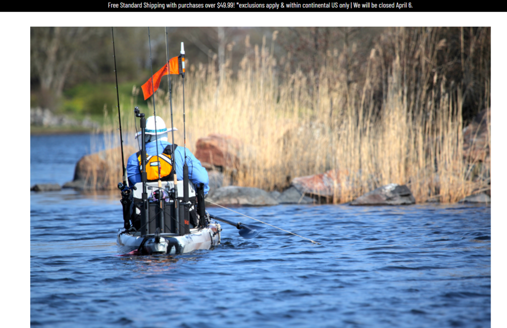
กลยุทธ์การออกแบบหน้าแรก
สร้างความประทับใจแรกพบที่แข็งแกร่ง
The homepage acts as the entry point into the brand’s ecosystem. We designed it to immediately communicate three key ideas:
- Lifestyle immersion (kayak fishing in action)
- Product ecosystem clarity (modular gear categories)
- Brand authority and trust
Hero Section Approach
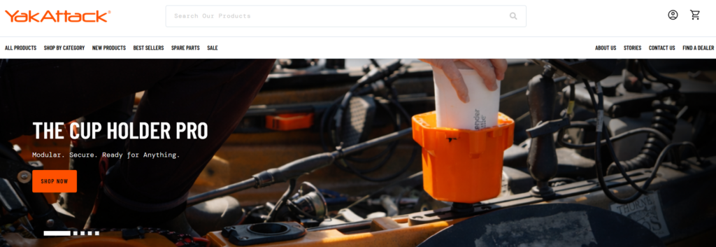
- Full-width lifestyle imagery showcasing real fishing scenarios
- Minimal but impactful headline messaging
- Clear primary CTA guiding users into product exploration
This approach avoids clutter and instead pulls users into an emotional context—helping them visualize themselves using the gear.
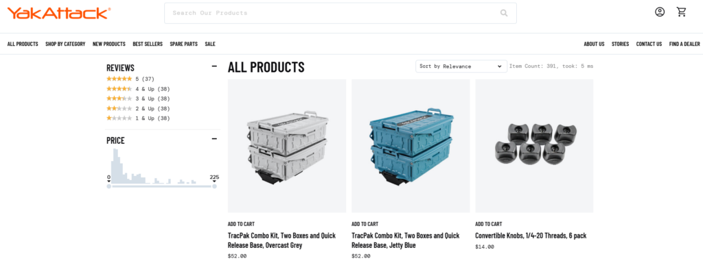
Structuring Product Discovery
One of the biggest challenges in fishing gear websites is complexity. There are multiple product types, compatibility concerns, and technical variations.
We addressed this through structured category navigation:
Category Blocks
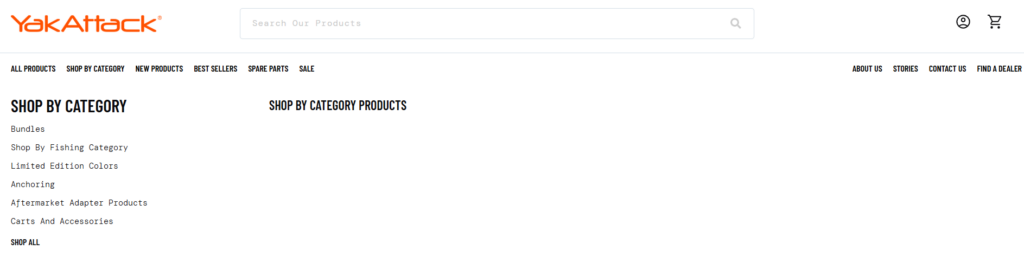
- Rod holders
- Mounting systems
- Storage solutions
- เครื่องประดับ
Each category is visually represented with:
- Clean product imagery
- Short, benefit-driven descriptions
- Clear navigation hierarchy
This reduces cognitive load and allows users to quickly find what they need.
Balancing Visual Impact with Clarity
Outdoor brands often rely heavily on imagery, but too much visual noise can hurt usability.
โซลูชันการออกแบบของเรา:
- Controlled use of high-quality visuals
- Strong spacing and grid alignment
- Consistent typography hierarchy
This ensures the site feels premium without sacrificing readability.
Product Page Design Optimization
Designing for Decision-Making
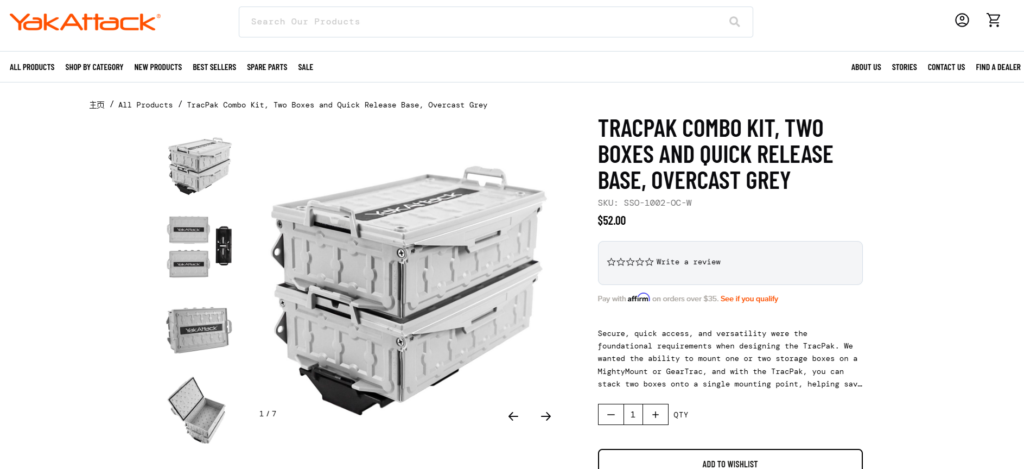
Product pages are where conversions happen. Instead of overwhelming users with technical data, we structured content to guide decision-making naturally.
Key Design Elements
- Above-the-fold clarity
- Product name, key benefits, and pricing visible immediately
- Visual storytelling
- Lifestyle images + close-up product details
- Structured information hierarchy
- Features → Benefits → Use cases
- Clear CTA positioning
- Prominent and always accessible
Simplifying Complex Product Systems
YakAttack products often work as part of a modular system. This can confuse users if not clearly explained.
We introduced:
- Visual compatibility cues
- Related product groupings
- Simple explanatory sections
This transforms complexity into clarity—helping users understand how products work together.
Collection Page Experience
Improving Browsing Efficiency
Collection pages were designed to support both:
- Quick scanning
- Deeper exploration
Design Enhancements
- Clean grid layout with consistent spacing
- Multi-line product titles with controlled truncation
- Subtle hover interactions for engagement
We avoided excessive filters or distractions, focusing instead on clarity and speed.
Visual Consistency Across Listings
Consistency builds trust. We ensured:
- Uniform product image ratios
- Balanced spacing between elements
- Predictable layout behavior
This makes the browsing experience feel stable and professional.
Supporting Pages and Brand Storytelling
About and Brand Pages
Rather than treating these as secondary pages, we designed them as trust-building assets.
Key Focus Areas
- Brand origin and mission
- Real-world product usage
- Community-driven identity
The layout emphasizes:
- Storytelling sections
- Lifestyle imagery
- Clean typography
Content and Educational Sections
Fishing enthusiasts often research before buying. We supported this behavior by structuring content areas that:
- Educate users on gear usage
- Showcase real applications
- Reinforce expertise
This approach positions the brand as both a product provider and a knowledge source.
กระบวนการออกแบบของเรา
Step 1: Research and Analysis
We began by analyzing:
- Competitor websites
- User behavior patterns in outdoor niches
- Existing site structure and pain points
This helped us identify gaps in clarity, navigation, and visual hierarchy.
Step 2: Information Architecture
We restructured the site to:
- Simplify navigation paths
- Group related products logically
- Reduce unnecessary friction
The goal was to make every click feel intentional.
Step 3: Visual System Design
We established a consistent design language:
- ลำดับชั้นของการจัดวางตัวอักษร
- Color usage aligned with outdoor branding
- Spacing and layout grids
This ensures visual coherence across all pages.
Step 4: Conversion-Focused Layouts
Every section was designed with a purpose:
- Guide users
- ลดความสับสน
- Encourage action
We focused on clarity over decoration.
ความท้าทายที่เราพบเจอ
1. Complex Product Relationships
YakAttack’s modular system can be difficult to explain visually.
วิธีแก้ปัญหาของเรา:
We simplified communication through layout structure and visual grouping instead of technical explanations.
2. Balancing Rugged Branding with Modern UX
Outdoor brands often lean heavily into rugged aesthetics, which can conflict with clean UX design.
วิธีแก้ปัญหาของเรา:
We retained authentic imagery while applying modern layout principles to maintain usability.
3. Avoiding Information Overload
Too much product detail can overwhelm users.
วิธีแก้ปัญหาของเรา:
We prioritized key selling points and structured additional details progressively.
Our Design Approach and Philosophy
Customer-First Experience
We design for how users think—not how brands want to present information.
หมายความว่า:
- การนำทางที่ชัดเจน
- ลำดับการไหลของเนื้อหาเชิงตรรกะ
- Reduced decision friction
Visual Clarity Over Complexity
Instead of adding more elements, we focus on:
- Better spacing
- Strong hierarchy
- Intentional design choices
Scalable Design Systems
We build designs that:
- Work across multiple pages
- Maintain consistency
- Adapt as the product catalog grows
ผลลัพธ์และผลกระทบ
ประสบการณ์การใช้งานที่ดีขึ้น
- Easier navigation across categories
- Faster product discovery
- Clearer understanding of product systems
Stronger Brand Perception
- More premium visual identity
- Increased trust through consistency
- Better storytelling across pages
Enhanced Conversion Potential
- Clear CTAs
- Reduced confusion
- More confident purchasing decisions
บทสรุป
Designing an eCommerce website for a specialized outdoor brand like YakAttack requires more than aesthetics—it requires strategic thinking, user empathy, and a deep understanding of how design drives behavior.
By focusing on clarity, structure, and storytelling, we transformed the site into a cohesive digital experience that supports both exploration and conversion. Every page—from homepage to product detail—was designed to guide users naturally while reinforcing the brand’s identity.
At the end of the day, great eCommerce design is not about making things look better—it’s about making them work better.
ที่ AIRSANG, we specialize in crafting high-converting, design-driven independent websites for global brands. If you’re looking to elevate your eCommerce experience through strategic design, our team is ready to help you build a site that not only looks premium—but performs.


ออกแบบและสร้างเว็บไซต์ WordPress หรือเว็บไซต์องค์กรพร้อมระบบอีคอมเมิร์ซครบวงจรสำหรับคุณ.
ช่วงราคา: $200.00 ถึง $2,500.00ข้อกำหนดเฉพาะหรือใบเสนอราคาพิเศษ
ราคาเดิมคือ: $2.00.$1.00ราคาปัจจุบันคือ: $1.00. ภาพหลักสำหรับการออกแบบอุปกรณ์กายภาพบำบัดที่บ้านของ Amazon (อธิบายรายละเอียด)
บทนำ: การสร้างภาพลักษณ์ที่น่าเชื่อถือสำหรับอุปกรณ์บำบัดที่บ้านบน Amazon เมื่อออกแบบภาพหลักสำหรับอุปกรณ์บำบัดที่บ้านบน Amazon สิ่งสำคัญอันดับแรกของเราคือ...

ภาพหลักสำหรับการแปลงลิปสติกเป็นสินค้าสำหรับ Amazon
บทนำ: การออกแบบภาพหลักลิปสติกที่ขายได้บน Amazon เมื่อเราออกแบบภาพหลักสำหรับลิปสติกบน Amazon ความรับผิดชอบของเราไม่ได้จำกัดอยู่แค่...

แฮกเกอร์ขโมยอีเมลผู้ดูแลระบบ WordPress ได้อย่างไร (และวิธีป้องกัน)
มาเริ่มกันด้วยความจริงที่ไม่น่าสบายใจ: อีเมลแอดมิน WordPress ของคุณอาจเปิดเผยต่อสาธารณะมากกว่าที่คุณคิด และแฮกเกอร์? พวกเขาชอบมาก สำหรับพวกเขา...

อะไรทำให้รองพื้นชนิดเหลวของ Amazon (ภาพหลัก) ขายดี?
บทนำ การออกแบบภาพหลักสำหรับรองพื้นชนิดเหลวบน Amazon ไม่ใช่แค่การทำให้ผลิตภัณฑ์ดูสวยงามเท่านั้น บน Amazon ภาพหลักและ...

การออกแบบภาพหลัก Amazon ที่มีประสิทธิภาพสำหรับตลับกรอง
บทนำ การออกแบบภาพหลักสำหรับ Amazon ไม่ใช่แค่การทำให้สินค้าดูน่าดึงดูดเท่านั้น แต่ยังเกี่ยวกับความชัดเจน ความน่าเชื่อถือ และความเข้าใจได้ในทันที โดยเฉพาะอย่างยิ่งสำหรับ...

การโจมตีแบบ Replay Attack บน WordPress: ภัยคุกคามจริงหรือแค่เรื่องที่ถูกพูดเกินจริง?
ก่อนอื่นขอชี้แจงให้ชัดเจนก่อน การโจมตีแบบ Replay Attack นั้นดูไม่น่ากลัว มันไม่ได้ทำลายรหัสผ่าน มันไม่ได้แทรกโค้ดที่เป็นอันตรายพร้อมข้อความแฮ็กเกอร์สีเขียวกระจัดกระจายไปทั่ว มันแนบเนียนกว่า...

วิธีคัดลอกหน้าเว็บ WordPress โดยไม่ทำให้ระบบเสียหาย
ยอมรับกันเถอะ บางครั้งคุณอาจไม่อยากสร้างหน้าเว็บใหม่ คุณแค่อยากได้หน้าเว็บเดิม...แต่แตกต่างไปเล็กน้อย รูปแบบเหมือนเดิม บล็อกเหมือนเดิม การตั้งค่าเหมือนเดิม เพราะ...

เปรียบเทียบธีม WordPress สำหรับสัตว์เลี้ยง 5 แบบ
บทนำ การเลือกธีม WordPress ที่เหมาะสมสำหรับธุรกิจเกี่ยวกับสัตว์เลี้ยงนั้นไม่ใช่แค่เรื่องของการออกแบบเท่านั้น แต่ยังส่งผลโดยตรงต่อการใช้งาน ความสามารถในการขยายขนาด และการเติบโตของธุรกิจในระยะยาว การดูแลสัตว์เลี้ยงและ...

เปรียบเทียบธีมอีคอมเมิร์ซชุดว่ายน้ำ 5 แบบ
บทนำ การเลือกธีมที่เหมาะสมสำหรับร้านค้าอิสระที่จำหน่ายชุดว่ายน้ำหรือชุดชั้นในนั้นไม่ใช่แค่การตัดสินใจด้านภาพลักษณ์เท่านั้น แต่ยังส่งผลโดยตรงต่ออัตราการเปลี่ยนลูกค้าให้เป็นผู้ซื้อ ความสามารถในการขยายธุรกิจ และความยั่งยืนในระยะยาว...

วิธีปิดการแสดงความคิดเห็นใน WordPress (โดยไม่ต้องเสียสติ)
มาพูดถึงระบบแสดงความคิดเห็นของ WordPress กันดีกว่า ในทางทฤษฎีแล้ว ความคิดเห็นนั้นยอดเยี่ยมมาก มันช่วยกระตุ้นการสนทนา สร้างชุมชน และทำให้เว็บไซต์ของคุณดูมีชีวิตชีวา แต่ในความเป็นจริงแล้ว มันมักจะเป็นเหมือนแม่เหล็กดึงดูด...

การสร้างเว็บไซต์ WordPress ที่ปรับขนาดได้สำหรับแบรนด์ที่ขับเคลื่อนด้วยวิทยาศาสตร์: โครงการ AminoUSA
บทนำ ในยุคดิจิทัลปัจจุบัน เว็บไซต์เป็นมากกว่าแค่สถานที่สำหรับแสดงรายการสินค้า สำหรับแบรนด์ที่ขับเคลื่อนด้วยวิทยาศาสตร์ซึ่งดำเนินงานในอุตสาหกรรมที่มีการควบคุมหรือเน้นการวิจัย...

สร้างร้านค้า Shopify ที่ปรับขนาดได้สำหรับแบรนด์ใบมีดระดับโลก: โครงการ CoolKatana
บทนำ ในธุรกิจอีคอมเมิร์ซข้ามพรมแดน เว็บไซต์ Shopify เป็นมากกว่าแค่หน้าร้าน สำหรับแบรนด์ที่ดำเนินธุรกิจในกลุ่มเฉพาะหรือกลุ่มที่ขับเคลื่อนด้วยวัฒนธรรม เว็บไซต์ต้องทำมากกว่านั้น...

การออกแบบร้านค้า Shopify ที่มีอัตราการแปลงสูงสำหรับขายการ์ดโปเกมอน
บทนำ ในโลกของอีคอมเมิร์ซสินค้าสะสม โดยเฉพาะอย่างยิ่งในตลาดเกมการ์ดโปเกมอน (TCG) เว็บไซต์จะต้องทำมากกว่าแค่แสดงรายการสินค้า...

ดีไซน์ Shopify ที่เพิ่มยอดขายสำหรับแบรนด์อิฐสั่งทำพิเศษ
บทนำ ในสภาพแวดล้อมการแข่งขันอีคอมเมิร์ซในปัจจุบัน โดยเฉพาะอย่างยิ่งในตลาดของขวัญส่วนบุคคลและของสะสม เว็บไซต์ Shopify ต้องทำมากกว่าแค่แสดงสินค้า...

วิธีติดต่อฝ่ายสนับสนุนของ Shopify: คู่มือที่ง่ายและไม่ยุ่งยาก
การบริหารร้านค้า Shopify ควรเป็นเรื่องที่น่าตื่นเต้น ไม่ใช่เรื่องที่ทำให้สับสน เมื่อมีคำถามหรือปัญหาเกิดขึ้น Shopify มีช่องทางการสนับสนุนหลายช่องทาง ขึ้นอยู่กับสถานการณ์...

วิธีปิดใช้งานร้านค้า Shopify: คู่มือที่ชัดเจนและใช้งานได้จริง
การปิดใช้งานร้านค้า Shopify นั้นไม่ซับซ้อน แต่ก็มีผลกระทบหลายอย่างที่ผู้ขายหลายรายมองข้ามไป คู่มือนี้จะอธิบายขั้นตอนอย่างละเอียดและเข้าใจง่าย...

กรณีศึกษาการออกแบบเว็บไซต์ Shopify สำหรับแบรนด์ดอกไม้ระดับพรีเมียม
บทนำ ในสภาพแวดล้อมการแข่งขันอีคอมเมิร์ซในปัจจุบัน เว็บไซต์ Shopify ต้องทำมากกว่าแค่แสดงสินค้า มันต้องสื่อสารคุณค่าของแบรนด์ได้ทันที และแนะนำผู้ใช้...

กรณีศึกษาการออกแบบร้านค้า Shopify: ร้านค้าเกมย้อนยุค
บทนำ ในสภาพแวดล้อมอีคอมเมิร์ซที่มีการแข่งขันสูง ความชัดเจนทางด้านภาพและการเชื่อมโยงทางอารมณ์มักเป็นตัวกำหนดว่าผู้เยี่ยมชมจะกลายเป็นลูกค้าหรือไม่ โดยเฉพาะอย่างยิ่งใน...