


การแนะนำ
In today’s competitive eCommerce landscape, design is no longer just about aesthetics—it’s about guiding user behavior, building trust, and driving conversions. For furniture-focused brands, especially those offering functional lifestyle products like slipcovers, the challenge becomes even more nuanced: how do you visually communicate comfort, durability, and style—within seconds?
This case study explores how we approached the design of a premium ช็อปฟี่ website for a furniture covers brand, focusing on user experience, visual storytelling, and conversion-oriented layout strategy. Rather than relying on technical complexity, the project was driven entirely by thoughtful design decisions—ensuring that every visual element served a purpose.
| ระยะเวลาจัดส่ง | หมวดหมู่ | แพลตฟอร์มแอปพลิเคชัน |
| 29 วัน | Furniture Covers | shopify |
| นักออกแบบที่เกี่ยวข้อง | ค่าใช้จ่าย | ผล |
| หลิน จาง | $3200 | Turnover📈263% |
Understanding the Brand and Market Position
Defining the Core Identity
Before any design work began, we first clarified the brand’s positioning:
- พรีเมียมแต่เข้าถึงง่าย
- Pet-friendly and family-oriented
- Italian-inspired craftsmanship
- Practical solutions for modern homes
This positioning informed every design decision—from typography and color palette to layout structure and image direction.
Target Audience Insights
We identified key audience segments:
- Pet owners seeking protection for furniture
- Families looking for easy maintenance solutions
- Design-conscious homeowners who value aesthetics
These users are highly visual and emotionally driven. They don’t just buy products—they buy lifestyle upgrades.
Homepage Design Strategy: First Impressions That Convert
Visual Hierarchy and Layout Flow
The homepage was structured to guide users through a natural journey:
- Hero Section – Emotional Hook
- Value Proposition – Quick Clarity
- Product Categories – Easy Navigation
- Lifestyle Imagery – Emotional Engagement
- Social Proof – Trust Building
- Product Highlights – Rational Justification
- Call-to-Action – Conversion Push
Every section was intentionally placed to answer a specific user question.
Hero Section: Selling a Lifestyle, Not a Product
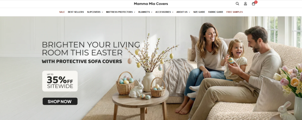
Instead of focusing purely on product features, the hero section emphasizes real-life scenarios:
- Cozy living rooms
- Pets lounging on sofas
- Natural lighting and warm tones
This approach immediately answers the subconscious question:
“Will this fit into my life?”
Design Choices:
- Full-width imagery for immersion
- Soft, neutral color palette to evoke comfort
- Clear headline with benefit-driven messaging
- Minimal distractions to keep focus on the product
Typography and Color System
We selected a combination of:
- Modern sans-serif fonts for readability
- Elegant serif accents for a premium feel
The color palette focused on:
- Warm beige and soft gray tones
- Subtle contrasts to maintain clarity
- Avoiding overly saturated colors to preserve a calm, home-like atmosphere
This balance ensures the site feels both premium and welcoming.
Product Presentation: Clarity Meets Emotion
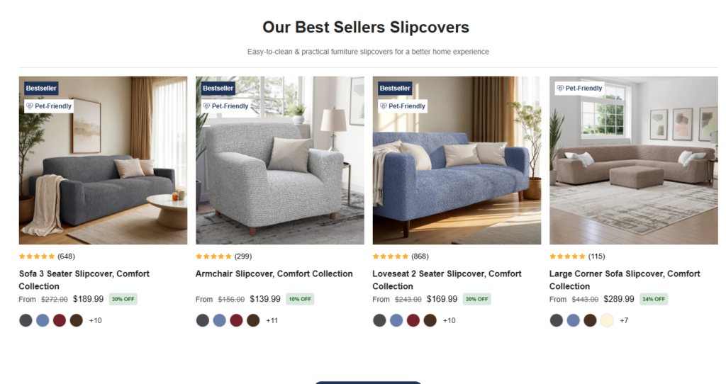
Lifestyle-Driven Product Displays
Instead of isolated product shots, we used:
- Real home environments
- Before-and-after comparisons
- Close-up textures showing fabric quality
This helps users visualize the product in context.
Conversion-Focused Product Cards
การ์ดข้อมูลผลิตภัณฑ์แต่ละใบได้รับการออกแบบมาเพื่อ:
- Highlight key benefits (e.g., pet-friendly, washable)
- Maintain visual consistency
- ลดภาระทางความคิด
Key Elements:
- Clean spacing
- Clear pricing visibility
- Subtle hover interactions (design-led, not technical-heavy)
Navigation and User Experience Design
Simplified Navigation Structure
We avoided overwhelming users with too many options. Instead, we focused on:
- การแบ่งกลุ่มหมวดหมู่ที่ชัดเจน
- Logical grouping of products
- Sticky navigation for easy access
Smart Filtering Experience
Rather than complex filtering systems, we designed a visually intuitive filtering flow:
- Fabric type
- Color options
- Sofa compatibility
This allows users to quickly narrow down choices without friction.
สร้างความไว้วางใจผ่านการออกแบบ
Social Proof Integration
Trust is critical in eCommerce, especially for higher-ticket home products.
We incorporated:
- Customer testimonials
- Lifestyle user-generated content
- Subtle review highlights
These elements were integrated seamlessly into the design—not as intrusive blocks, but as natural parts of the browsing experience.
สัญญาณความน่าเชื่อถือที่มองเห็นได้
Instead of overwhelming users with badges, we used:
- ไอคอนที่ดูสะอาดตา
- Minimal trust indicators
- Consistent styling
This maintains a premium feel while still reinforcing credibility.
Supporting Pages: Extending the Design System
While the homepage sets the tone, supporting pages reinforce consistency.
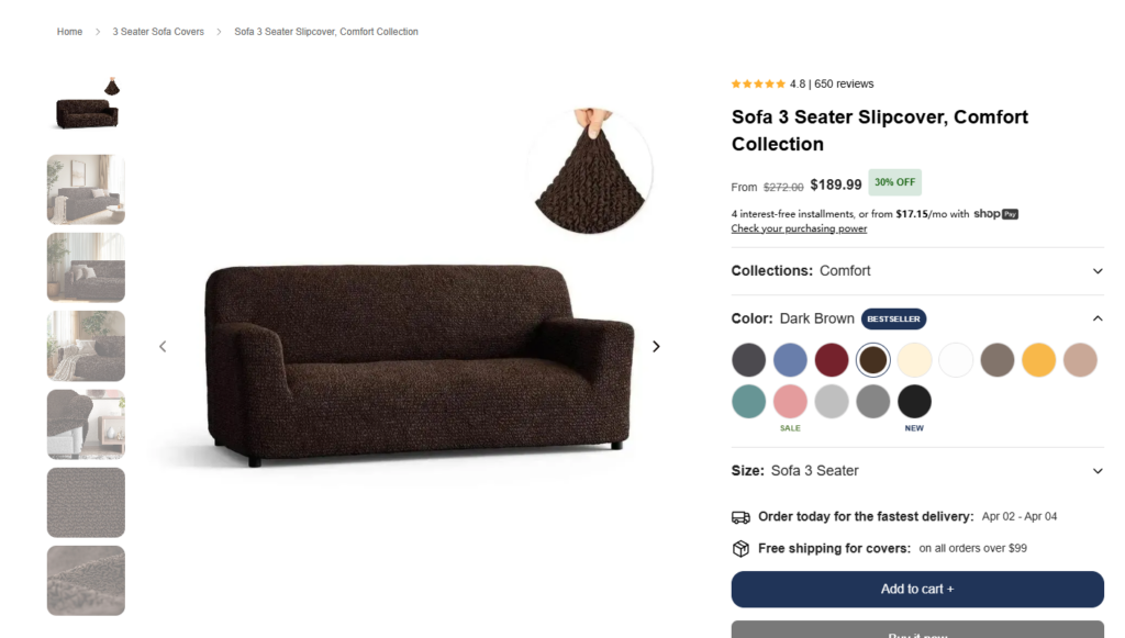
Product Detail Pages (PDP)
The PDP design focused on:
- Clear product storytelling
- Step-by-step feature explanation
- ลำดับชั้นทางภาพที่ชัดเจน
Key Sections:
- Fabric benefits explained visually
- Size and fit guidance
- Lifestyle imagery to reinforce usage scenarios
About Page: Humanizing the Brand
The About page was designed to:
- Highlight craftsmanship
- Communicate brand values
- Build emotional connection
Instead of long text blocks, we used:
- Visual storytelling
- Short, impactful copy
- Clean layouts for readability
Collection Pages: Balancing Choice and Clarity
Collection pages were designed to:
- Showcase variety without overwhelming users
- รักษาการเว้นระยะห่างและการจัดแนวให้สม่ำเสมอ
- Use visual cues to guide selection
กระบวนการออกแบบของเรา
1. Research and Discovery
เราได้วิเคราะห์:
- เว็บไซต์ของคู่แข่ง
- รูปแบบพฤติกรรมของผู้ใช้
- Industry trends
The goal was to identify gaps and opportunities.
2. Wireframing and Structure Planning
Before visual design, we mapped:
- User journeys
- ลำดับชั้นของเนื้อหา
- Conversion pathways
This ensured that the design would be both functional and intuitive.
3. Visual Direction and Mood Development
We defined:
- โทนสี
- Typography systems
- Image style guidelines
This created a cohesive visual identity.
4. Iteration and Refinement
We continuously refined:
- Layout spacing
- Image selection
- Copy placement
Every iteration focused on improving clarity and conversion potential.
ความท้าทายที่เราเผชิญ
Communicating Function Through Design
Furniture covers are practical products, but functionality alone isn’t enough.
Challenge:
How to visually communicate durability, flexibility, and ease of use—without relying on technical explanations?
Balancing Aesthetic and Usability
A premium look can sometimes conflict with usability.
Challenge:
Maintaining a high-end feel while ensuring the site remains easy to navigate.
Avoiding Visual Clutter
With multiple product variations and features, there’s a risk of overwhelming users.
Challenge:
Keeping the design clean while still delivering all necessary information.
โซลูชันการออกแบบของเรา
Visual Storytelling Over Technical Explanation
เราใช้:
- Lifestyle imagery
- Before-and-after visuals
- Texture close-ups
This communicates product value instantly.
Minimalist Layout with Strong Hierarchy
เรารับประกันว่า:
- Clear section separation
- ระยะห่างที่สม่ำเสมอ
- Focused content blocks
This improves readability and user flow.
Emotion-Driven Design Approach
Instead of selling features, we focused on:
- Comfort
- Convenience
- Lifestyle enhancement
This aligns with how users actually make purchasing decisions.
คำถามที่พบบ่อย
A high-converting Shopify furniture store design focuses on clear visual hierarchy, lifestyle-driven imagery, and intuitive navigation. Instead of overwhelming users with features, it highlights key benefits like comfort, durability, and ease of use. Strong product storytelling and trust elements—such as reviews and real-life scenarios—also play a crucial role in guiding users toward purchase decisions.
Lifestyle imagery helps customers visualize how products fit into their daily lives. For furniture covers, showing real homes, pets, and cozy environments builds emotional connection and trust. This approach reduces uncertainty and makes the product feel more relevant, which significantly increases engagement and conversion rates.
Good design improves user experience by simplifying navigation, organizing content clearly, and reducing cognitive load. Elements like clean layouts, consistent spacing, and easy-to-use filters help users find what they need quickly. A well-structured design ensures users move smoothly from browsing to purchasing without confusion.
An effective Shopify homepage typically includes a strong hero section, clear value propositions, organized product categories, lifestyle visuals, and trust-building elements like testimonials. Each section should serve a specific purpose, guiding users step-by-step toward understanding the product and taking action.
Balancing aesthetics and functionality means creating a visually appealing interface without sacrificing usability. This involves using clean layouts, readable typography, and a consistent color system while ensuring all key information remains easy to access. The goal is to create a premium feel that still allows users to navigate effortlessly and make quick decisions.
ผลลัพธ์และผลกระทบ
Improved User Engagement
The design led to:
- Longer session durations
- Higher interaction with product pages
- Increased exploration of collections
Stronger Brand Perception
Users perceived the brand as:
- พรีเมียม
- Trustworthy
- Lifestyle-oriented
Enhanced Conversion Potential
By simplifying navigation and improving clarity, the design:
- Reduced friction in decision-making
- Made product benefits instantly understandable
- Encouraged faster purchasing decisions
Why Design Matters More Than Ever
โครงการนี้ตอกย้ำหลักการสำคัญประการหนึ่ง:
Good design is not decoration—it’s strategy.
In eCommerce, especially on platforms like Shopify, design directly influences:
- ความไว้วางใจของผู้ใช้
- Product understanding
- อัตราการแปลง
A well-designed store doesn’t just look good—it performs.
บทสรุป
การออกแบบระบบที่มีประสิทธิภาพสูง ช็อปฟี่ store requires more than templates or visual polish. It demands a deep understanding of user behavior, brand positioning, and conversion psychology.
From homepage structure to product storytelling, every element of this project was crafted with intention—ensuring that users not only understand the product but also feel confident purchasing it.
ที่ AIRSANG, we specialize in design-driven eCommerce experiences. From independent site design to product visual strategy, we help brands turn ideas into high-converting digital storefronts. If you’re looking to elevate your Shopify presence through thoughtful design, our team is here to help.


ออกแบบและสร้างเว็บไซต์ WordPress หรือเว็บไซต์องค์กรพร้อมระบบอีคอมเมิร์ซครบวงจรสำหรับคุณ.
ช่วงราคา: $200.00 ถึง $2,500.00custom-requirements-or-special-quotations
ราคาเดิมคือ: $2.00.$1.00ราคาปัจจุบันคือ: $1.00. ภาพหลักสำหรับการออกแบบอุปกรณ์กายภาพบำบัดที่บ้านของ Amazon (อธิบายรายละเอียด)
บทนำ: การสร้างภาพลักษณ์ที่น่าเชื่อถือสำหรับอุปกรณ์บำบัดที่บ้านบน Amazon เมื่อออกแบบภาพหลักสำหรับอุปกรณ์บำบัดที่บ้านบน Amazon สิ่งสำคัญอันดับแรกของเราคือ...

ภาพหลักสำหรับการแปลงลิปสติกเป็นสินค้าสำหรับ Amazon
บทนำ: การออกแบบภาพหลักลิปสติกที่ขายได้บน Amazon เมื่อเราออกแบบภาพหลักสำหรับลิปสติกบน Amazon ความรับผิดชอบของเราไม่ได้จำกัดอยู่แค่...

แฮกเกอร์ขโมยอีเมลผู้ดูแลระบบ WordPress ได้อย่างไร (และวิธีป้องกัน)
มาเริ่มกันด้วยความจริงที่ไม่น่าสบายใจ: อีเมลแอดมิน WordPress ของคุณอาจเปิดเผยต่อสาธารณะมากกว่าที่คุณคิด และแฮกเกอร์? พวกเขาชอบมาก สำหรับพวกเขา...

อะไรทำให้รองพื้นชนิดเหลวของ Amazon (ภาพหลัก) ขายดี?
บทนำ การออกแบบภาพหลักสำหรับรองพื้นชนิดเหลวบน Amazon ไม่ใช่แค่การทำให้ผลิตภัณฑ์ดูสวยงามเท่านั้น บน Amazon ภาพหลักและ...

การออกแบบภาพหลัก Amazon ที่มีประสิทธิภาพสำหรับตลับกรอง
บทนำ การออกแบบภาพหลักสำหรับ Amazon ไม่ใช่แค่การทำให้สินค้าดูน่าดึงดูดเท่านั้น แต่ยังเกี่ยวกับความชัดเจน ความน่าเชื่อถือ และความเข้าใจได้ในทันที โดยเฉพาะอย่างยิ่งสำหรับ...

การโจมตีแบบ Replay Attack บน WordPress: ภัยคุกคามจริงหรือแค่เรื่องที่ถูกพูดเกินจริง?
ก่อนอื่นขอชี้แจงให้ชัดเจนก่อน การโจมตีแบบ Replay Attack นั้นดูไม่น่ากลัว มันไม่ได้ทำลายรหัสผ่าน มันไม่ได้แทรกโค้ดที่เป็นอันตรายพร้อมข้อความแฮ็กเกอร์สีเขียวกระจัดกระจายไปทั่ว มันแนบเนียนกว่า...

วิธีคัดลอกหน้าเว็บ WordPress โดยไม่ทำให้ระบบเสียหาย
ยอมรับกันเถอะ บางครั้งคุณอาจไม่อยากสร้างหน้าเว็บใหม่ คุณแค่อยากได้หน้าเว็บเดิม...แต่แตกต่างไปเล็กน้อย รูปแบบเหมือนเดิม บล็อกเหมือนเดิม การตั้งค่าเหมือนเดิม เพราะ...

เปรียบเทียบธีม WordPress สำหรับสัตว์เลี้ยง 5 แบบ
บทนำ การเลือกธีม WordPress ที่เหมาะสมสำหรับธุรกิจเกี่ยวกับสัตว์เลี้ยงนั้นไม่ใช่แค่เรื่องของการออกแบบเท่านั้น แต่ยังส่งผลโดยตรงต่อการใช้งาน ความสามารถในการขยายขนาด และการเติบโตของธุรกิจในระยะยาว การดูแลสัตว์เลี้ยงและ...

เปรียบเทียบธีมอีคอมเมิร์ซชุดว่ายน้ำ 5 แบบ
บทนำ การเลือกธีมที่เหมาะสมสำหรับร้านค้าอิสระที่จำหน่ายชุดว่ายน้ำหรือชุดชั้นในนั้นไม่ใช่แค่การตัดสินใจด้านภาพลักษณ์เท่านั้น แต่ยังส่งผลโดยตรงต่ออัตราการเปลี่ยนลูกค้าให้เป็นผู้ซื้อ ความสามารถในการขยายธุรกิจ และความยั่งยืนในระยะยาว...

วิธีปิดการแสดงความคิดเห็นใน WordPress (โดยไม่ต้องเสียสติ)
มาพูดถึงระบบแสดงความคิดเห็นของ WordPress กันดีกว่า ในทางทฤษฎีแล้ว ความคิดเห็นนั้นยอดเยี่ยมมาก มันช่วยกระตุ้นการสนทนา สร้างชุมชน และทำให้เว็บไซต์ของคุณดูมีชีวิตชีวา แต่ในความเป็นจริงแล้ว มันมักจะเป็นเหมือนแม่เหล็กดึงดูด...

การสร้างเว็บไซต์ WordPress ที่ปรับขนาดได้สำหรับแบรนด์ที่ขับเคลื่อนด้วยวิทยาศาสตร์: โครงการ AminoUSA
บทนำ ในยุคดิจิทัลปัจจุบัน เว็บไซต์เป็นมากกว่าแค่สถานที่สำหรับแสดงรายการสินค้า สำหรับแบรนด์ที่ขับเคลื่อนด้วยวิทยาศาสตร์ซึ่งดำเนินงานในอุตสาหกรรมที่มีการควบคุมหรือเน้นการวิจัย...

สร้างร้านค้า Shopify ที่ปรับขนาดได้สำหรับแบรนด์ใบมีดระดับโลก: โครงการ CoolKatana
บทนำ ในธุรกิจอีคอมเมิร์ซข้ามพรมแดน เว็บไซต์ Shopify เป็นมากกว่าแค่หน้าร้าน สำหรับแบรนด์ที่ดำเนินธุรกิจในกลุ่มเฉพาะหรือกลุ่มที่ขับเคลื่อนด้วยวัฒนธรรม เว็บไซต์ต้องทำมากกว่านั้น...

การออกแบบร้านค้า Shopify ที่มีอัตราการแปลงสูงสำหรับขายการ์ดโปเกมอน
บทนำ ในโลกของอีคอมเมิร์ซสินค้าสะสม โดยเฉพาะอย่างยิ่งในตลาดเกมการ์ดโปเกมอน (TCG) เว็บไซต์จะต้องทำมากกว่าแค่แสดงรายการสินค้า...

ดีไซน์ Shopify ที่เพิ่มยอดขายสำหรับแบรนด์อิฐสั่งทำพิเศษ
บทนำ ในสภาพแวดล้อมการแข่งขันอีคอมเมิร์ซในปัจจุบัน โดยเฉพาะอย่างยิ่งในตลาดของขวัญส่วนบุคคลและของสะสม เว็บไซต์ Shopify ต้องทำมากกว่าแค่แสดงสินค้า...

วิธีติดต่อฝ่ายสนับสนุนของ Shopify: คู่มือที่ง่ายและไม่ยุ่งยาก
การบริหารร้านค้า Shopify ควรเป็นเรื่องที่น่าตื่นเต้น ไม่ใช่เรื่องที่ทำให้สับสน เมื่อมีคำถามหรือปัญหาเกิดขึ้น Shopify มีช่องทางการสนับสนุนหลายช่องทาง ขึ้นอยู่กับสถานการณ์...

วิธีปิดใช้งานร้านค้า Shopify: คู่มือที่ชัดเจนและใช้งานได้จริง
การปิดใช้งานร้านค้า Shopify นั้นไม่ซับซ้อน แต่ก็มีผลกระทบหลายอย่างที่ผู้ขายหลายรายมองข้ามไป คู่มือนี้จะอธิบายขั้นตอนอย่างละเอียดและเข้าใจง่าย...

กรณีศึกษาการออกแบบเว็บไซต์ Shopify สำหรับแบรนด์ดอกไม้ระดับพรีเมียม
บทนำ ในสภาพแวดล้อมการแข่งขันอีคอมเมิร์ซในปัจจุบัน เว็บไซต์ Shopify ต้องทำมากกว่าแค่แสดงสินค้า มันต้องสื่อสารคุณค่าของแบรนด์ได้ทันที และแนะนำผู้ใช้...

กรณีศึกษาการออกแบบร้านค้า Shopify: ร้านค้าเกมย้อนยุค
บทนำ ในสภาพแวดล้อมอีคอมเมิร์ซที่มีการแข่งขันสูง ความชัดเจนทางด้านภาพและการเชื่อมโยงทางอารมณ์มักเป็นตัวกำหนดว่าผู้เยี่ยมชมจะกลายเป็นลูกค้าหรือไม่ โดยเฉพาะอย่างยิ่งใน...