


การแนะนำ
In the competitive world of mobile accessories, a website must do more than simply display products—it must communicate brand identity, highlight product value, and create a seamless shopping experience. For brands selling premium items such as carbon fiber phone cases, design plays a crucial role in conveying quality, durability, and innovation.
เดอะ ช็อปฟี่ ร้านค้าสำหรับ คาร์บอนเคส was designed with these goals in mind. The objective was to create a visually striking storefront that reflects the sleek, high-performance nature of carbon fiber products while maintaining a clean and intuitive user journey.
In this project, our role focused entirely on Shopify website design—structuring the layout, creating visual hierarchy, organizing product presentation, and crafting an interface that encourages exploration and conversion. By aligning design decisions with brand positioning and user behavior, we helped transform the site into a modern, high-impact ecommerce experience.
This article explains the design strategy behind the คาร์บอนเคส Shopify website, including the design process, the challenges we faced, the solutions we implemented, and the final results.
| ระยะเวลาจัดส่ง | หมวดหมู่ | แพลตฟอร์มแอปพลิเคชัน |
| 11days | Carbon Fiber Cases | shopify |
| นักออกแบบที่เกี่ยวข้อง | ค่าใช้จ่าย | ผล |
| หลิน จาง | $310 | Store Entry Rate📈247% |
ทำความเข้าใจแบรนด์และเป้าหมายของโครงการ
Before starting the design process, it was essential to understand the brand’s identity and the audience it targets.
คาร์บอนเคส sells premium carbon fiber phone cases and accessories. Carbon fiber is commonly associated with performance, engineering, durability, and luxury, often seen in industries such as automotive, aerospace, and high-end technology products. The website design needed to visually communicate these qualities from the moment a visitor lands on the homepage.
Key Goals of the Project
The project focused on several core objectives:
- Establish a premium brand image
- Showcase the unique carbon fiber aesthetic
- Create a clear product browsing structure
- Build strong visual trust signals
- Improve the overall shopping experience
- Ensure the site feels modern and professional
From a design perspective, the challenge was to balance visual impact and usability. A visually heavy design could distract from product discovery, while a minimal layout might fail to express the premium nature of the products.
Our task was to find the right balance.
แนวทางการออกแบบ Shopify ของเรา
Designing a successful ecommerce site requires more than arranging sections on a page. It involves understanding how users browse products, what builds trust, and how visual hierarchy influences purchasing decisions.
Our Shopify design approach focused on four principles:
1. Visual Hierarchy
A well-structured hierarchy helps visitors quickly understand:
- what the brand sells
- what products are available
- where to go next
We carefully structured the homepage so that users naturally move from brand introduction → product categories → featured products → trust elements → social proof.
2. Product-Focused Layout
Since the product itself is visually distinctive, the design prioritizes large product visuals and clean backgrounds. This ensures the carbon fiber textures and patterns stand out.
3. Minimal Distractions
Premium products benefit from clean layouts and controlled color palettes. We avoided unnecessary elements and focused attention on the products.
4. Brand Consistency
Every visual element—from colors to spacing—was designed to reinforce the brand’s identity.
The Design Process
Research and Inspiration
The first step involved studying:
- premium phone accessory brands
- luxury tech ecommerce sites
- modern Shopify storefront design trends
We analyzed how leading brands use:
- high-contrast product photography
- minimal color palettes
- bold hero sections
- strong visual storytelling
This research helped establish a design direction that would align with the คาร์บอนเคส brand.
Creating the Homepage Structure
The homepage plays the most critical role in an ecommerce website. It must immediately communicate the brand value and guide visitors toward products.
We structured the homepage into several strategic sections.
การออกแบบส่วนฮีโร่

The hero section introduces the brand with a bold visual statement.
ปัจจัยสำคัญในการออกแบบได้แก่:
- large product imagery
- dark, high-contrast background
- minimal text overlay
- clear navigation access
The carbon fiber textures and colorful forged patterns immediately capture attention. This approach helps communicate the premium material quality without requiring lengthy descriptions.
Category Navigation

After the hero section, visitors are guided into product categories.
We designed a visual category grid that allows users to explore products based on their device type:
- Apple
- Samsung
- เครื่องประดับ
This layout serves two important purposes:
- It simplifies product discovery.
- It visually showcases the product range.
Instead of overwhelming users with too many options, the design encourages intuitive browsing.
Featured Products Layout
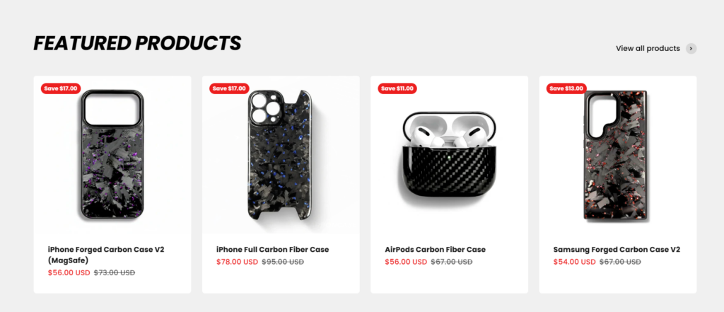
The featured products section highlights best-selling items.
From a design standpoint, we focused on:
- clean product cards
- clear product imagery
- visible pricing
- simple discount indicators
Spacing and alignment were carefully optimized to create a balanced product grid that feels organized and professional.
This section helps customers quickly identify popular items and encourages engagement.
Trust-Building Section

Trust elements are critical in ecommerce design.
We included a section that highlights key selling points such as:
- brand popularity
- fast shipping
- responsive customer support
Visually, this section uses simple icons and short descriptions, which makes the information easy to scan.
The goal is to reassure customers and reduce purchase hesitation.
Customer Review Showcase
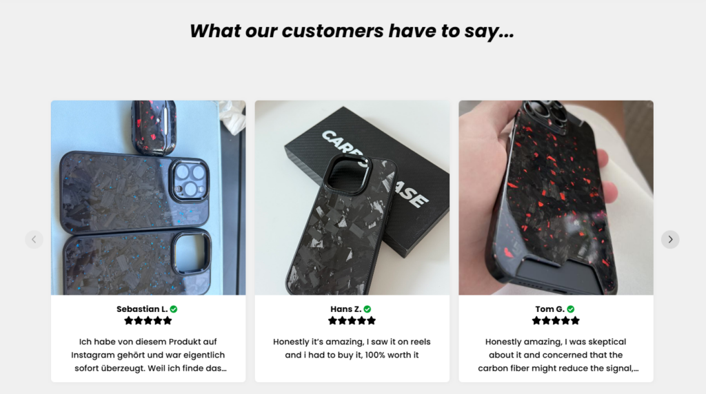
User-generated content is one of the strongest forms of social proof.
To reinforce product credibility, we created a customer review carousel that displays:
- real product images
- customer names
- short testimonials
This section adds authenticity to the website and visually demonstrates how the products look in real-world usage.
FAQ Section
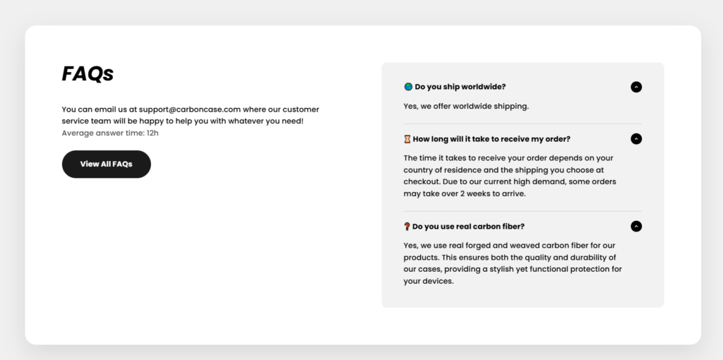
The FAQ section addresses common questions customers may have, such as:
- shipping availability
- delivery timelines
- product materials
From a design perspective, the accordion layout keeps the page clean while still making information accessible.
This reduces friction during the buying process.
Design Challenges We Faced
Even a well-defined project presents challenges. In this case, several design considerations required careful attention.
Balancing Visual Impact and Simplicity
Carbon fiber patterns are visually rich. If used excessively, they could make the page feel cluttered.
We solved this by:
- using neutral backgrounds
- limiting textures to product imagery
- maintaining generous white space
This allowed the products to remain the focal point.
Maintaining Brand Consistency
คาร์บอนเคส features multiple color variations of forged carbon patterns.
To maintain visual consistency across the site, we used a neutral color palette for the interface:
- black
- dark gray
- white
This ensures that colorful product textures stand out without overwhelming the design.
Ensuring Clear Navigation
Visitors should be able to reach products within seconds.
To achieve this, we:
- simplified the navigation structure
- emphasized category entry points
- used clear visual grouping
The result is a browsing experience that feels intuitive.
โซลูชันการออกแบบของเรา
To address the challenges above, we implemented several design solutions.
A Strong Visual Identity
The design emphasizes bold imagery and minimal text. This reflects the premium nature of the products and aligns with the expectations of modern ecommerce shoppers.
Product-Centered Design
Instead of overloading the homepage with marketing text, we allowed product visuals to tell the story.
This approach:
- improves product appeal
- shortens decision time
- increases browsing engagement
Clean and Modern Layout
The design prioritizes spacing, alignment, and simplicity.
This makes the site feel:
- modern
- trustworthy
- easy to navigate
These qualities are essential for high-end ecommerce brands.
The Results of the Design
After implementing the final Shopify design structure, the website achieved several key outcomes.
A Clear Brand Identity
The site now visually communicates the strength and sophistication associated with carbon fiber products.
Improved Product Presentation
Products are displayed in a way that highlights their textures, finishes, and craftsmanship.
This enhances perceived product value.
A Streamlined User Journey
Visitors can easily move through the site:
Homepage → Category → Product → Purchase
Reducing friction improves overall usability.
Stronger Customer Trust
With trust badges, customer reviews, and clear structure, the website feels more credible and professional.
Why Design Matters in Shopify Ecommerce
A successful Shopify store depends heavily on design.
Strong design can:
- improve brand perception
- guide user behavior
- highlight product quality
- increase customer confidence
For premium products especially, the website often serves as the first impression of the brand. A thoughtful design strategy ensures that impression is positive.
บทสรุป
การออกแบบ คาร์บอนเคส ช็อปฟี่ website required a balance of aesthetics, usability, and brand storytelling. By focusing on clear visual hierarchy, product-centered layouts, and trust-building elements, we created a modern storefront that effectively showcases carbon fiber phone cases and accessories.
The project demonstrates how strategic Shopify design can elevate an ecommerce brand and improve the overall shopping experience.
ที่ AIRSANG, we specialize in Shopify website design for ecommerce brands, helping businesses create visually compelling storefronts that highlight their products and strengthen brand identity. Our focus is on thoughtful design, clear user journeys, and modern ecommerce presentation that supports long-term brand growth.


ออกแบบและสร้างเว็บไซต์ WordPress หรือเว็บไซต์องค์กรพร้อมระบบอีคอมเมิร์ซครบวงจรสำหรับคุณ.
ช่วงราคา: $200.00 ถึง $2,500.00ข้อกำหนดเฉพาะหรือใบเสนอราคาพิเศษ
ราคาเดิมคือ: $2.00.$1.00ราคาปัจจุบันคือ: $1.00. ภาพหลักสำหรับการออกแบบอุปกรณ์กายภาพบำบัดที่บ้านของ Amazon (อธิบายรายละเอียด)
บทนำ: การสร้างภาพลักษณ์ที่น่าเชื่อถือสำหรับอุปกรณ์บำบัดที่บ้านบน Amazon เมื่อออกแบบภาพหลักสำหรับอุปกรณ์บำบัดที่บ้านบน Amazon สิ่งสำคัญอันดับแรกของเราคือ...

ภาพหลักสำหรับการแปลงลิปสติกเป็นสินค้าสำหรับ Amazon
บทนำ: การออกแบบภาพหลักลิปสติกที่ขายได้บน Amazon เมื่อเราออกแบบภาพหลักสำหรับลิปสติกบน Amazon ความรับผิดชอบของเราไม่ได้จำกัดอยู่แค่...

แฮกเกอร์ขโมยอีเมลผู้ดูแลระบบ WordPress ได้อย่างไร (และวิธีป้องกัน)
มาเริ่มกันด้วยความจริงที่ไม่น่าสบายใจ: อีเมลแอดมิน WordPress ของคุณอาจเปิดเผยต่อสาธารณะมากกว่าที่คุณคิด และแฮกเกอร์? พวกเขาชอบมาก สำหรับพวกเขา...

อะไรทำให้รองพื้นชนิดเหลวของ Amazon (ภาพหลัก) ขายดี?
บทนำ การออกแบบภาพหลักสำหรับรองพื้นชนิดเหลวบน Amazon ไม่ใช่แค่การทำให้ผลิตภัณฑ์ดูสวยงามเท่านั้น บน Amazon ภาพหลักและ...

การออกแบบภาพหลัก Amazon ที่มีประสิทธิภาพสำหรับตลับกรอง
บทนำ การออกแบบภาพหลักสำหรับ Amazon ไม่ใช่แค่การทำให้สินค้าดูน่าดึงดูดเท่านั้น แต่ยังเกี่ยวกับความชัดเจน ความน่าเชื่อถือ และความเข้าใจได้ในทันที โดยเฉพาะอย่างยิ่งสำหรับ...

การโจมตีแบบ Replay Attack บน WordPress: ภัยคุกคามจริงหรือแค่เรื่องที่ถูกพูดเกินจริง?
ก่อนอื่นขอชี้แจงให้ชัดเจนก่อน การโจมตีแบบ Replay Attack นั้นดูไม่น่ากลัว มันไม่ได้ทำลายรหัสผ่าน มันไม่ได้แทรกโค้ดที่เป็นอันตรายพร้อมข้อความแฮ็กเกอร์สีเขียวกระจัดกระจายไปทั่ว มันแนบเนียนกว่า...

วิธีคัดลอกหน้าเว็บ WordPress โดยไม่ทำให้ระบบเสียหาย
ยอมรับกันเถอะ บางครั้งคุณอาจไม่อยากสร้างหน้าเว็บใหม่ คุณแค่อยากได้หน้าเว็บเดิม...แต่แตกต่างไปเล็กน้อย รูปแบบเหมือนเดิม บล็อกเหมือนเดิม การตั้งค่าเหมือนเดิม เพราะ...

เปรียบเทียบธีม WordPress สำหรับสัตว์เลี้ยง 5 แบบ
บทนำ การเลือกธีม WordPress ที่เหมาะสมสำหรับธุรกิจเกี่ยวกับสัตว์เลี้ยงนั้นไม่ใช่แค่เรื่องของการออกแบบเท่านั้น แต่ยังส่งผลโดยตรงต่อการใช้งาน ความสามารถในการขยายขนาด และการเติบโตของธุรกิจในระยะยาว การดูแลสัตว์เลี้ยงและ...

เปรียบเทียบธีมอีคอมเมิร์ซชุดว่ายน้ำ 5 แบบ
บทนำ การเลือกธีมที่เหมาะสมสำหรับร้านค้าอิสระที่จำหน่ายชุดว่ายน้ำหรือชุดชั้นในนั้นไม่ใช่แค่การตัดสินใจด้านภาพลักษณ์เท่านั้น แต่ยังส่งผลโดยตรงต่ออัตราการเปลี่ยนลูกค้าให้เป็นผู้ซื้อ ความสามารถในการขยายธุรกิจ และความยั่งยืนในระยะยาว...

วิธีปิดการแสดงความคิดเห็นใน WordPress (โดยไม่ต้องเสียสติ)
มาพูดถึงระบบแสดงความคิดเห็นของ WordPress กันดีกว่า ในทางทฤษฎีแล้ว ความคิดเห็นนั้นยอดเยี่ยมมาก มันช่วยกระตุ้นการสนทนา สร้างชุมชน และทำให้เว็บไซต์ของคุณดูมีชีวิตชีวา แต่ในความเป็นจริงแล้ว มันมักจะเป็นเหมือนแม่เหล็กดึงดูด...

การสร้างเว็บไซต์ WordPress ที่ปรับขนาดได้สำหรับแบรนด์ที่ขับเคลื่อนด้วยวิทยาศาสตร์: โครงการ AminoUSA
บทนำ ในยุคดิจิทัลปัจจุบัน เว็บไซต์เป็นมากกว่าแค่สถานที่สำหรับแสดงรายการสินค้า สำหรับแบรนด์ที่ขับเคลื่อนด้วยวิทยาศาสตร์ซึ่งดำเนินงานในอุตสาหกรรมที่มีการควบคุมหรือเน้นการวิจัย...

สร้างร้านค้า Shopify ที่ปรับขนาดได้สำหรับแบรนด์ใบมีดระดับโลก: โครงการ CoolKatana
บทนำ ในธุรกิจอีคอมเมิร์ซข้ามพรมแดน เว็บไซต์ Shopify เป็นมากกว่าแค่หน้าร้าน สำหรับแบรนด์ที่ดำเนินธุรกิจในกลุ่มเฉพาะหรือกลุ่มที่ขับเคลื่อนด้วยวัฒนธรรม เว็บไซต์ต้องทำมากกว่านั้น...

การออกแบบร้านค้า Shopify ที่มีอัตราการแปลงสูงสำหรับขายการ์ดโปเกมอน
บทนำ ในโลกของอีคอมเมิร์ซสินค้าสะสม โดยเฉพาะอย่างยิ่งในตลาดเกมการ์ดโปเกมอน (TCG) เว็บไซต์จะต้องทำมากกว่าแค่แสดงรายการสินค้า...

ดีไซน์ Shopify ที่เพิ่มยอดขายสำหรับแบรนด์อิฐสั่งทำพิเศษ
บทนำ ในสภาพแวดล้อมการแข่งขันอีคอมเมิร์ซในปัจจุบัน โดยเฉพาะอย่างยิ่งในตลาดของขวัญส่วนบุคคลและของสะสม เว็บไซต์ Shopify ต้องทำมากกว่าแค่แสดงสินค้า...

วิธีติดต่อฝ่ายสนับสนุนของ Shopify: คู่มือที่ง่ายและไม่ยุ่งยาก
การบริหารร้านค้า Shopify ควรเป็นเรื่องที่น่าตื่นเต้น ไม่ใช่เรื่องที่ทำให้สับสน เมื่อมีคำถามหรือปัญหาเกิดขึ้น Shopify มีช่องทางการสนับสนุนหลายช่องทาง ขึ้นอยู่กับสถานการณ์...

วิธีปิดใช้งานร้านค้า Shopify: คู่มือที่ชัดเจนและใช้งานได้จริง
การปิดใช้งานร้านค้า Shopify นั้นไม่ซับซ้อน แต่ก็มีผลกระทบหลายอย่างที่ผู้ขายหลายรายมองข้ามไป คู่มือนี้จะอธิบายขั้นตอนอย่างละเอียดและเข้าใจง่าย...

กรณีศึกษาการออกแบบเว็บไซต์ Shopify สำหรับแบรนด์ดอกไม้ระดับพรีเมียม
บทนำ ในสภาพแวดล้อมการแข่งขันอีคอมเมิร์ซในปัจจุบัน เว็บไซต์ Shopify ต้องทำมากกว่าแค่แสดงสินค้า มันต้องสื่อสารคุณค่าของแบรนด์ได้ทันที และแนะนำผู้ใช้...

กรณีศึกษาการออกแบบร้านค้า Shopify: ร้านค้าเกมย้อนยุค
บทนำ ในสภาพแวดล้อมอีคอมเมิร์ซที่มีการแข่งขันสูง ความชัดเจนทางด้านภาพและการเชื่อมโยงทางอารมณ์มักเป็นตัวกำหนดว่าผู้เยี่ยมชมจะกลายเป็นลูกค้าหรือไม่ โดยเฉพาะอย่างยิ่งใน...