


การแนะนำ
In the highly competitive electric bike market, a brand’s website plays a critical role in shaping customer perception, communicating product value, and guiding visitors toward purchase decisions. For brands selling premium mobility products, design is not simply about aesthetics—it is about building trust, simplifying complex product information, and creating a seamless browsing experience that mirrors the excitement of riding an electric bike.
กรณีศึกษาชิ้นนี้จะสำรวจว่า... ช็อปฟี่ เว็บไซต์สำหรับ อินเวอร์เตอร์ Electric Bikes was carefully designed to create a powerful digital storefront that combines storytelling, product discovery, and conversion-focused layout design. Our approach focused entirely on visual structure, user experience, and strategic content placement to ensure that visitors can easily understand the brand’s value while enjoying an immersive browsing journey.
Rather than relying on complex technical solutions, the project emphasized thoughtful Shopify design strategy: clean visual hierarchy, lifestyle-driven imagery, modular sections, and intuitive navigation. The goal was to transform the website into a modern brand experience that reflects innovation, performance, and reliability—core values that resonate strongly with electric bike enthusiasts.
| ระยะเวลาจัดส่ง | หมวดหมู่ | แพลตฟอร์มแอปพลิเคชัน |
| 24 วัน | electric bike | shopify |
| นักออกแบบที่เกี่ยวข้อง | ค่าใช้จ่าย | ผล |
| หลิน จาง | $1200 | Store traffic📈214% |
Understanding the Brand and Design Goals
The Brand Positioning
CINVERTER operates in a fast-growing segment of the mobility industry: electric bicycles designed for modern commuting and outdoor adventure. The brand targets riders who value freedom, sustainability, and performance.
Because the product itself represents movement and exploration, the website needed to visually communicate those feelings immediately. Visitors should feel inspired the moment they land on the homepage.
Key brand characteristics the design needed to express
- Modern mobility lifestyle
- Outdoor exploration and freedom
- Reliable and powerful engineering
- Premium yet accessible products
The website design had to translate these abstract brand ideas into a concrete visual experience.
Primary Website Objectives
Before designing the layout, we identified several key goals that the Shopify website needed to accomplish:
1. Build immediate trust
Electric bikes are high-value purchases. The design must communicate reliability and professionalism from the first screen.
2. Showcase the products clearly
Customers want to quickly understand different models, features, and use cases.
3. Create an immersive brand story
The website should not feel like a simple product catalog. Instead, it should guide visitors through a narrative of riding, adventure, and lifestyle.
4. Simplify product discovery
A well-structured layout helps visitors explore models easily without feeling overwhelmed.
5. Encourage conversion through clarity
Every design decision—from image selection to section hierarchy—should reduce friction and guide visitors naturally toward purchasing decisions.
Our Shopify Design Strategy
Designing a Shopify website for a product like electric bikes requires balancing strong visual storytelling with structured product presentation. The design strategy centered around three main pillars:
Visual storytelling
Lifestyle imagery and real-world riding scenes help visitors imagine themselves using the product.
Structured product discovery
Clean sections and organized product collections allow users to quickly explore different models.
Trust-building elements
Clear service information, customer reviews, and brand credibility signals reinforce confidence.
By combining these elements, the homepage becomes both inspirational and practical.
Homepage Design Structure
Hero Section: Capturing Attention Immediately
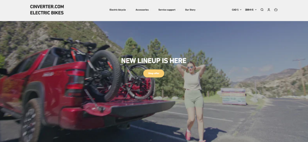
The homepage begins with a large cinematic hero banner featuring a rider interacting with an electric bike in an outdoor environment.
Design goals of the hero section
- Immediately communicate the product category
- Convey a lifestyle-oriented brand identity
- Establish emotional connection with visitors
The headline “NEW LINEUP IS HERE” provides a clear announcement while the background video or imagery introduces movement and energy.
Why this design works
The hero section focuses on visual emotion rather than technical specifications. This approach mirrors the way customers shop for lifestyle products—they first connect with the feeling before evaluating the details.
The strong hero banner sets the tone for the entire browsing experience.
Featured Collection: Guiding Product Exploration
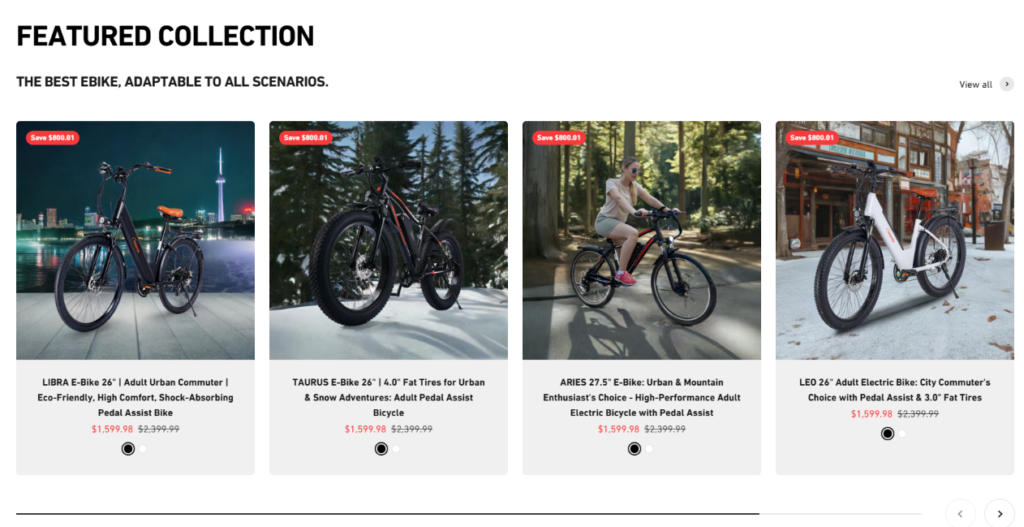
Directly beneath the hero section is a Featured Collection displaying several electric bike models in a structured grid layout.
Key design choices
- Consistent product photography
- Balanced spacing between items
- Clear pricing and product titles
- Easy visual comparison
Why the layout is effective
Visitors can instantly scan multiple models without navigating to separate pages. This improves product discovery and keeps users engaged within the homepage.
The grid format also ensures that each product receives equal visual weight, preventing confusion about which model to explore first.
Lifestyle Banner Section: Reinforcing the Brand Story

A full-width banner showcasing an electric bike in a scenic outdoor setting appears further down the page.
The word “ELECTRIC BIKE” overlays the landscape, reinforcing the product category while maintaining a clean visual composition.
Design purpose
This section acts as a visual breathing space between product modules while reinforcing the emotional aspect of riding.
Large lifestyle imagery helps users imagine how the product fits into their daily lives.
Lifestyle Content Blocks: Showing Real Use Cases
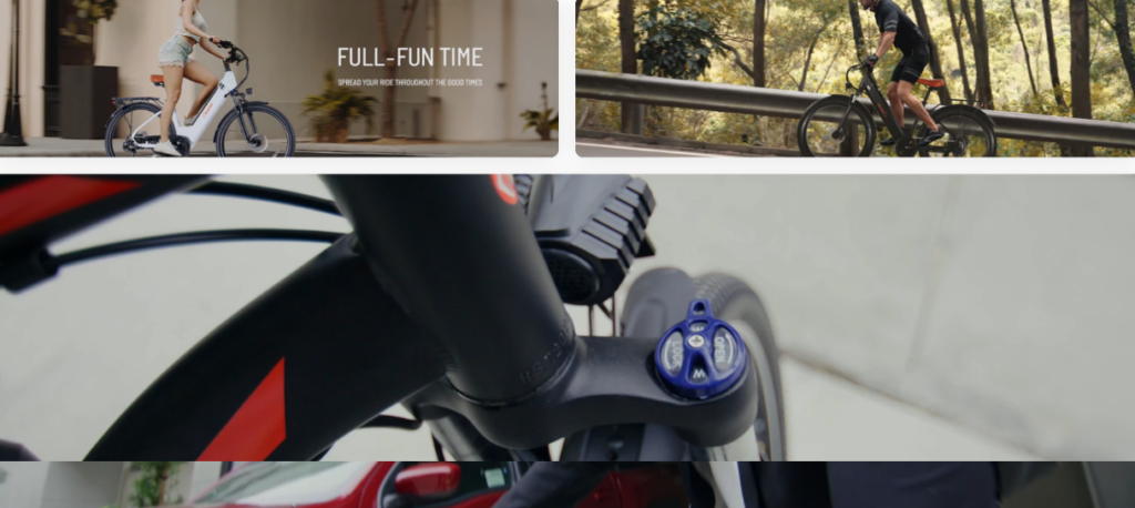
The design incorporates several smaller lifestyle image sections displaying riders in different environments:
- urban commuting
- park riding
- recreational exploration
Why lifestyle content matters
Electric bike buyers often evaluate how the product fits into their personal routines. By showing real-world use scenarios, the design answers those questions visually without relying on lengthy text explanations.
This method keeps the page visually engaging while subtly communicating product versatility.
Building Trust Through Visual Design
“Why Choose CINVERTER?” Section
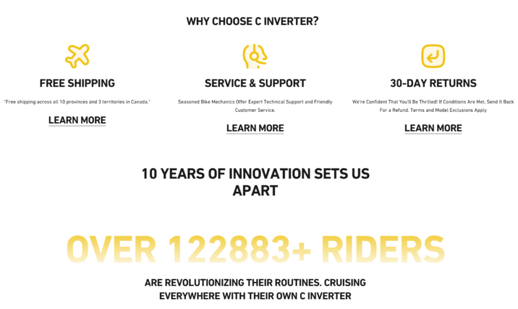
Trust-building content plays a crucial role in high-ticket product websites.
The homepage includes a section highlighting three key customer benefits:
- จัดส่งฟรี
- Service and support
- 30-day returns
Design elements used
- Minimalist icons
- short descriptive text
- consistent spacing and alignment
Impact on user experience
This section reassures visitors that the brand stands behind its products and offers reliable customer service.
Simple visual icons allow users to understand the benefits quickly without reading long paragraphs.
หลักฐานทางสังคมและความน่าเชื่อถือของแบรนด์
One of the most powerful trust signals included in the design is the rider community section.
The page highlights a statistic:
Over 122,883+ riders
This number serves as a social validation indicator showing that many customers already trust the brand.
Supporting design elements
- real-world riding photos
- customer stories
- community imagery
This approach transforms abstract numbers into visual proof of brand popularity.
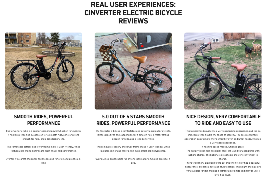
Customer Reviews and User Experiences
A dedicated review section showcases real riders sharing their experiences with the electric bikes.
Key design features
- customer photography
- concise testimonial quotes
- product usage images
Why this design is important
Electric bike buyers often want reassurance from other users before making a purchase. Including authentic visual testimonials strengthens credibility and helps potential buyers feel more confident.
The grid layout ensures the reviews remain easy to scan without overwhelming the visitor.
Encouraging Engagement Through Email and Support
Newsletter Subscription Section
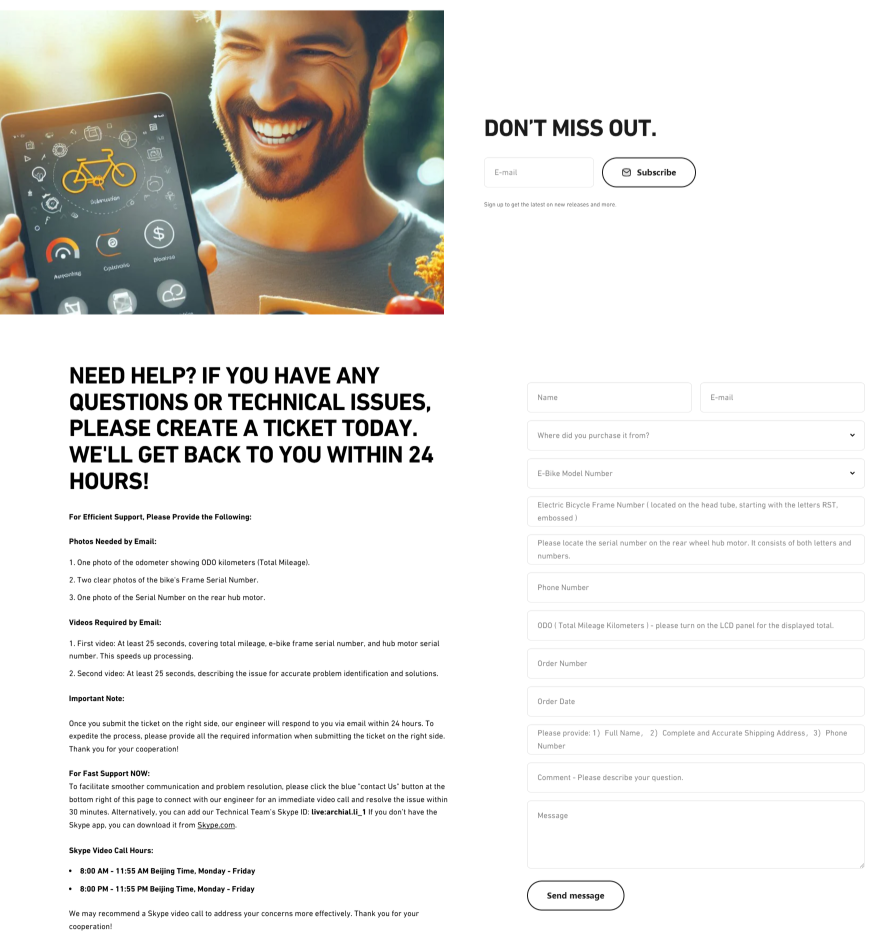
The design includes a visually engaging subscription section encouraging visitors to stay connected with the brand.
Instead of presenting a plain form, the layout features:
- lifestyle imagery
- a friendly visual atmosphere
- a simple call-to-action
This approach transforms the subscription area into a natural extension of the brand experience.
Customer Support Contact Section
Toward the bottom of the page, the design introduces a comprehensive support area encouraging visitors to submit inquiries.
Design priorities
- clarity
- structured form layout
- reassuring messaging
The messaging emphasizes quick response times and customer care.
This final interaction point helps convert hesitant visitors into potential customers by providing reassurance and easy communication.
Challenges During the Design Process
Designing an effective Shopify homepage for an electric bike brand presented several unique challenges.
Communicating technical products visually
Electric bikes involve many specifications and features. Presenting too much information at once could overwhelm visitors.
Our approach
Instead of listing technical details immediately, the design prioritizes:
- lifestyle imagery
- visual storytelling
- simplified product presentation
This approach introduces the product emotionally before presenting deeper information on product pages.
Balancing inspiration with clarity
Another challenge was ensuring the website remained visually inspiring while still guiding users toward purchasing decisions.
Solution
We structured the homepage with alternating sections:
- emotional lifestyle visuals
- structured product modules
- trust-building content
This rhythm keeps visitors engaged while maintaining clear navigation.
Maintaining visual consistency
With multiple sections—including products, lifestyle images, reviews, and support forms—visual consistency was essential.
Design solution
A consistent color palette, spacing system, and typography style unify the entire layout, ensuring the website feels cohesive rather than fragmented.
กระบวนการออกแบบของเรา
Research and discovery
Before beginning the design, we analyzed:
- electric bike competitor websites
- consumer behavior patterns
- e-commerce browsing habits
This research informed the visual direction and layout structure.
Wireframing the user journey
The next step was mapping how visitors move through the homepage.
We designed a layout that gradually guides users through stages:
- brand discovery
- product exploration
- trust building
- purchase consideration
This structure ensures that visitors always know what to do next.
Visual design and content hierarchy
Once the structure was finalized, we developed the visual language of the website.
Key design principles
- strong hero imagery
- clean product grids
- generous white space
- clear section hierarchy
The result is a homepage that feels both modern and approachable.
ผลลัพธ์และผลกระทบ
The final website design successfully transformed อินเวอร์เตอร์’s online presence into a compelling brand experience.
Key improvements achieved
- stronger first impression through immersive visuals
- clearer product presentation
- improved trust through reviews and service messaging
- smoother browsing flow for visitors
By combining storytelling with structured product presentation, the website encourages visitors to explore the brand and feel confident about their purchase decisions.
The design also ensures that the homepage remains scalable as the product lineup expands in the future.
บทสรุป
Designing an effective ช็อปฟี่ website for an electric bike brand requires more than simply placing products on a page. It requires understanding how customers think, what motivates their purchase decisions, and how visual storytelling can guide them through a meaningful browsing experience.
เดอะ อินเวอร์เตอร์ project demonstrates how thoughtful Shopify design—focused on layout strategy, visual hierarchy, and brand storytelling—can transform a standard e-commerce site into a powerful brand platform.
By carefully structuring each section of the homepage, balancing inspiration with clarity, and highlighting the rider community behind the brand, the website now reflects the energy, reliability, and adventure that electric bike customers seek.
Projects like this reflect the design philosophy behind AIRSANG, where Shopify websites are crafted not simply as online stores, but as immersive brand experiences that connect storytelling, product presentation, and user engagement into one cohesive journey.


ออกแบบและสร้างเว็บไซต์ WordPress หรือเว็บไซต์องค์กรพร้อมระบบอีคอมเมิร์ซครบวงจรสำหรับคุณ.
ช่วงราคา: $200.00 ถึง $2,500.00custom-requirements-or-special-quotations
ราคาเดิมคือ: $2.00.$1.00ราคาปัจจุบันคือ: $1.00. ภาพหลักสำหรับการออกแบบอุปกรณ์กายภาพบำบัดที่บ้านของ Amazon (อธิบายรายละเอียด)
บทนำ: การสร้างภาพลักษณ์ที่น่าเชื่อถือสำหรับอุปกรณ์บำบัดที่บ้านบน Amazon เมื่อออกแบบภาพหลักสำหรับอุปกรณ์บำบัดที่บ้านบน Amazon สิ่งสำคัญอันดับแรกของเราคือ...

ภาพหลักสำหรับการแปลงลิปสติกเป็นสินค้าสำหรับ Amazon
บทนำ: การออกแบบภาพหลักลิปสติกที่ขายได้บน Amazon เมื่อเราออกแบบภาพหลักสำหรับลิปสติกบน Amazon ความรับผิดชอบของเราไม่ได้จำกัดอยู่แค่...

แฮกเกอร์ขโมยอีเมลผู้ดูแลระบบ WordPress ได้อย่างไร (และวิธีป้องกัน)
มาเริ่มกันด้วยความจริงที่ไม่น่าสบายใจ: อีเมลแอดมิน WordPress ของคุณอาจเปิดเผยต่อสาธารณะมากกว่าที่คุณคิด และแฮกเกอร์? พวกเขาชอบมาก สำหรับพวกเขา...

อะไรทำให้รองพื้นชนิดเหลวของ Amazon (ภาพหลัก) ขายดี?
บทนำ การออกแบบภาพหลักสำหรับรองพื้นชนิดเหลวบน Amazon ไม่ใช่แค่การทำให้ผลิตภัณฑ์ดูสวยงามเท่านั้น บน Amazon ภาพหลักและ...

การออกแบบภาพหลัก Amazon ที่มีประสิทธิภาพสำหรับตลับกรอง
บทนำ การออกแบบภาพหลักสำหรับ Amazon ไม่ใช่แค่การทำให้สินค้าดูน่าดึงดูดเท่านั้น แต่ยังเกี่ยวกับความชัดเจน ความน่าเชื่อถือ และความเข้าใจได้ในทันที โดยเฉพาะอย่างยิ่งสำหรับ...

การโจมตีแบบ Replay Attack บน WordPress: ภัยคุกคามจริงหรือแค่เรื่องที่ถูกพูดเกินจริง?
ก่อนอื่นขอชี้แจงให้ชัดเจนก่อน การโจมตีแบบ Replay Attack นั้นดูไม่น่ากลัว มันไม่ได้ทำลายรหัสผ่าน มันไม่ได้แทรกโค้ดที่เป็นอันตรายพร้อมข้อความแฮ็กเกอร์สีเขียวกระจัดกระจายไปทั่ว มันแนบเนียนกว่า...

วิธีคัดลอกหน้าเว็บ WordPress โดยไม่ทำให้ระบบเสียหาย
ยอมรับกันเถอะ บางครั้งคุณอาจไม่อยากสร้างหน้าเว็บใหม่ คุณแค่อยากได้หน้าเว็บเดิม...แต่แตกต่างไปเล็กน้อย รูปแบบเหมือนเดิม บล็อกเหมือนเดิม การตั้งค่าเหมือนเดิม เพราะ...

เปรียบเทียบธีม WordPress สำหรับสัตว์เลี้ยง 5 แบบ
บทนำ การเลือกธีม WordPress ที่เหมาะสมสำหรับธุรกิจเกี่ยวกับสัตว์เลี้ยงนั้นไม่ใช่แค่เรื่องของการออกแบบเท่านั้น แต่ยังส่งผลโดยตรงต่อการใช้งาน ความสามารถในการขยายขนาด และการเติบโตของธุรกิจในระยะยาว การดูแลสัตว์เลี้ยงและ...

เปรียบเทียบธีมอีคอมเมิร์ซชุดว่ายน้ำ 5 แบบ
บทนำ การเลือกธีมที่เหมาะสมสำหรับร้านค้าอิสระที่จำหน่ายชุดว่ายน้ำหรือชุดชั้นในนั้นไม่ใช่แค่การตัดสินใจด้านภาพลักษณ์เท่านั้น แต่ยังส่งผลโดยตรงต่ออัตราการเปลี่ยนลูกค้าให้เป็นผู้ซื้อ ความสามารถในการขยายธุรกิจ และความยั่งยืนในระยะยาว...

วิธีปิดการแสดงความคิดเห็นใน WordPress (โดยไม่ต้องเสียสติ)
มาพูดถึงระบบแสดงความคิดเห็นของ WordPress กันดีกว่า ในทางทฤษฎีแล้ว ความคิดเห็นนั้นยอดเยี่ยมมาก มันช่วยกระตุ้นการสนทนา สร้างชุมชน และทำให้เว็บไซต์ของคุณดูมีชีวิตชีวา แต่ในความเป็นจริงแล้ว มันมักจะเป็นเหมือนแม่เหล็กดึงดูด...

การสร้างเว็บไซต์ WordPress ที่ปรับขนาดได้สำหรับแบรนด์ที่ขับเคลื่อนด้วยวิทยาศาสตร์: โครงการ AminoUSA
บทนำ ในยุคดิจิทัลปัจจุบัน เว็บไซต์เป็นมากกว่าแค่สถานที่สำหรับแสดงรายการสินค้า สำหรับแบรนด์ที่ขับเคลื่อนด้วยวิทยาศาสตร์ซึ่งดำเนินงานในอุตสาหกรรมที่มีการควบคุมหรือเน้นการวิจัย...

สร้างร้านค้า Shopify ที่ปรับขนาดได้สำหรับแบรนด์ใบมีดระดับโลก: โครงการ CoolKatana
บทนำ ในธุรกิจอีคอมเมิร์ซข้ามพรมแดน เว็บไซต์ Shopify เป็นมากกว่าแค่หน้าร้าน สำหรับแบรนด์ที่ดำเนินธุรกิจในกลุ่มเฉพาะหรือกลุ่มที่ขับเคลื่อนด้วยวัฒนธรรม เว็บไซต์ต้องทำมากกว่านั้น...

การออกแบบร้านค้า Shopify ที่มีอัตราการแปลงสูงสำหรับขายการ์ดโปเกมอน
บทนำ ในโลกของอีคอมเมิร์ซสินค้าสะสม โดยเฉพาะอย่างยิ่งในตลาดเกมการ์ดโปเกมอน (TCG) เว็บไซต์จะต้องทำมากกว่าแค่แสดงรายการสินค้า...

ดีไซน์ Shopify ที่เพิ่มยอดขายสำหรับแบรนด์อิฐสั่งทำพิเศษ
บทนำ ในสภาพแวดล้อมการแข่งขันอีคอมเมิร์ซในปัจจุบัน โดยเฉพาะอย่างยิ่งในตลาดของขวัญส่วนบุคคลและของสะสม เว็บไซต์ Shopify ต้องทำมากกว่าแค่แสดงสินค้า...

วิธีติดต่อฝ่ายสนับสนุนของ Shopify: คู่มือที่ง่ายและไม่ยุ่งยาก
การบริหารร้านค้า Shopify ควรเป็นเรื่องที่น่าตื่นเต้น ไม่ใช่เรื่องที่ทำให้สับสน เมื่อมีคำถามหรือปัญหาเกิดขึ้น Shopify มีช่องทางการสนับสนุนหลายช่องทาง ขึ้นอยู่กับสถานการณ์...

วิธีปิดใช้งานร้านค้า Shopify: คู่มือที่ชัดเจนและใช้งานได้จริง
การปิดใช้งานร้านค้า Shopify นั้นไม่ซับซ้อน แต่ก็มีผลกระทบหลายอย่างที่ผู้ขายหลายรายมองข้ามไป คู่มือนี้จะอธิบายขั้นตอนอย่างละเอียดและเข้าใจง่าย...

กรณีศึกษาการออกแบบเว็บไซต์ Shopify สำหรับแบรนด์ดอกไม้ระดับพรีเมียม
บทนำ ในสภาพแวดล้อมการแข่งขันอีคอมเมิร์ซในปัจจุบัน เว็บไซต์ Shopify ต้องทำมากกว่าแค่แสดงสินค้า มันต้องสื่อสารคุณค่าของแบรนด์ได้ทันที และแนะนำผู้ใช้...

กรณีศึกษาการออกแบบร้านค้า Shopify: ร้านค้าเกมย้อนยุค
บทนำ ในสภาพแวดล้อมอีคอมเมิร์ซที่มีการแข่งขันสูง ความชัดเจนทางด้านภาพและการเชื่อมโยงทางอารมณ์มักเป็นตัวกำหนดว่าผู้เยี่ยมชมจะกลายเป็นลูกค้าหรือไม่ โดยเฉพาะอย่างยิ่งใน...