


การแนะนำ
An industrial website must do more than look clean. It must help potential buyers understand the company’s products, manufacturing capabilities, customization process, and business reliability within a short browsing journey. For a friction disc manufacturer, the website also needs to balance technical clarity with commercial trust. Buyers who visit this type of website usually care about product accuracy, production strength, quality control, OEM and ODM support, delivery stability, and whether the supplier understands different machinery applications.
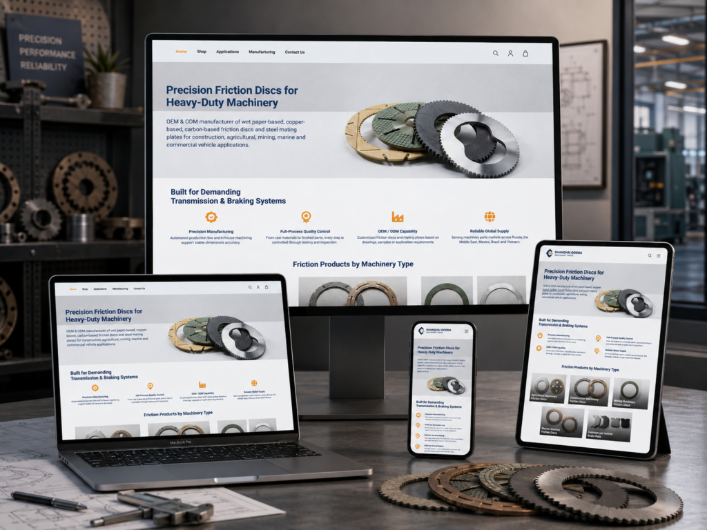
For this WordPress website, we designed the entire experience around those buyer concerns. Every section works as part of a clear conversion path. The homepage begins with a direct hero message, then introduces company strengths, product applications, manufacturing background, featured products, customization workflow, factory capability, partner brands, industry content, and finally contact options. This order helps visitors move from first impression to trust, from trust to product understanding, and from product understanding to inquiry.
We used a professional industrial color palette, clear typography, structured spacing, real product photography, factory visuals, and concise content blocks to support the company’s positioning. Instead of making the website overly decorative, we focused on readability, authority, and practical decision-making. The design speaks to B2B buyers who need information quickly and clearly. It also presents the company as a reliable manufacturer that can serve customers across construction machinery, agricultural machinery, mining machinery, marine gearboxes, and commercial vehicle applications.
| ระยะเวลาจัดส่ง | หมวดหมู่ | ประเภทเว็บไซต์ |
| 15days | Industrial Parts | วordpress |
| นักออกแบบที่เกี่ยวข้อง | ค่าใช้จ่าย | ผล |
| หลิน จาง | $1700 | Sales📈217% |
Hero Section: Creating a Strong First Impression
Clear Product Positioning From the First Screen
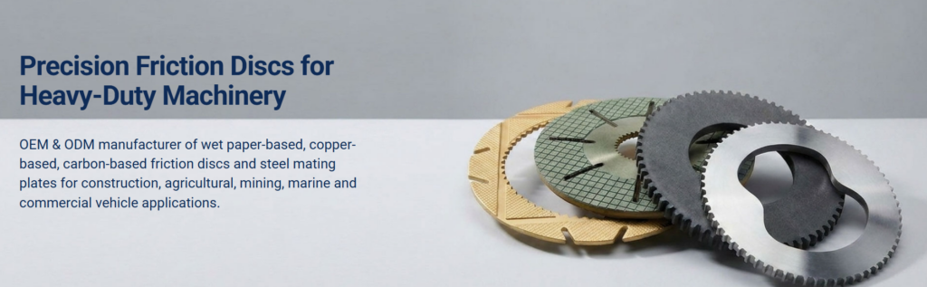
The hero section introduces the company with the headline “Precision Friction Discs for Heavy-Duty Machinery.” We placed this message on the left side because visitors naturally scan from left to right, and we wanted the core product category to appear immediately. For an industrial website, the first screen should not hide the business behind vague slogans. It should tell visitors exactly what the company does.
The phrase “precision friction discs” communicates product specialization, while “heavy-duty machinery” expands the application scope. Together, the headline helps buyers understand that this company serves demanding mechanical systems rather than general consumer products. This direct approach reduces confusion and improves the quality of visitor engagement.
Supporting Copy That Explains Capability
Below the headline, we added a concise paragraph describing OEM and ODM manufacturing for wet paper-based, copper-based, carbon-based friction discs, and steel mating plates. We also mentioned the target industries, including construction, agricultural, mining, marine, and commercial vehicle applications.
We designed this copy to answer the buyer’s first question: “Can this supplier make the type of part I need?” By listing materials and application fields directly in the hero section, the website gives technical buyers enough context to keep browsing. The copy avoids unnecessary storytelling at this stage because early-page visitors need clarity before emotion.
Product Photography as Immediate Visual Proof
On the right side, we used a large image of friction discs and mating plates. This visual choice supports the headline and makes the page feel product-focused. Industrial buyers often prefer to see real products rather than abstract graphics, so the image helps build credibility from the first impression.
The clean gray background keeps the page calm and professional. It avoids visual noise and allows the product shapes, textures, and metallic surfaces to stand out. We used dark blue typography to create a reliable engineering tone, while the balanced layout makes the hero section feel stable and confident.
Core Strengths: Turning Capabilities Into Scannable Trust
Why We Used a Four-Column Layout
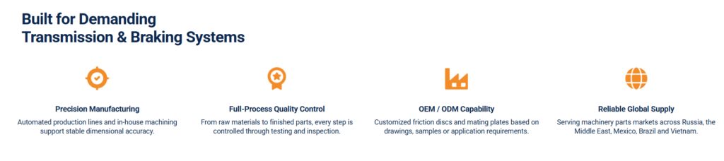
After the hero section, we introduced four core strengths: precision manufacturing, full-process quality control, OEM/ODM capability, and reliable global supply. We used a four-column layout because it allows buyers to scan the company’s advantages quickly. B2B visitors often compare suppliers, so they need key information in a structured and digestible format.
Each column focuses on one value. This prevents the content from becoming dense and helps visitors remember the company’s capabilities. Instead of writing a long paragraph about production strength, we divided the message into clear decision points.
Orange Icons for Visual Anchoring
We used simple orange icons above each point to create visual anchors. The orange color adds energy and contrast to the dark blue text. It also makes the section feel more approachable without reducing the professional tone.
Each icon supports the meaning of its section. The precision symbol represents manufacturing accuracy. The quality badge reinforces inspection and control. The factory icon communicates OEM and ODM capability. The globe icon shows international supply. These simple visual cues help visitors understand the content faster.
Short Text for Faster Decision-Making
The supporting text under each heading stays short and focused. For example, the quality control point explains that every step is controlled through testing and inspection. The OEM/ODM point explains that customized friction discs and mating plates can be produced based on drawings, samples, or application requirements.
This type of concise wording helps technical buyers identify relevant strengths without reading unnecessary promotional language. The design keeps the background white and the spacing generous, creating a clean and confident presentation.
Product Categories by Machinery Type
Organizing Products Around Buyer Applications
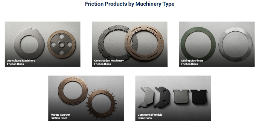
The next section presents “Friction Products by Machinery Type.” We organized the product categories by application because industrial buyers usually search based on machinery type, not only by product material. A buyer may need friction discs for agricultural machinery, construction machinery, mining machinery, marine gearboxes, or commercial vehicle brake pads. By structuring the section around these use cases, the website makes navigation more intuitive.
This approach also shows that the company understands different industries and their specific needs. It presents the product system as practical and application-driven rather than abstract.
Visual Cards That Reduce Search Friction
We used large image cards for each machinery type. This layout helps users recognize categories faster than a text-only list. Product images give each category a real industrial context, while the card format keeps the section organized.
The labels appear directly on the images. This allows visitors to connect the product appearance with the machinery application at the same time. We placed the text at the lower part of each image because the darker gradient area improves readability and keeps the product visuals visible.
A Balanced Grid for Professional Structure
The section uses a clean grid with three cards on the first row and two cards on the second row. This structure creates rhythm and prevents the page from feeling too crowded. The centered title introduces the purpose of the section, while the neutral background keeps the focus on the product categories.
For an industrial website, this type of category display improves user experience because it turns a complex product catalog into a simple browsing path. Buyers can quickly select the application that matches their needs and continue deeper into the website.
About Section: Building Company Credibility
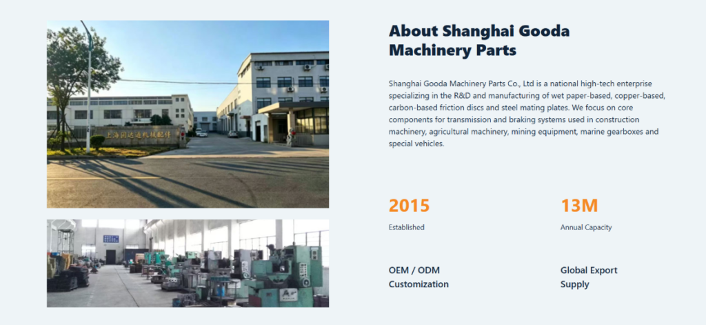
Combining Factory Images With Company Story
The “About Shanghai Gooda Machinery Parts” section strengthens trust by combining real factory visuals with a concise company introduction. We placed the factory exterior and workshop interior images on the left because these visuals immediately show that the company has a real operating environment. In B2B manufacturing, authenticity matters. Buyers want to see evidence of production space, equipment, and operational capability.
The exterior image communicates business presence, while the workshop image communicates production activity. Together, they make the company feel more credible and grounded.
Clear Copy That Explains Specialization
On the right side, we introduced the company as a national high-tech enterprise specializing in R&D and manufacturing of wet paper-based, copper-based, carbon-based friction discs, and steel mating plates. We also explained that the products serve transmission and braking systems across several machinery applications.
We wrote this section to give visitors a more complete understanding of the business. The copy connects product specialization, manufacturing focus, and industry relevance. It also supports buyers who may need to evaluate whether the company has enough technical experience for their project.
Key Numbers for Faster Trust
We highlighted the establishment year and annual capacity using large orange numbers. The number “2015” helps visitors understand the company’s history, while “13M” communicates production scale. These data points create quick trust because they turn company strength into measurable information.
Below the numbers, we included short statements such as OEM/ODM customization and global export supply. These points reinforce the company’s ability to serve different customer needs. We kept the layout spacious so the section feels professional, not overloaded.
Popular Products: Highlighting Representative Items
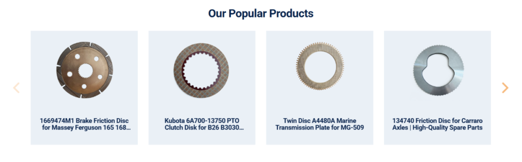
A Focused Carousel for Product Discovery
The “Our Popular Products” section helps visitors discover representative products without browsing the full catalog immediately. We used a carousel layout because it allows the website to showcase multiple items while keeping the page clean. For B2B buyers, this section works as a product preview. It gives them a quick sense of what the company sells and which models may be relevant.
The carousel also encourages exploration. Visitors can use the arrows to view more products, but the initial layout remains simple and controlled.
Consistent Product Cards for Better Comparison
Each product appears inside a light card with generous spacing. We kept the product photos consistent in scale and presentation so the section feels organized. This consistency helps buyers compare product shapes and types more easily.
The product names appear below the images. Since industrial product names often include model numbers, machinery brands, or application references, we made sure the text remains close to the product image. This connection helps visitors understand what they are viewing without confusion.
Clean Visual Hierarchy
The centered title makes the section easy to identify. The cards use a pale background to separate each item from the white page, while the dark blue text maintains brand consistency. The navigation arrows use a soft orange tone that aligns with the site’s accent color.
This section supports conversion by showing real products early in the browsing journey. It gives buyers more confidence that the company can provide specific parts, not just general manufacturing services.
OEM and ODM Manufacturing Process
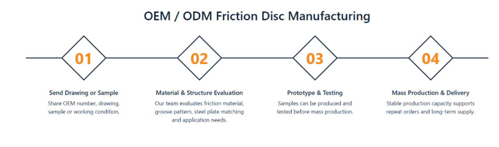
Making Custom Manufacturing Easy to Understand
The OEM/ODM manufacturing section explains the cooperation process through a four-step timeline. We designed this section because custom industrial manufacturing can feel complicated for new buyers. A clear process reduces uncertainty and helps visitors understand how to start a project.
The steps include sending a drawing or sample, material and structure evaluation, prototype and testing, and mass production and delivery. This sequence reflects the practical path from inquiry to production.
Diamond Markers for a Strong Process Flow
We used diamond-shaped step markers connected by a horizontal line. The line creates a sense of movement, while the diamonds give each step visual importance. The orange step numbers stand out clearly and guide the visitor through the process.
This design turns a technical workflow into a simple visual story. It shows that the company has an organized process rather than an unclear or informal approach.
Concise Descriptions for Each Stage
Each step includes a short heading and a brief explanation. For example, the first step asks customers to share OEM numbers, drawings, samples, or working conditions. The second step explains that the team evaluates friction materials, groove patterns, steel plate matching, and application needs. The third step shows that samples can be produced and tested before mass production. The final step emphasizes stable production capacity and long-term supply.
This wording reassures buyers that the company can support technical evaluation, testing, and repeat orders. The clean layout makes the process easy to follow and supports inquiry conversion.
Manufacturing Strength: Making Capability Visible
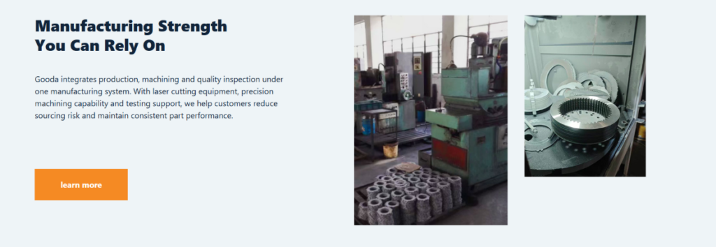
A Section Built Around Production Confidence
The manufacturing strength section focuses on the company’s integrated production, machining, and quality inspection system. We placed the message on the left and factory images on the right to balance explanation with proof.
The headline “Manufacturing Strength You Can Rely On” creates a confident tone. It speaks directly to buyers who care about stable part performance, sourcing risk, and production reliability.
Factory Photos That Show Real Capability
On the right side, we used two factory images with different proportions. One image shows machinery and production space, while the other shows friction disc parts in a production or processing environment. This combination makes the section feel authentic and practical.
We avoided overly polished or artificial visuals because industrial buyers value real evidence. The images show equipment, parts, and workshop context, which helps visitors believe the company has hands-on manufacturing capability.
A Clear Call-to-Action
We added an orange “learn more” button under the paragraph. This call-to-action gives interested visitors a next step without interrupting the content flow. It also supports the website’s conversion structure by encouraging deeper exploration.
The background uses a light industrial tone that keeps the section calm and readable. The dark blue heading and orange button maintain the same visual language used throughout the website. This consistency helps the brand feel organized and intentional.
Partner Brands: Visual Proof of Market Experience
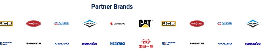
Using Logos as Trust Signals
The “Partner Brands” section uses recognized machinery and transmission brand logos to build credibility. In industrial markets, buyers often look for signs that a supplier understands well-known equipment systems. Displaying partner or application-related brand marks can help communicate market experience quickly.
Instead of explaining every relationship in a long paragraph, we used a logo grid. This allows visitors to absorb the trust signal in seconds.
A Clean Layout That Keeps Focus on Recognition
We placed the title at the top center and arranged the logos across the section with generous white space. This simple layout ensures that the logos remain the visual focus. The section does not need heavy decoration because the value comes from recognition and association.
The repeated horizontal arrangement also creates rhythm. It makes the company appear active across multiple markets and machinery categories.
Supporting Compatibility and Confidence
For buyers, this section suggests that the company understands different machinery systems and can supply parts for a variety of equipment brands. It supports the earlier product category section by reinforcing the company’s application range.
The design keeps the tone professional and minimal. This prevents the section from feeling like an advertisement and instead makes it function as a concise credibility module.
Technical Insights and Industry News
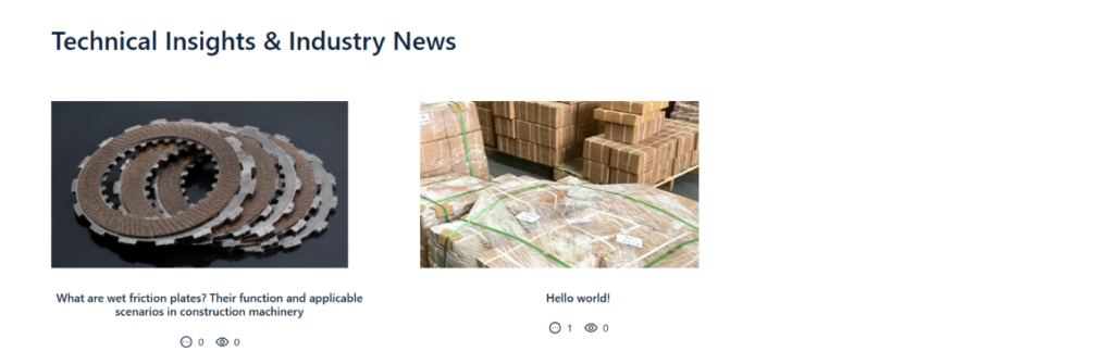
Adding Educational Value to the Website
The “Technical Insights & Industry News” section gives the website more depth. We included it because an industrial website should not only display products; it should also demonstrate knowledge. Technical articles can help buyers understand friction plates, applications, material differences, maintenance topics, and industry trends.
This type of content supports long-term trust. It shows that the company understands the field and can provide information beyond basic sales communication.
Article Cards for Simple Browsing
We used an article-card layout with featured images, titles, and small metadata icons. The images make the content more approachable, while the titles explain the topic clearly. This structure helps visitors decide whether they want to read more.
For example, an article about wet friction plates and their applicable scenarios gives technical visitors useful context. The layout makes the content feel accessible rather than hidden inside a blog archive.
SEO and Professional Authority
This section also supports SEO. By publishing technical articles and industry news, the website can target more search queries related to friction discs, braking systems, transmission parts, and machinery applications. From a design perspective, we made sure the content area still fits the industrial brand style. The section remains clean, readable, and practical.
The small view and comment icons show activity without distracting from the main article titles. Overall, this section helps the website become a resource, not just a product catalog.
Contact Page: Turning Interest Into Inquiry
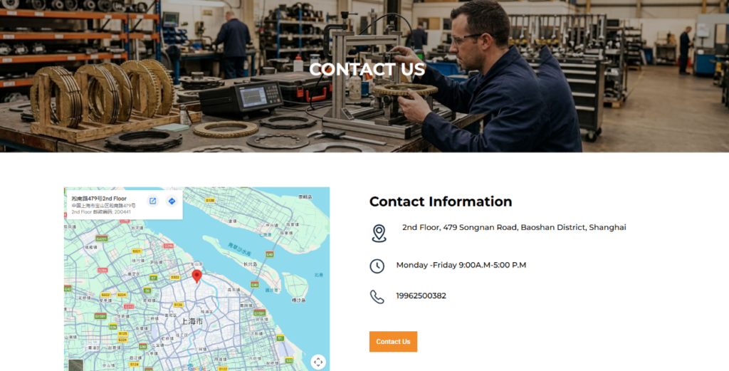
A Strong Contact Banner
The contact page begins with a wide factory-style banner and a centered “CONTACT US” title. We designed this hero area to connect the inquiry experience with the company’s manufacturing identity. The factory background reinforces credibility and reminds visitors that they are contacting a real industrial supplier.
The title appears clearly in the center, giving the page a direct purpose. We avoided unnecessary promotional text here because the contact page should help users act quickly.
Map and Contact Information Side by Side
Below the banner, we placed the map on the left and contact information on the right. This structure gives visitors both location proof and practical communication details. The map helps overseas buyers verify the company’s physical presence, while the address, business hours, and phone number provide direct ways to connect.
We used icons for each contact detail because icons improve scanability. Visitors can quickly identify address, time, and phone information without reading a dense block of text.
A Simple Form That Reduces Friction
The contact form appears below the contact information section. We kept the form simple, using only essential fields such as first name, last name, email, and message. A shorter form reduces friction and increases the chance that visitors will submit an inquiry.
The large orange “Send Message” button creates a strong conversion point. It visually stands out and clearly tells users what to do next. The form layout uses generous spacing, which makes the page feel clean and easy to use.
Footer Structure for Continued Navigation
The footer includes quick links, product categories, contact details, and payment icons. This structure helps visitors continue browsing even after they reach the bottom of the contact page. It also repeats key business information, which reinforces trust and usability.
For an industrial website, the contact page must do more than provide a form. It must remove hesitation. By combining a factory banner, map, contact details, simple form, and structured footer, the page makes communication feel reliable and easy.
Overall Design Strategy
Professional Industrial Branding
Across the website, we used dark blue as the primary text color because it communicates stability, professionalism, and technical reliability. We used orange as the accent color because it adds energy and guides attention toward important numbers, icons, and buttons. This color system creates a strong brand identity without becoming too decorative.
The visual style remains clean and structured. We avoided unnecessary animation-heavy or overly artistic elements because this audience values clarity and credibility. Every design decision supports product understanding, supplier evaluation, or inquiry conversion.
ลำดับชั้นข้อมูลที่ชัดเจน
The website follows a logical order. It starts with what the company makes, then explains why the company is reliable, shows product categories, introduces company background, displays popular products, explains the OEM/ODM process, proves manufacturing strength, shows partner brands, shares technical insights, and ends with contact options.
This order matches how B2B buyers evaluate suppliers. They first need to understand the product. Then they need to trust the company. Finally, they need a simple way to contact the supplier.
Real Visuals Over Generic Graphics
We used real product images, factory photos, workshop visuals, and map information because industrial buyers need tangible proof. Generic stock visuals would weaken the website’s credibility. Real visuals help make the company feel more transparent and established.
The product images also support technical clarity. Friction discs and steel plates have specific shapes, textures, and patterns, so showing them clearly helps buyers recognize relevant parts.
Conversion-Focused Simplicity
The website avoids overwhelming visitors with too many competing elements. Each section has one main purpose. The hero introduces the product. The strength section builds confidence. The machinery category section guides browsing. The OEM/ODM timeline explains cooperation. The contact page encourages inquiry.
This simplicity improves user experience and supports conversion. It helps visitors move through the website with less friction and more confidence.
บทสรุป
นี้ วordpress website presents Shanghai Gooda Machinery Parts as a focused, capable, and trustworthy friction disc manufacturer. The design uses clear messaging, structured layouts, real product photography, factory visuals, application-based navigation, process explanations, trust signals, and easy contact options to support the needs of industrial buyers.
From the first hero section to the final contact form, every part of the website serves a practical purpose. It helps visitors understand what the company makes, why its manufacturing system matters, how OEM and ODM cooperation works, and how buyers can start a conversation. The result is a professional B2B website experience that balances technical clarity with commercial trust.
For companies that want to build this type of conversion-focused industrial website, AIRSANG can help create clear, professional, and market-ready website designs for global buyers.


ออกแบบและสร้างเว็บไซต์ WordPress หรือเว็บไซต์องค์กรพร้อมระบบอีคอมเมิร์ซครบวงจรสำหรับคุณ.
ช่วงราคา: $200.00 ถึง $2,500.00ข้อกำหนดเฉพาะหรือใบเสนอราคาพิเศษ
ราคาเดิมคือ: $2.00.$1.00ราคาปัจจุบันคือ: $1.00. ภาพหลักสำหรับการออกแบบอุปกรณ์กายภาพบำบัดที่บ้านของ Amazon (อธิบายรายละเอียด)
บทนำ: การสร้างภาพลักษณ์ที่น่าเชื่อถือสำหรับอุปกรณ์บำบัดที่บ้านบน Amazon เมื่อออกแบบภาพหลักสำหรับอุปกรณ์บำบัดที่บ้านบน Amazon สิ่งสำคัญอันดับแรกของเราคือ...

ภาพหลักสำหรับการแปลงลิปสติกเป็นสินค้าสำหรับ Amazon
บทนำ: การออกแบบภาพหลักลิปสติกที่ขายได้บน Amazon เมื่อเราออกแบบภาพหลักสำหรับลิปสติกบน Amazon ความรับผิดชอบของเราไม่ได้จำกัดอยู่แค่...

แฮกเกอร์ขโมยอีเมลผู้ดูแลระบบ WordPress ได้อย่างไร (และวิธีป้องกัน)
มาเริ่มกันด้วยความจริงที่ไม่น่าสบายใจ: อีเมลแอดมิน WordPress ของคุณอาจเปิดเผยต่อสาธารณะมากกว่าที่คุณคิด และแฮกเกอร์? พวกเขาชอบมาก สำหรับพวกเขา...

อะไรทำให้รองพื้นชนิดเหลวของ Amazon (ภาพหลัก) ขายดี?
บทนำ การออกแบบภาพหลักสำหรับรองพื้นชนิดเหลวบน Amazon ไม่ใช่แค่การทำให้ผลิตภัณฑ์ดูสวยงามเท่านั้น บน Amazon ภาพหลักและ...

การออกแบบภาพหลัก Amazon ที่มีประสิทธิภาพสำหรับตลับกรอง
บทนำ การออกแบบภาพหลักสำหรับ Amazon ไม่ใช่แค่การทำให้สินค้าดูน่าดึงดูดเท่านั้น แต่ยังเกี่ยวกับความชัดเจน ความน่าเชื่อถือ และความเข้าใจได้ในทันที โดยเฉพาะอย่างยิ่งสำหรับ...

การโจมตีแบบ Replay Attack บน WordPress: ภัยคุกคามจริงหรือแค่เรื่องที่ถูกพูดเกินจริง?
ก่อนอื่นขอชี้แจงให้ชัดเจนก่อน การโจมตีแบบ Replay Attack นั้นดูไม่น่ากลัว มันไม่ได้ทำลายรหัสผ่าน มันไม่ได้แทรกโค้ดที่เป็นอันตรายพร้อมข้อความแฮ็กเกอร์สีเขียวกระจัดกระจายไปทั่ว มันแนบเนียนกว่า...

วิธีคัดลอกหน้าเว็บ WordPress โดยไม่ทำให้ระบบเสียหาย
ยอมรับกันเถอะ บางครั้งคุณอาจไม่อยากสร้างหน้าเว็บใหม่ คุณแค่อยากได้หน้าเว็บเดิม...แต่แตกต่างไปเล็กน้อย รูปแบบเหมือนเดิม บล็อกเหมือนเดิม การตั้งค่าเหมือนเดิม เพราะ...

เปรียบเทียบธีม WordPress สำหรับสัตว์เลี้ยง 5 แบบ
บทนำ การเลือกธีม WordPress ที่เหมาะสมสำหรับธุรกิจเกี่ยวกับสัตว์เลี้ยงนั้นไม่ใช่แค่เรื่องของการออกแบบเท่านั้น แต่ยังส่งผลโดยตรงต่อการใช้งาน ความสามารถในการขยายขนาด และการเติบโตของธุรกิจในระยะยาว การดูแลสัตว์เลี้ยงและ...

เปรียบเทียบธีมอีคอมเมิร์ซชุดว่ายน้ำ 5 แบบ
บทนำ การเลือกธีมที่เหมาะสมสำหรับร้านค้าอิสระที่จำหน่ายชุดว่ายน้ำหรือชุดชั้นในนั้นไม่ใช่แค่การตัดสินใจด้านภาพลักษณ์เท่านั้น แต่ยังส่งผลโดยตรงต่ออัตราการเปลี่ยนลูกค้าให้เป็นผู้ซื้อ ความสามารถในการขยายธุรกิจ และความยั่งยืนในระยะยาว...

วิธีปิดการแสดงความคิดเห็นใน WordPress (โดยไม่ต้องเสียสติ)
มาพูดถึงระบบแสดงความคิดเห็นของ WordPress กันดีกว่า ในทางทฤษฎีแล้ว ความคิดเห็นนั้นยอดเยี่ยมมาก มันช่วยกระตุ้นการสนทนา สร้างชุมชน และทำให้เว็บไซต์ของคุณดูมีชีวิตชีวา แต่ในความเป็นจริงแล้ว มันมักจะเป็นเหมือนแม่เหล็กดึงดูด...

การสร้างเว็บไซต์ WordPress ที่ปรับขนาดได้สำหรับแบรนด์ที่ขับเคลื่อนด้วยวิทยาศาสตร์: โครงการ AminoUSA
บทนำ ในยุคดิจิทัลปัจจุบัน เว็บไซต์เป็นมากกว่าแค่สถานที่สำหรับแสดงรายการสินค้า สำหรับแบรนด์ที่ขับเคลื่อนด้วยวิทยาศาสตร์ซึ่งดำเนินงานในอุตสาหกรรมที่มีการควบคุมหรือเน้นการวิจัย...

สร้างร้านค้า Shopify ที่ปรับขนาดได้สำหรับแบรนด์ใบมีดระดับโลก: โครงการ CoolKatana
บทนำ ในธุรกิจอีคอมเมิร์ซข้ามพรมแดน เว็บไซต์ Shopify เป็นมากกว่าแค่หน้าร้าน สำหรับแบรนด์ที่ดำเนินธุรกิจในกลุ่มเฉพาะหรือกลุ่มที่ขับเคลื่อนด้วยวัฒนธรรม เว็บไซต์ต้องทำมากกว่านั้น...

การออกแบบร้านค้า Shopify ที่มีอัตราการแปลงสูงสำหรับขายการ์ดโปเกมอน
บทนำ ในโลกของอีคอมเมิร์ซสินค้าสะสม โดยเฉพาะอย่างยิ่งในตลาดเกมการ์ดโปเกมอน (TCG) เว็บไซต์จะต้องทำมากกว่าแค่แสดงรายการสินค้า...

ดีไซน์ Shopify ที่เพิ่มยอดขายสำหรับแบรนด์อิฐสั่งทำพิเศษ
บทนำ ในสภาพแวดล้อมการแข่งขันอีคอมเมิร์ซในปัจจุบัน โดยเฉพาะอย่างยิ่งในตลาดของขวัญส่วนบุคคลและของสะสม เว็บไซต์ Shopify ต้องทำมากกว่าแค่แสดงสินค้า...

วิธีติดต่อฝ่ายสนับสนุนของ Shopify: คู่มือที่ง่ายและไม่ยุ่งยาก
การบริหารร้านค้า Shopify ควรเป็นเรื่องที่น่าตื่นเต้น ไม่ใช่เรื่องที่ทำให้สับสน เมื่อมีคำถามหรือปัญหาเกิดขึ้น Shopify มีช่องทางการสนับสนุนหลายช่องทาง ขึ้นอยู่กับสถานการณ์...

วิธีปิดใช้งานร้านค้า Shopify: คู่มือที่ชัดเจนและใช้งานได้จริง
การปิดใช้งานร้านค้า Shopify นั้นไม่ซับซ้อน แต่ก็มีผลกระทบหลายอย่างที่ผู้ขายหลายรายมองข้ามไป คู่มือนี้จะอธิบายขั้นตอนอย่างละเอียดและเข้าใจง่าย...

กรณีศึกษาการออกแบบเว็บไซต์ Shopify สำหรับแบรนด์ดอกไม้ระดับพรีเมียม
บทนำ ในสภาพแวดล้อมการแข่งขันอีคอมเมิร์ซในปัจจุบัน เว็บไซต์ Shopify ต้องทำมากกว่าแค่แสดงสินค้า มันต้องสื่อสารคุณค่าของแบรนด์ได้ทันที และแนะนำผู้ใช้...

กรณีศึกษาการออกแบบร้านค้า Shopify: ร้านค้าเกมย้อนยุค
บทนำ ในสภาพแวดล้อมอีคอมเมิร์ซที่มีการแข่งขันสูง ความชัดเจนทางด้านภาพและการเชื่อมโยงทางอารมณ์มักเป็นตัวกำหนดว่าผู้เยี่ยมชมจะกลายเป็นลูกค้าหรือไม่ โดยเฉพาะอย่างยิ่งใน...