Project overview
The client of this project is a brand that specializes in ergonomic chairs and office comfort solutions. It hopes to enhance product value and consumer trust in the brand through a more professional brand website image. With the continuous growth of online sales business, the client’s original page could no longer meet the promotion needs in terms of visual hierarchy, product display and brand atmosphere, so he came to us and hoped to reorganize the website design. The project is based on the Shopify platform. We focus on visual planning around the functional features, usage scenarios and comfortable experience of the ergonomic chair. Through clear page structure, simple and modern layout, real scene pictures and key selling point display, consumers can quickly understand the product advantages, while strengthening the brand’s professional positioning and establishing a more unified visual foundation for subsequent product sales, advertising promotion and long-term brand operations.
| Services | Industry | Platform |
| Website design and decoration | Home department store | shopify |
| Project requirements | target market | design style |
| Optimize website structure and user browsing experience | Global | Simple and refreshing|Japanese style home|Function-oriented |
| project budget | Delivery content | Delivery time |
| ¥6500 | Website construction and full-site page design | 16 working days |
Project Challenges
The core challenge of this project is how to fully present the rich adjustment functions, comfort experience and product value of the ergonomic chair without making the page appear complicated and technical. In the early stage of the project, we first sorted out the core issues that users are most concerned about when purchasing office chairs, including lumbar support, headrest, armrests, reclining adjustment, breathability and long-term office comfort, and further analyzed the reading habits, aesthetic preferences and trust factors of users in the Japanese market. On this basis, we re-planned the information hierarchy and browsing path of the Shopify homepage, split the content into several stages: product awareness, functional education, scene experience and trust assurance. We also organized product materials, lifestyle pictures, after-sales policies and brand information to establish a unified direction for subsequent page visual design and content layout.
Our design process
Preliminary research: understanding products and consumers’ purchasing psychology
Every good Shopify website design project should start with brand positioning. Before formally planning the page layout, we will first think about a question: How does this product make consumers feel?
In this project, the answer is clear. We hope this product can convey the following core feelings:
Comfortable support
The product needs to allow users to feel the stable support brought by ergonomic design for the first time and help improve the sitting experience when working for long periods of time.
Relaxation and recovery
Office chairs not only need to meet work needs, but also help users relieve fatigue caused by sitting for long periods of time, making the office process easier.
modern sense
The product itself has a modern ergonomic structure, so the website visual also needs to reflect a design language that is concise, professional and consistent with the modern office environment.
Practicality
In addition to visual appeal, we also need to give consumers a clear understanding of the actual value of the product during long hours at work, working from home, and daily use.
An ergonomic office chair is more than just a piece of furniture, it is more like a solution to problems such as discomfort from prolonged sitting, fatigue from sitting, long periods of working from home, and poor experience in the office environment.
This knowledge directly affects the design direction of the entire page.
We don’t want this Shopify store to look like a simple product catalog, but we want to use the page content to guide consumers to gradually understand the products, and make the entire browsing process feel like learning a more comfortable and healthy way of working.
Content planning: Give each page section a clear role
After clarifying the emotional value and business goals of the product, we began to plan the entire page content hierarchically.
Different modules are not simply stacked on the page, but undertake different user communication tasks.
product awareness layer
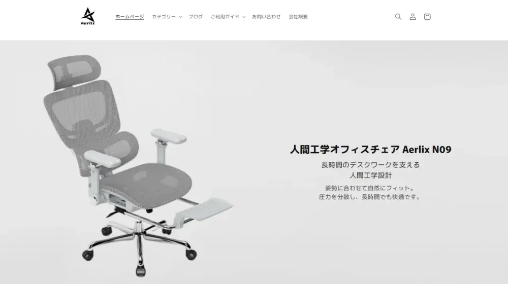
The first screen of the page needs to help users quickly understand what the product is.
Therefore, the current home page stands out immediately after entering the page Aerlix N09 The product name, combined with ergonomic positioning and product visual pictures, allows consumers to complete basic product awareness in a short time.
Users do not need to browse a large amount of information to quickly understand that this is a seating product that focuses on ergonomics and comfortable office experience.
product education layer
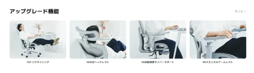
After establishing an initial understanding, the page needs to further explain the differences between this chair and ordinary office chairs.
Therefore, the website displays content around several key ergonomic features, including:
- headrest support
- Lumbar support
- Adjustable armrests
- recline adjustment
- Breathable mesh seat
- Comfortable for long working hours
Through these functional sections, we transform the relatively complex product structure into actual use value that is easier for consumers to understand.
lifestyle layer
Merely showing product parameters is not enough to make consumers really want to buy.
We also need to allow users to see the product in use in a real-life environment.
Therefore, the website has added lifestyle scenarios such as home office and daily rest, and designed relevant content around different usage states, such as:
working mode
Demonstrate the practical application of products in long hours of office work, computer use and home office environments.
casual mode
Through more relaxed sitting postures and life scenes, consumers can feel that the chair is not only suitable for work, but can also meet daily leisure needs.
Relaxation mode
By displaying functions such as recline, headrest and lumbar support, consumers can further understand the comfortable experience of ergonomic chairs while resting.
These scenarios can help potential customers more naturally imagine the state of the product after it enters their lives, thereby enhancing the sense of product involvement.
trust building layer

The last important task of the page is to reduce consumers’ concerns before purchasing.
Therefore, we need to provide protection for the entire purchasing process through multiple trust modules.
The website currently displays include:
- Product warranty
- Delivery guarantee
- Return and exchange policy
- Safe payment method
- Blog content
- Contact information
These contents are distributed in the page auxiliary module and the website footer structure.
Although they are not the core visual elements of the page, they can effectively supplement the information consumers need to make purchasing decisions and help enhance brand credibility.
Shopping path wireframe design
From a design perspective, we do not treat this page as a static product display page; A sales story that unfolds as the user scrolls 。
During the wireframe planning phase, we paid particular attention to page view pacing.
Avoid too much technical information too soon
If a large number of product functions and parameters are directly stacked in the first half of the page, the entire website will appear too technical and will easily increase the user’s reading pressure.
Avoid too much brand content and lack of product proof
If the page spends too much space introducing the brand concept but does not demonstrate the product advantages in a timely manner, consumers may not be able to quickly understand the product value.
Avoid trust information appearing too late
If logistics, after-sales, returns and exchanges, payment guarantee and other information appear too late, users may have purchasing concerns during the browsing process.
Therefore, we finally planned the entire page structure into a more balanced browsing path:
Product display → Core advantages → Usage scenarios → In-depth product certification → Purchase guarantee
This structure allows consumers to obtain information gradually during the browsing process, rather than facing a large amount of content at once.
Visual direction and page hierarchy design
The Aerlix ergonomic chair itself has a relatively modern product outline and uses a large amount of mesh structure. Therefore, the visual direction of the entire website needs to focus on three aspects:
Product styling
Through a simple background and sufficient white space, the structure and outline of the seat itself become the visual center of the page.
Breathable experience
Mesh is an important design feature of the product, so the page needs to enhance the product’s breathability and long-term comfort through local details and scene pictures.
Ergonomic structure
Structures such as headrests, lumbar supports, armrests, and backrest adjustments need to be clearly presented, but the entire page cannot be turned into a traditional product parameter manual.
Therefore, we mainly adopt the following visual principles in website design.
Loose page composition
Keeping enough visual space around product images can make the product look more premium and prevent the page from feeling crowded.
For products such as ergonomic office chairs that emphasize quality and comfortable experience, appropriate white space can effectively enhance the overall brand feel.
soft visual contrast
Compared with traditional e-commerce visuals with high saturation and strong sense of promotion, we adopt a more restrained and soft color scheme.
This visual language can better convey the brand message of comfort, health and relaxation, and is also more in line with modern home and office scenes.
Modular image layout
The page is organized through function cards, lifestyle images, and product details modules.
This modular design can improve the browsability of the page, allowing consumers to still grasp key information while scrolling quickly.
Different users can also enter product awareness from different modules according to their own concerns.
Establish visual hierarchy through restraint
We didn’t use a lot of complicated decorative elements to create visual focus.
Instead, the entire page mainly passes:
- font size
- content location
- Image ratio
- module duplication
- white space rhythm
to guide the user’s gaze.
The current Shopify store also continues this design logic. Through a relatively unified section structure and a stable visual rhythm, the entire page remains clear, comfortable and consistent during long-distance scrolling.