


Введение
Он XQMI website is designed as more than a simple eCommerce platform—it is a structured emotional journey that transforms a functional product into a lifestyle experience. From a designer’s perspective, every section is intentionally crafted to guide users through a sequence of emotional engagement, product understanding, trust building, and finally purchase conversion.
Rather than relying on traditional product listing logic, the website uses narrative-driven UX patterns. It combines lifestyle storytelling, visual hierarchy, psychological reassurance, and modular content blocks to create a seamless flow. Each section builds upon the previous one, gradually reducing user uncertainty while increasing emotional attachment to the product.
This article breaks down the full website structure in sequence, explaining why each design decision was made and how it contributes to both user experience and conversion optimization.
| Срок доставки | Категория | Тип веб-сайта |
| 14days | Smart Aromatherapy | WordPress |
| Участники проекта (дизайнеры) | Расходы | Эффект |
| Линь Чжан | $1300 | Sales📈237% |
Hero Section – Emotional First Impression Strategy

Creating Immediate Emotional Connection
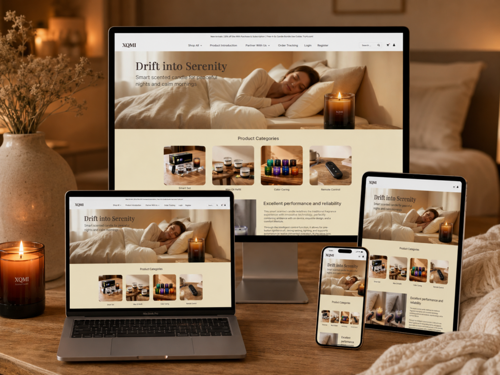
The homepage opens with a powerful hero section featuring the message “Drift into Serenity.” From a design perspective, this is not just a headline—it is an emotional trigger. The goal is to immediately position the product as a lifestyle enhancer rather than a simple scented candle.
We use warm, soft lighting and a bedroom relaxation scene to create instant psychological comfort. This visual approach reduces cognitive resistance and allows users to emotionally accept the brand within seconds of landing on the page.
Visual Hierarchy and Focus Control
The layout is intentionally minimal:
Primary Focus
- Emotional lifestyle imagery (sleeping scene)
- Product subtly placed in the environment
Secondary Focus
- Headline communication
- Supporting subtext
We avoid overwhelming users with technical information at this stage. Instead, we let atmosphere lead perception, which is crucial for wellness-based products.
Why This Design Works
This section works because it aligns with the principle of emotional-first UX design. Users do not initially buy features—they buy feelings. By anchoring the first impression in serenity and comfort, we establish the emotional foundation for the rest of the website journey.
Product Categories – Simplifying Cognitive Load
Structured Browsing Through Clear Segmentation
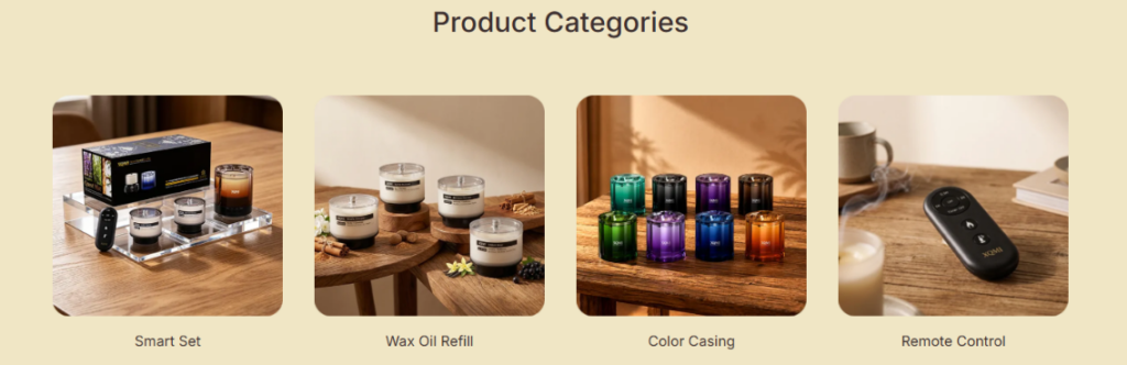
The product category section uses a four-card grid layout to simplify decision-making. From a design perspective, this prevents cognitive overload by breaking the product ecosystem into digestible segments.
Each category represents a specific user intent:
- Smart Set (complete experience)
- Wax Oil Refill (maintenance & continuity)
- Color Casing (personalization)
- Remote Control (functionality enhancement)
Visual Consistency and Recognition
Each card uses consistent composition, spacing, and framing. This consistency allows users to scan quickly without needing to re-learn visual patterns.
Why Grid Layout Matters
- Supports fast comparison
- Reduces navigation friction
- Encourages exploration
Emotional Continuity in UI Design
Although this is a functional section, we maintain soft tones and lifestyle imagery to ensure continuity with the hero section. This prevents the user from feeling a sudden shift into “hard commerce mode.”
Performance Section – Building Rational Trust
Balancing Emotion with Logic
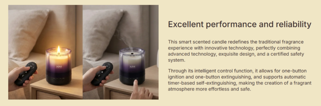
Once emotional interest is established, we introduce the “Excellent Performance and Reliability” section. This is where the design shifts from emotional storytelling to rational validation.
Split Layout Strategy
The section uses a left-right structure:
Left Side – Visual Demonstration
- Real usage scenarios
- Remote control interaction
- Candle operation in environment
Right Side – Technical Explanation
- Performance description
- Safety features
- Intelligent control functions
Why Split Design Works
This structure allows users to simultaneously process:
- What the product looks like in real life
- What the product does technically
This dual-channel communication increases comprehension efficiency and trust formation.
Product Gallery – Visual Exploration at Scale
Creating Product Discovery Depth
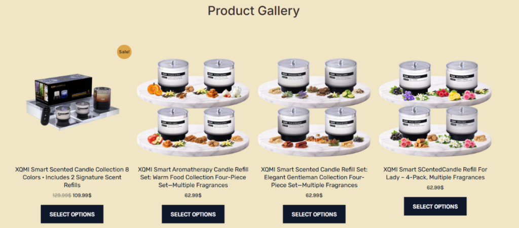
The product gallery section expands the product range visually, allowing users to explore multiple variants in a structured format.
We use a grid-based layout because it supports:
- Multi-product comparison
- Visual scanning efficiency
- Category recognition
Ingredient-Based Visual Storytelling
Each candle is paired with fragrance-related visuals such as fruits, herbs, and spices. This helps users mentally associate scent profiles with real-world references.
Psychological Effect
This technique enhances sensory imagination, making the product feel more tangible even in a digital environment.
Conversion-Oriented Layout
Key purchase elements are placed directly under each product:
- Price visibility
- Clear CTA buttons
- Product naming hierarchy
This ensures that decision-making happens without unnecessary scrolling or confusion.
Patent & IP Section – Authority Building Layer
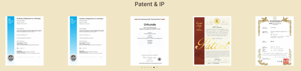
Transforming Certificates into Visual Trust
Instead of hiding certifications in a footer or text page, we convert them into a visual gallery. This significantly increases their perceived importance.
Global Credibility Strategy
The section includes documents from multiple regions, reinforcing international legitimacy.
Design Intent
- Communicate legal compliance
- Establish brand authority
- Reduce buyer skepticism
Why Visual Proof Matters
Users trust what they can see. Turning legal documents into a structured visual layout makes abstract credibility feel concrete and verifiable.
Safety & Compliance – Risk Reduction Design

Addressing Purchase Anxiety
At this stage of the page, users are close to decision-making. The goal is to eliminate any remaining hesitation.
Dual Column Information Strategy
Left Side – Bullet Points
- Remote ignition control
- Automatic extinguishing timer
- Tilt safety mechanism
- Heat-resistant construction
Right Side – Supporting Visuals
- Real-life operation scenes
- Safety behavior demonstration
Why This Section Increases Conversion
By explicitly addressing risk concerns, we reduce psychological barriers and increase user confidence in product safety.
Service Assurance Icons – Final Trust Reinforcement
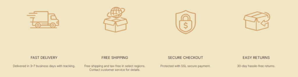
Simplifying Transaction Confidence
This section communicates logistics and transactional safety in a simple icon-based format.
Four Core Assurance Pillars
- Fast delivery
- Бесплатная доставка
- Безопасная оплата
- Easy returns
Why Icon Systems Work
Icons allow users to process information in seconds, which is essential for final-stage conversion support.
Design Principle
Less reading, more recognition.
Blog Section – Expanding SEO and Authority
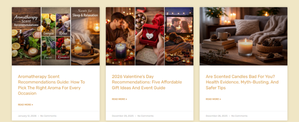
Content Marketing Integration
The blog section transforms the website into a knowledge ecosystem rather than just a storefront.
Content Structure Strategy
Each blog card includes:
- Emotional imagery
- Educational titles
- Clear reading path
Why Blogs Increase Conversions
Blogs support:
- SEO traffic acquisition
- User education
- Brand authority building
They also capture users at different intent levels, from curiosity to purchase readiness.
Product Page – Full Conversion Engine
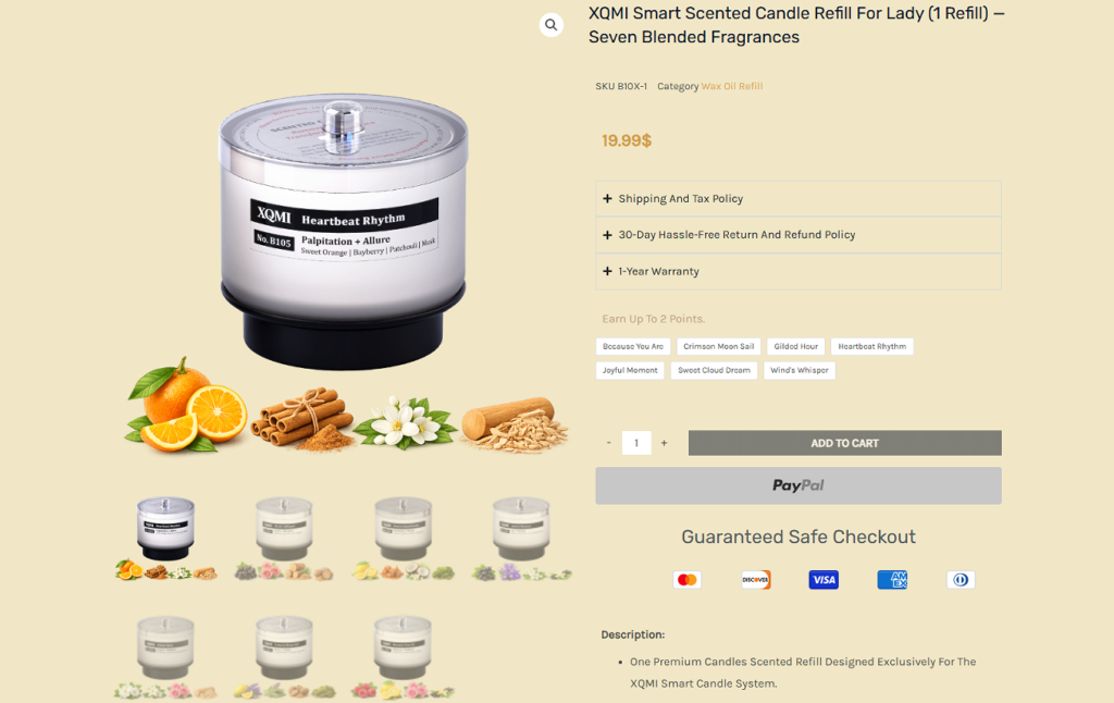
Structured Purchase Journey
The product page is the most critical conversion point in the entire website architecture.
Information Hierarchy Design
Top Section
- Product image dominance
- Price visibility
- Add-to-cart focus
Middle Section
- Feature explanation
- Material benefits
- Usage scenarios
Lower Section
- Related products
- Cross-selling opportunities
Trust Layer Integration
We strategically place:
- Shipping policy
- Return policy
- Warranty details
near the price area to reduce hesitation at the decision moment.
Cross-Section Design Logic – Unified UX System
Emotional → Rational → Trust → Conversion Flow
The entire website follows a structured psychological progression:
- Emotional attraction (Hero section)
- Exploration (Categories & Gallery)
- Rational validation (Performance section)
- Authority building (Patent section)
- Risk reduction (Safety section)
- Transaction reassurance (Service icons)
- Content engagement (Blog)
- Final conversion (Product page)
Why This Flow Works
This structure mirrors real human decision-making behavior:
- Feel first
- Understand second
- Trust third
- Act last
Заключение
Он XQMI website is ultimately designed as a complete UX ecosystem where every visual decision, content block, and interaction pattern works together to guide users through a seamless emotional and rational journey. From the first impression of calm lifestyle imagery to the final reassurance of safety, certification, and post-purchase confidence, the entire structure is intentionally engineered to reduce friction and elevate trust at every step.
What makes this design effective is not just the aesthetic consistency, but the strategic sequencing of psychological triggers—emotion first, clarity second, trust third, and conversion last. Each section plays a specific role in shaping user perception, ensuring that visitors never feel overwhelmed, yet always feel guided toward a natural decision-making flow.
This approach reflects a modern eCommerce philosophy where design is no longer just visual decoration, but a structured behavioral system. It demonstrates how thoughtful UX architecture can transform a simple product into a meaningful lifestyle experience.
At its core, this project represents the design thinking approach of Airsang, where creativity, conversion logic, and user psychology are merged into a single unified digital experience.


Спроектируем и создадим для вас WordPress-сайт или корпоративный сайт с полной системой электронной коммерции.
Ценовой диапазон: от $200.00 до $2,500.00Нестандартные требования или специальные предложения
Первоначальная цена составляла: $2.00.$1.00Текущая цена: $1.00. Дизайн главного изображения для домашнего физиотерапевтического устройства Amazon: пояснения.
Введение: Создание достоверного изображения для домашних терапевтических приборов на Amazon При разработке главного изображения для домашнего терапевтического прибора на Amazon мы в первую очередь...

Дизайн основного изображения для конвертации помады на Amazon.
Введение: Разработка главного образа помады, которая продается на Amazon Когда мы разрабатываем главный образ для помады Amazon, наша ответственность выходит далеко за рамки...

Как хакеры крадут электронные письма администраторов WordPress (и как им это предотвратить)
Начнем с неприятной истины: ваша электронная почта администратора WordPress, вероятно, гораздо более публична, чем вы думаете. А хакеры? Им это нравится. Для них ваш...

Что делает основное изображение жидкой тональной основы Amazon конвертируемым?
Введение. Разработка дизайна основного изображения для жидкой тональной основы на Amazon — это не просто создание красивого внешнего вида продукта. На Amazon основное изображение и...

Разработка эффективного основного изображения Amazon для фильтрующих картриджей
Введение. Разработка основного изображения для Amazon — это не просто создание привлекательного внешнего вида товара. Речь идёт о ясности, доверии и мгновенном понимании, особенно для...

Повторные атаки на WordPress: реальная угроза или преувеличенный миф?
Давайте сначала кое-что проясним. Атаки повторного воспроизведения не выглядят страшно. Они не взламывают пароли. Они не внедряют вредоносный код с зелёным хакерским текстом, разлетающимся повсюду. Они действуют коварно...

Как скопировать страницы WordPress, ничего не сломав
Давайте посмотрим правде в глаза. Иногда вам не хочется создавать новую страницу. Вам нужна та же самая страница… но немного другая. Тот же макет. Те же блоки. Те же настройки. Потому что….

Сравнение пяти тем WordPress для сайтов о домашних животных
Введение. Выбор подходящей темы WordPress для сайтов, посвященных домашним животным, — это не просто решение, связанное с дизайном; оно напрямую влияет на удобство использования, масштабируемость и долгосрочный рост бизнеса. Уход за домашними животными и...

Сравнение пяти тем оформления для интернет-магазинов купальников
Введение. Выбор правильной тематики для независимого магазина купальников или нижнего белья — это не просто визуальное решение, оно напрямую влияет на коэффициент конверсии, масштабируемость и долгосрочную перспективу...

Как отключить комментарии в WordPress (не сойдя с ума)
Давайте поговорим о комментариях в WordPress. В теории комментарии — это здорово. Они стимулируют дискуссии. Они создают сообщество. Они делают ваш сайт “живым”. А на практике? Зачастую они притягивают...

Создание масштабируемого веб-сайта на WordPress для научно-ориентированного бренда: проект AminoUSA
Введение. В современном цифровом пространстве веб-сайт — это больше, чем просто место для размещения информации о товарах. Для научно-ориентированных брендов, работающих в регулируемых или научно-исследовательских отраслях, это….

Создание масштабируемого магазина Shopify для глобального бренда ножей: проект CoolKatana
Введение. В трансграничной электронной коммерции веб-сайт Shopify — это больше, чем просто витрина магазина. Для брендов, работающих в нишевых, ориентированных на культуру категориях, веб-сайт должен делать гораздо больше, чем...

Разработка высокоэффективного магазина Shopify для карточек Pokémon.
Введение. В мире электронной коммерции коллекционных товаров, особенно на рынке коллекционных карточных игр Pokémon, веб-сайт должен делать больше, чем просто перечислять товары...

Высокоэффективный дизайн Shopify для индивидуального бренда стационарной торговой точки.
Введение. В условиях современной конкурентной среды электронной коммерции, особенно в сегменте персонализированных подарков и коллекционных товаров, веб-сайт на платформе Shopify должен делать гораздо больше, чем просто отображать товары. Он...

Как связаться со службой поддержки Shopify: простое и понятное руководство
Управление магазином Shopify должно приносить удовольствие, а не путаницу. Когда возникают вопросы или проблемы замедляют вашу работу, Shopify предлагает несколько вариантов поддержки в зависимости от ситуации...

Как деактивировать магазин Shopify: понятное и практичное руководство
Деактивация магазина Shopify — несложная процедура, но она влечет за собой последствия, которые многие продавцы упускают из виду. В этом руководстве процесс описан простым и понятным языком...

Пример разработки веб-сайта на платформе Shopify для премиального цветочного бренда.
Введение. В условиях современной конкурентной среды электронной коммерции веб-сайт на платформе Shopify должен делать гораздо больше, чем просто отображать товары. Он должен мгновенно передавать ценность бренда, направлять пользователей...

Пример проекта дизайна на Shopify: магазин ретро-игр
Введение. В условиях высокой конкуренции в сфере электронной коммерции визуальная ясность и эмоциональная связь часто определяют, станет ли посетитель клиентом. Это особенно актуально в...