


소개
그만큼 XQMI website is designed as more than a simple eCommerce platform—it is a structured emotional journey that transforms a functional product into a lifestyle experience. From a designer’s perspective, every section is intentionally crafted to guide users through a sequence of emotional engagement, product understanding, trust building, and finally purchase conversion.
Rather than relying on traditional product listing logic, the website uses narrative-driven UX patterns. It combines lifestyle storytelling, visual hierarchy, psychological reassurance, and modular content blocks to create a seamless flow. Each section builds upon the previous one, gradually reducing user uncertainty while increasing emotional attachment to the product.
This article breaks down the full website structure in sequence, explaining why each design decision was made and how it contributes to both user experience and conversion optimization.
| 배송 시간 | 범주 | 웹사이트 유형 |
| 14days | Smart Aromatherapy | 워드프레스 |
| 참여 디자이너 | 비용 | 효과 |
| 린 장 | $1300 | Sales📈237% |
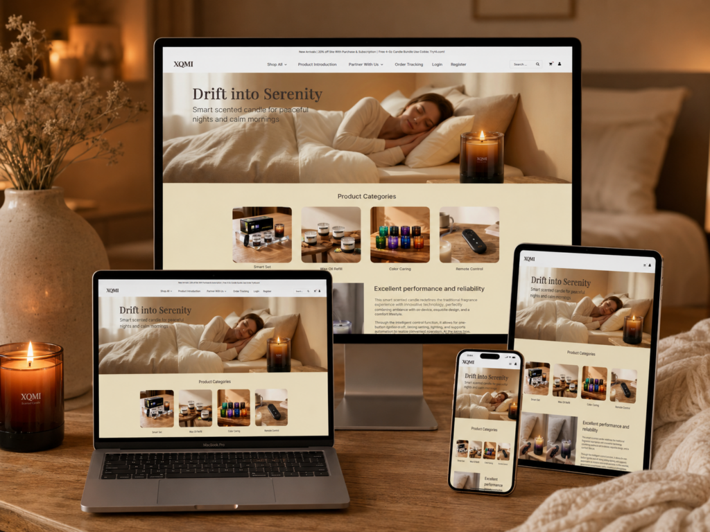
Hero Section – Emotional First Impression Strategy
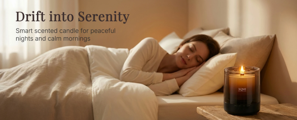
Creating Immediate Emotional Connection
The homepage opens with a powerful hero section featuring the message “Drift into Serenity.” From a design perspective, this is not just a headline—it is an emotional trigger. The goal is to immediately position the product as a lifestyle enhancer rather than a simple scented candle.
We use warm, soft lighting and a bedroom relaxation scene to create instant psychological comfort. This visual approach reduces cognitive resistance and allows users to emotionally accept the brand within seconds of landing on the page.
Visual Hierarchy and Focus Control
The layout is intentionally minimal:
Primary Focus
- Emotional lifestyle imagery (sleeping scene)
- Product subtly placed in the environment
Secondary Focus
- Headline communication
- Supporting subtext
We avoid overwhelming users with technical information at this stage. Instead, we let atmosphere lead perception, which is crucial for wellness-based products.
Why This Design Works
This section works because it aligns with the principle of emotional-first UX design. Users do not initially buy features—they buy feelings. By anchoring the first impression in serenity and comfort, we establish the emotional foundation for the rest of the website journey.
Product Categories – Simplifying Cognitive Load
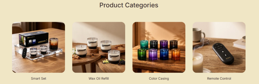
Structured Browsing Through Clear Segmentation
The product category section uses a four-card grid layout to simplify decision-making. From a design perspective, this prevents cognitive overload by breaking the product ecosystem into digestible segments.
Each category represents a specific user intent:
- Smart Set (complete experience)
- Wax Oil Refill (maintenance & continuity)
- Color Casing (personalization)
- Remote Control (functionality enhancement)
Visual Consistency and Recognition
Each card uses consistent composition, spacing, and framing. This consistency allows users to scan quickly without needing to re-learn visual patterns.
Why Grid Layout Matters
- Supports fast comparison
- Reduces navigation friction
- Encourages exploration
Emotional Continuity in UI Design
Although this is a functional section, we maintain soft tones and lifestyle imagery to ensure continuity with the hero section. This prevents the user from feeling a sudden shift into “hard commerce mode.”
Performance Section – Building Rational Trust
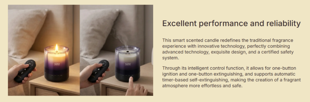
Balancing Emotion with Logic
Once emotional interest is established, we introduce the “Excellent Performance and Reliability” section. This is where the design shifts from emotional storytelling to rational validation.
Split Layout Strategy
The section uses a left-right structure:
Left Side – Visual Demonstration
- Real usage scenarios
- Remote control interaction
- Candle operation in environment
Right Side – Technical Explanation
- Performance description
- Safety features
- Intelligent control functions
Why Split Design Works
This structure allows users to simultaneously process:
- What the product looks like in real life
- What the product does technically
This dual-channel communication increases comprehension efficiency and trust formation.
Product Gallery – Visual Exploration at Scale
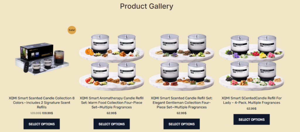
Creating Product Discovery Depth
The product gallery section expands the product range visually, allowing users to explore multiple variants in a structured format.
We use a grid-based layout because it supports:
- Multi-product comparison
- Visual scanning efficiency
- Category recognition
Ingredient-Based Visual Storytelling
Each candle is paired with fragrance-related visuals such as fruits, herbs, and spices. This helps users mentally associate scent profiles with real-world references.
Psychological Effect
This technique enhances sensory imagination, making the product feel more tangible even in a digital environment.
Conversion-Oriented Layout
Key purchase elements are placed directly under each product:
- Price visibility
- Clear CTA buttons
- Product naming hierarchy
This ensures that decision-making happens without unnecessary scrolling or confusion.
Patent & IP Section – Authority Building Layer
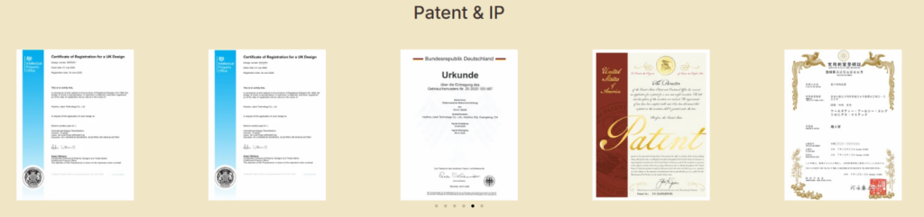
Transforming Certificates into Visual Trust
Instead of hiding certifications in a footer or text page, we convert them into a visual gallery. This significantly increases their perceived importance.
Global Credibility Strategy
The section includes documents from multiple regions, reinforcing international legitimacy.
디자인 의도
- Communicate legal compliance
- Establish brand authority
- Reduce buyer skepticism
Why Visual Proof Matters
Users trust what they can see. Turning legal documents into a structured visual layout makes abstract credibility feel concrete and verifiable.
Safety & Compliance – Risk Reduction Design
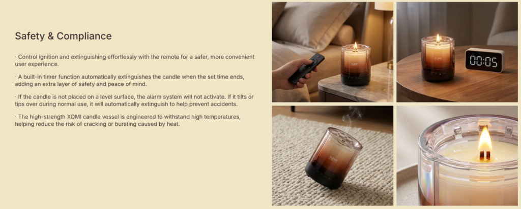
Addressing Purchase Anxiety
At this stage of the page, users are close to decision-making. The goal is to eliminate any remaining hesitation.
Dual Column Information Strategy
Left Side – Bullet Points
- Remote ignition control
- Automatic extinguishing timer
- Tilt safety mechanism
- Heat-resistant construction
Right Side – Supporting Visuals
- Real-life operation scenes
- Safety behavior demonstration
Why This Section Increases Conversion
By explicitly addressing risk concerns, we reduce psychological barriers and increase user confidence in product safety.
Service Assurance Icons – Final Trust Reinforcement
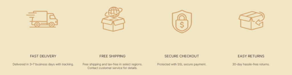
Simplifying Transaction Confidence
This section communicates logistics and transactional safety in a simple icon-based format.
Four Core Assurance Pillars
- Fast delivery
- 무료 배송
- Secure checkout
- Easy returns
Why Icon Systems Work
Icons allow users to process information in seconds, which is essential for final-stage conversion support.
Design Principle
Less reading, more recognition.
Blog Section – Expanding SEO and Authority
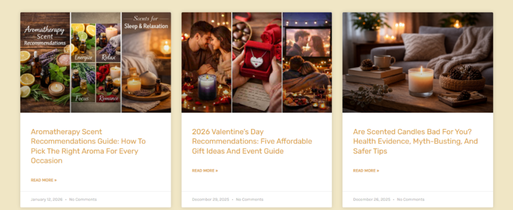
Content Marketing Integration
The blog section transforms the website into a knowledge ecosystem rather than just a storefront.
Content Structure Strategy
Each blog card includes:
- Emotional imagery
- Educational titles
- Clear reading path
Why Blogs Increase Conversions
Blogs support:
- SEO traffic acquisition
- User education
- Brand authority building
They also capture users at different intent levels, from curiosity to purchase readiness.
Product Page – Full Conversion Engine
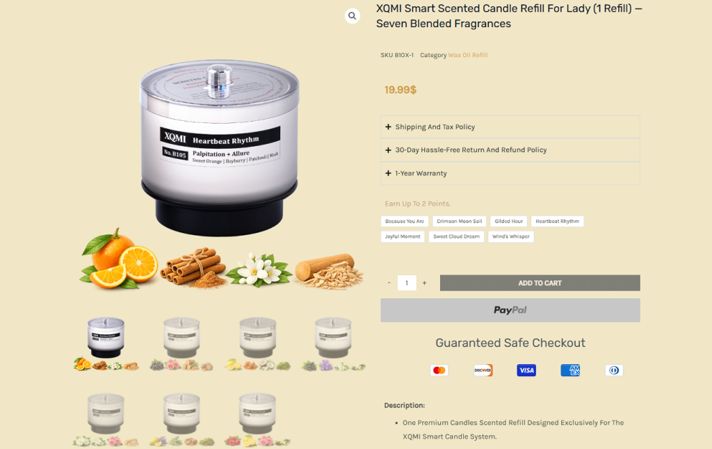
Structured Purchase Journey
The product page is the most critical conversion point in the entire website architecture.
Information Hierarchy Design
Top Section
- Product image dominance
- Price visibility
- Add-to-cart focus
Middle Section
- Feature explanation
- Material benefits
- Usage scenarios
Lower Section
- Related products
- Cross-selling opportunities
Trust Layer Integration
We strategically place:
- Shipping policy
- Return policy
- Warranty details
near the price area to reduce hesitation at the decision moment.
Cross-Section Design Logic – Unified UX System
Emotional → Rational → Trust → Conversion Flow
The entire website follows a structured psychological progression:
- Emotional attraction (Hero section)
- Exploration (Categories & Gallery)
- Rational validation (Performance section)
- Authority building (Patent section)
- Risk reduction (Safety section)
- Transaction reassurance (Service icons)
- Content engagement (Blog)
- Final conversion (Product page)
Why This Flow Works
This structure mirrors real human decision-making behavior:
- Feel first
- Understand second
- Trust third
- Act last
결론
그만큼 XQMI website is ultimately designed as a complete UX ecosystem where every visual decision, content block, and interaction pattern works together to guide users through a seamless emotional and rational journey. From the first impression of calm lifestyle imagery to the final reassurance of safety, certification, and post-purchase confidence, the entire structure is intentionally engineered to reduce friction and elevate trust at every step.
What makes this design effective is not just the aesthetic consistency, but the strategic sequencing of psychological triggers—emotion first, clarity second, trust third, and conversion last. Each section plays a specific role in shaping user perception, ensuring that visitors never feel overwhelmed, yet always feel guided toward a natural decision-making flow.
This approach reflects a modern eCommerce philosophy where design is no longer just visual decoration, but a structured behavioral system. It demonstrates how thoughtful UX architecture can transform a simple product into a meaningful lifestyle experience.
At its core, this project represents the design thinking approach of Airsang, where creativity, conversion logic, and user psychology are merged into a single unified digital experience.


완전한 전자상거래 시스템을 갖춘 워드프레스 웹사이트 또는 기업 사이트를 디자인하고 구축하세요.
가격 범위: $200.00~$2,500.00사용자 지정 요구 사항 또는 특별 견적
원래 가격: $2.00.$1.00현재 가격: $1.00. 아마존 가정용 물리치료 기기 메인 이미지 디자인 설명
소개 소개: 아마존에서 홈 테라피 기기의 신뢰할 수 있는 이미지 구축 아마존에서 홈 테라피 기기의 기본 이미지를 디자인할 때 기본 ...

아마존 립스틱 전환을 위한 메인 이미지 디자인
소개: 소개: 아마존에서 판매되는 립스틱 메인 이미지 디자인하기 아마존 립스틱의 메인 이미지를 디자인할 때 우리의 책임은 그 이상입니다.

해커들이 워드프레스 관리자 이메일을 훔치는 방법(그리고 이를 막는 방법)
불편한 진실부터 말씀드리자면, 워드프레스 관리자 이메일은 생각보다 훨씬 더 많이 공개되어 있습니다. 그들은 그것을 좋아합니다. 해커에게 여러분의...

아마존 리퀴드 파운데이션 메인 이미지 변환의 특징은 무엇일까요?
서론 아마존 리퀴드 파운데이션의 메인 이미지 디자인은 단순히 제품을 아름답게 보이게 하는 것만이 아닙니다. 아마존에서 메인 이미지와...

필터 카트리지 제품을 위한 효과적인 아마존 메인 이미지 디자인하기
서론 아마존 메인 이미지 디자인은 단순히 제품을 매력적으로 보이게 하는 것만이 아닙니다. 명확성, 신뢰, 그리고 즉각적인 이해를 제공하는 것이 중요합니다. 특히...

워드프레스에 대한 리플레이 공격: 실제 위협인가, 과장된 신화인가?
먼저 한 가지를 분명히 해두죠. 리플레이 공격은 겉보기에 무섭지 않습니다. 비밀번호를 날려버리지도 않고, 초록색 해커 텍스트가 사방에 흩날리는 악성 코드를 주입하지도 않습니다. 그저 교묘하게 이루어질 뿐입니다.

WordPress 페이지를 손상 없이 복제하는 방법
솔직히 말해봅시다. 때로는 새 페이지를 만들고 싶지 않을 때가 있죠. 그냥 기존 페이지를 약간만 다르게 하고 싶을 때가 있어요. 레이아웃도, 블록도, 설정도 그대로요. 왜냐하면...

반려동물 관련 워드프레스 테마 5가지 비교
서론 반려동물 관련 워드프레스 테마를 선택하는 것은 단순한 디자인 결정 이상의 의미를 지닙니다. 사용성, 확장성, 그리고 장기적인 비즈니스 성장에 직접적인 영향을 미치기 때문입니다. 반려동물 관리 및 관련...

수영복 온라인 쇼핑몰 테마 5가지 비교
서론 수영복이나 란제리 독립 매장에 적합한 테마를 선택하는 것은 단순히 시각적인 결정에 그치는 것이 아니라, 전환율, 확장성, 그리고 장기적인 성공에 직접적인 영향을 미칩니다.

워드프레스에서 댓글 기능을 끄는 방법 (정신줄 놓지 않고)
워드프레스 댓글에 대해 이야기해 봅시다. 이론적으로 댓글은 훌륭합니다. 토론을 장려하고, 커뮤니티를 형성하며, 웹사이트에 생동감을 불어넣습니다. 하지만 현실은 어떨까요? 댓글은 종종 문제를 야기하기도 합니다...

과학 중심 브랜드를 위한 확장 가능한 워드프레스 웹사이트 구축: 아미노USA 프로젝트
서론 오늘날의 디지털 환경에서 웹사이트는 단순히 제품을 나열하는 공간 이상의 의미를 지닙니다. 규제 산업이나 연구 중심 산업에서 활동하는 과학 기반 브랜드에게 웹사이트는 더욱 중요한 역할을 합니다.

글로벌 블레이드 브랜드를 위한 확장 가능한 쇼피파이 스토어 구축: 쿨카타나 프로젝트
서론: 국경을 넘나드는 전자상거래에서 Shopify 웹사이트는 단순한 매장 이상의 의미를 지닙니다. 특정 문화권에서 사업을 운영하는 브랜드의 경우, 웹사이트는 단순한 판매 공간을 넘어 훨씬 더 많은 기능을 수행해야 합니다.

포켓몬 카드 판매를 위한 높은 전환율을 자랑하는 쇼피파이 스토어 디자인하기
서론 수집품 전자상거래, 특히 포켓몬 트레이딩 카드 게임(TCG) 시장에서 웹사이트는 단순히 제품 목록을 나열하는 것 이상의 역할을 해야 합니다.

맞춤형 오프라인 브랜드에 최적화된 전환율 높은 쇼피파이 디자인
서론 오늘날 경쟁이 치열한 전자상거래 환경, 특히 맞춤형 선물 및 수집품 분야에서 Shopify 웹사이트는 단순히 제품을 전시하는 것 이상의 역할을 해야 합니다. ...

Shopify 고객 지원팀에 문의하는 방법: 간단하고 스트레스 없는 가이드
쇼피파이 스토어 운영은 흥미진진해야지 혼란스러워서는 안 됩니다. 궁금한 점이 생기거나 문제가 발생하여 진행이 늦어질 때, 쇼피파이는 상황에 따라 다양한 지원 경로를 제공합니다.

쇼피파이 스토어 비활성화 방법: 명확하고 실용적인 가이드
쇼피파이 스토어를 비활성화하는 것은 복잡하지 않지만, 많은 판매자가 간과하는 몇 가지 결과가 따릅니다. 이 가이드에서는 비활성화 과정을 간단하고 유익하게 설명합니다.

프리미엄 꽃집 브랜드를 위한 쇼피파이 웹사이트 디자인 사례 연구
서론 오늘날 경쟁이 치열한 전자상거래 환경에서 Shopify 웹사이트는 단순히 제품을 보여주는 것 이상의 역할을 해야 합니다. 브랜드 가치를 즉시 전달하고 사용자를 안내해야 합니다...

Shopify 디자인 사례 연구: 레트로 게임 스토어
서론: 경쟁이 치열한 전자상거래 환경에서 시각적 명확성과 감정적 연결은 방문자가 고객이 될지 여부를 결정짓는 중요한 요소입니다. 특히 다음과 같은 경우에 더욱 그렇습니다...