


لا توجد منتجات في سلة التسوق.

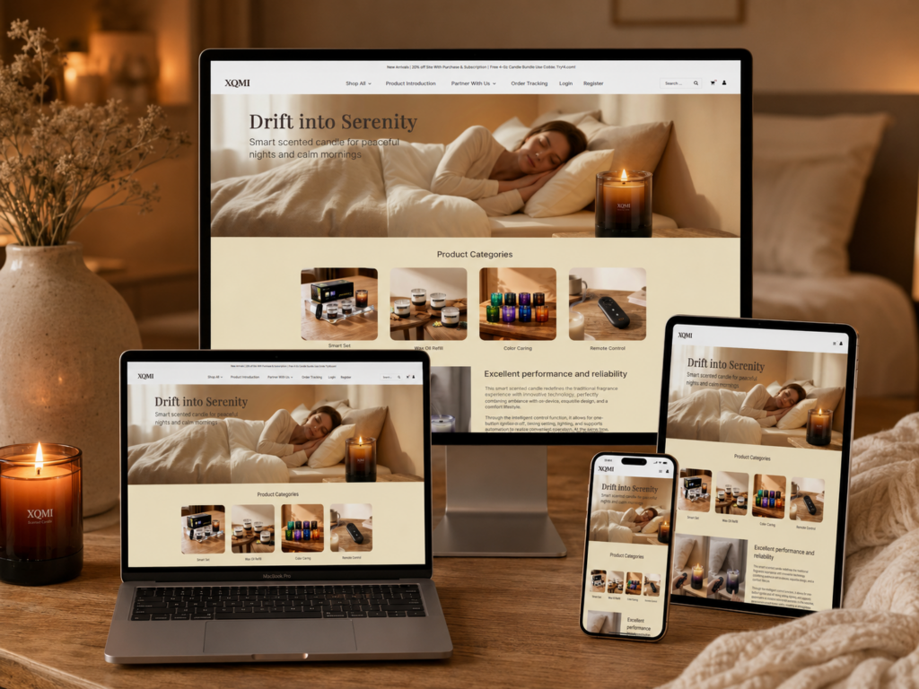
ال XQMI website is designed as more than a simple eCommerce platform—it is a structured emotional journey that transforms a functional product into a lifestyle experience. From a designer’s perspective, every section is intentionally crafted to guide users through a sequence of emotional engagement, product understanding, trust building, and finally purchase conversion.
Rather than relying on traditional product listing logic, the website uses narrative-driven UX patterns. It combines lifestyle storytelling, visual hierarchy, psychological reassurance, and modular content blocks to create a seamless flow. Each section builds upon the previous one, gradually reducing user uncertainty while increasing emotional attachment to the product.
This article breaks down the full website structure in sequence, explaining why each design decision was made and how it contributes to both user experience and conversion optimization.
| التسليم في الوقت المحدد | فئة | نوع الموقع الإلكتروني |
| 14 يومًا | Smart Aromatherapy | ووردبريس |
| المصممون المشاركون | يكلف | تأثير |
| لين تشانغ | $1300 | Sales📈237% |
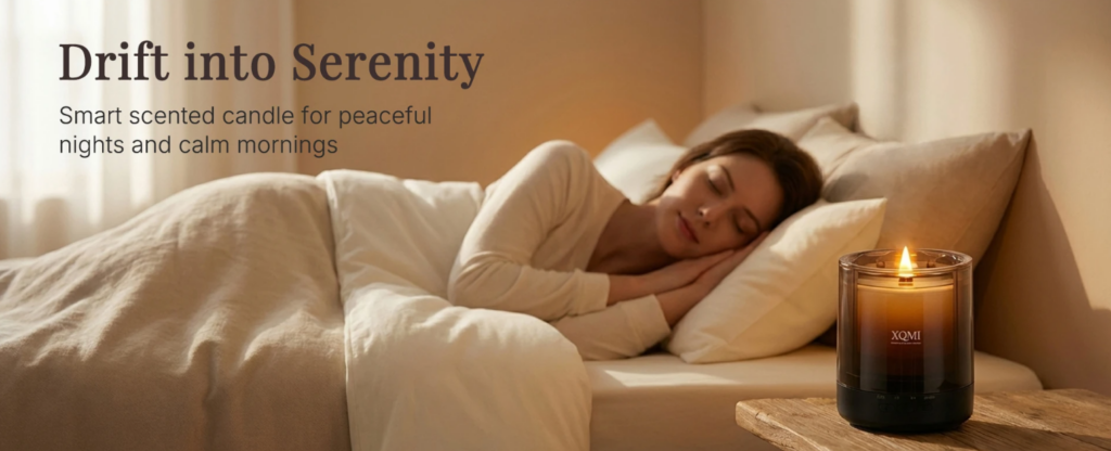
The homepage opens with a powerful hero section featuring the message “Drift into Serenity.” From a design perspective, this is not just a headline—it is an emotional trigger. The goal is to immediately position the product as a lifestyle enhancer rather than a simple scented candle.
We use warm, soft lighting and a bedroom relaxation scene to create instant psychological comfort. This visual approach reduces cognitive resistance and allows users to emotionally accept the brand within seconds of landing on the page.
The layout is intentionally minimal:
We avoid overwhelming users with technical information at this stage. Instead, we let atmosphere lead perception, which is crucial for wellness-based products.
This section works because it aligns with the principle of emotional-first UX design. Users do not initially buy features—they buy feelings. By anchoring the first impression in serenity and comfort, we establish the emotional foundation for the rest of the website journey.
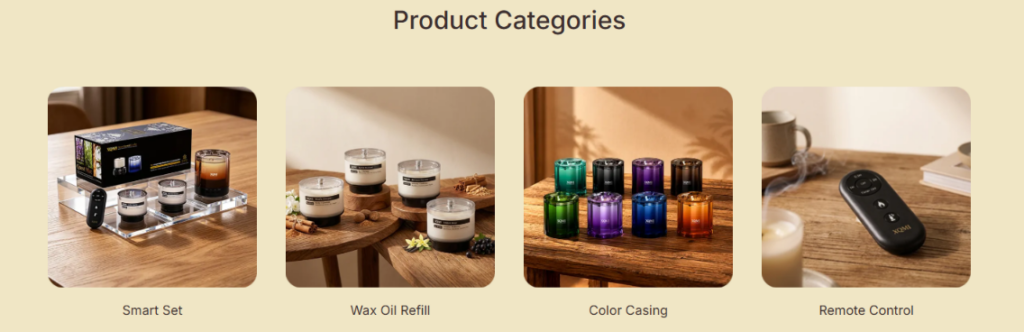
The product category section uses a four-card grid layout to simplify decision-making. From a design perspective, this prevents cognitive overload by breaking the product ecosystem into digestible segments.
Each category represents a specific user intent:
Each card uses consistent composition, spacing, and framing. This consistency allows users to scan quickly without needing to re-learn visual patterns.
Although this is a functional section, we maintain soft tones and lifestyle imagery to ensure continuity with the hero section. This prevents the user from feeling a sudden shift into “hard commerce mode.”
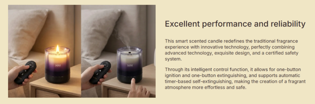
Once emotional interest is established, we introduce the “Excellent Performance and Reliability” section. This is where the design shifts from emotional storytelling to rational validation.
The section uses a left-right structure:
This structure allows users to simultaneously process:
This dual-channel communication increases comprehension efficiency and trust formation.
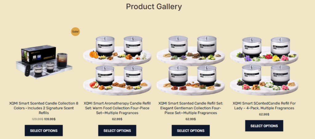
The product gallery section expands the product range visually, allowing users to explore multiple variants in a structured format.
We use a grid-based layout because it supports:
Each candle is paired with fragrance-related visuals such as fruits, herbs, and spices. This helps users mentally associate scent profiles with real-world references.
This technique enhances sensory imagination, making the product feel more tangible even in a digital environment.
Key purchase elements are placed directly under each product:
This ensures that decision-making happens without unnecessary scrolling or confusion.
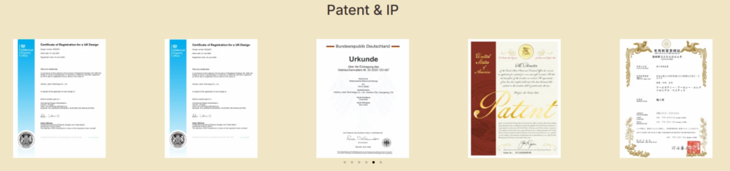
Instead of hiding certifications in a footer or text page, we convert them into a visual gallery. This significantly increases their perceived importance.
The section includes documents from multiple regions, reinforcing international legitimacy.
Users trust what they can see. Turning legal documents into a structured visual layout makes abstract credibility feel concrete and verifiable.
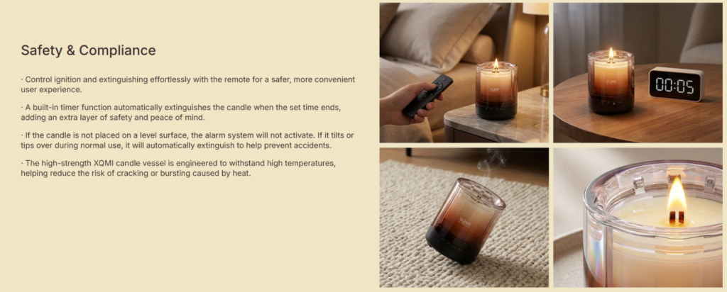
At this stage of the page, users are close to decision-making. The goal is to eliminate any remaining hesitation.
By explicitly addressing risk concerns, we reduce psychological barriers and increase user confidence in product safety.
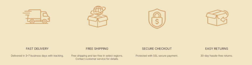
This section communicates logistics and transactional safety in a simple icon-based format.
Icons allow users to process information in seconds, which is essential for final-stage conversion support.
Less reading, more recognition.
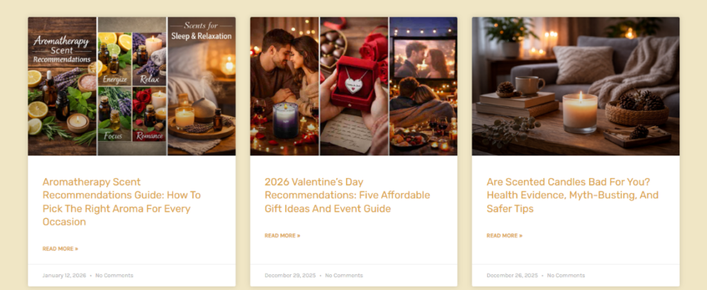
The blog section transforms the website into a knowledge ecosystem rather than just a storefront.
Each blog card includes:
Blogs support:
They also capture users at different intent levels, from curiosity to purchase readiness.
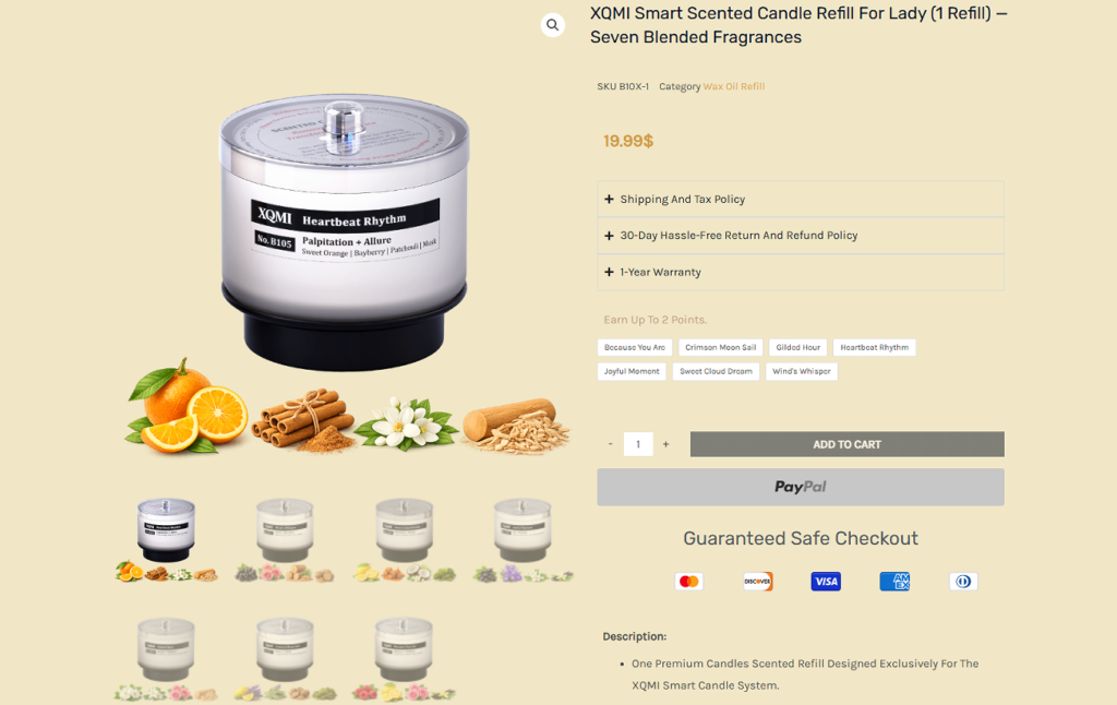
The product page is the most critical conversion point in the entire website architecture.
We strategically place:
The entire website follows a structured psychological progression:
This structure mirrors real human decision-making behavior:
ال XQMI website is ultimately designed as a complete UX ecosystem where every visual decision, content block, and interaction pattern works together to guide users through a seamless emotional and rational journey. From the first impression of calm lifestyle imagery to the final reassurance of safety, certification, and post-purchase confidence, the entire structure is intentionally engineered to reduce friction and elevate trust at every step.
What makes this design effective is not just the aesthetic consistency, but the strategic sequencing of psychological triggers—emotion first, clarity second, trust third, and conversion last. Each section plays a specific role in shaping user perception, ensuring that visitors never feel overwhelmed, yet always feel guided toward a natural decision-making flow.
This approach reflects a modern eCommerce philosophy where design is no longer just visual decoration, but a structured behavioral system. It demonstrates how thoughtful UX architecture can transform a simple product into a meaningful lifestyle experience.
At its core, this project represents the design thinking approach of Airsang, where creativity, conversion logic, and user psychology are merged into a single unified digital experience.


