


Введение
Designing a main image for hardware tools on Озон is not about making a product look “cool.” It is about making the product instantly understandable, trustworthy, and competitive within a crowded marketplace. When users scroll through Ozon search results, they do not read first — they scan. The main image must communicate product type, power level, safety, and value in a fraction of a second.
In this project, we designed a series of Ozon main images for different categories of hardware tools, including gasoline chainsaws, cordless chainsaws, brushless impact wrenches, and battery-powered cutting tools. Although the products vary in function and power source, they share one goal: to clearly show performance, reliability, and professional quality while remaining compliant with Ozon’s visual standards.
Below, we break down each image and explain the design decisions behind it — from layout and color hierarchy to typography, icon usage, and visual storytelling — all from a designer’s perspective.
| Срок доставки | Категория | Платформа приложений |
| 7 дней | Аппаратные инструменты | Озон |
| Участники проекта (дизайнеры) | Расходы | Эффект |
| Линь Чжан | $110 | Sales📈274% |
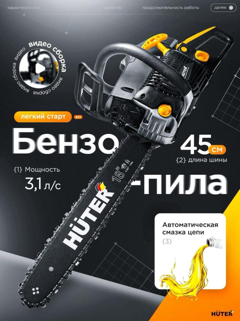
Image 1: Gasoline Chainsaw – Power and Professional Confidence
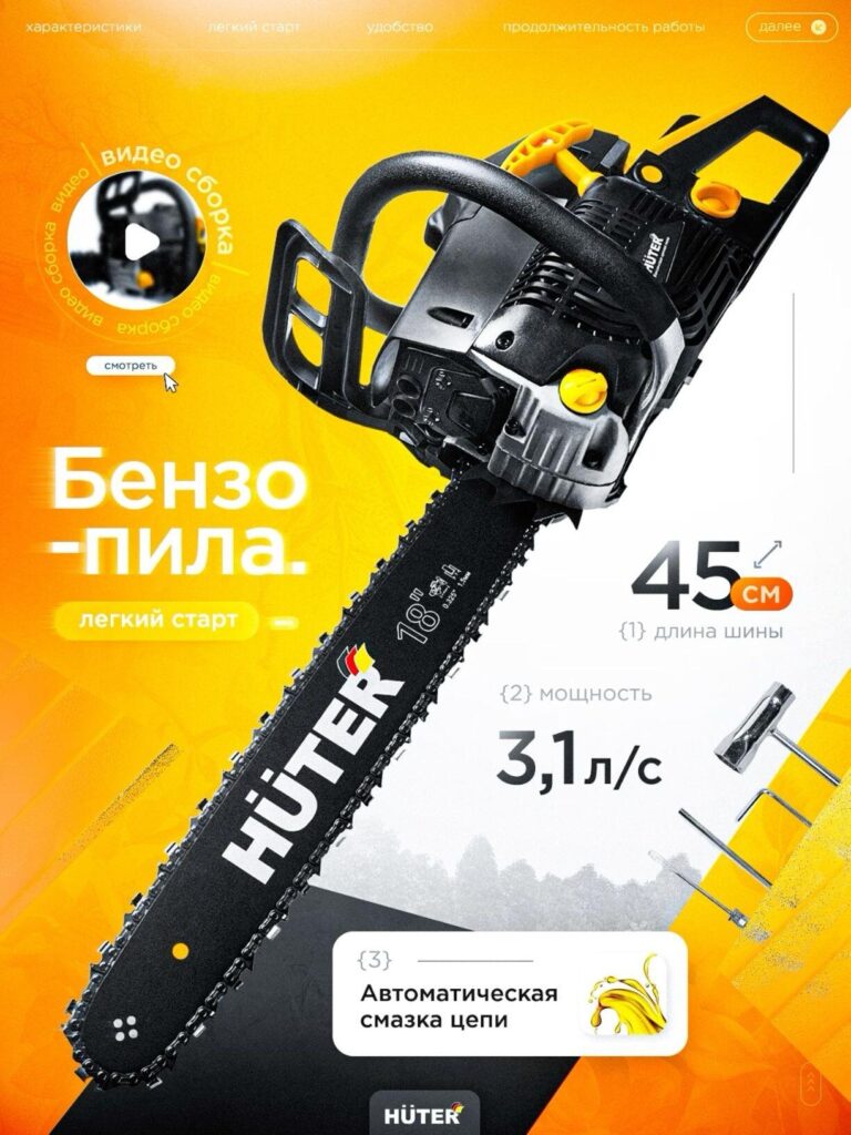
The first image focuses on a full-size gasoline chainsaw designed for heavy-duty cutting tasks. Our primary goal here was to visually communicate power, durability, and professional-grade performance.
We used a bold diagonal composition to make the chainsaw dominate the frame. This angle adds a sense of motion and strength, suggesting cutting force even in a static image. The yellow-and-black color palette reinforces an industrial, high-performance identity — a common visual language users already associate with professional tools.
Key specifications such as bar length (45 cm), chain lubrication, and output power are presented using clear numeric blocks and icons. Instead of placing all text in one area, we distributed information across the image to guide the viewer’s eye naturally from top to bottom. This prevents cognitive overload while still delivering essential details.
The background remains clean and bright, ensuring the product silhouette stays sharp and readable even on small mobile screens, which is critical for Ozon’s user behavior.
Image 2: Compact Cordless Chainsaw – Mobility and Convenience
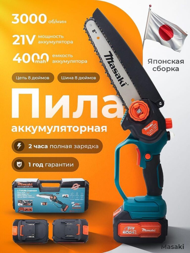
This image introduces a compact battery-powered chainsaw, targeting users who value portability and ease of use. Our design strategy shifted from “raw power” to mobility and everyday practicality.
The upright product positioning emphasizes lightness and balance. We highlighted battery voltage, RPM, and charging time in large, high-contrast text to instantly answer the most common buyer questions. The inclusion of the battery pack and packaging in the frame adds transparency and builds trust — users can immediately see what is included.
Warm orange tones were chosen to create a friendly, approachable feel without losing the tool’s professional identity. This color choice also performs well in Ozon’s grid layout, standing out against more neutral competitor images.
Image 3: Brushless Cordless Chainsaw – Efficiency and Safety
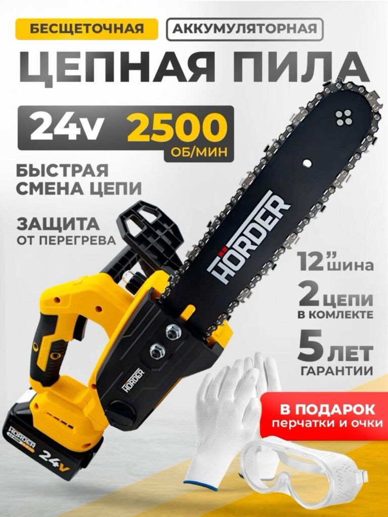
For the brushless cordless chainsaw, the focus shifted to technical reliability and safety. Brushless technology is a strong selling point, but only if communicated clearly.
We used structured text blocks to highlight features such as chain replacement, overheating protection, and warranty length. These elements were intentionally aligned vertically to create a logical reading flow.
The product is shown at a controlled angle, not aggressive, reinforcing safety and precision. Including protective accessories visually reinforces the message that this tool is suitable for careful, responsible users — an important factor for household buyers on Ozon.
Image 4: Heavy-Duty Gasoline Chainsaw – Outdoor Performance Context
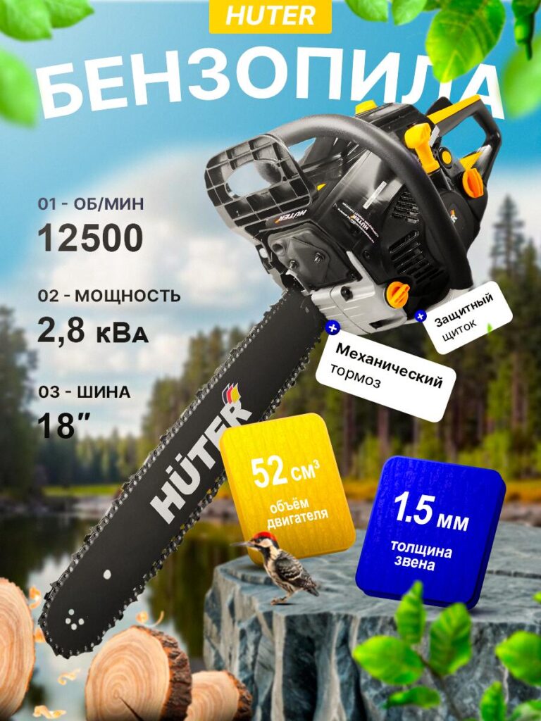
This image places the gasoline chainsaw in a realistic outdoor environment. While Ozon main images often favor clean backgrounds, controlled environmental context can be powerful when used correctly.
Here, the forest backdrop communicates real-world application without distracting from the product. The chainsaw remains sharply lit and visually separated from the background to maintain clarity.
Feature labels such as engine displacement, chain thickness, and mechanical brake are placed close to relevant parts of the tool. This visual proximity helps users connect technical data with physical components, increasing perceived credibility.
Image 5: Dark Background Gasoline Chainsaw – Technical Precision
In this version, we used a dark, technical background with grid elements to emphasize engineering and precision. This style appeals strongly to professional and semi-professional buyers.
High-contrast typography ensures readability, while the darker palette elevates the product’s perceived value. The automatic chain lubrication feature is highlighted with a visual oil graphic, making a functional detail instantly understandable even without reading.
This image works particularly well in comparison-based shopping, where users are evaluating specifications side by side.
Image 6: Brushless Impact Wrench – Speed and Control
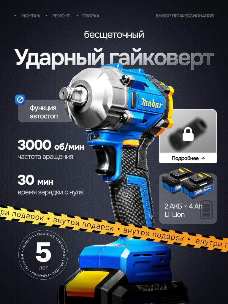
The impact wrench image focuses on speed, control, and modern engineering. We used a vertical layout that highlights the tool’s compact head and ergonomic grip.
Numeric highlights such as RPM and charging time are presented in bold typography, while icons communicate features like auto-stop and brushless motor technology. The diagonal caution-style stripe introduces a sense of industrial authenticity and reinforces durability.
Battery visibility is crucial here. By showing the battery clearly, we reduce uncertainty and increase buyer confidence, especially for users comparing battery platforms.
Consistent Design Principles Across All Images
Despite differences in product type, every image follows the same core principles:
- Instant Product Recognition
The tool type is always clear within the first second. - Visual Hierarchy
Product first, specifications second, secondary features last. - Mobile Optimization
All text remains legible on small screens. - Trust Through Transparency
Real accessories, realistic proportions, and honest specification display. - Ozon Platform Compatibility
Clean layouts, controlled backgrounds, and strong contrast to stand out in search results.
Почему этот подход работает на озоновом кольце
Ozon users often compare multiple products quickly. A strong main image must reduce decision time by answering key questions visually:
- What is it?
- How powerful is it?
- Is it safe?
- Is it worth the price?
Our design approach transforms technical specifications into visual cues, allowing users to understand value without reading long descriptions.
Заключительные мысли
Effective main image design for hardware tools on Озон is a balance between engineering clarity and visual appeal. These images do not simply decorate the product — they sell its function, reliability, and professionalism at a glance.
This project demonstrates how thoughtful composition, typography, and feature prioritization can significantly improve product competitiveness in a crowded marketplace.
If you are building or scaling a cross-border hardware brand and want your product visuals to convert — not just look good — this is exactly the kind of design system we specialize in at АИРСАНГ.


Спроектируем и создадим для вас WordPress-сайт или корпоративный сайт с полной системой электронной коммерции.
Ценовой диапазон: от $200.00 до $2,500.00Нестандартные требования или специальные предложения
Первоначальная цена составляла: $2.00.$1.00Текущая цена: $1.00. Дизайн главного изображения для домашнего физиотерапевтического устройства Amazon: пояснения.
Введение: Создание достоверного изображения для домашних терапевтических приборов на Amazon При разработке главного изображения для домашнего терапевтического прибора на Amazon мы в первую очередь...

Дизайн основного изображения для конвертации помады на Amazon.
Введение: Разработка главного образа помады, которая продается на Amazon Когда мы разрабатываем главный образ для помады Amazon, наша ответственность выходит далеко за рамки...

Что делает основное изображение жидкой тональной основы Amazon конвертируемым?
Введение. Разработка дизайна основного изображения для жидкой тональной основы на Amazon — это не просто создание красивого внешнего вида продукта. На Amazon основное изображение и...

Разработка эффективного основного изображения Amazon для фильтрующих картриджей
Введение. Разработка основного изображения для Amazon — это не просто создание привлекательного внешнего вида товара. Речь идёт о ясности, доверии и мгновенном понимании, особенно для...

Сравнение пяти тем WordPress для сайтов о домашних животных
Введение. Выбор подходящей темы WordPress для сайтов, посвященных домашним животным, — это не просто решение, связанное с дизайном; оно напрямую влияет на удобство использования, масштабируемость и долгосрочный рост бизнеса. Уход за домашними животными и...

Создание масштабируемого веб-сайта на WordPress для научно-ориентированного бренда: проект AminoUSA
Введение. В современном цифровом пространстве веб-сайт — это больше, чем просто место для размещения информации о товарах. Для научно-ориентированных брендов, работающих в регулируемых или научно-исследовательских отраслях, это….

Создание масштабируемого магазина Shopify для глобального бренда ножей: проект CoolKatana
Введение. В трансграничной электронной коммерции веб-сайт Shopify — это больше, чем просто витрина магазина. Для брендов, работающих в нишевых, ориентированных на культуру категориях, веб-сайт должен делать гораздо больше, чем...

Разработка высокоэффективного магазина Shopify для карточек Pokémon.
Введение. В мире электронной коммерции коллекционных товаров, особенно на рынке коллекционных карточных игр Pokémon, веб-сайт должен делать больше, чем просто перечислять товары...

Высокоэффективный дизайн Shopify для индивидуального бренда стационарной торговой точки.
Введение. В условиях современной конкурентной среды электронной коммерции, особенно в сегменте персонализированных подарков и коллекционных товаров, веб-сайт на платформе Shopify должен делать гораздо больше, чем просто отображать товары. Он...

Пример разработки веб-сайта на платформе Shopify для премиального цветочного бренда.
Введение. В условиях современной конкурентной среды электронной коммерции веб-сайт на платформе Shopify должен делать гораздо больше, чем просто отображать товары. Он должен мгновенно передавать ценность бренда, направлять пользователей...

Пример проекта дизайна на Shopify: магазин ретро-игр
Введение. В условиях высокой конкуренции в сфере электронной коммерции визуальная ясность и эмоциональная связь часто определяют, станет ли посетитель клиентом. Это особенно актуально в...

Пример проекта по дизайну на Shopify: Tactical Rescue Brand
Введение. Эффективный веб-сайт на Shopify делает больше, чем просто отображает товары — он передает цель, укрепляет доверие и помогает пользователям принимать уверенные решения о покупке. Это особенно важно...

Пример разработки веб-сайта на платформе Shopify для бренда электровелосипедов.
Введение. На современном конкурентном рынке электровелосипедов веб-сайт на платформе Shopify должен делать больше, чем просто демонстрировать товары — он должен рассказывать историю, вызывать доверие и направлять пользователей...

Масштабируемая платформа электронной коммерции Shopify для креативного бренда.
Введение. Когда креативные бренды растут, их веб-сайты часто с трудом успевают за развитием. По мере расширения ассортимента продукции, увеличения объема контента и роста трафика многие бренды, ориентированные на визуальное оформление...

Пример разработки веб-сайта на платформе Shopify для бренда товаров для дома.
Введение. На высококонкурентном рынке товаров для дома визуальная идентичность — это уже не просто эстетика, она напрямую влияет на доверие, поведение покупателей при просмотре товаров и принятие решений о покупке. Для...

Пример создания масштабируемого сайта с платной подпиской на WordPress.
Введение. Для современных брендов электронной коммерции веб-сайт — это уже не просто цифровая витрина. Это движок, поддерживающий подписки, создание контента, построение доверия и т.д.

Высокоэффективный дизайн WordPress для брендов, ориентированных на взрослую аудиторию.
Введение. На высококонкурентных рынках электронной коммерции одних лишь ярких визуальных элементов недостаточно. Успешный веб-сайт на WordPress должен направлять посетителей по четкому и целенаправленному маршруту, который….

Масштабируемый веб-сайт электронной коммерции по продаже секс-кукол на WordPress
Введение. Запуск высокоэффективного веб-сайта для трансграничной электронной коммерции — это не просто размещение товаров в интернете. Для брендов, работающих на высококонкурентных рынках, ориентированных на визуальный контент, веб-сайт...