


Введение
При разработке основного набора изображений для Озон listing, our primary goal is always the same: help shoppers understand the product within seconds and feel confident enough to click. This becomes even more critical in creative toy categories, where parents are not only buying an item, but also investing in their child’s development, safety, and happiness.
For this Glass Painting Creative Kit, we approached the project as both designers and strategists. Ozon shoppers scroll quickly, compare multiple similar kits, and rely heavily on visuals rather than long descriptions. That means the image set must clearly communicate what the product is, who it is for, how it is used, and why it is better, all without overwhelming the viewer.
The final image sequence was carefully structured to guide customers step by step—from first impression, to understanding the contents, to imagining the child using the kit, and finally to recognizing its educational value. Below, we break down each image and explain the design decisions behind it.
| Срок доставки | Категория | Платформа приложений |
| 8 дней | Glass painting creative kit | Озон |
| Участники проекта (дизайнеры) | Расходы | Эффект |
| Линь Чжан | $150 | Sales📈273% |
Image 1: Product Overview and First Impression
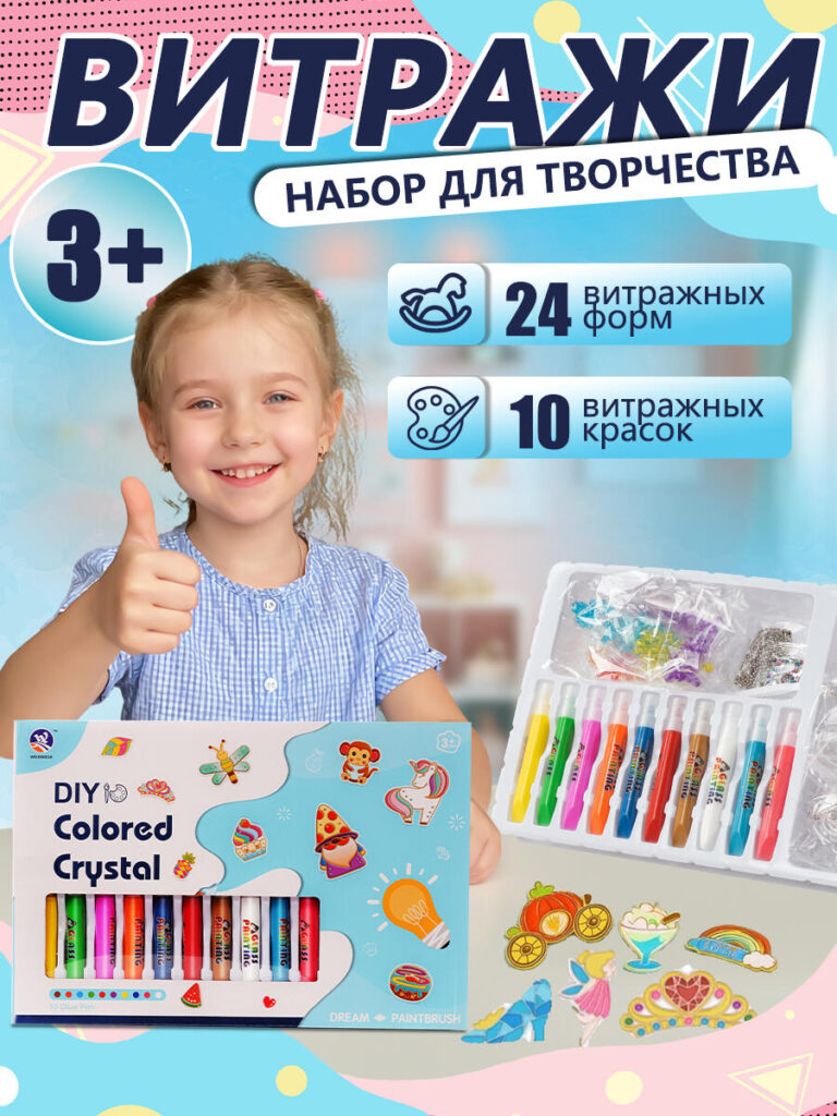
The first image functions as the core Ozon main image, designed to stop the scroll instantly.
We chose a bright, playful background with soft pastel elements to immediately signal that this is a children’s creative product. The smiling child holding the completed glass art pieces plays a crucial role here. Instead of showing only the product, we intentionally showed a real outcome and emotional reaction—joy, pride, and confidence. Parents don’t just want to see tools; they want to see results.
Key information such as age suitability (3+), number of glass forms, and number of paints is presented clearly using icons and short text blocks. This ensures instant comprehension without requiring the shopper to read the description. The product box and paint set are placed prominently to establish trust and show exactly what will arrive in the package.
From a design perspective, this image balances emotional appeal and factual clarity, which is essential for high click-through rates on Ozon.
Image 2: Step-by-Step Usage Instructions
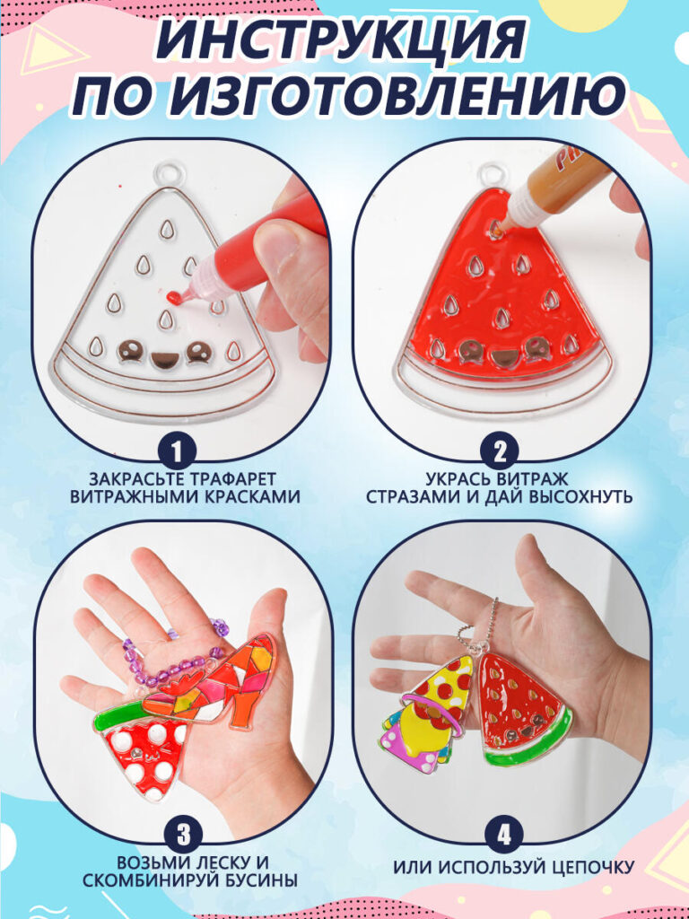
The second image shifts focus from emotion to functionality and ease of use.
We designed this image as a visual instruction manual, broken into four simple steps. Each step is shown clearly using close-up photography, making the process feel accessible even for parents who may worry about mess or difficulty.
By visually demonstrating painting, decorating, assembling, and wearing the finished pieces, we remove uncertainty. This image answers a silent but important customer question:
“Can my child actually do this on their own?”
Clear numbering, large icons, and minimal text ensure that the instructions remain readable on both desktop and mobile. This approach significantly reduces hesitation and builds confidence in the product.
Image 3: Gift Appeal and Emotional Value
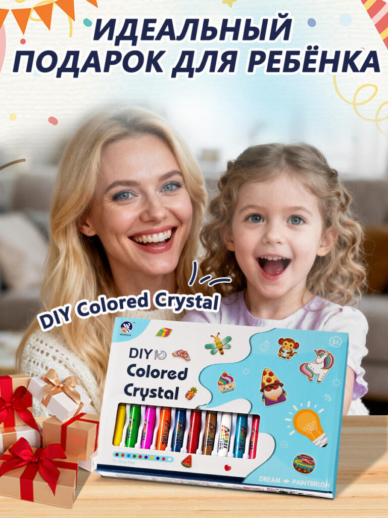
This image focuses on positioning the kit as an ideal gift.
We intentionally included both a parent and child to communicate shared moments and emotional bonding. The composition highlights the product box front and center, reinforcing its suitability as a ready-to-gift solution—no additional wrapping or preparation required.
The festive styling subtly suggests birthdays, holidays, and special occasions without tying the product to a single event. This broadens its appeal and increases relevance throughout the year.
From a design standpoint, this image is about storytelling. It helps shoppers imagine giving this kit as a present and seeing the child’s excitement firsthand.
Image 4: Eco-Friendly Materials and Safety Message
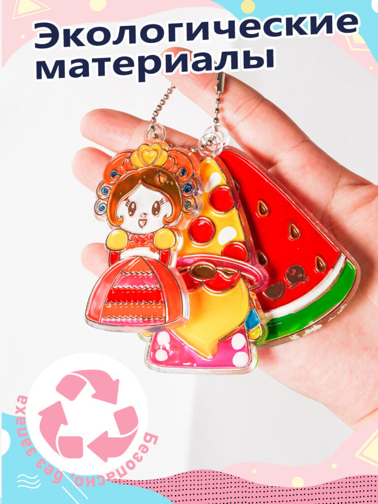
Modern parents care deeply about materials and safety, especially when purchasing creative kits for young children.
In this image, we used a clean, close-up hand-held composition to highlight the finished glass pieces. This allows viewers to clearly see the smooth edges, glossy finish, and vibrant colors. The recycling icon and eco-material messaging are deliberately placed to reassure buyers that the kit is made with environmentally responsible materials.
This design choice helps position the product as a thoughtful and responsible purchase, rather than just a toy. It builds trust and aligns with current parental values around sustainability and child safety.
Image 5: Paint Quality and Reusability
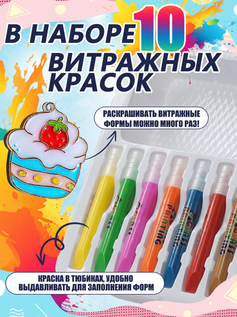
The fifth image focuses entirely on the 10 glass paints included in the kit.
We used dynamic paint splashes and bold color contrasts to visually express creativity and fun. Each paint tube is shown clearly to emphasize quantity, variety, and usability. The message that the glass forms can be painted multiple times is especially important, as it highlights long-term value and replayability.
From a conversion perspective, this image answers another key concern:
“Is this a one-time activity, or can my child use it again?”
By visually emphasizing reusability, we position the kit as a better investment compared to disposable craft sets.
Image 6: Complete Kit Contents Breakdown
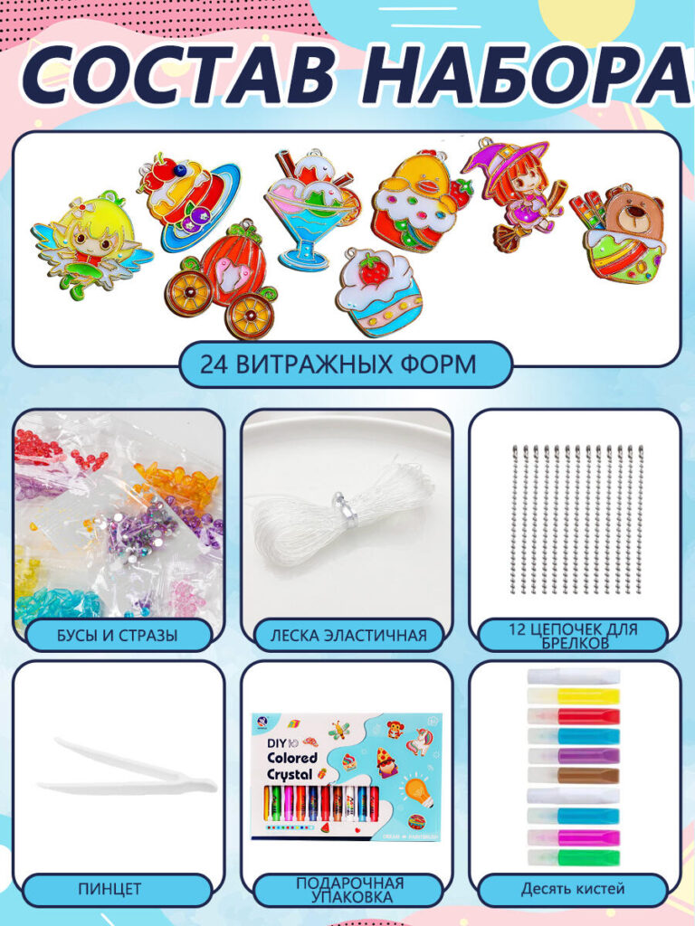
Transparency is critical in e-commerce, and this image is designed to eliminate all ambiguity.
We laid out every component of the kit in a clean, structured grid: glass forms, paints, beads, elastic string, chains, tweezers, and gift packaging. Each item is clearly labeled, allowing shoppers to instantly understand what they are paying for.
This image reduces returns and negative reviews by ensuring expectations match reality. From a design standpoint, it also reinforces the idea that this is a complete, all-in-one creative solution, not a partial or incomplete kit.
Image 7: Educational and Developmental Benefits
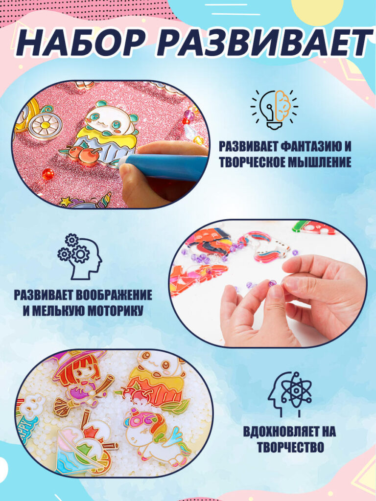
The final image focuses on child development, which is often the deciding factor for parents.
We visually connected creative activities with icons representing imagination, fine motor skills, creative thinking, and inspiration. Close-up shots of hands painting and assembling beads help reinforce the educational value through action rather than abstract claims.
This image reframes the product from being “just a craft kit” to being a learning tool that supports cognitive and motor development. It gives parents a strong justification for purchase, especially when comparing multiple similar products.
Краткое описание стратегии проектирования
This Ozon main image set was not created as a collection of isolated visuals. It was designed as a conversion-driven visual journey.
- The first image captures attention
- The next images explain usage and contents
- Middle images build emotional and gift value
- Final images reinforce safety, quality, and educational benefits
Every color choice, composition, and text placement was made to align with how Ozon shoppers browse, compare, and decide.
Заключение
Успешный Озон listing depends heavily on how effectively the main images communicate value within seconds. For this Glass Painting Creative Kit, our design approach combined emotional storytelling, clear information structure, and strong visual hierarchy to create a listing that is both attractive and trustworthy.
By designing images that answer real customer questions before they are asked, we help our clients improve click-through rates, reduce hesitation, and increase conversions. This project reflects our broader philosophy at АИРСАНГ—using thoughtful, platform-specific design to turn products into compelling, high-performing listings in competitive marketplaces.


Спроектируем и создадим для вас WordPress-сайт или корпоративный сайт с полной системой электронной коммерции.
Ценовой диапазон: от $200.00 до $2,500.00Нестандартные требования или специальные предложения
Первоначальная цена составляла: $2.00.$1.00Текущая цена: $1.00. Дизайн главного изображения для домашнего физиотерапевтического устройства Amazon: пояснения.
Введение: Создание достоверного изображения для домашних терапевтических приборов на Amazon При разработке главного изображения для домашнего терапевтического прибора на Amazon мы в первую очередь...

Дизайн основного изображения для конвертации помады на Amazon.
Введение: Разработка главного образа помады, которая продается на Amazon Когда мы разрабатываем главный образ для помады Amazon, наша ответственность выходит далеко за рамки...

Что делает основное изображение жидкой тональной основы Amazon конвертируемым?
Введение. Разработка дизайна основного изображения для жидкой тональной основы на Amazon — это не просто создание красивого внешнего вида продукта. На Amazon основное изображение и...

Разработка эффективного основного изображения Amazon для фильтрующих картриджей
Введение. Разработка основного изображения для Amazon — это не просто создание привлекательного внешнего вида товара. Речь идёт о ясности, доверии и мгновенном понимании, особенно для...

Сравнение пяти тем WordPress для сайтов о домашних животных
Введение. Выбор подходящей темы WordPress для сайтов, посвященных домашним животным, — это не просто решение, связанное с дизайном; оно напрямую влияет на удобство использования, масштабируемость и долгосрочный рост бизнеса. Уход за домашними животными и...

Создание масштабируемого веб-сайта на WordPress для научно-ориентированного бренда: проект AminoUSA
Введение. В современном цифровом пространстве веб-сайт — это больше, чем просто место для размещения информации о товарах. Для научно-ориентированных брендов, работающих в регулируемых или научно-исследовательских отраслях, это….

Создание масштабируемого магазина Shopify для глобального бренда ножей: проект CoolKatana
Введение. В трансграничной электронной коммерции веб-сайт Shopify — это больше, чем просто витрина магазина. Для брендов, работающих в нишевых, ориентированных на культуру категориях, веб-сайт должен делать гораздо больше, чем...

Разработка высокоэффективного магазина Shopify для карточек Pokémon.
Введение. В мире электронной коммерции коллекционных товаров, особенно на рынке коллекционных карточных игр Pokémon, веб-сайт должен делать больше, чем просто перечислять товары...

Высокоэффективный дизайн Shopify для индивидуального бренда стационарной торговой точки.
Введение. В условиях современной конкурентной среды электронной коммерции, особенно в сегменте персонализированных подарков и коллекционных товаров, веб-сайт на платформе Shopify должен делать гораздо больше, чем просто отображать товары. Он...

Пример разработки веб-сайта на платформе Shopify для премиального цветочного бренда.
Введение. В условиях современной конкурентной среды электронной коммерции веб-сайт на платформе Shopify должен делать гораздо больше, чем просто отображать товары. Он должен мгновенно передавать ценность бренда, направлять пользователей...

Пример проекта дизайна на Shopify: магазин ретро-игр
Введение. В условиях высокой конкуренции в сфере электронной коммерции визуальная ясность и эмоциональная связь часто определяют, станет ли посетитель клиентом. Это особенно актуально в...

Пример проекта по дизайну на Shopify: Tactical Rescue Brand
Введение. Эффективный веб-сайт на Shopify делает больше, чем просто отображает товары — он передает цель, укрепляет доверие и помогает пользователям принимать уверенные решения о покупке. Это особенно важно...

Пример разработки веб-сайта на платформе Shopify для бренда электровелосипедов.
Введение. На современном конкурентном рынке электровелосипедов веб-сайт на платформе Shopify должен делать больше, чем просто демонстрировать товары — он должен рассказывать историю, вызывать доверие и направлять пользователей...

Масштабируемая платформа электронной коммерции Shopify для креативного бренда.
Введение. Когда креативные бренды растут, их веб-сайты часто с трудом успевают за развитием. По мере расширения ассортимента продукции, увеличения объема контента и роста трафика многие бренды, ориентированные на визуальное оформление...

Пример разработки веб-сайта на платформе Shopify для бренда товаров для дома.
Введение. На высококонкурентном рынке товаров для дома визуальная идентичность — это уже не просто эстетика, она напрямую влияет на доверие, поведение покупателей при просмотре товаров и принятие решений о покупке. Для...

Пример создания масштабируемого сайта с платной подпиской на WordPress.
Введение. Для современных брендов электронной коммерции веб-сайт — это уже не просто цифровая витрина. Это движок, поддерживающий подписки, создание контента, построение доверия и т.д.

Высокоэффективный дизайн WordPress для брендов, ориентированных на взрослую аудиторию.
Введение. На высококонкурентных рынках электронной коммерции одних лишь ярких визуальных элементов недостаточно. Успешный веб-сайт на WordPress должен направлять посетителей по четкому и целенаправленному маршруту, который….

Масштабируемый веб-сайт электронной коммерции по продаже секс-кукол на WordPress
Введение. Запуск высокоэффективного веб-сайта для трансграничной электронной коммерции — это не просто размещение товаров в интернете. Для брендов, работающих на высококонкурентных рынках, ориентированных на визуальный контент, веб-сайт...