Introdução
In the competitive world of niche eCommerce, design is not decoration—it is strategy. When building a Shopify website for a brand like CoolKatana, the objective goes far beyond showcasing products. The goal is to translate craftsmanship, heritage, and bold visual identity into a high-conversion digital experience.
CoolKatana operates in a visually intense and culturally rich category. Their products—Japanese-inspired swords, anime katanas, and collectible weapons—carry emotional value, collector appeal, and lifestyle symbolism. To support this positioning, the Shopify website needed to feel powerful, immersive, and premium while remaining intuitive and conversion-focused.
This case study explores how we approached the Shopify website design for CoolKatana, the challenges we encountered, the strategy behind our design decisions, and how our structured methodology helped elevate both brand authority and user engagement.
| Prazo de entrega | Categoria | Plataforma de Aplicação |
| 21days | Katana | shopify |
| Designers envolvidos | Custo | Efeito |
| Lin Zhang | $1100 | Purchase Rate📈265% |
Entendendo a marca e seu público-alvo
Before designing a single section, we focused on clarity: Who is the customer? What emotional triggers drive purchase decisions? What visual cues communicate authenticity and trust?
CoolKatana’s audience includes:
- Anime enthusiasts
- Collectors of Japanese-style swords
- Martial arts practitioners
- Cosplayers
- Gift buyers seeking statement pieces
This audience values:
- Visual drama
- Authentic craftsmanship
- Cultural storytelling
- Product detail and close-up imagery
- Clear specifications and trust signals
We designed the Shopify experience to reflect these priorities from the very first scroll.
Defining the Project Goals
Objetivos principais
- Strengthen brand authority through immersive visual design
- Improve product discoverability across multiple sword categories
- Increase engagement through storytelling and rich product presentation
- Support higher average order values
- Create a structured, scalable Shopify layout
Design-Focused KPI Targets
- Higher click-through rate from homepage to collections
- Increased product page dwell time
- Improved add-to-cart behavior
- Enhanced trust perception
Because we specialize in Shopify design rather than technical development, our focus centered on layout structure, visual hierarchy, conversion psychology, and brand storytelling—not backend engineering.
Nosso processo de design para Shopify
We follow a structured and repeatable methodology when designing Shopify websites.
1. Research & Brand Analysis
We began by analyzing:
- Competitor sword and collectible websites
- Industry visual trends
- Shopify layout best practices
- Existing CoolKatana branding elements
We identified a key opportunity: most competitor sites relied on either overly dark themes or generic layouts. We decided to balance cinematic drama with structured usability.
2. Information Architecture Planning
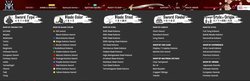
We reorganized the navigation structure to prioritize:
- Best-selling katanas
- Anime-inspired collections
- Functional swords vs. decorative pieces
- Armors and accessories
- Faixas promocionais
Clear hierarchy reduces cognitive friction and improves exploration.
3. Wireframing Conversion-Focused Layouts
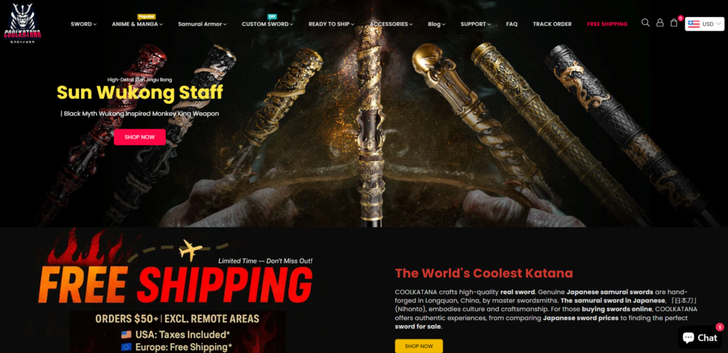
We designed wireframes that emphasized:
- Hero impact
- Segmentação clara de categorias
- Trust indicators
- Prova social
- Faixas promocionais
- Upsell modules
Only after structural clarity did we move into full visual design.
Estratégia de design da página inicial
The homepage is the brand’s digital stage. For CoolKatana, we crafted it as an immersive experience.
Hero Section: Cinematic Authority
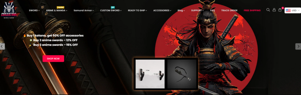
We designed a bold hero area featuring:
- Dramatic samurai imagery
- High-contrast red and black tones
- Immediate promotional messaging
- Clear call-to-action buttons
This approach delivers instant emotional engagement while guiding users toward collections.
Category Highlights
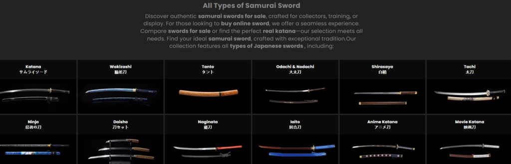
Instead of overwhelming users, we structured the homepage into clean, segmented product blocks:
- Best-Selling Real Katanas
- Handmade Samurai Swords
- Anime Replica Swords
- Ninja & Chinese Swords
- Armor and Samurai Gear
Each block uses consistent spacing, premium product photography, and hover interactions to reinforce quality.
Promotional Strategy Integration

We integrated:
- Free shipping banners
- Limited-time offers
- Discount code placements
- Scarcity cues
All promotional elements were designed to feel intentional—not cluttered.
Product Page Design Excellence
The product page is where conversion happens. Our design priorities were clarity, detail, and trust.
Hierarquia Visual
We structured product pages with:
- Large, high-resolution sword imagery
- Zoom-in capability emphasis (design-focused presentation)
- Clean variant selectors
- Prominent price positioning
- Visible review ratings
Trust Signals
We added strategically placed:
- Shipping assurances
- Warranty messaging
- Quality guarantees
- Tax & duty information
These reduce hesitation in high-ticket purchases.
Storytelling Sections
For higher-value swords, we designed long-form product storytelling blocks:
- Blade material explanation
- Craftsmanship process
- Historical inspiration
- Usage recommendations
This elevates the perceived value and justifies premium pricing.
Visual Identity and Brand Cohesion
Color Palette
We leaned into:
- Deep black backgrounds
- Bold crimson highlights
- Metallic accents
- Neutral grays for balance
This palette reinforces strength and tradition while keeping the interface modern.
Tipografia
We selected strong, legible fonts that complement the dramatic visuals without compromising readability.
Image Treatment
Product imagery was refined to ensure:
- Consistent lighting
- Clear blade detail
- Dark premium backgrounds
- Subtle shadowing for depth
Visual consistency builds trust.
Design Challenges We Solved
Challenge 1: Avoiding Visual Overload
Sword websites can easily feel chaotic. We introduced disciplined spacing, grid systems, and structured blocks to maintain clarity.
Challenge 2: Balancing Drama with Usability
While dark themes are powerful, they can reduce readability. We adjusted contrast, button clarity, and typography scaling to ensure accessibility.
Challenge 3: Managing Large Product Catalogs
We created segmented collection layouts that allow customers to filter visually through:
- Tipo
- Inspiração
- Preço
- Popularity
Structured categorization increases browsing efficiency.
Our Design Methodology in Action
We believe Shopify design is about controlled storytelling.
Our method includes:
- Strategic hierarchy planning
- Conversion-based layout structuring
- Brand-aligned visual direction
- Promotional integration
- Scalable section systems
We do not rely on heavy customization or complex coding. Instead, we maximize Shopify’s ecosystem through structured design thinking and visual optimization.
Measurable Impact of Strategic Shopify Design
Although this case study focuses on design rather than analytics reporting, the structural improvements created clear performance advantages:
- Improved homepage engagement flow
- Cleaner product presentation
- Stronger brand authority perception
- Enhanced upsell visibility
- Better promotional clarity
Design clarity directly influences purchase confidence.
Why Shopify Design Matters in Niche Markets
In specialized categories like collectible swords, customers do not purchase impulsively. They research, compare, and evaluate authenticity.
A strong Shopify website design:
- Reduces friction
- Builds credibility
- Reinforces brand narrative
- Encourages deeper exploration
- Supports higher price positioning
Para CoolKatana, design became the bridge between craftsmanship and commerce.
Our Competitive Advantages in Shopify Design
Deep eCommerce Visual Strategy
We design for conversion first, aesthetics second—while making them work together seamlessly.
Brand-Led Thinking
Every layout decision reflects brand identity.
Scalable Systems
Our designs allow future collection expansion without losing visual consistency.
Promotion-Integrated Layouts
We design discount, bundle, and shipping messaging as part of the experience—not as afterthoughts.
Final Results and Takeaways
O CoolKatana Shopify redesign transformed the website from a simple product catalog into an immersive, authority-driven eCommerce experience.
Através:
- Structured homepage storytelling
- Clean product hierarchy
- Premium visual presentation
- Strategic promotional integration
- Segmentação clara de categorias
We created a high-impact Shopify website aligned with the brand’s identity and growth ambitions.
The project demonstrates how thoughtful Shopify design can elevate niche brands into premium digital destinations.
Conclusão
CoolKatana’'s Shopify website showcases what happens when design strategy meets strong brand storytelling. Instead of relying on aggressive marketing alone, the website itself becomes a conversion engine—structured, immersive, and persuasive.
If you are looking to transform your Shopify store through strategic layout design, visual hierarchy optimization, and brand-driven storytelling, our team specializes in exactly that. At the intersection of cross-border eCommerce and conversion-focused Shopify design, AIRSANG delivers premium digital experiences built for long-term growth.