Introdução
In the fast-growing peptide and research chemicals market, credibility, clarity, and structure are everything. When users land on a website in this niche, they are not just browsing—they are evaluating trust, product quality, and scientific legitimacy within seconds.
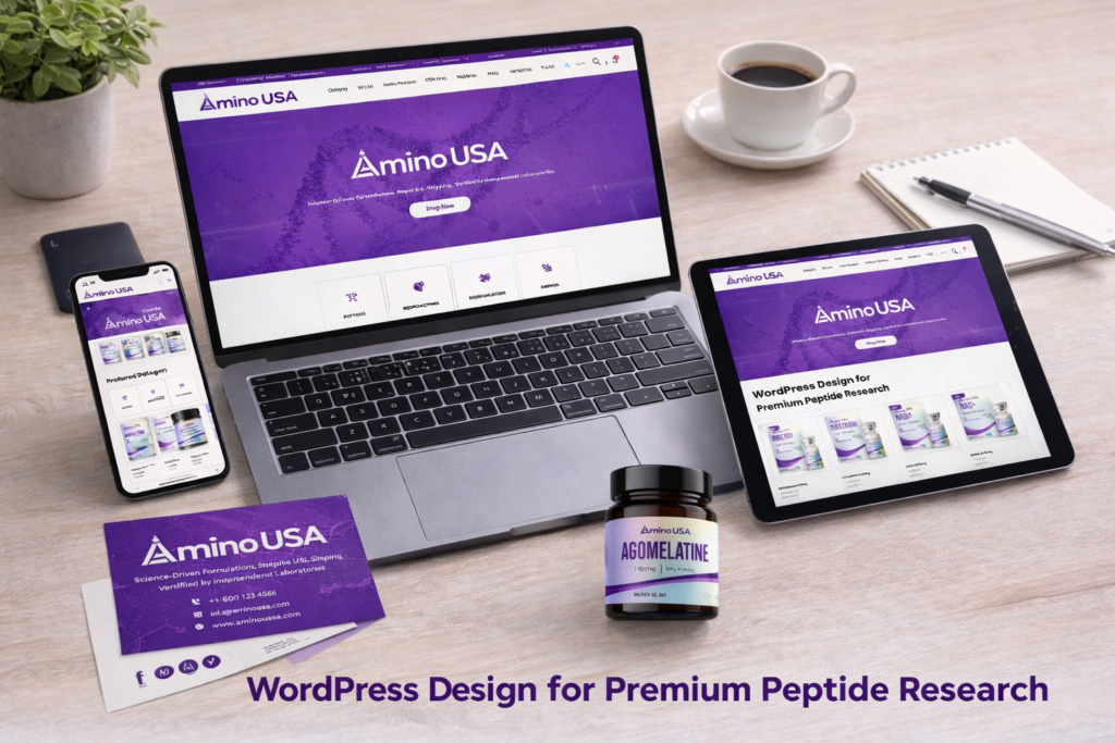
That’s exactly the challenge behind aminousa.com—a WordPress-based website designed to showcase premium peptide products while delivering a clean, research-focused user experience.
In this case study, we’ll walk through how we built this WordPress website from the ground up, how we structured its pages for both usability and conversion, and how thoughtful design decisions were integrated into the build process. While the homepage plays a central role, we’ll also explore how supporting pages contribute to the overall ecosystem.
| Prazo de entrega | Categoria | Plataforma de Aplicação |
| 22 dias | health products | WordPress |
| Designers envolvidos | Custo | Efeito |
| Lin Zhang | $2300 | Store traffic📈214% |
Understanding the Project Goals
Before any design or layout decisions, we aligned on a few critical objectives:
Core Goals
- Build a professional and trustworthy WordPress website
- Create a clear product categorization system
- Support conversion through structure, not aggressive selling
- Deliver a research-oriented browsing experience
- Ensure scalability for future product expansion
This project required a balance: the site needed to feel scientific and authoritative, but also modern and accessible.
Our WordPress Website Construction Approach
Structuring Before Designing
One of the biggest mistakes in website projects is starting with visuals instead of structure. For this project, we reversed that.
We began by mapping out:
- Product hierarchy (Peptides, Neuroactives, Bioregulators, Modulators)
- User entry points (homepage, search, category navigation)
- Conversion paths (product discovery → product detail → checkout)
This structure became the foundation of the WordPress build.
Homepage as the Conversion Hub
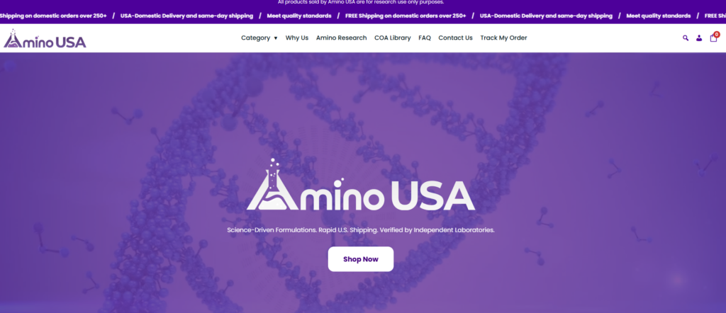
The homepage was designed and built as the central hub of the entire experience.
Key Sections We Built:
1. Hero Section (Trust First)
- Clean banner with minimal distractions
- Focus on scientific credibility and product quality
- Clear headline emphasizing purity and testing
2. Product Category Navigation

- Structured entry into key product groups
- Avoided overwhelming users with too many choices
- Designed for quick scanning and clarity
3. Featured & New Arrivals
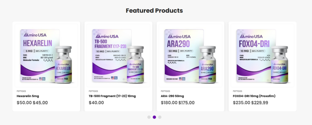
- Dynamic product grids
- Highlighted key items without clutter
- Balanced spacing and typography for readability
4. Trust-Building Blocks
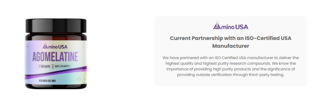
- Third-party testing mentions
- Quality assurance messaging
- Subtle but powerful credibility signals
5. Brand Story Section
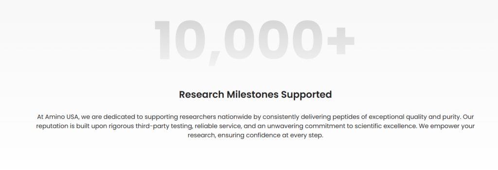
- Positioned the brand as science-driven and reliable
- Focused on transparency and manufacturing standards
Category Pages That Guide, Not Confuse
Instead of treating category pages as simple product lists, we built them as guided experiences.
What We Implemented:
- Clear product grouping
- Consistent card design across all categories
- Easy scanning with structured spacing
- Visual hierarchy to highlight key products
Each category page acts as a secondary landing page, not just a directory.
Product Pages Focused on Clarity and Trust
In this niche, product pages must do more than sell—they must reassure.
Key Elements We Built:
- Clean product image layout
- Clear product naming and structure
- Organized specifications and descriptions
- Supporting trust signals (quality, testing, origin)
We avoided unnecessary visual noise and focused on information clarity.
Our Design Process Integrated Into the Build
Design and Build Working Together
We don’t treat design and website construction as separate steps. Instead, they evolve together.
Step-by-Step Process
1. Wireframe Planning
We defined layout structures before adding any visual styling.
2. Visual Direction
We selected:
- Fundos brancos limpos
- Neutral tones
- Scientific and minimal typography
3. Section-Based WordPress Build
Each section was built modularly, allowing:
- Easy updates
- Flexible content replacement
- Scalable expansion
4. Content Alignment
We ensured that:
- Every section had a purpose
- Every message supported trust and clarity
Advantages of This WordPress Setup
Por que essa abordagem funciona
1. Clear Structure = Better Conversion
Users can quickly find what they need without confusion.
2. Trust-Focused Design
Instead of aggressive marketing, we used:
- Clean layouts
- Scientific tone
- Transparent messaging
3. Scalable System
New products and categories can be added easily without redesigning the entire site.
4. Consistent User Experience
From homepage to product page, everything feels unified.
Desafios que enfrentamos
Real-World Problems in This Project
Challenge 1: Balancing Science and Simplicity
Too much technical detail overwhelms users. Too little reduces trust.
Challenge 2: Avoiding Visual Clutter
Ecommerce sites often become overcrowded quickly.
Challenge 3: Building Trust Without Overclaiming
We needed to communicate quality without sounding exaggerated.
Nossas soluções
How We Solved These Challenges
Solution 1: Structured Content Layers
We layered information:
- First glance → simple
- Deeper scroll → more detailed
Solution 2: Minimalist Layout System
Utilizamos:
- Espaço em branco
- Consistent grids
- Controlled typography
Solution 3: Strategic Messaging Placement
Trust elements were placed exactly where users expect them:
- Near product information
- Within homepage sections
- Inside category introductions
Supporting Pages That Strengthen the Ecosystem
Beyond the Homepage
While the homepage is the core, supporting pages complete the experience.
Página Sobre
- Reinforces brand credibility
- Explains manufacturing and quality standards
Páginas da Coleção
- Help users navigate deeper into product categories
Informational Sections
- Provide context around usage and product types
- Improve overall trust and SEO relevance
The Results
What This Website Achieves
After completing the WordPress build and design integration, the site delivers:
- A clean and professional scientific brand image
- A structured and intuitive user journey
- Melhoria na descoberta de produtos
- Stronger user trust and credibility
- A scalable system ready for growth
This is not just a website—it’s a conversion-focused digital foundation.
Conclusão
Building a successful WordPress website is not about adding more features or complex functionality. It’s about creating a clear structure, aligning design with user expectations, and guiding visitors toward trust and action.
Para aminousa.com, the key was combining thoughtful website construction with purposeful design, ensuring every section supports both usability and credibility.
At the end of the day, this is exactly where our expertise comes in.
Em AIRSANG, we specialize in building and designing WordPress and eCommerce websites that don’t just look good—but actually convert. From structure planning to visual execution, we focus on delivering websites that align with real business goals, especially in cross-border markets.
If you’re looking to build a high-performing website that reflects your brand and drives results, we’re here to help.