In the Coupang product detail page design of MOLLM’s ten makeup brushes, we organized the content around brush type selection and material hierarchy. Through cream beige, white brush handles, rounded corner pictures and warm photography, product identification, partial description and scene information are arranged at different levels, allowing readers to continue to understand the product in a clear sequence.
| 서비스 | Industry | 플랫폼 |
|---|---|---|
| Coupang product detail page design | Beauty and personal care | 쿠팡 |
| Project requirements | target market | design style |
| Brush type selection and material layering | Korean content display | Cream beige, white brush handle, rounded corners picture and warm color photography |
| Project quotation | Delivery content | Delivery time |
| ¥1,300 | Version 1 product product detail page design | not disclosed |
Design challenge: Separate different reading tasks
This set of product detail pages should not only retain the appearance recognition of MOLLM’s ten makeup brushes, but also accommodate different themes such as brush type selection and material levels. Instead of letting each picture carry all the information repeatedly, we separated the whole, parts and scenes, and controlled the distance between titles, pictures and descriptions.
Our design strategy
We used cream beige, white brush handles, rounded images and warm photography to establish a continuous visual language so that the subject can be clearly identified from the background. The title uses an obvious font size and weight hierarchy, and the supplementary description is relegated to the next level to avoid decoration, photos and text competing for attention at the same time.
In terms of content organization, we divide chapters according to the themes of real works: use larger pictures to establish overall relationships, use parts and diagrams to explain details, and then use bounded text areas or lists to organize supplementary information. Long pages create pauses through color blocks, cards, and white space between groups, and chapter switches can also be identified during continuous reading.
Opening Overview: Arched windows house the entire set of products
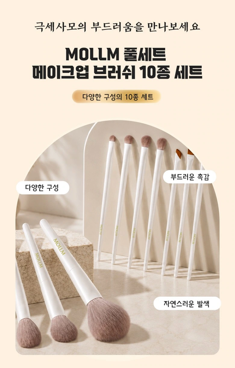
We placed the brush set into the arched frame, with the cream base extending into the title area. The short label should be placed close to the brush head and handle, leaving enough distance between the product and the text.
Character scene: first show the makeup action
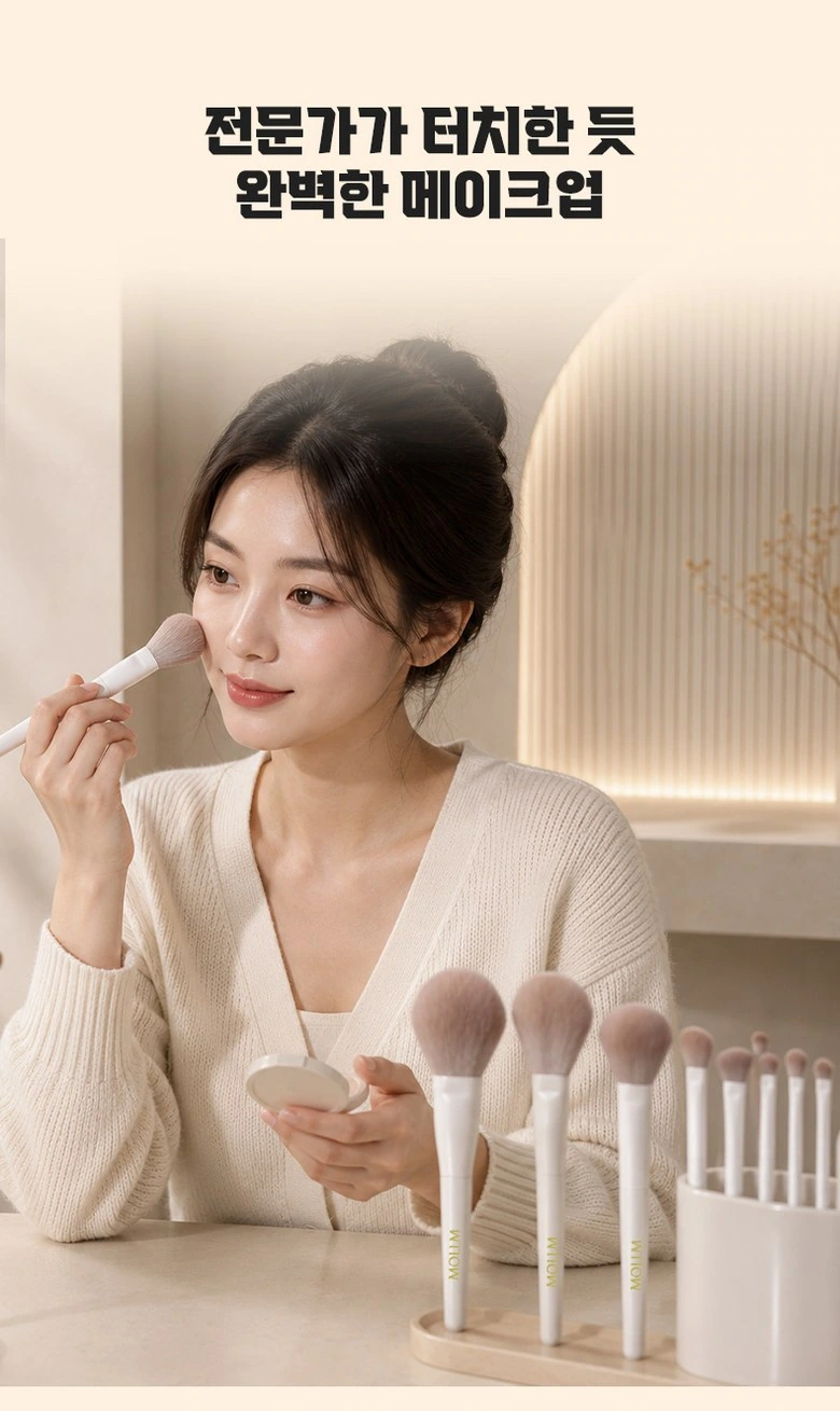
We put the characters in the same frame as the entire set of brushes, and the mirror and tabletop continue the beige atmosphere. The headline is placed in the white space above, without blocking facial and hand movements.
Close up of bristles: size differences create hierarchy
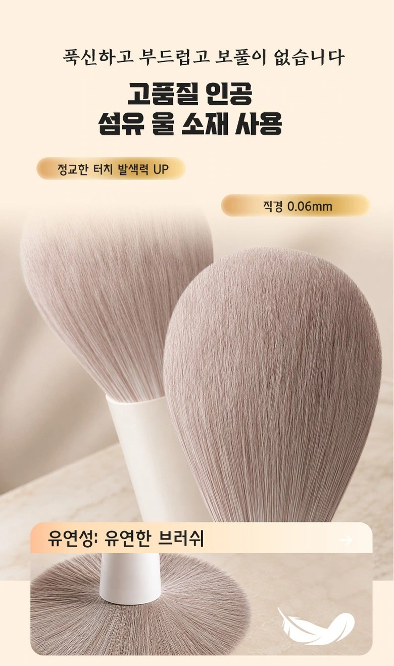
We enlarge the two brush heads, and the partially rounded outline contrasts with the thinner description. Small labels are arranged along the white space, allowing the material theme to be seen before the fine text.
Partial comparison: Two horizontal pictures each have a title band
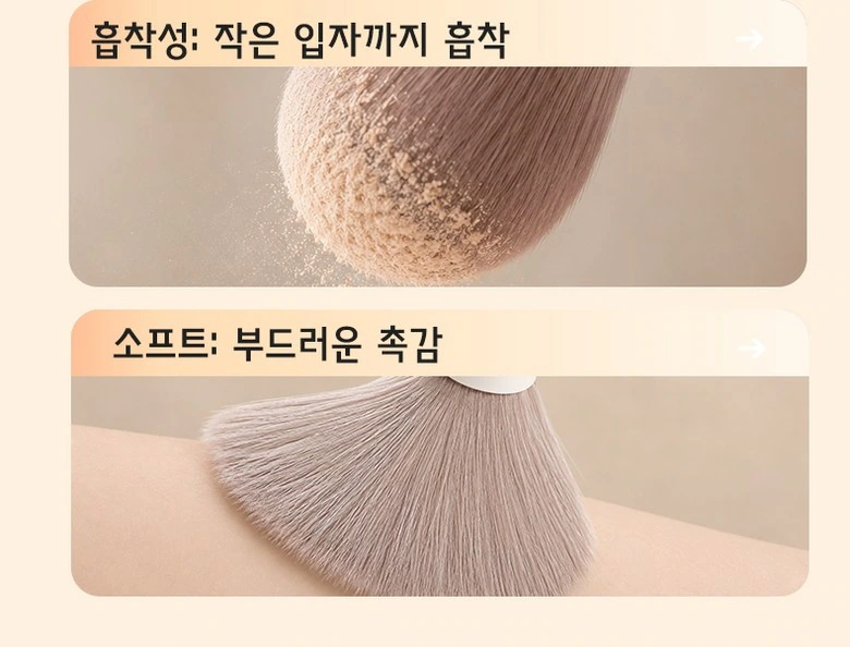
We use the upper and lower rounded photos to distinguish the powder and bristle forms, and the warm orange title strip connects the pictures. Uniform margins organize different close-ups into continuous reading.
Use partitions: connect characters and local actions up and down
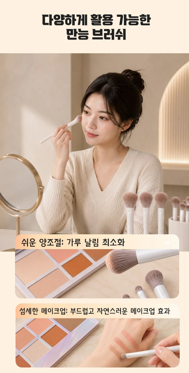
We use portraits to establish the overall makeup situation, and use two narrower photos below to supplement the brush movements. The image scales are different, respectively responsible for overall and local description.
Brush handle details: text arranged along diagonal lines
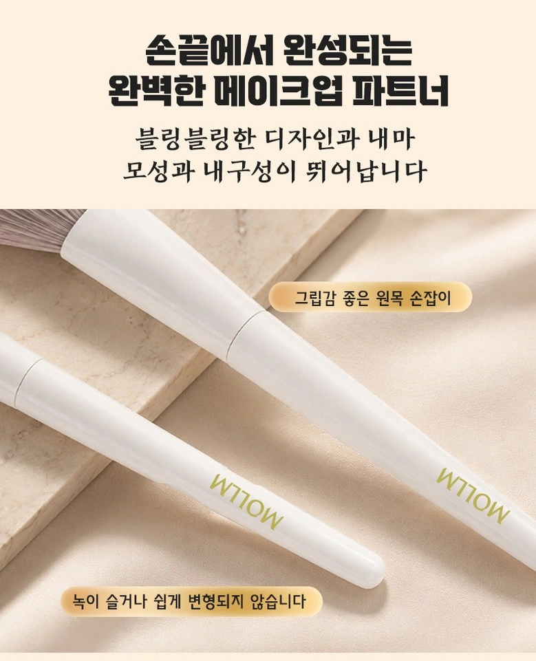
We have crossed brush handles to form the diagonal main body, with small gold tabs near the joins. The large area of light-colored background retains a sense of breathing, and details will not be overwhelmed by background decoration.
Combined display: spread the brushes by length
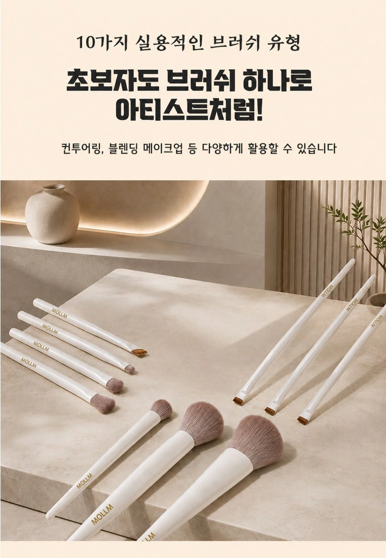
We arranged the entire set of brushes diagonally on the table, leaving the theme text at the top. The parallel relationship of the brush handles and the natural shadows create an order that makes it easy to identify the structure of the set.
Large brush type: organize two brush heads with the same card
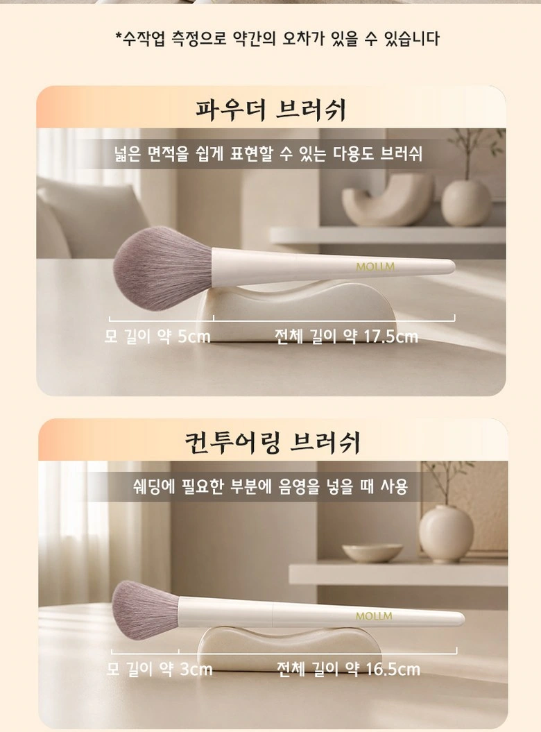
We put the two large brushes into the upper and lower rounded corner cards, with the name, purpose text and size lines in the same position. A common framework allows selection information to be directly compared.
Medium Brush: Follow the same reading baseline
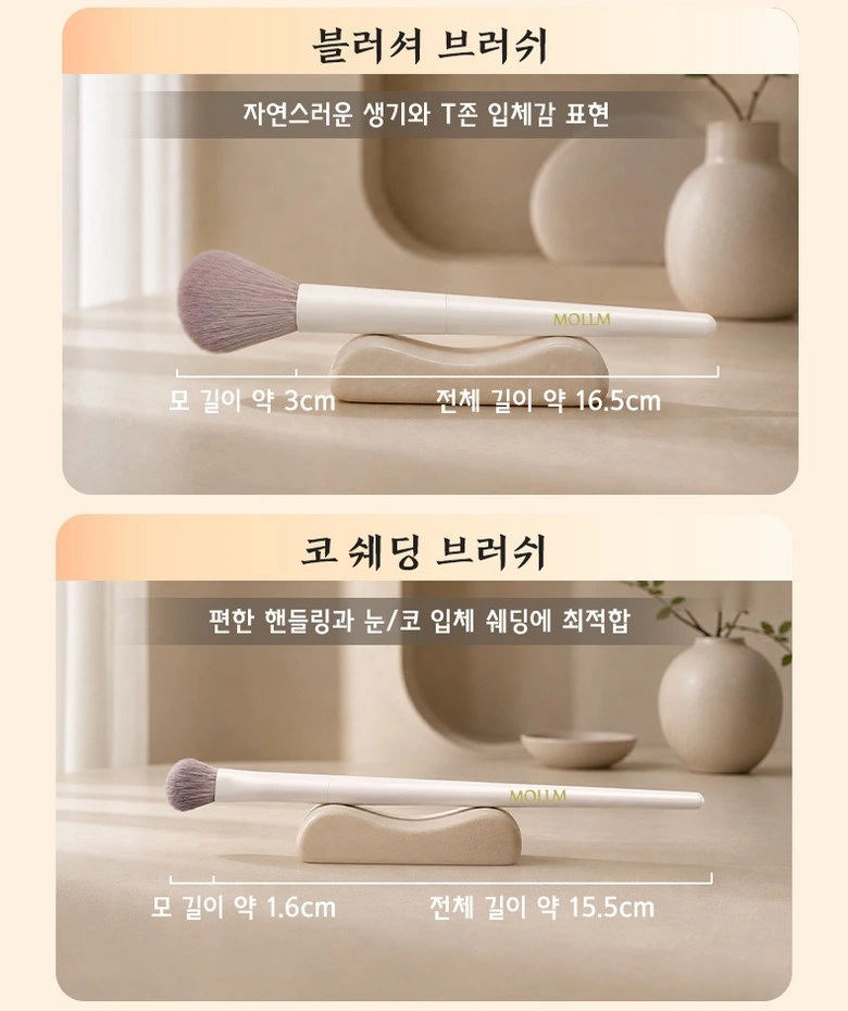
We continue the double card structure in the blush and partial brush styles, and the size lines are close to the corresponding brush handles. The warm background and clear white space maintain the consistency of the entire set of brush pages.
Eye Brush Style: Use Approximate Scale to Show Differences
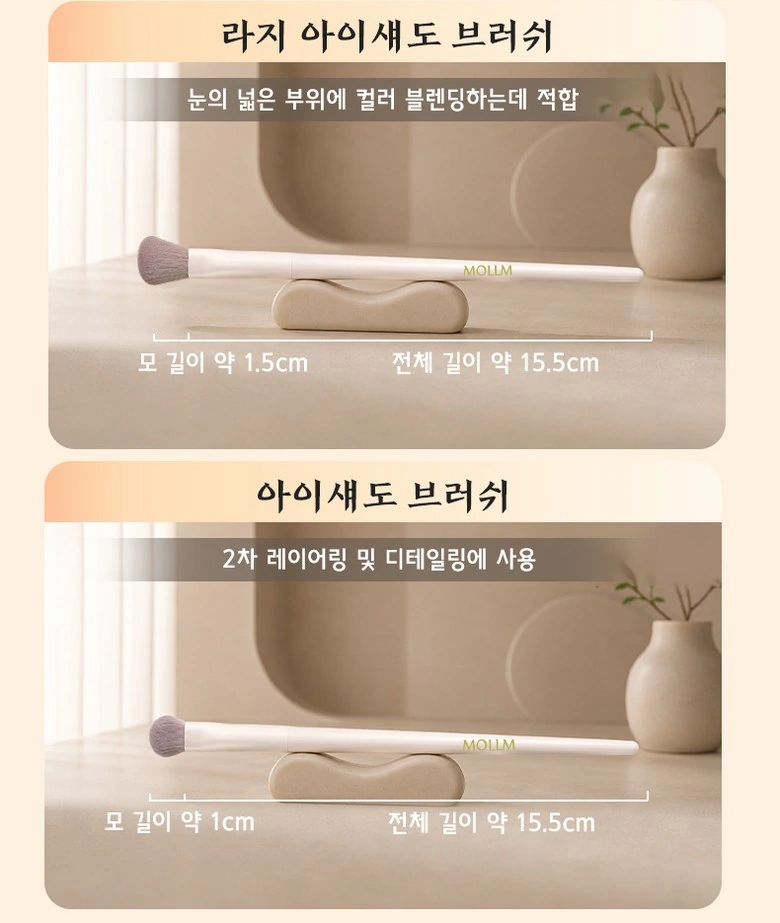
We placed the two eye brushes horizontally, with the title and short description at the top of the photo. Similar product dimensions make the shape of the brush head a visible focus.
Partial brushing type: allows the delicate contours to be seen clearly
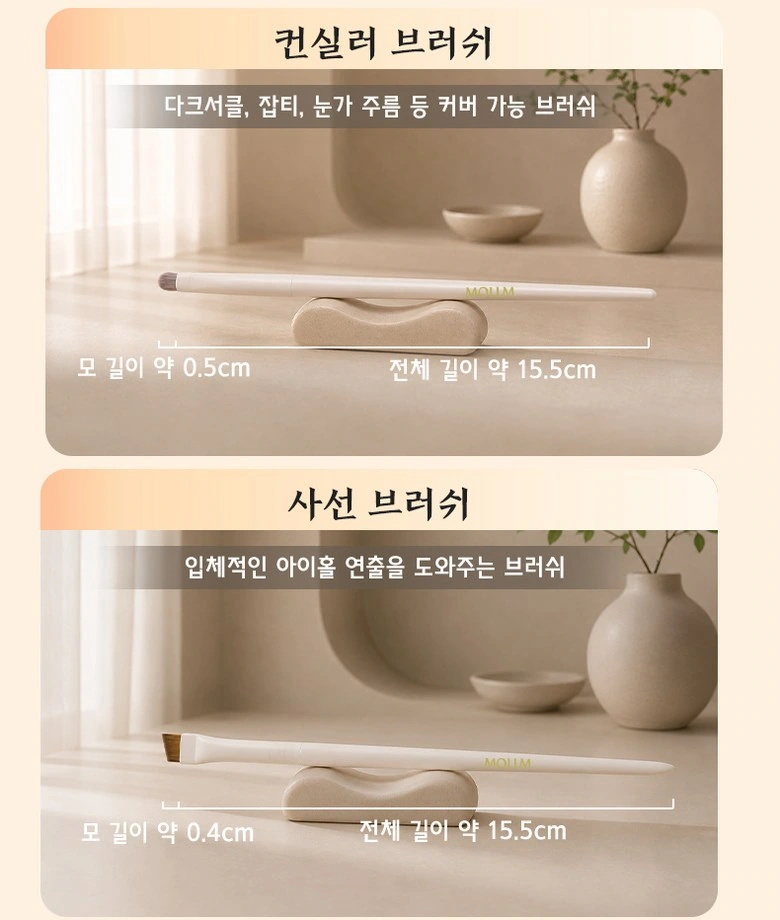
We reserve a large display space for small brush heads, and size information is arranged below. Unify card spacing and text levels to prevent small products from losing their presence on long pages.
Detail brushing: complete the brushing directory with regular partitions
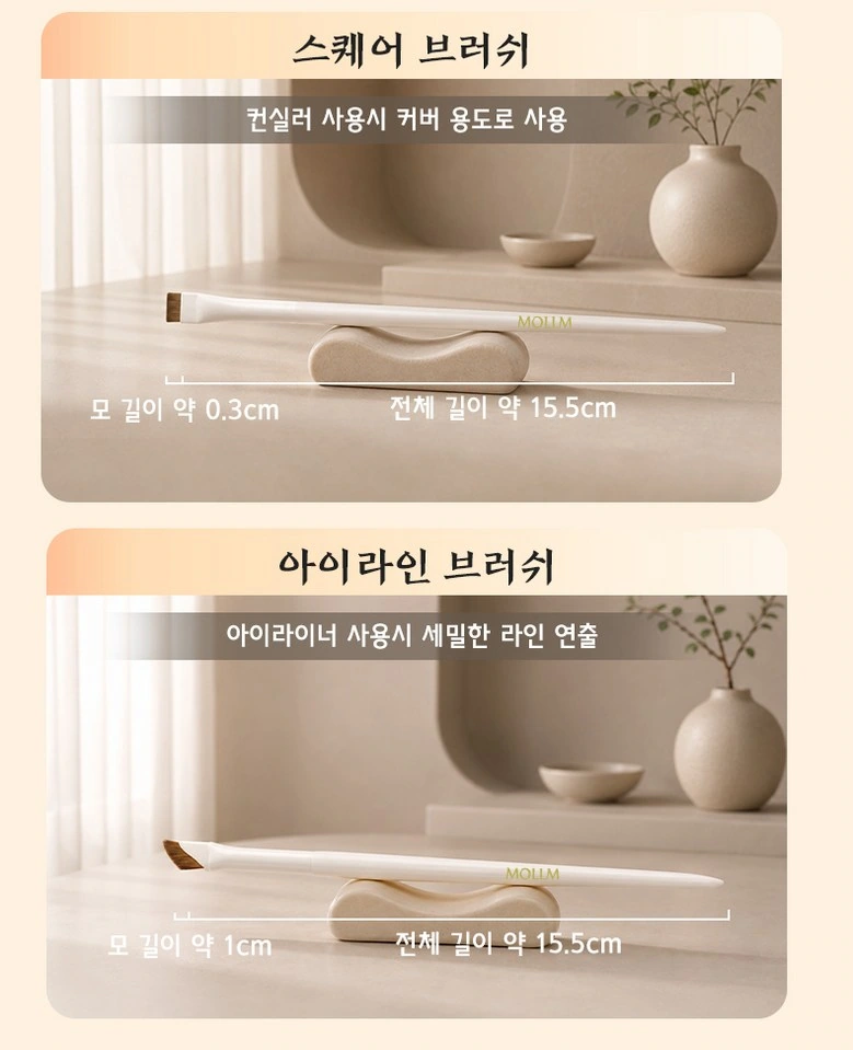
We kept the same table top and title strip for the last two brushes. Continuous alignment and margins connect multiple content pages so readers don’t have to adapt to new layouts over and over again.
Nursing steps: four-frame photos unfold step by step
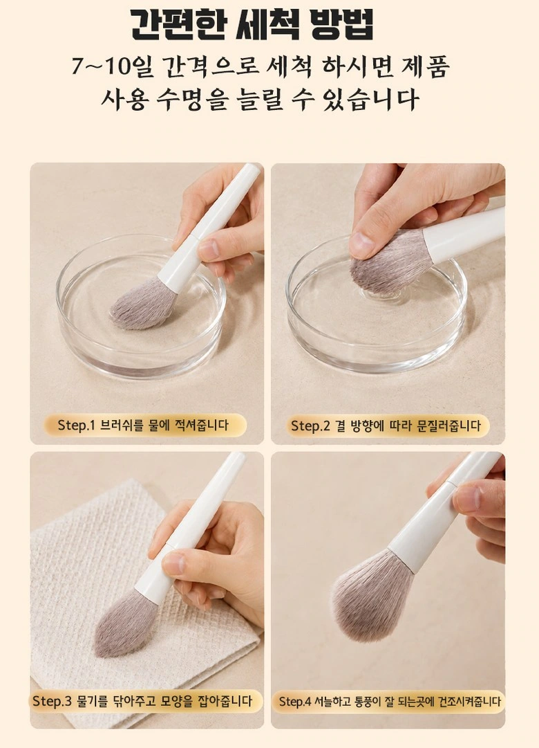
We divide the cleaning action into four pictures and use numbers to connect the sequences. Each step has its own area so the instructions don’t crowd into the bristles and hand details.
The whole set of gatherings: use arrangement to emphasize the consistency of the series
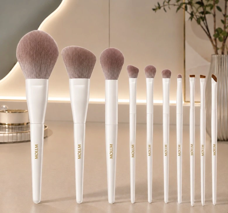
We finish with brushes arranged vertically, with handles and bristles forming a rhythm from high to low. Keep the background and opening in the same color system to keep the product detail page coherent from beginning to end.
Deliver and design value
Through this version of the product detail page, we establish a continuous reading path around brush type selection and material hierarchy. Creamy beige, white brush handles, rounded corner pictures and warm-color photography connect different chapters. Image scale, text level and white space jointly distinguish the priorities, allowing the product overview and local descriptions to complement each other.
Develop a clear Coupang visual expression for your product
You can provide us with product links, existing materials, and key points that need clarification. We will combine the product structure, style and usage scenarios to plan the appropriate picture group or product detail page content and layout.