Project overview
The client of this project is a travel brand that provides China travel planning and railway travel services to overseas tourists. It mainly serves international tourists who come to China for the first time, travel across cities, and want to experience China’s high-speed rail lines. As travel routes, destinations and travel information continue to increase, the original page needs to be further optimized in terms of information level, visual appeal and user conversion path. Therefore, the customer came to us hoping to reorganize the overall website experience. The project was designed based on the Shopify platform. The client hoped that through a clearer page structure, a more immersive display of travel scenes, and modules such as routes, destinations, travel products, user reviews, and action buttons, it would reduce the difficulty for users to obtain information, while enhancing the brand’s professionalism and trust, ultimately guiding visitors to gradually move from browsing travel information to itinerary consultation, route exploration, and booking.
| 서비스 | Industry | 플랫폼 |
| Website design and decoration | Sports and outdoor | shopify |
| Project requirements | target market | design style |
| Optimize website structure and user browsing experience | 글로벌 | Immerse yourself in nature|High-end customization|Humanistic travel |
| project budget | Delivery content | Delivery time |
| ¥12000 | Website construction and full-site page design | 24 working days |
https://www.chinahighlights.com
Project Challenges
The core challenge of this project is how to enable overseas tourists to quickly understand the brand service content and successfully find a travel route that suits them when there is a lot of travel information and long user decision-making links. We need to focus on solving problems such as unclear information levels on the page, scattered destination and route displays, insufficient brand trust, and unclear conversion paths from browsing to consultation or booking. Before starting the project, we first conducted an overall review of the client’s existing Shopify website, analyzing the homepage structure, navigation logic, travel product classification, user browsing paths and core conversion portals, and also sorting out the main destinations, railway lines, service advantages, user reviews and visual materials. Through early information architecture planning and content priority sorting, a clear foundation is established for subsequent page design and conversion structure optimization.
Page core design section
Above the fold area: Quickly inspire travel inspiration
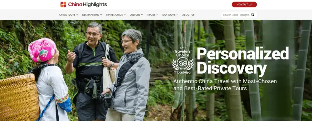
The first screen area is the first emotional point of contact for visitors after entering the website.
Design focus
- Use large-scale lifestyle images that showcase authentic travel experiences
- Highlight personalized travel experiences through clear copy
- Establish a clear visual hierarchy to allow users to quickly understand core values
The main title revolves around exploration and discovery, further strengthening the brand concept that “travel planning can be more personalized, easier and smoother”.
auxiliary design elements
- Reduce visual interference caused by navigation
- Improve text readability through strong light and dark contrast
- Set a clear visual focus and guide users to browse naturally from the title to the content below
The main function of this section is to establish a sense of expectation and emotional connection for travel as soon as the user enters the website.
Trust endorsement and brand authority
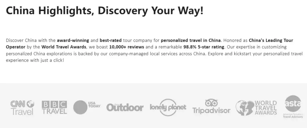
Travel decisions typically require a higher level of trust, so the page incorporates various brand credibility elements higher up on the page.
Key trust elements include
- media reports
- Travel Industry Awards
- Endorsed by well-known travel platforms
- Industry recognition and honors
From a design perspective, this content is presented in a concise horizontal arrangement, allowing visitors to quickly identify the strength of the brand without interrupting the visual rhythm of the overall page.
These trust signs appear in a relatively restrained manner, conveying to users the message that the brand is professional, reliable and experienced without causing visual burden.
Highlights of travel information
An important challenge in tourism website design is how to clearly display important policies, announcements and travel information.
For example, visa policies, entry requirements or travel notices need to be eye-catching but not overload the user with information.
design solutions
The page is displayed through key information prompt boxes. The main features include:
- Use lightweight borders
- Information differentiation through background color difference
- Keep fonts simple and clear
- Convenient for users to quickly browse and obtain key content
This design ensures that important travel information is always highly visible without affecting the user’s ability to continue browsing other content.
Tourist routes to explore areas
The “Popular China Travel Routes” section is mainly used to inspire users to further explore different travel options.
Each travel itinerary card contains
- High quality destination images
- Travel days
- Main cities involved in the itinerary
- Clear “see more” operation entry
The design value of grid layout
From a design perspective, a card grid layout can:
- Help users quickly compare different lines
- Establish a neat and unified visual rhythm
- Encourage users to continue browsing for more travel products
The overall card design maintains a balance between visual appeal and practical information, helping travelers quickly determine whether a certain route meets their interests and needs.
Social Proof and Visitor Reviews
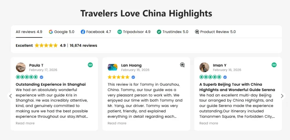
Real user reviews are very convincing for travel websites.
The evaluation section focuses on displaying the travel experiences of real travelers while keeping the page clean.
main design elements
- Star rating to quickly establish credibility
- User avatar to enhance authenticity
- Streamlined evaluation content for easy reading
The entire section adopts a card-style design, which can display the reviews of multiple visitors at the same time while avoiding the page from appearing overcrowded.
This part further enhances brand trust and strengthens users’ recognition of service quality and brand reliability.
Destination Discovery Grid
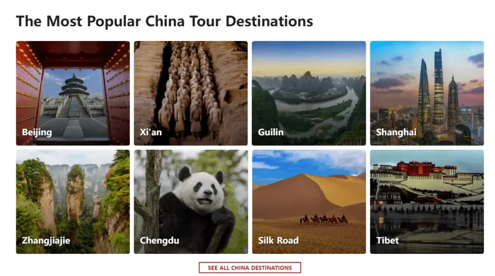
When many travelers plan their itinerary, they do not start directly with specific travel routes, but first explore destinations of interest.
Therefore, the page has a dedicated destination display area to match the user’s real browsing habits.
Core design features
- Use visually impactful destination photography
- Set clear name labels for each location
- Use a modern, easy-to-navigate grid layout
Popular destinations such as Beijing, Shanghai, Guilin, and Tibet are presented in a strong visual way.
This section is like a visual travel map that can help users quickly imagine different travel routes and possible future travel experiences.
Travel guides and educational content
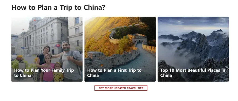
Many travelers need a lot of travel information and planning advice before they actually decide to book.
Therefore, a dedicated travel guide content area has been added to the page.
Examples of content include
- Planning tips for your first trip to China
- Family travel guide
- A guide to popular attractions and natural beauty
From a user experience perspective, this section can support content-driven browsing.
Even if users are not ready to book yet, they can continue to learn more about the destination through guide articles while staying within the content system of the brand website.
Conversion area: driving users to take action
After gradually guiding users through travel inspiration, practical information, and destination content, the page begins a natural transition into the conversion phase.
Here, users are guided through a clear call to action to start planning their own personalized trip.
Design focus
- Use contrasting button colors
- Use a centered layout to highlight core operations
- Reduce distractions from other content around you
This section is equivalent to the key decision-making node in the entire page, pushing users further from “browsing and understanding” to the “consulting and planning” stage.
Newsletter email subscription area
Tour plans often last for weeks or even months, so not all visitors will book immediately on their first visit to the site.
The email subscription section is mainly used to receive potential customers who are not yet ready to book, but are already interested.
Core design features
- Use a scenic background image with a travel vibe
- Clearly describe the content and value you receive from your subscription
- Simplify the subscription process
Through this design, even if the user does not complete the booking temporarily, the brand can still keep in touch with potential travelers through follow-up email content and gradually drive subsequent conversions.