Around the tower socket, we organized the interface partitions and desktop scenes into a set of English product pictures. The entire set of works adopts the visual language of black and white products, blue emphasis, and clean home. Through the division of labor in different pictures, the product appearance, local information, and usage scenarios are gradually presented.
| 서비스 | Industry | 플랫폼 |
|---|---|---|
| Amazon primary and secondary product images design | Home department store | 아마존 |
| Project requirements | target market | design style |
| Interface Partition and Desktop Scenario | English content display | Black and white products, blue accents, clean home |
| Project quotation | Delivery content | Delivery time |
| ¥500 | 7 product primary and secondary product images | 4 days |
Design Challenge: Let different information have its place
Tower sockets require explanation of interface distribution and table placement. We use white background images to first establish shape recognition, and then separate the ports, charging and usage environments to avoid dense functional text from covering up the product structure.
Our design strategy
The white and gray background and blue markings are unified to keep both dark and light colors clear.
Use leading lines for structural description, photo partitions for scene description, and left and right comparisons for comparative information.
Main vision on white background: complete explanation of tower body and wires
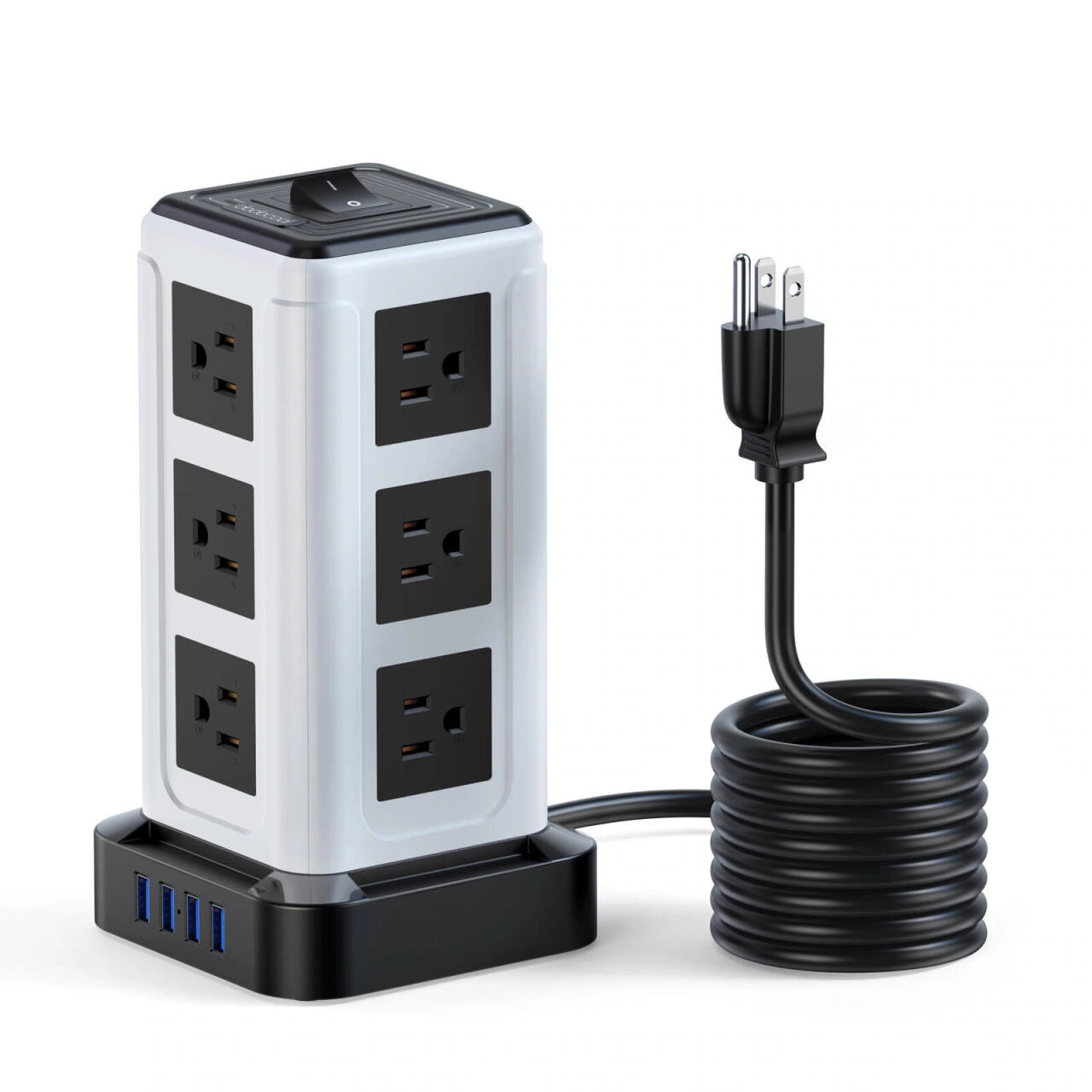
We let the tower take up the center, with the cables and plugs spread out underneath. The white space around the product retains the outline of the interface, and the black and white color scheme forms a stable recognition on the light background.
Interface theme: main body and device representation separated
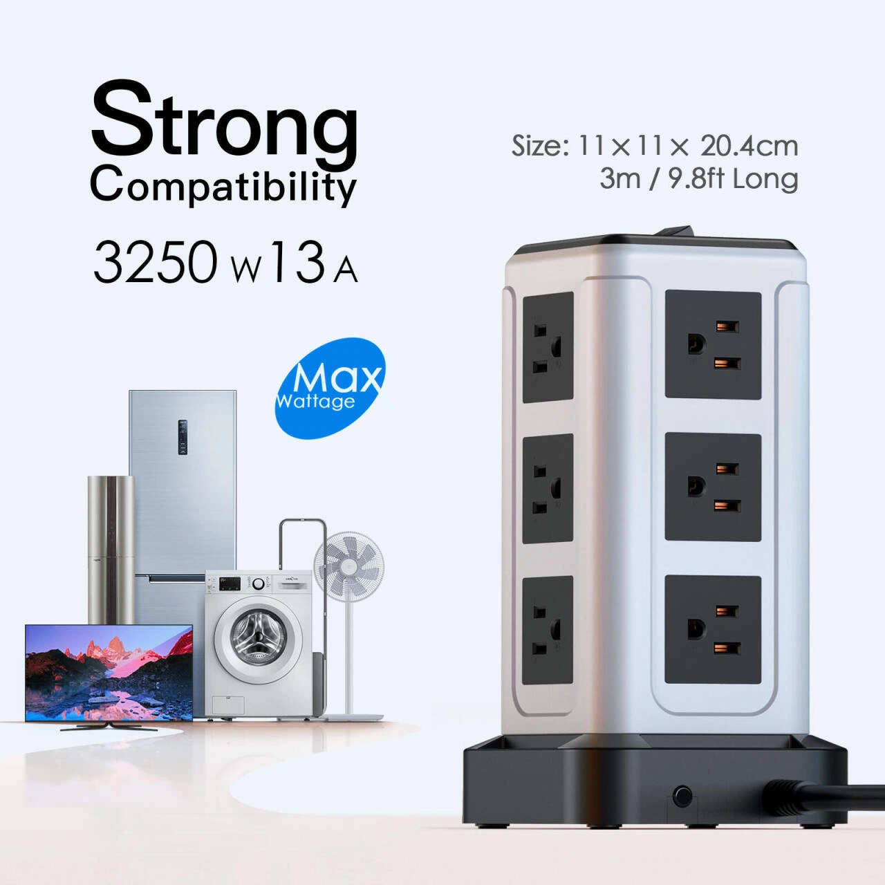
We enlarged the tower body, arranged the related equipment on the side with simplified graphics, and concentrated the titles and numbers on the top. The description element will not pass through the jack area, and readers can see the main body clearly before reading the interface theme.
Detail marking: Arrange leads along the outer edge of the product
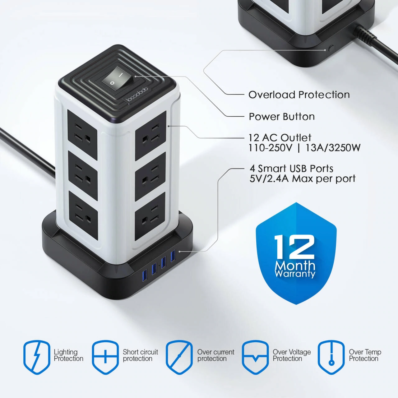
We show the different sides through angled views, with leads pointing to ports and buttons, and icons arranged in a row below. Leaders, text, and icons are kept at different levels to reduce congestion when multiple pieces of information appear at the same time.
Charging situation: the mobile phone forms a relationship with the tower
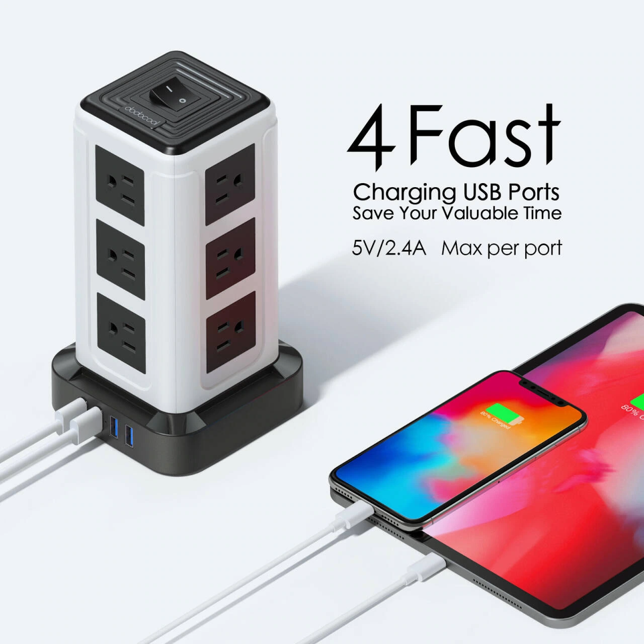
We put the mobile phone, charging cable and socket on the same screen, and the white curved background maintains a clean digital temperament. The blue information area focuses on undertaking titles, and the cable relationships between products remain visible.
Desktop comparison: Make wiring differences visible
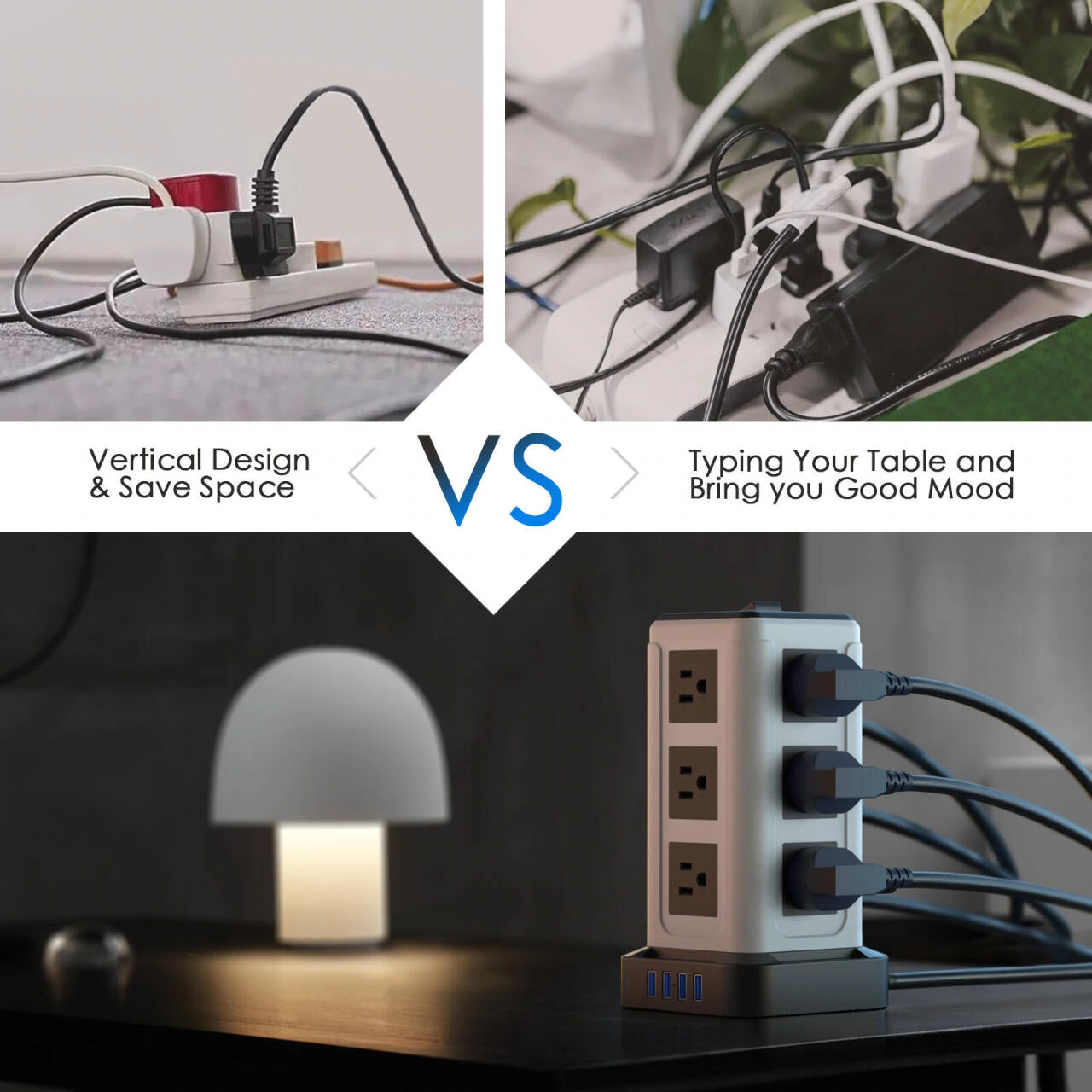
We use the desktop images on both sides to show different wiring states, and the geometric area in the middle contains the theme. The boundaries on both sides are clear, allowing readers to compare the organization of desktop space laterally.
Multi-space use: unified size for three scenes
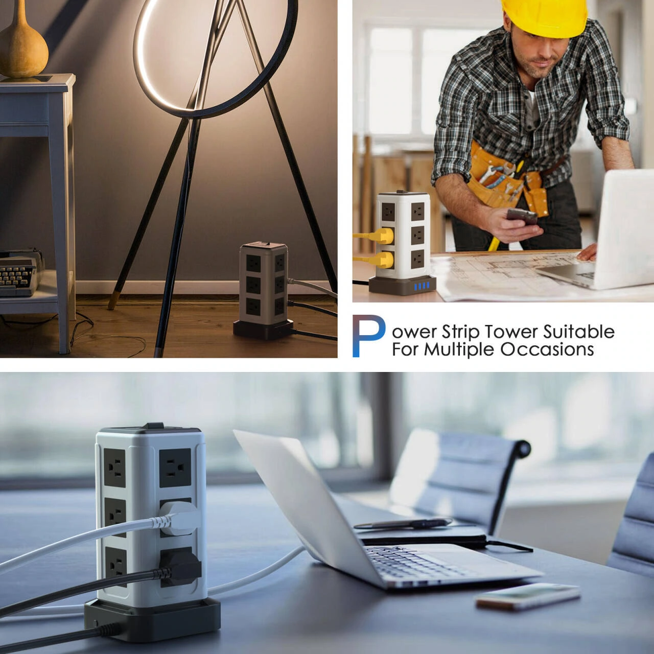
We divided situations such as home and workbench into three parts, and established continuous reading by unifying the margins of the photos. The product retains a spatial relationship with the surrounding furniture, allowing the scene to assume the responsibility of environmental reference.
Material theme: dark images set off the visual rhythm
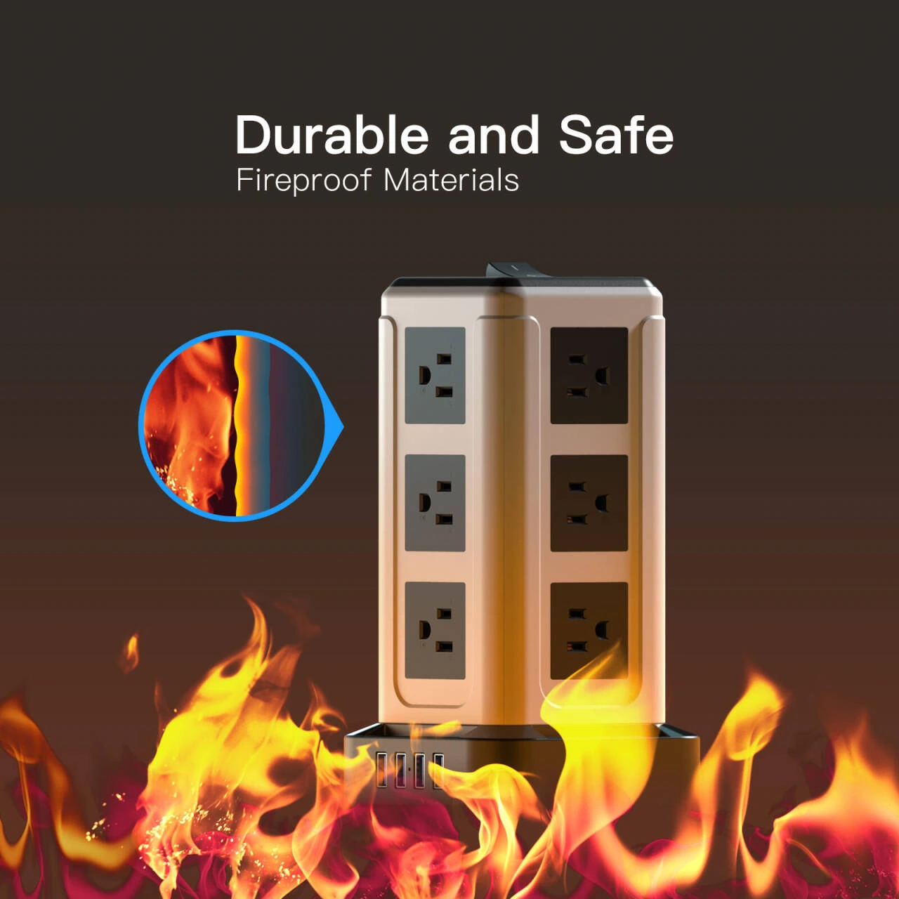
We use dark backgrounds and close-ups of local materials to organize the material theme, with the bright body becoming the center. The description below is arranged separately from the close-up, making this one an obvious chapter change in the group of light-colored pictures.
Deliver and design value
This set of works contains a total of 7 product pictures. We arrange the responsibilities of different pictures around interface partitions and desktop scenes, and maintain the visual consistency of the entire set with black and white products, blue accents, and clean homes. From overall identification to partial explanation, the pictures complement each other, allowing readers to find information based on their own concerns.
Develop a clear visual expression for your products
You can provide us with existing product information, physical photos and key points to be displayed. We will combine the product structure, style differences and usage scenarios to plan image content and layout suitable for Amazon product display.