Project overview
YakAttack is an outdoor brand specializing in kayak fishing equipment and modular accessories. It is mainly targeted at professional fishing enthusiasts who value durability, compatibility and practical use experience. As the types of products continue to increase, the original website gradually becomes complex in terms of product classification, information level and purchase path, and users need to spend more time understanding the relationship between different accessories. Therefore, the client came to us, hoping to reorganize the visual and page structure of the website, while retaining the tough outdoor tone of the brand, while improving the overall professionalism and shopping experience. This project is based on WordPress As the platform expands, we focus on optimizing the home page, product category page, product detail page and brand content page. Through clearer navigation, product grouping, visual hierarchy and scenario-based display, we help users find fishing equipment that suits them faster and improve brand trust and conversion efficiency.
| Services | Industry | Plate-forme |
| Website design and decoration | Sports and outdoor | WordPress |
| Project requirements | target market | design style |
| Optimize product classification and reduce user search costs | Mondial | Rugged outdoor | Professional and practical | Simple industrial |
| project budget | Delivery content | Delivery time |
| ¥14600 | Website construction and full-site page design | 24 working days |
Project Challenges
The core challenge of this project is how to allow users to quickly understand the purpose, compatibility and usage scenarios of different fishing equipment when there are a large number of products and complex accessories, while avoiding overcrowding of information on the page. We need to solve problems such as the classification level is not intuitive enough, key products are not prominent, the cost of reading professional parameters is high, and the brand vision is insufficiently combined with outdoor usage scenarios. Before starting the project, we first sorted out the product catalog, core categories, target users and main purchase paths, and analyzed the page structure and visual performance of similar fishing and outdoor equipment websites. At the same time, organize brand materials, product selling points, application scenarios and content priorities to establish a clear foundation for the layout planning, visual unity and conversion design of subsequent homepages, category pages and product detail pages.
Home Page Design Strategy
Make a powerful first impression
The homepage is the first entrance for users to enter the brand ecosystem. When designing, we hope to convey three core messages as soon as possible:
lifestyle immersion
Through the real kayak fishing scene, users can quickly enter the actual use environment of the product.
Product system clarity
Through modular equipment classification, users can clearly understand the relationship between different products.
Brand professionalism and trust
Through unified and professional visual expression, the brand’s professional image in the field of fishing equipment is strengthened.
First screen Hero area design ideas
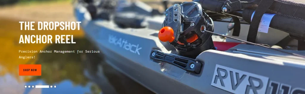
Full width lifestyle scene illustration
Use real fishing scenes as the core visual to intuitively show the use status of the product in the actual environment.
Concise and powerful title copy
Reduce complex information stacking and quickly convey brand value through concise core copy.
Clear primary action buttons
Set up a clear CTA to guide users to browse and explore the product further.
This design method avoids overcrowding of content on the first screen, and at the same time establishes emotional connections through scene-based visuals, making it easier for users to imagine their actual experience using these devices.
Product discovery path design
Simplify complex product systems
One of the biggest challenges for fishing equipment websites is that the product system is usually complex, involving not only multiple product types, but also compatibility and different technical specifications.
We solve this problem through structured category navigation.
Product classification module
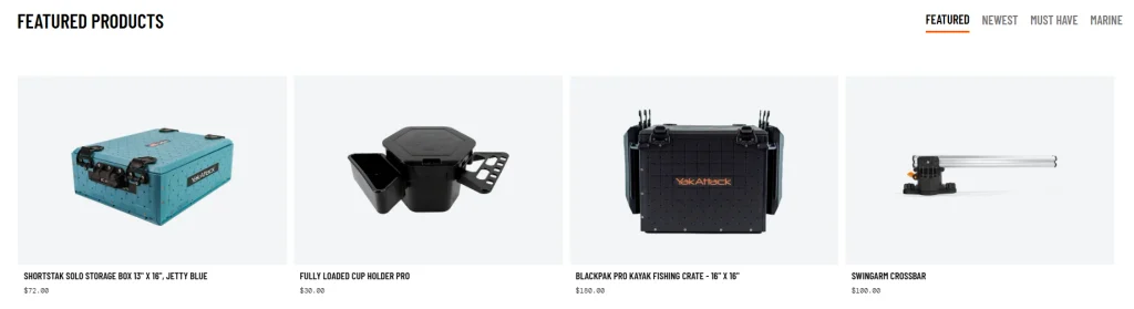
fishing rod holder
Help users quickly find different types of fishing rod fixing and support products.
Install system
Concentrated display of various installation bases, rails and modular connection accessories.
Storage solutions
Showcasing storage and organization products for kayaking and fishing scenarios.
Accessoires
Integrate other auxiliary equipment to facilitate users to further expand their equipment system.
Each classification module is visually represented in the following ways:
Clean and clear product images
Reduce background distractions and make the product itself the visual focus.
A brief and focused description of the benefits
Avoid accumulating too much technical information and allow users to quickly understand the value of the product.
Clear navigation hierarchy
Help users quickly determine which category to enter next.
This structure can effectively reduce users’ cognitive load and allow them to find the products they really need faster.
A balance between visual impact and information clarity
Control visual information density
Outdoor brands usually use a lot of scene images, but if there are too many visual elements, it can easily affect the usability and reading efficiency of the website.
Our design solutions include:
Control the frequency of use of high-quality visual materials
Use powerful images in key locations rather than flooding all areas with visual elements.
Enhance white space and grid alignment
Make the page tidier through reasonable spacing and unified layout rules.
Unified font information level
Establish a clear reading order through differences in font size for titles, text, and supporting information.
This design method allows the website to maintain a high-end feel and visual impact without sacrificing information readability.
Product product detail page design optimization
Design around user decisions
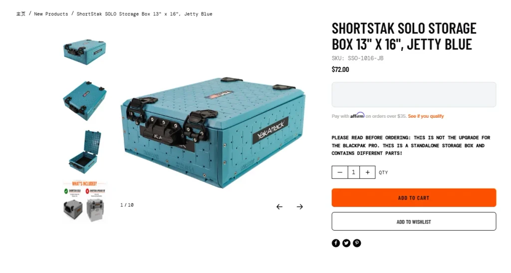
The product detail page is one of the most important pages to drive conversions. Instead of stacking a large number of technical parameters directly in front of users, we reorganized the content structure so that users can understand the product in a natural decision-making sequence.
core design elements
Clear information on the first screen
The product name, core advantages and price can be quickly seen on the first screen.
Visual product story
Combining lifestyle scene pictures and close-ups of product details allows users to understand the usage scenarios and see product details clearly.
structured information hierarchy
Display content in the order of “Product Features → User Benefits → Usage Scenarios”.
Clear CTA layout
Place the main purchase button in an eye-catching and easy-to-operate location to reduce the time users spend looking for the purchase entrance.
Simplify complex modular product systems
Help users understand the relationship between products
Many of YakAttack’s products are not used independently, but as part of a modular system. Without clear instructions, users can easily have questions about compatibility and combinations.
To this end, we have added:
Visual compatibility tips
Help users understand whether different products can be used in combination.
Related product portfolio display
Put products suitable for use together to improve the efficiency of users discovering other products.
Simple description module
Use a more intuitive way to explain the connections and usage logic between products.
Through these methods, we transform the originally complex product system into a more understandable purchase path, allowing users to clearly understand how different equipment should be used together.
Product collection page experience design
Improve product browsing efficiency
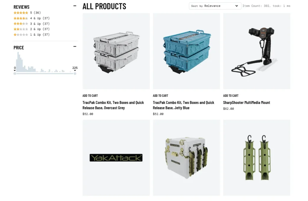
The product collection page needs to meet the needs of two types of users at the same time:
quick view
It is convenient for users to quickly view different products and make preliminary comparisons.
Deep exploration
Allow users with clear needs to further understand the specific information of different products.
Page design optimization
Clean and unified grid layout
Keep the page more organized with consistent spacing and product card sizes.
Optimize multi-line product titles
Reasonably control and truncate long product names to avoid affecting the overall layout.
Lightweight hover interaction
Use a moderate hover effect to enhance the sense of interactivity without adding too much visual interference.
We avoid adding too many filters and irrelevant elements and focus on browsing efficiency and information clarity.
Product listing visual consistency
Strengthen trust through unified design
Consistent visual rules can give users a more stable and professional experience during browsing.
Our focus is unified:
Product image ratio
All product images maintain a uniform visual proportion.
spacing between elements
Maintain consistent white space between product cards, titles, prices, and buttons.
Predictable page layout
Different product and category pages maintain similar visual logic to reduce users’ learning costs.
This makes the entire browsing experience more stable while reinforcing the brand’s professional image.
Auxiliary page and brand story design
About us and brand page
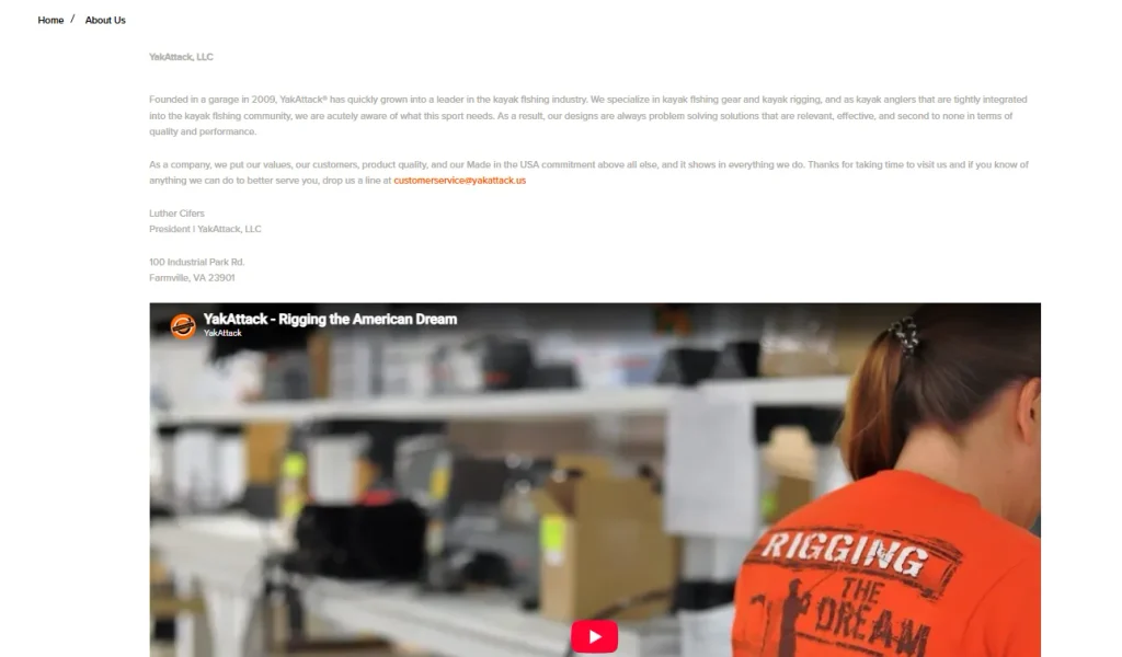
Rather than treating these pages as simple ancillary pages, we designed them to be important content assets that build trust in the brand.
Mainly focus on the following directions:
Brand Origin and Mission
Help users understand why the brand was founded and what problems the brand hopes to solve.
Real product usage scenarios
Enhance brand credibility with footage of actual outdoor use.
Community-driven brand identity
Strengthen the connection and sense of belonging between the brand and fishing enthusiasts.
The page layout highlights:
Brand story module
Tell the brand philosophy step by step through a clear content structure.
lifestyle pictures
Connect the brand story with real fishing scenes.
Simple typography
Make sure longer brand content still has a good reading experience.
Content and educational modules
Support users’ research behavior before purchasing
Fishing enthusiasts usually conduct more information inquiries and product research before purchasing equipment, so we have designed corresponding content areas for this behavior.
These contents are mainly used for:
Educate users on how to use equipment
Help users understand how to install, match and use products through relevant content.
Show real application scenarios
Let users see the specific performance of the product in an actual fishing environment.
Strengthen brand professionalism
By continuously outputting professional content, we enhance the brand’s sense of industry authority in the minds of users.
This design method makes the brand not only a product sales platform, but also an information source for users to obtain fishing equipment knowledge and usage advice.