









Project overview
In NINONLY’s Shoplazza website design, we focused on the display characteristics of household products and connected brand themes, content categories and specific pages. We put the magnetic knife holder and the clean kitchen countertop on the first screen. The product installation position, kitchen utensils and white walls jointly illustrate the home storage theme, and then connect subsequent browsing with a unified graphic and text hierarchy. The entire set of expressions takes “practical scenes and regional product selection” as clues, allowing visitors to first understand the brand’s temperament and then find content related to their own needs.
| Services | Industry | Plate-forme |
| Shoplazza website visual and page design | Home department store | Shoplazza |
| Project requirements | target market | design style |
| Practical scenarios and regional product selections | Presented in English, specific target market not disclosed | Off-white and light wood color, real kitchen scene, regular product card |
| Project quotation | Delivery content | Delivery time |
| ¥6,200 | Visual layout of home page, category page, product details, and brand introduction | 13 days |
design challenge
Home furnishings websites need to present products and scenes, but also allocate reading space for categories, detailed information, and brand descriptions. We separate the overall feeling from the specific verification: the first screen is responsible for establishing the direction, subsequent modules gradually expand the content, and different pages each undertake clear tasks. Explain the use of supplies with kitchen and home usage scenarios, and then distribute products through catalogs such as home kitchen, gardening and handicrafts, while retaining entrances to different area collections.
Design strategy: practical scenarios and regional product selection
01 Arrange content sequence around product features
Explain the use of supplies with kitchen and home usage scenarios, and then distribute products through catalogs such as home kitchen, gardening and handicrafts, while retaining entrances to different area collections. We let the photos provide specific context first, and then use columns, cards, and captions to carry over the reading, so as to avoid different topics competing for attention on the same screen.
02 Use fonts, colors and white space to connect pages
We use Lato to organize English text and establish hierarchy through differences in font size and weight of titles, product names and main text. Off-white and light wood colors, real kitchen scenes, and regular product cards run through different pages; wider module spacing separates themes, and tighter spacing is used inside the cards to connect pictures and descriptions, allowing key points and supplementary information to have their own places.
03 Place browsing and selection in corresponding locations
We put the category entrance at the position where the content switches, concentrate the single product information next to the relevant pictures, and let the brand or supporting content continue to add understanding. Page scrolling, directory links, and actual visible action areas are organized around the same browsing path, letting users know what they are looking at and where they can go next.
Home page above the fold: first establish the brand tone of household products
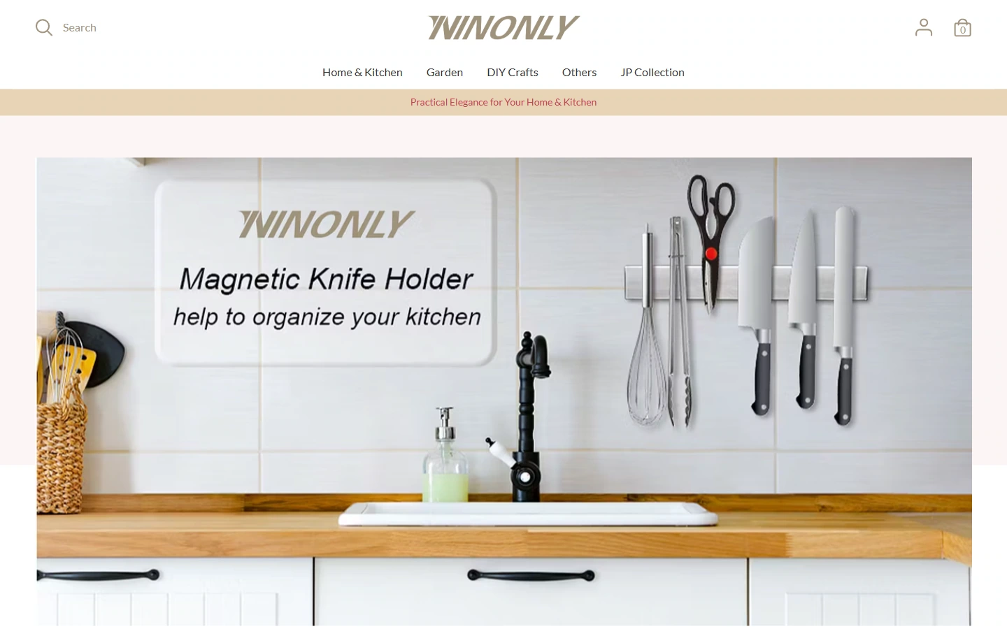
We put the magnetic knife holder and the clean kitchen countertop on the first screen. The product installation position, kitchen utensils and white walls jointly illustrate the home storage theme. The image on the first screen is responsible for theme identification, and the text and navigation retain their respective reading positions. After entering the website, you can first determine the direction of the displayed content.
We control the rhythm of the first screen with off-white and light wood colors, real kitchen scenes, and regular product cards. The title and short description are separated in font size and weight, and the main entrance is close to the corresponding topic; the surrounding white space allows the image details and text to be distinguished from each other, and also preserves the transition for downward browsing.
Home page content: Let the theme gradually unfold along the modules
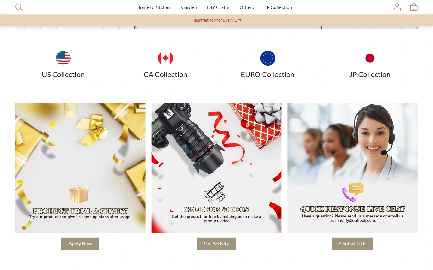
We split the content after the first screen into independent blocks, using images, columns and short descriptions to form new reading nodes. Different contents are distinguished by their own pictures and text areas, and readers can continue browsing in vertical order.
Compared with the overall atmosphere of the first screen, there is more emphasis on item-by-item viewing. We continued the off-white and light wood colors, the actual kitchen scene, and the regular product cards, separated the themes with module spacing, and maintained a tight relationship between graphics and text within the same group of content, allowing the page to gradually move from the brand theme to the specific content.
Category page: Provide a clear browsing order for the product catalog
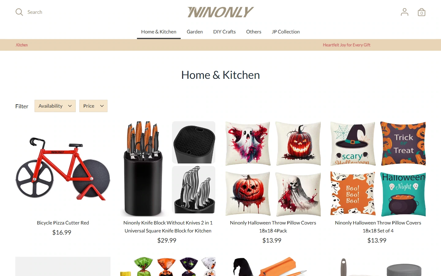
We organize the classified content of household products into independent pages, separate the column positioning from the product area, and arrange the pictures, names and information actually displayed on the page in a unified position. The repeated card structure preserves product differentiation and allows visitors to continue comparisons along similar locations.
Filtering and sorting are arranged next to the product catalog, and each handles the browsing range and display order. We use title scale, card spacing, and light backgrounds to establish boundaries, allowing the regularity of the table of contents to serve the item-by-item view.
Product details: Put pictures and single product information together
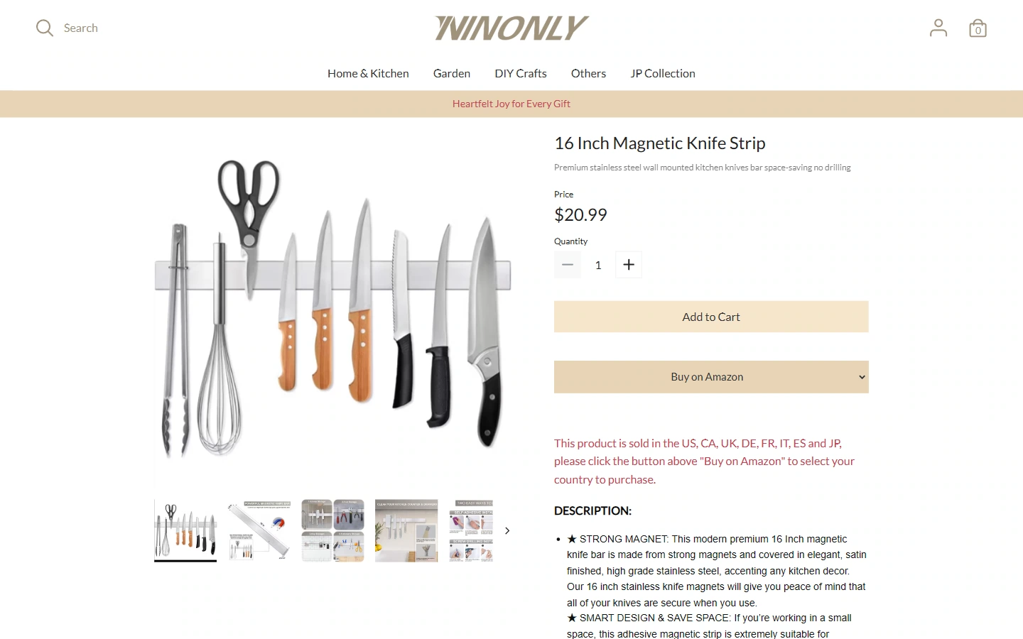
Entering the details of the magnetic tool storage strip, we reserve the main display area for the product image so that the appearance, pattern or structure can be seen first; the name, price and page operations are then expanded in the corresponding information area. Single product images and text are organized around the same object, and product identification and further verification remain connected.
We use field spacing to distinguish different information groups so that product names, prices, and operation areas maintain their respective hierarchies. The page continues the brand font and color, and thin lines, blank spaces, and button shapes jointly indicate the location of reading and operation, making the process of entering details from the catalog familiar.
Details below: Let the images and supplementary information continue to unfold
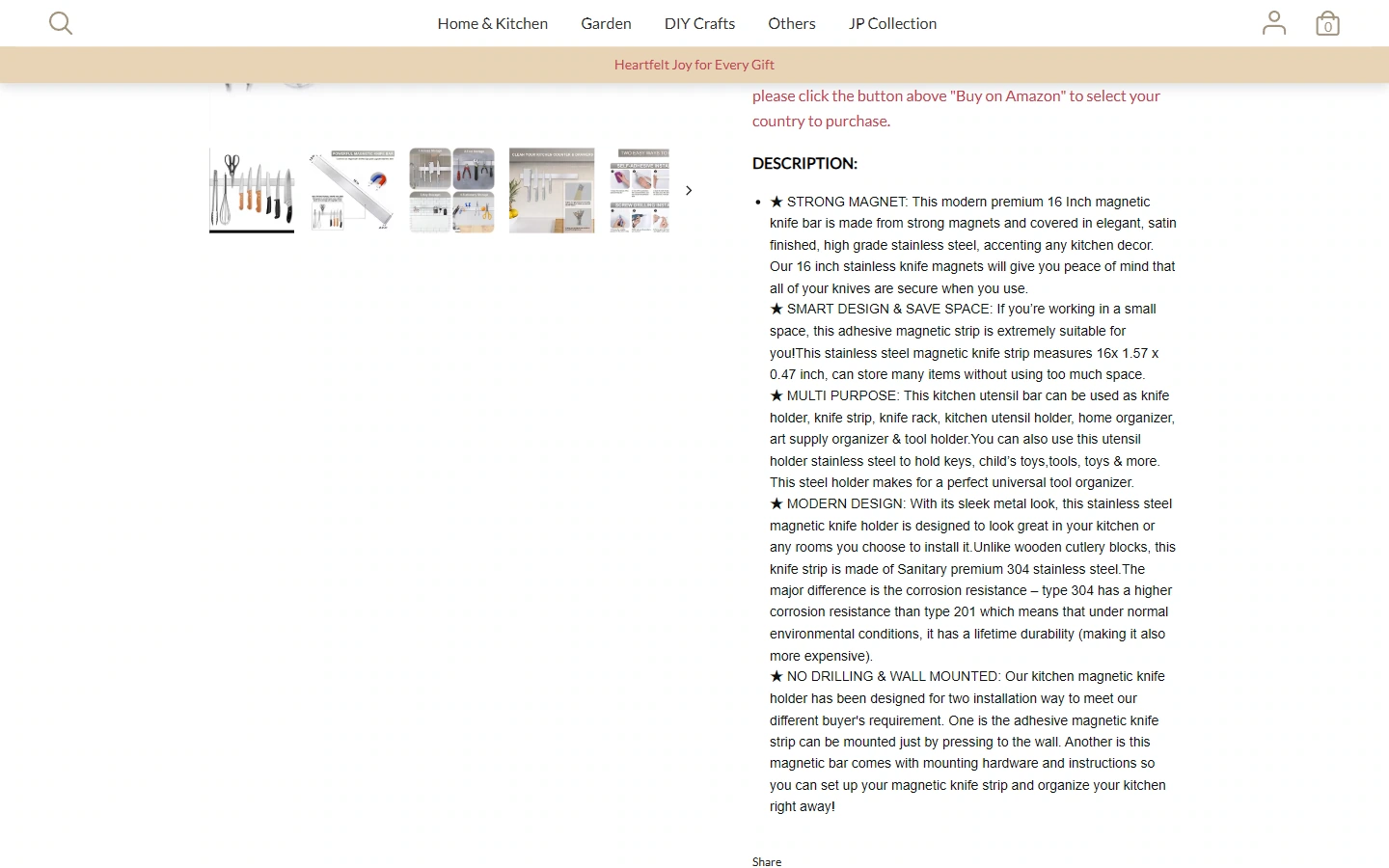
We allow the magnetic tool storage bar page to continue to retain the corresponding relationship between pictures and item information when it extends downwards. Longer content is organized into separate sections and paragraph groups, allowing viewers to check further along the page sequence.
Compared with product identification on the first screen, more emphasis is placed on the separation between content. We continue the same text hierarchy, using white space and subtitles to create pauses so that the main action, supplementary explanations, and subsequent content are not all crowded together.
Brand introduction: leaving room for recognition beyond the product
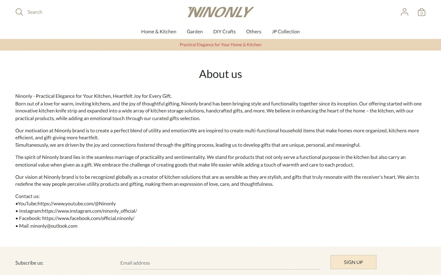
We arrange an independent narrative space for NINONLY on the brand introduction page, so that the content shifts from product browsing to brand description. Titles, paragraphs, and actual displayed graphics and text have their own places, so visitors can continue to understand the brand expression of the website at their own pace.
The page still continues the off-white and light wood colors, the actual kitchen scene, and the regular product cards, maintaining the hierarchical difference between the title and the main text. We use paragraph spacing to control reading density so that this type of explanatory content belongs to the same visual system as the product page, and has a rhythm more suitable for continuous reading.
Mobile homepage: Convert the theme and content to narrow screen reading
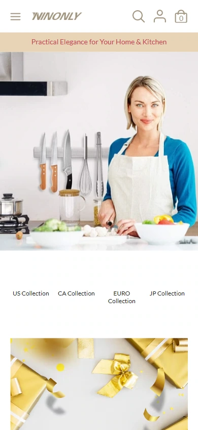
In the mobile viewport, we retain the NINONLY brand identity and rearrange the first-screen images and text according to the actual available width. The title, description and subsequent content are continued vertically, and the product or scene in the image continues to bear the theme expression.
We adapt to the narrow screen through font size, text wrapping and module spacing, continuing the color and visual cues of the desktop. The top navigation and page entrance are kept close to the content, allowing small-screen readers to start from the topic and continue to the subsequent modules.
Mobile phone details: let product pictures and information appear in order
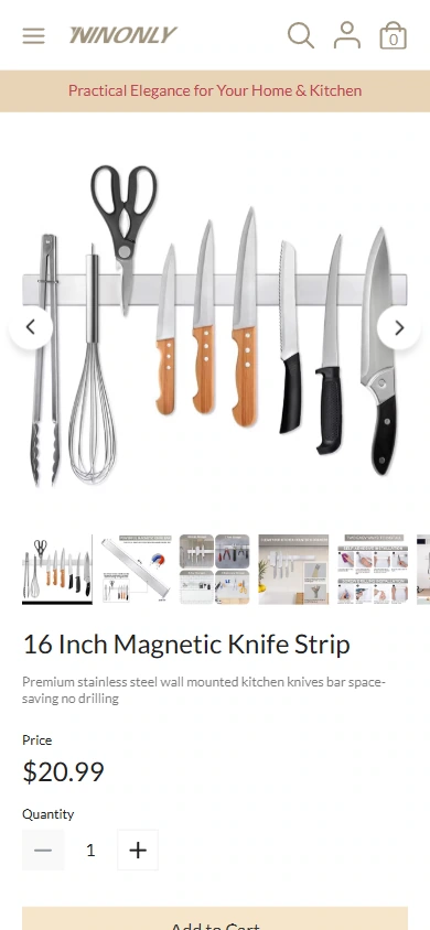
We give priority to retaining the readable area of the magnetic tool storage strip image on the mobile product page, and then expand the product name and page information vertically. The wider content area of the desktop is converted to read up and down, with images and fields using the available width respectively.
The same titles, text and operating language are still used in the narrow screen. We use spacing to mark the boundaries between images and text, so that product identification, information verification and subsequent operations appear in sequence, maintaining the same content direction as the desktop page.
Design summary: Keep brand expression and browsing path connected
On NINONLY’s website, we use off-white and light wood colors, real kitchen scenes, and regular product cards to establish a unified visual language, and then allocate content according to tasks on different pages. Explain the use of supplies with kitchen and home usage scenarios, and then distribute products through catalogs such as home kitchen, gardening and handicrafts, while retaining entrances to different area collections.
Images, fonts, spacing, and physically visible interactions serve this path: first recognizing the topic, then finding the content, and finally moving to the specific page and selection area. We gave different levels of focus and maintained a consistent brand identity between pages.
Plan a clear Shoplazza website for your brand
You can provide us with your existing website address, product catalog, brand materials and required page range, and together we can sort out the content structure, visuals and functions that suit your business.