Project overview
The client is a beauty brand targeting young female consumers. It mainly sells lip gloss, lipstick, eyebrow pencil, lip balm and multi-functional makeup products. It plans to further enhance the overall visual image and product attractiveness of the store on the Shopee platform. The customer came to us and hoped to reorganize the display of different products through a unified brand vision. While highlighting the color number, texture, makeup effect and core selling points, the entire set of store posters maintained a consistent sense of luxury and femininity. Based on its product positioning and the browsing habits of Shopee users, we planned a unified and conversion-oriented visual solution for the beauty store, focusing on model makeup effects, product close-ups, color display and functional information.
| Dienstleistungen | Industry | Plattform |
| shopee store design | Beauty and personal care | shopee |
| Project requirements | target market | design style |
| Improve click-through rate | Global | Soft and delicate|Korean style and translucent|Light luxury and romance |
| project budget | Delivery content | Delivery time |
| ¥450 | 6 posters | 4 working days |
Project Challenges
The core challenge of this project is to ensure that the selling points of different beauty products are clear while avoiding the problems of scattered style, cluttered information and visual duplication in the entire set of Shopee store posters. In the early stage, we first sorted out the customer’s product types, target consumer groups, core selling points and color system, and analyzed the browsing habits of Shopee’s beauty category and the visual performance of competing products. Then, the model style, main color, font level, icon language and product display method were unifiedly planned, and then the information structure was formulated according to different categories such as lip makeup, eyebrow makeup, blush, etc. to ensure that each poster has independent focus and can jointly form a complete and unified brand visual system.
1. The first poster: Use high-gloss lip effects to establish the first visual memory
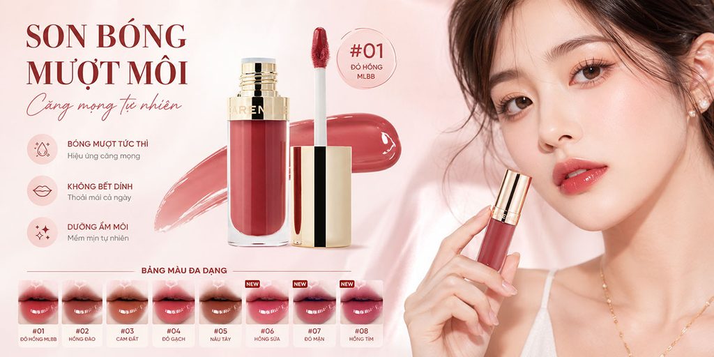
The first poster shows lip products with a moist and glossy finish.
We placed the model on the right side of the screen and used a large-scale close-up of the face that is close to half of the frame, so that consumers can see the transparent and glossy lip makeup effect at the first time. For lip gloss products, the model’s lips themselves are the most direct proof of the effect, so we did not let the complex background steal the attention, but used a very light warm pink as the main ambient color.
The left side of the screen is responsible for information transmission.
The title uses a larger dark red serif font, and quickly establishes product positioning through “glossy, smooth, and natural” text expressions. A lighter handwritten font is used below the title to prevent the entire image from looking too formal due to the large title, while at the same time enhancing the femininity and fashion sense.
The main body of the product is arranged in the middle left position of the screen, and the bottle body and brush head are displayed at the same time. We did not only show a complete package, but told consumers that the product is a liquid lip makeup through the opened brush head, and at the same time added a large area of lip glaze application texture behind the product.
This design is very important.
Simply displaying product packaging can only tell consumers “what the product looks like”; adding real paste texture can further convey color, concentration, gloss and texture.
Three concise icons are used in the lower left area to illustrate the characteristics of hydration, comfort and nourishment respectively, so that the core selling points can be quickly read in a few seconds.
The bottom section displays multiple color numbers, and allows consumers to directly compare color differences through lip renderings.
This type of layout actually forms a clear browsing path:
Brand atmosphere → Model effect → Product body → Core functions → Color number selection.
For a Shopee homepage or store carousel, this structure can both build visual appeal and complete basic product education.
2. The second poster: highlighting the soft mist texture of matte lipstick
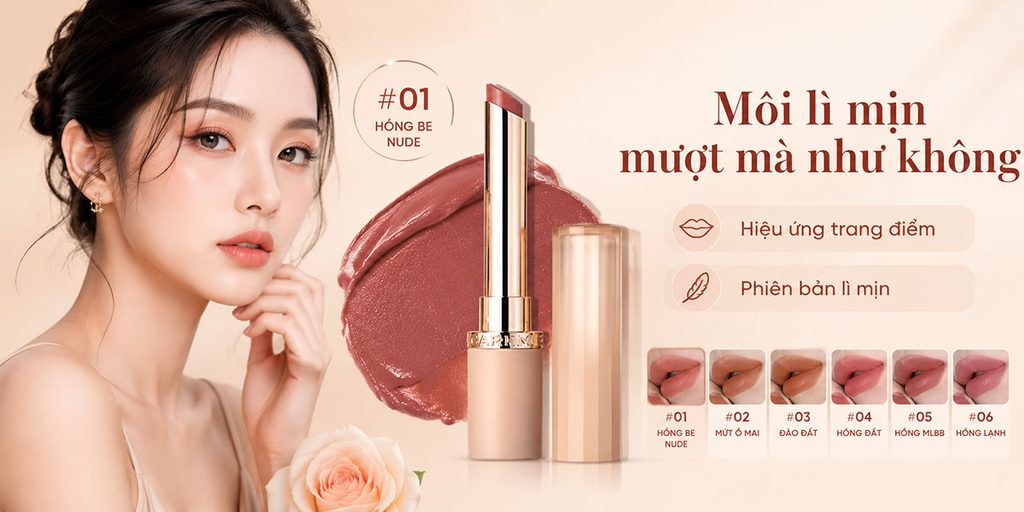
The second poster shows lipstick products with matte and soft mist effects.
Compared with the moist feeling in the first picture, we actively reduced the highlight performance of the entire picture and adjusted the background to be softer and more nude apricot, so that the visual atmosphere is consistent with the matte product attributes.
The model is on the left, the product is in the middle, and the text and color number information are concentrated on the right, forming a very stable three-stage layout.
This structure is particularly suitable for beauty e-commerce posters with a lot of information, because it can well distinguish between “effect display”, “product display” and “purchasing information”.
The large area of lipstick paste application texture behind the product is an important design element of this piece.
We chose reddish-brown and nude rose colors instead of overly bright reds to make the whole look closer to daily makeup usage scenarios and also strengthen the gentle and natural brand impression of the product.
The title on the right emphasizes the light and smooth lip makeup experience, and highlights the makeup effect and texture attributes through two rounded information bars.
The six shades below are arranged using real lip effects.
For lipstick consumers, it is often difficult to accurately imagine the effect of the upper lip just by seeing the color block, so we choose to have each color number correspond to a specific lip makeup picture to reduce consumers’ uncertainty when choosing colors.
The design purpose of this picture is very clear: not only to make consumers feel that the product is beautiful, but also to help consumers quickly judge “which color is more suitable for me”.
3. The third poster: The function of eyebrow pencil becomes clear at a glance
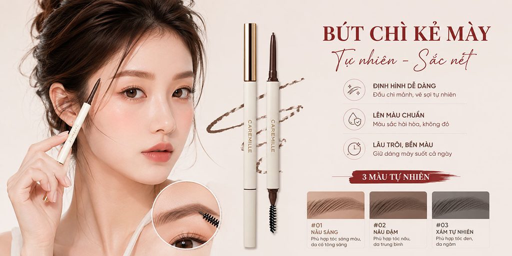
The third poster switched from lip makeup to brow products, so we adjusted the visual emphasis.
The most important thing about an eyebrow pencil product is not the packaging, but whether the tip is easy to outline, whether the color is natural, and whether the makeup is stable. So we kept the model’s brow area clearly visible, while adding an enlarged rendering of the brow area.
On the left side of the screen, a model is used to demonstrate natural eyebrow makeup, and the model is asked to hold an eyebrow pencil to strengthen the connection between the product and the real usage scenario.
The middle area shows the complete structure of the eyebrow pencil, including the tip, body and eyebrow brush at the other end.
We deliberately arrange the products vertically so that consumers can quickly understand that this is a product with a double-head structure, and at the same time, the perspective will not be too large to see the details clearly.
The real eyebrow pencil stroke texture is added to the background, and the color development effect of the product is displayed with a few simple strokes, so that the product’s selling point can be expressed visually rather than purely textually.
The information area on the right is arranged in the order of “Title – Core Selling Point – Color Selection”.
We keep the functional area simple through three linear icons corresponding to the characteristics of easy shaping, natural color and long-lasting.
Three eyebrow colors are displayed at the bottom, and different options such as light brown, dark brown, and natural gray are corresponding to the real-shot effects of eyebrows.
The entire page is not heavily decorated, instead maintaining a premium feel with a light beige background, dark brown text, and local gold product details.
For eyebrow makeup products, this rational and clear design approach is more effective than too many flowers or complex backgrounds.
4. The fourth poster: Use pink atmosphere to enhance the moist feeling of lip moisturizing products
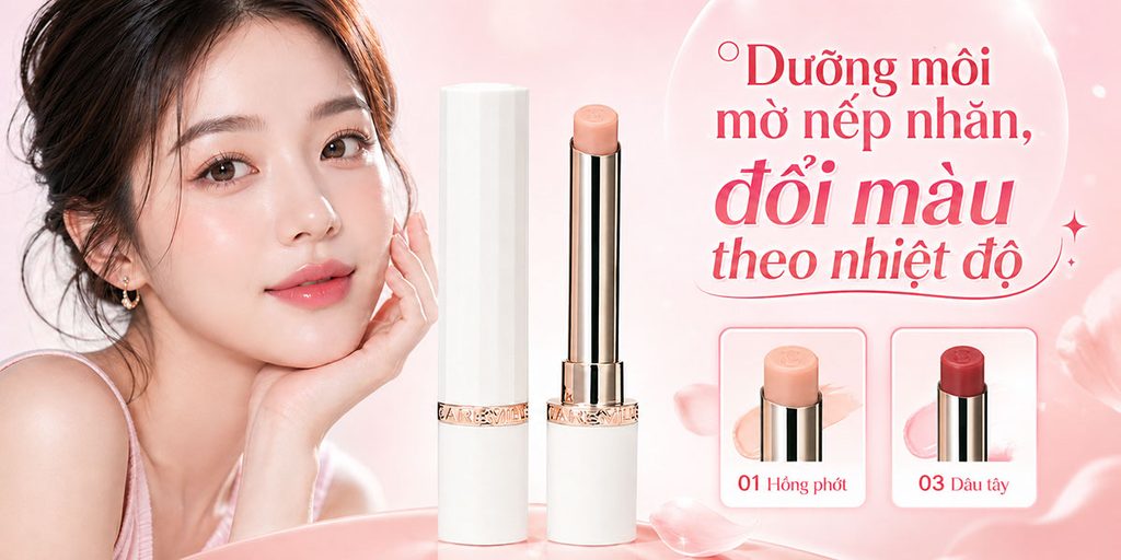
The fourth poster obviously increases the proportion of pink in the picture.
This is because the product itself has sentimental selling points such as moisturizing lips, nourishing, and color changes with temperature, so we hope that the image will be more light, dreamy, and girlish.
The model is on the left and in a natural position with her face in her hands. Lips retain a noticeable, but not overly exaggerated, hydrated shine, allowing consumers to directly associate them with a soft state after use.
The main body of the product is placed in the center of the screen, and the product structure is displayed simultaneously through one closed state and one open state.
On the right side, a large red and pink title is used as the main visual element.
Compared with the previous more rational product introductions, this title itself has stronger communication attributes, so we deliberately amplified core concepts such as “moisturizing, lightening lip lines, and temperature discoloration”.
Add transparent bubbles, petals, soft light and slight highlight effects to the background.
These elements are not purely for decoration, but to visually simulate the feeling of “moisture, softness, and translucence”, so that consumers can feel the moisturizing positioning of the product even if they do not read the complete text.
The two color number product pictures at the bottom are displayed on independent cards, and the obvious difference in paste color is retained, so that the page still has clear purchasing information in a soft atmosphere.
5. The fifth poster: explain the multi-functional blush stick through the left and right structure
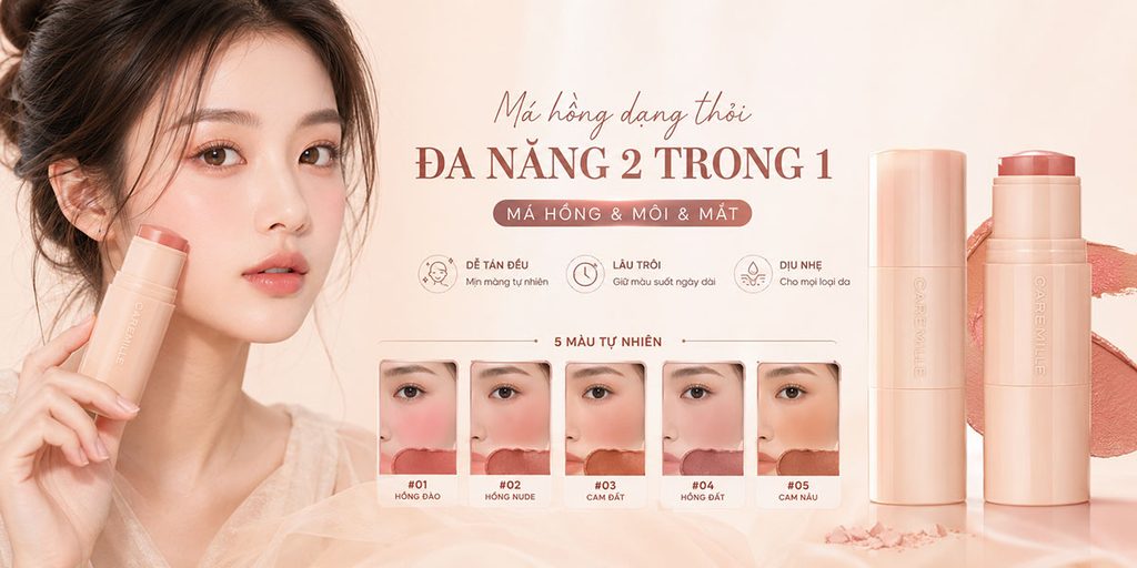
The fifth picture shows a multi-purpose makeup stick that can be used on cheeks, lips and other areas at the same time.
The biggest advantage of this type of product is convenience and multi-functionality, so we did not let the page stop at pure product display, but focused on strengthening the concepts of “2-in-1” and multi-part use.
The model is arranged on the left side and holds the product, allowing consumers to intuitively understand the size and use of the product.
A large title is used in the middle area to highlight the multi-purpose positioning, and three functional icons are set below so that information such as “easy to blend, long-lasting, light texture” can be quickly read by consumers.
The product body is arranged on the far right, and the closed and open states are displayed respectively.
In order to make the color of the paste more obvious, we add a large area of blush application texture behind the product. This kind of texture can not only add depth, but also focus consumers’ attention on the color performance that really determines the purchase.
The bottom five color numbers are not just pure color blocks, but show the effects of different colors on the skin through facial areas.
This kind of treatment is especially suitable for blush products, because what consumers are most concerned about is often not the packaging, but “whether the face will be too red after applying it”, “whether the color is natural” and “whether it is suitable for daily makeup”.
Through real effect comparison, consumers can more easily find the color that suits them.
6. The sixth poster: using seasonal concepts to enhance the sense of the lip gloss series
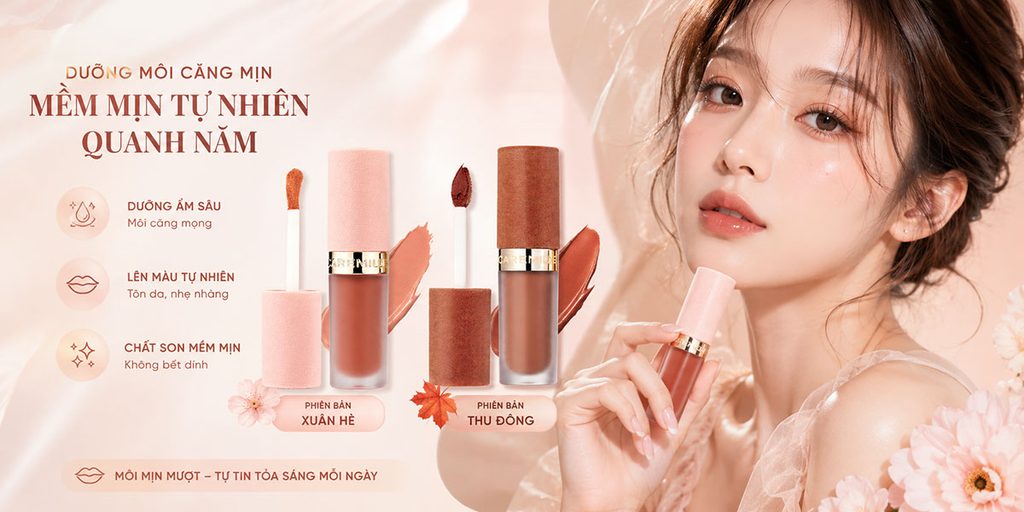
The last poster still belongs to lip products, but we did not repeat the design method of the first one, but added the concepts of “spring, summer” and “autumn and winter”.
This is the biggest visual difference in this one.
The left side displays product information intensively, the middle displays two lip glazes with different textures and colors, and the right side uses models to display emotions and makeup effects.
Different seasonal labels are added below the two products, and are matched with small visual elements such as flowers and maple leaves.
This design makes the product no longer just two colors, but is given a clearer usage situation.
Light pink, peach, and flowers are more likely to remind people of the lightness of spring and summer; darker brick red, brown red, and maple leaves naturally convey the atmosphere of autumn and winter.
We also use silk-like background and soft warm light to add femininity and give the entire page a more refined brand vision.
The three function icons on the left continue to maintain a similar information structure to the first one, including selling points such as moisturizing, natural color development, and smoothness and non-stickiness.
This repetition is not a visual repetition, but a consistency in the brand information system.
When consumers browse different posters, they will gradually form a stable understanding: the circular icon represents the selling point, the paste texture is displayed near the product, and the bottom or local area is responsible for the color number information.
This consistency can significantly improve the professional feel of your entire Shopee store.