Project overview
The client is a cross-border ecommerce brand that specializes in fashionable mobile phone cases and mobile phone accessories. The products cover flowers, hearts, polka dots, leopard prints, angel wings, metallic mobile phone cases, as well as mobile phone lanyards, lens protection accessories and smart watch straps. As product styles continue to be enriched, customers want further improvements SHEIN store The overall visual appeal and series recognition were therefore approached by us for store poster design. Customers hope that we can establish differentiated scenes and styles for different series on the basis of accurately displaying product colors, materials and details, while maintaining a unified, young, fashionable and female-focused visual image of the entire store.
| Dịch vụ | Industry | Nền tảng |
| shein online store design | Home department store | Shein |
| Project requirements | target market | design style |
| Improve click-through rate | Toàn cầu | Sweet and dreamy, fashionable and exquisite, light luxury display |
| project budget | Delivery content | Delivery time |
| ¥700 | 8 shein posters | 5 working days |
Project Challenges
The core challenge of this project is to highlight the product features of each series while maintaining the overall visual unity of the SHEIN store when there are many styles of mobile phone cases and large differences in visual styles. We need to solve the problem of a large number of products, rich colors, complex patterns that easily cause clutter in the picture, and the lack of clear distinction between different series. In the early stage of design, we first sorted out the product type, color, material and core selling points, analyzed the target consumer groups and the browsing characteristics of the SHEIN platform, and then planned the scenes, color matching, props and layout methods according to the series of flowers, hearts, leopard prints, metals, etc., and unified the light, texture and visual language to establish clear specifications for the subsequent design of the entire set of posters.
The first picture: Use colorful flowers to create a youthful and energetic first-screen impression
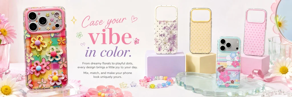
The first poster assumes a strong visual role as the main store, so we took the initiative to enhance the number of products, color levels and scene richness.
On the left side of the picture, a flower phone case with the most vivid colors is used as the core product. Colorful plaids, three-dimensional flowers and transparent materials already have a strong visual impact, so we did not use complex backgrounds, but chose a large area of light-colored environment to make the product the first visual center.
On the right side, purple flowers, yellow polka dots, pink polka dots, and colorful flowers are arranged in multiple styles, and light purple, beige, and pink square booths are used to create a staggered height. A clear acrylic flower-shaped tray, daisies, beads, glasses and pink ribbons further enhance the girly feel, but these elements are kept low in saturation to avoid stealing attention from the product.
The copywriting area is located in the center of the screen. We use a combination of large serif fonts and handwritten fonts to convey the concept of “expressing personal style through mobile phone cases” through “Case your vibe in color”.
The core of this picture is not to introduce a single product, but to tell consumers: this store has a rich, interesting, young and suitable for free matching mobile phone case series.
Second picture: Strengthening the sweet attributes of love phone cases through pink scenes
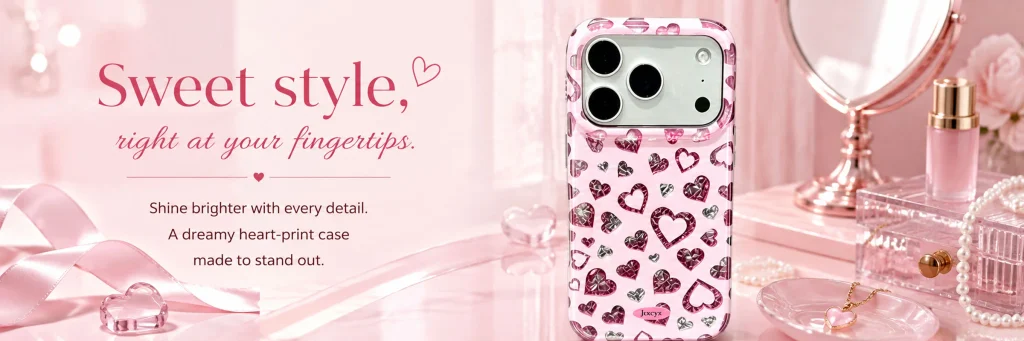
The second poster only shows a mobile phone case with love elements, so we changed the design focus from “enriching products” to “building emotions”.
The product itself is made of transparent material and features a large number of pink and crimson heart patterns. If you continue to use a colored background, the picture will tend to look cluttered. So we directly controlled the entire environment within the soft pink range, allowing the phone case and background to form a unified color language.
We arrange a round cosmetic mirror, perfume, transparent jewelry box, pearls and love necklace on the right side of the picture, so that consumers can have more specific usage associations through the life scenes of women’s dressing tables.
The left side retains sufficient space for copywriting, and uses a larger “Sweet style” as the emotional theme. Compared with ordinary product introductions, this design is more like product advertisements in fashion magazines, which can significantly improve the sophistication of the product.
We hope that when consumers see this picture, they will not just notice a loving phone case, but feel a romantic, sweet, and luxurious daily style for women.
The third picture: The multi-color polka dot series emphasizes the sense of choice and matching
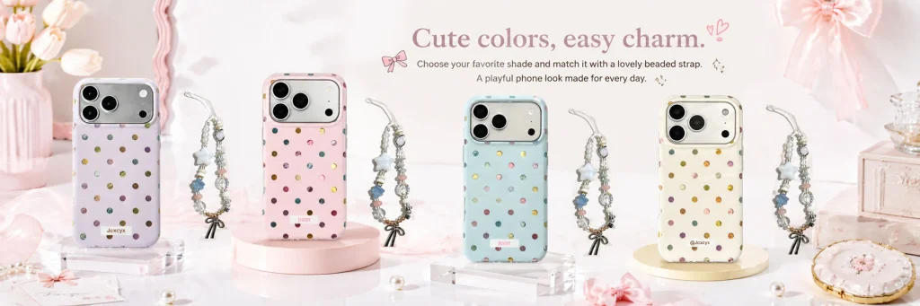
The third poster mainly shows four polka-dot phone cases in different colors and matching beaded lanyards, so we put the “series sense” first.
The four products come in lilac, pink, light blue and beige tones. In order to prevent them from looking like a simple product list when arranged, we used transparent acrylic and round pink and yellow booths to support them, allowing different products to form a natural rhythm.
Beaded lanyards are placed between mobile phone cases, making the entire series have a stronger matching relationship. Consumers can not only choose the color of the mobile phone case, but also further match it with a lanyard. This visual presentation actually strengthens the store’s associated sales capabilities.
The top copy uses “Cute colors, easy charm.” to directly summarize the features of the series. We did not use overly commercial discount information, but used color selection, daily matching and a sense of fun to guide consumers through browsing.
In the SHEIN store vision, this series of posters is very important because it can quickly tell users “this one has multiple colors”, thus increasing the willingness to stay and compare.
Photo 4: Use warm brown tones to create a mature and fashionable sense of leopard print series
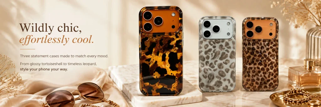
Leopard print is obviously different from the previous girly pink products, so the fourth poster actively switches the visual language.
We adjusted the background to warm beige and caramel brown, and used window shadows to create a more realistic natural light environment. The right side of the screen focuses on tortoiseshell and leopard print mobile phone cases, while the left side displays champagne silk, sunglasses, perfume, metal jewelry and dried flowers.
These props are very consistent with the fashion attributes of leopard print itself, transforming the product from a “cute accessory” to a more mature wear item.
The title “Wildly chic, effortlessly cool.” emphasizes spontaneity, fashion and individuality, forming a clear distinction from the sweet copywriting on the front.
Through this poster, we have expanded the consumer coverage of the entire store, making the store not only suitable for users who like pink and cute styles, but also can attract consumers who prefer European, American, retro and mature styles.
Picture 5: Use classification vision to help consumers understand the product structure of the store
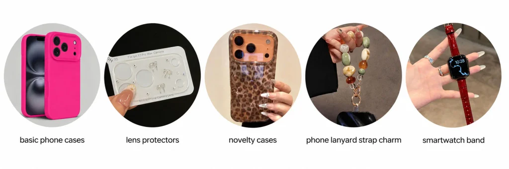
The fifth poster is different from other posters in that it is closer to the store category navigation.
We put five categories of products into circular pictures, including basic mobile phone cases, lens protective films, creative mobile phone cases, mobile phone lanyards and smart watch straps.
This design does not add complex scenes, but uses a pure white background and a unified circular structure to allow users to quickly identify product categories.
For SHEIN stores, consumers often visually determine whether the store has the products they need, so we need to make the classification module as straightforward as possible.
The unified circular image reduces information interference, and simple English category names are used below, so that the entire module can not only undertake visual display, but also serve as an entrance for users to further browse store products.
The purpose of this one is not to create emotions, but to improve information efficiency.
Picture 6: The Angel Wings series highlights dreamy and sparkling textures
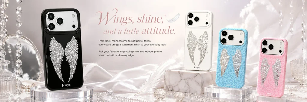
The sixth poster revolves around angel wings elements.
The products include black, white, blue and pink styles, and each phone case has a large silver wing decoration on the back. In order to express this shining material, we chose a light pink and gray environment and added crystal pendants, transparent glass, pearls, feathers and marble booths.
The black mobile phone case on the left serves as the visual focus, forming an obvious contrast between dark and light. The three light-colored products on the right are arranged at different heights to maintain overall balance.
We also used soft light and crystal reflection to enhance the high-gloss effect on the product surface, but did not add overly exaggerated special effects to ensure that the phone case still maintains an authentic product quality.
“Wings, shine, and a little attitude.” Transforming angel wings from mere decoration into a personal expression gives this series a clearer fashion theme.
Picture 7: Use highly saturated colors to create a sense of youthfulness and fun
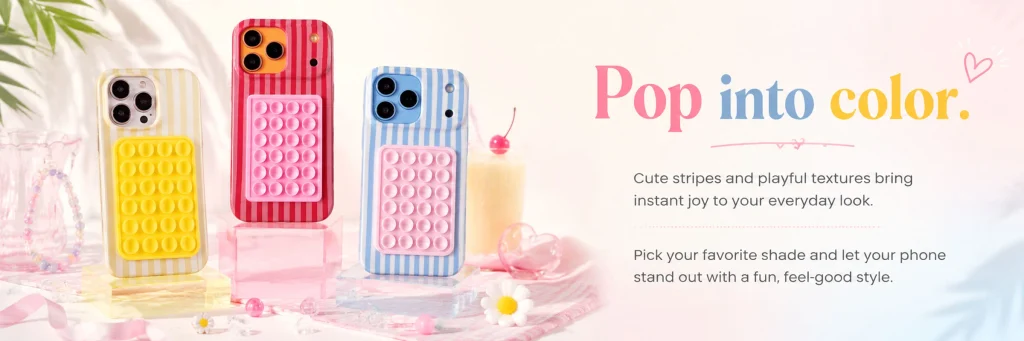
The seventh product has an obvious stripe design and three-dimensional bubble bracket, so we chose a more relaxed and bright visual expression.
Three mobile phone cases in yellow, red and blue are placed on transparent and colored acrylic stands, and decorated with cherry drinks, daisies, colorful beads and transparent hearts.
A light pink, creamy white and light blue background is maintained throughout, with bright products forming the main color focus.
Use a large color title “Pop into color.” on the right side, and use pink, blue and yellow for different words, making the text itself become part of the picture.
This type of layout is more in line with the browsing habits of young users, and also echoes the interesting design of the mobile phone case itself.
We hope to create a visual effect that “makes you happy when you see it” through this one, thus strengthening the impulse purchase attribute of the product.
Picture 8: The metal texture series uses display methods to enhance the sense of luxury
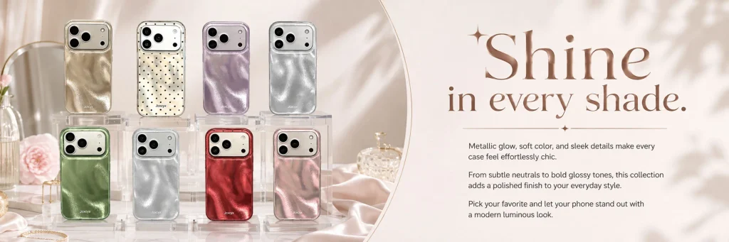
The final poster shows multiple metallic gloss phone cases, including champagne gold, silver, purple, green, red, and pink colors.
Since the product itself has an obvious reflective material, we did not continue to use a highly saturated background. Instead, we used champagne beige, light pink and silk texture environments to make gloss the main visual feature.
The eight products are arranged through two-layer transparent acrylic booths, similar to the display method of jewelry display cabinets. This kind of composition can display rich colors at the same time without looking cluttered by the large number of products.
A large space is left on the right side to place “Shine in every shade.”. The large serif font forms a more mature and refined visual relationship with the metal series.
Perfume bottles, glassware, flowers and soft fabrics further enhance the light luxury atmosphere, giving ordinary phone cases a visual effect close to that of fashion accessory advertisements.