Focusing on the children’s paper-cut handicraft kit, we organized the material list and grading steps into a set of English product pictures. The entire set of works adopts the visual language of bright blue and yellow, cartoon graphics, and numbered teaching layout. Through the division of labor in different pictures, the product appearance, local information and usage scenarios are gradually presented.
| Dịch vụ | Industry | Nền tảng |
|---|---|---|
| Amazon primary and secondary product images design | Maternity and baby products | Amazon |
| Project requirements | target market | design style |
| Materials list and grading steps | English content display | Bright blue and yellow, cartoon graphics, numbered teaching layout |
| Project quotation | Delivery content | Delivery time |
| ¥600 | 9 product primary and secondary product images | 4 days |
Design Challenge: Let different information have its place
The paper-cutting set also includes tools, paper cards, steps and finished works. We arrange the pictures in the order from understanding the materials to observing the finished product, organize the complex content with numbering and grading cards, and let each picture bear the task of clear explanation.
Our design strategy
The main colors of blue and yellow connect the packaging and cartoon decoration, and the bright background is left appropriately white.
Checklists, difficulty levels, and operation steps are separated from the work display, and the numbers are always close to the corresponding pictures.
Material overview: packaging, paper cards and tools arranged separately
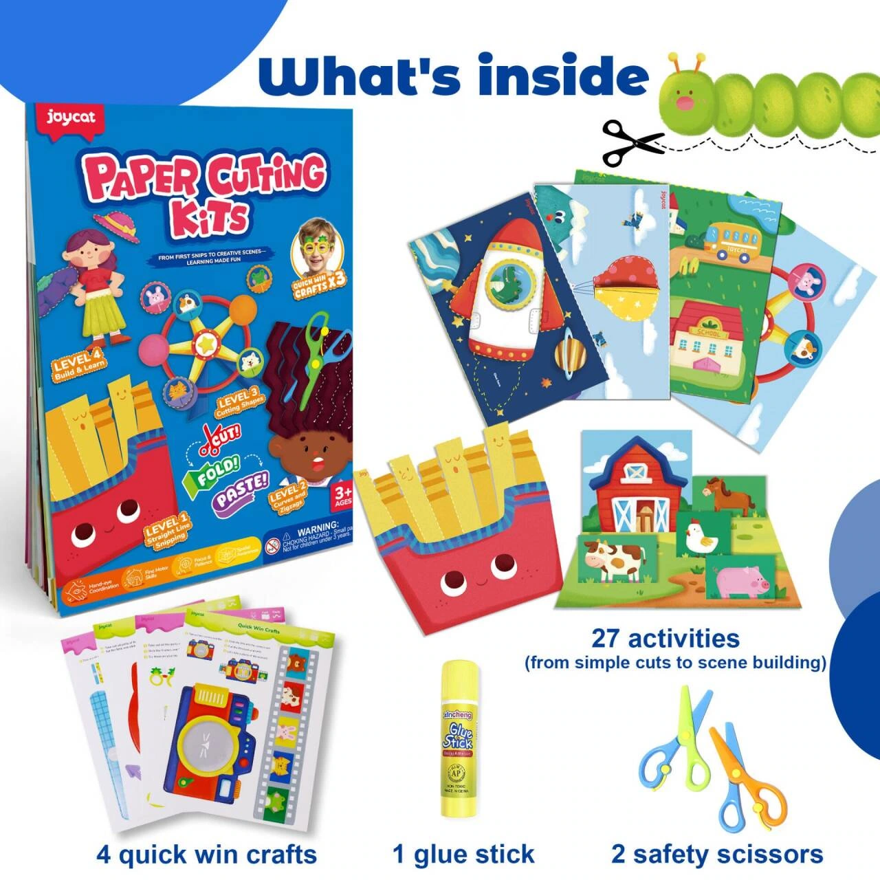
We use a white background to present paper boxes, cards, scissors and glue sticks, with clear spacing between objects. The packaging provides the main color, and the paper cards and tools form the auxiliary layer, so readers can first understand the composition of the set.
Graded content: Allow four levels to be compared item by item
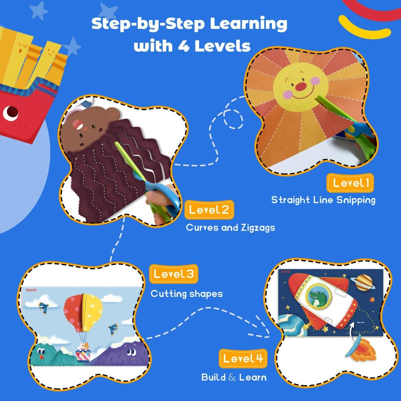
We use four numbered areas to organize different paper-cut examples, and the numbers become the entrance to reading. Each level of graphics retains a similar display area, and the difficulty theme is expressed through structural sequence rather than stacked explanatory text.
Paper framework: Collecting hierarchical examples into a unified container
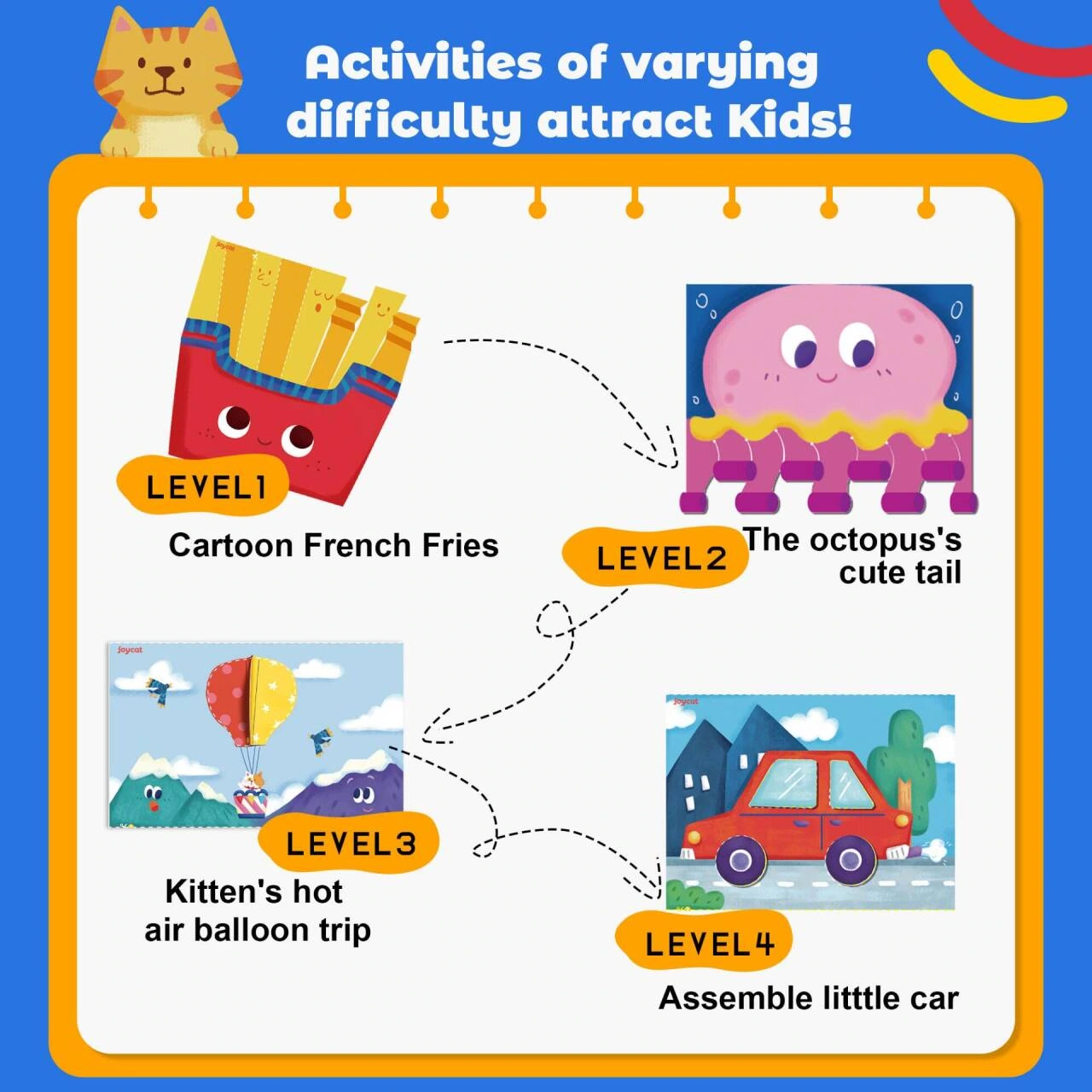
We arranged different shapes within a notebook-shaped area, and constrained the information with consistent titles and white space. Graphics such as French fries and octopus each have their own independent space, and multiple examples can still maintain clear boundaries.
Operation steps: One-to-one correspondence between hand photos and numbers
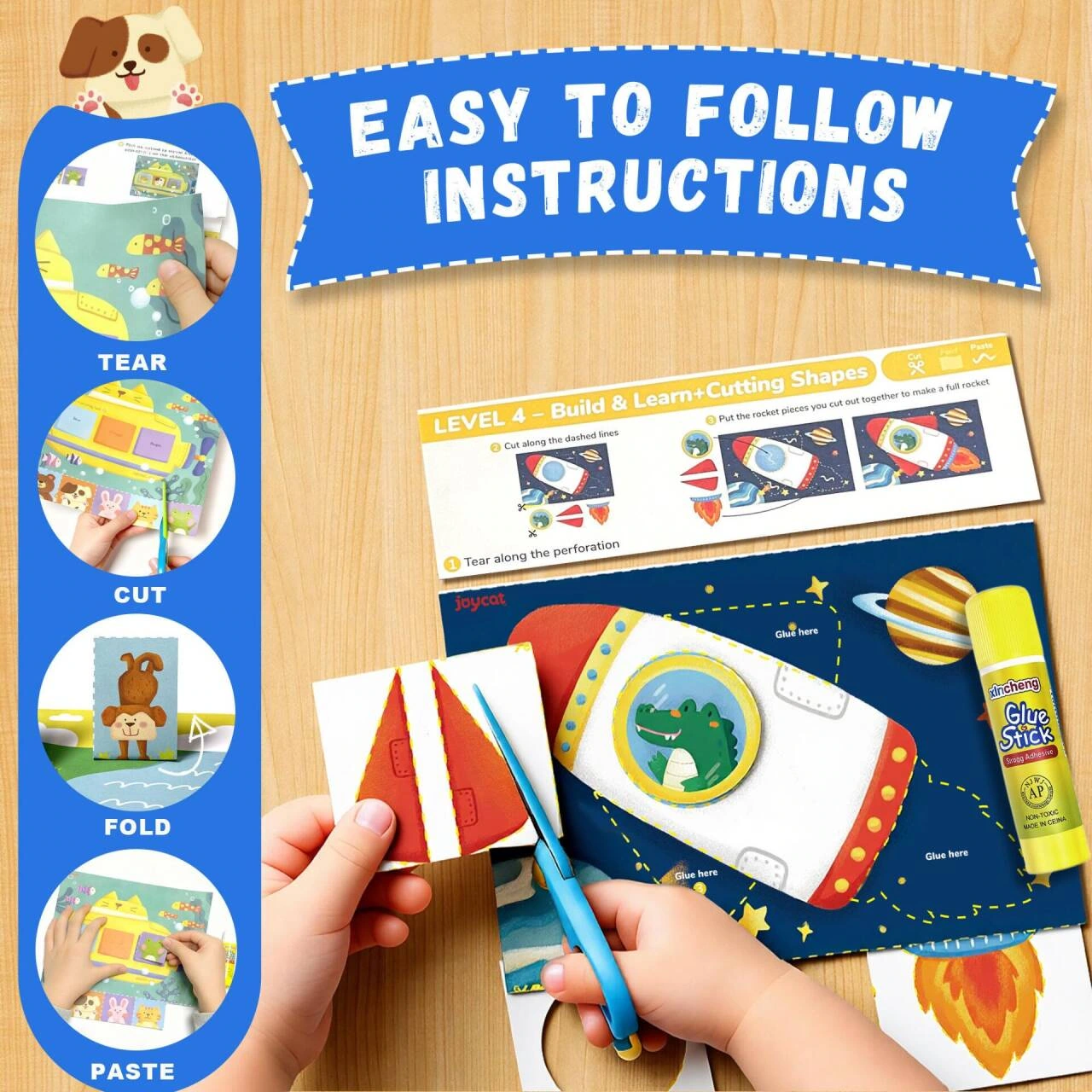
We let the instruction manual and the paper-cutting action appear in the mirror together, with step-by-step diagrams of tearing, cutting, folding, and pasting arranged vertically on the side. The numbers are closely adjacent to the local actions, and the reading sequence unfolds naturally along the screen.
Topic description: Big title with four short messages
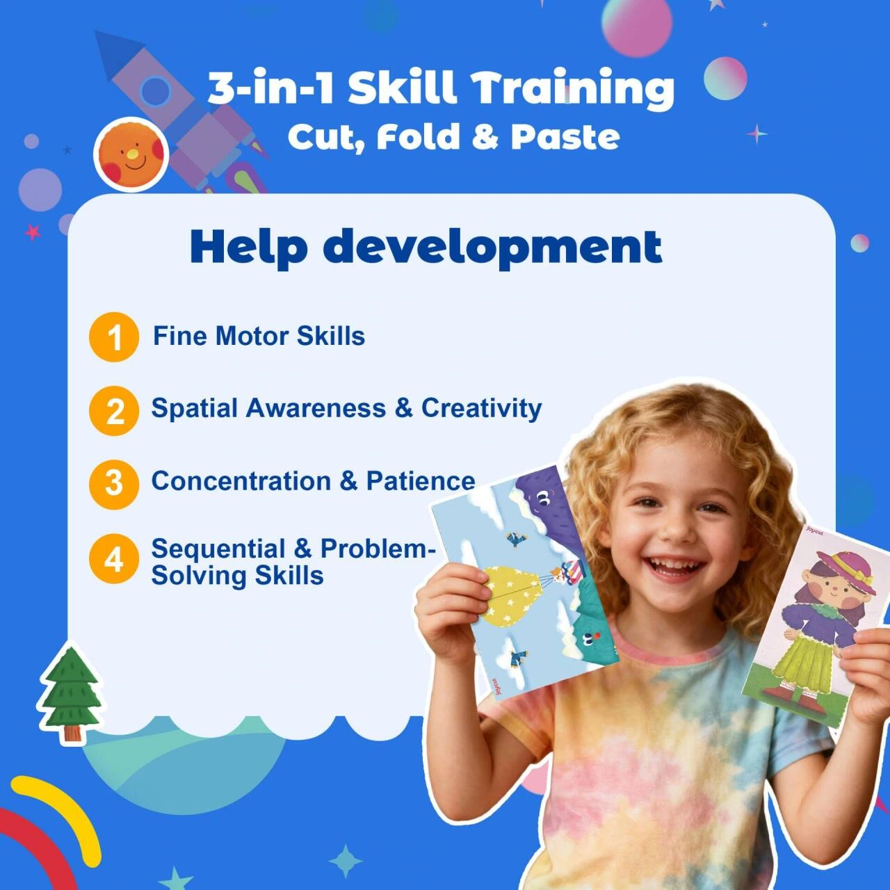
We put the cut, fold and glue theme in a prominent position, grouped into four numbered paragraphs below, and portraits of characters as supplements to the scenes. Separate titles, descriptions, and photos to prevent cartoon backgrounds from engulfing the text.
Completed work: Four panels showing different shapes
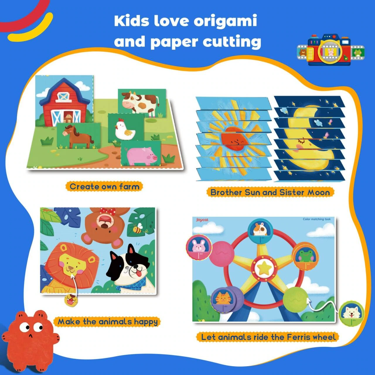
We divided the finished products such as the farm, the moon and the amusement facilities into four pieces and unified the margins and photo scale. The rich graphics are organized in a common grid, allowing readers to view the finished state block by block.
Works Display: Figures maintain a relationship with handmade works

We enlarged the picture of children showing their clock works and added small labels around it to supplement the information. The works and expressions become the core, and the text avoids the hands and the edges of the subject, retaining the integrity of the displayed movements.
Gift scenario: bringing the suit into a family situation
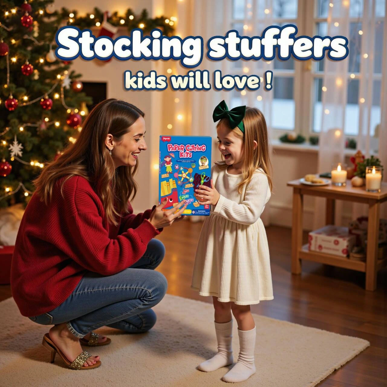
We used the gift-giving scene in the holiday room to carry on the packaging theme, and the characters’ actions provided contextual clues. The background decoration is set back appropriately so that the relationship between the gift box and the characters can be seen first.
Festival display: use pedestal to stabilize product focus
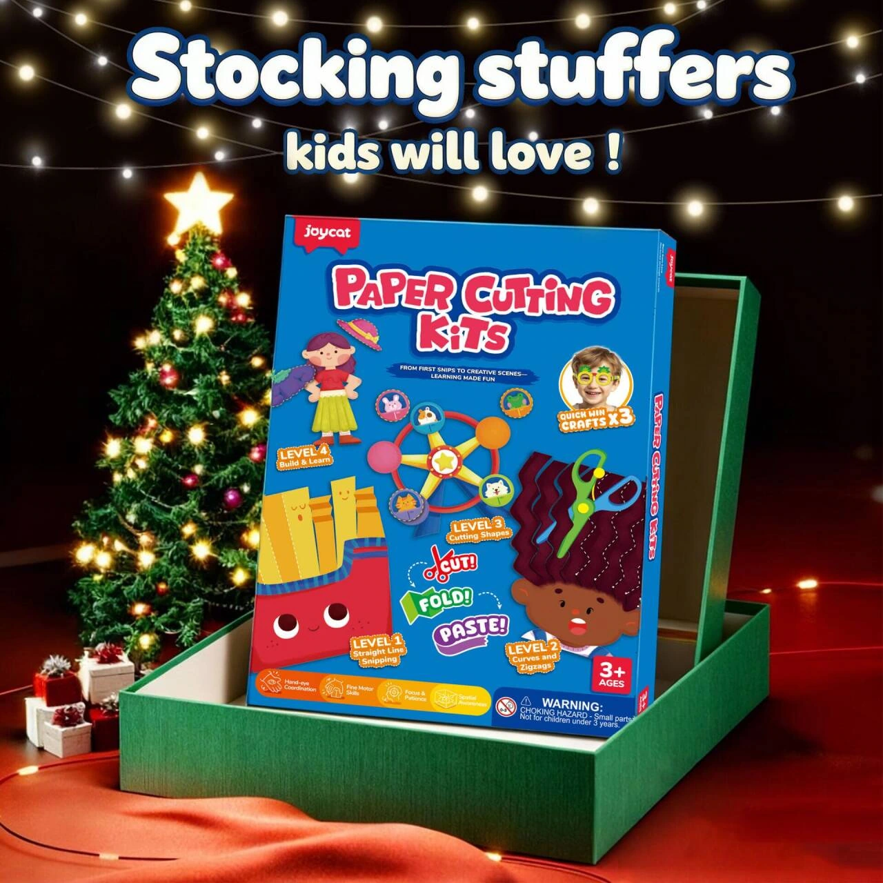
We placed the packaging box on a green pedestal, leaving the holiday lights and tree decorations in the background. Light, shade, and context separate the product from the environment and form a display in the group.
Deliver and design value
This set of works contains a total of 9 product pictures. We arrange the responsibilities of different pictures around the material list and grading steps, and maintain the visual consistency of the entire set with bright blue and yellow, cartoon graphics, and numbered teaching layouts. From overall identification to partial explanation, the pictures complement each other, allowing readers to find information based on their own concerns.
Develop a clear visual expression for your products
You can provide us with existing product information, physical photos and key points to be displayed. We will combine the product structure, style differences and usage scenarios to plan image content and layout suitable for Amazon product display.