Giới thiệu
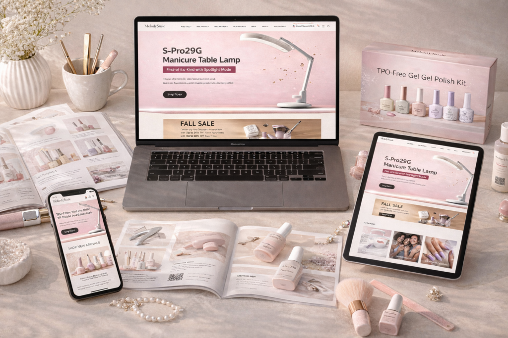
In today’s competitive beauty eCommerce landscape, a website must do more than simply display products—it needs to communicate brand identity, build trust, and guide users seamlessly toward purchase. When working on the design of the MelodySusie website built on Shopify, the goal was clear: create a visually engaging, user-centered experience that reflects professionalism while driving conversions.
This project was not about development or coding. Instead, it focused entirely on design strategy—how layout, visual hierarchy, typography, and storytelling come together to shape user perception and behavior. From the homepage to product pages and supporting sections, every element was crafted to align aesthetics with business goals.
| Thời gian giao hàng | Loại | Nền tảng ứng dụng |
| 24 ngày | Nail Art | shopify |
| Các nhà thiết kế tham gia | Trị giá | Tác dụng |
| Lin Zhang | $2600 | Sales📈265% |
Understanding the Brand and Design Objectives
Before any design work began, we focused on understanding the essence of the brand.
Brand Positioning
MelodySusie operates in the professional manicure and nail care space, targeting both individual consumers and salon-level users. This dual audience required a careful balance:
- Elegant yet accessible visuals
- Professional credibility without feeling overly technical
- A design that appeals to both beginners and experts
Mục tiêu thiết kế cốt lõi
We defined several key objectives:
- Build a clean, modern, and trustworthy visual identity
- Highlight product functionality through design, not technical explanation
- Improve navigation clarity and reduce friction in the buying journey
- Strengthen emotional engagement through lifestyle-driven visuals
- Increase conversion through structured layout and visual cues
Chiến lược thiết kế trang chủ
The homepage serves as the first impression and the foundation of the entire user experience. Our approach was to combine storytelling with clarity.
Visual Direction and Layout
We adopted a minimalist yet polished aesthetic:
- Soft, feminine color palettes combined with neutral tones
- Generous white space to reduce cognitive load
- High-quality imagery to elevate perceived product value
The layout follows a clear visual hierarchy:
- Hero section (brand statement + key product visuals)
- Category navigation (quick access to core collections)
- Featured products (conversion-focused display)
- Brand storytelling and trust-building sections
Hero Section: First Impact Matters
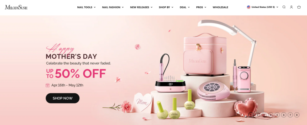
The hero section was designed to immediately communicate:
- Những gì thương hiệu cung cấp
- Dành cho ai
- Why it’s worth exploring
Instead of overwhelming users, we kept messaging concise and visually driven. The focus was on:
- Clean typography
- Strong product imagery
- Clear call-to-action buttons
This ensures users understand the brand within seconds.
Product Display and Conversion Design
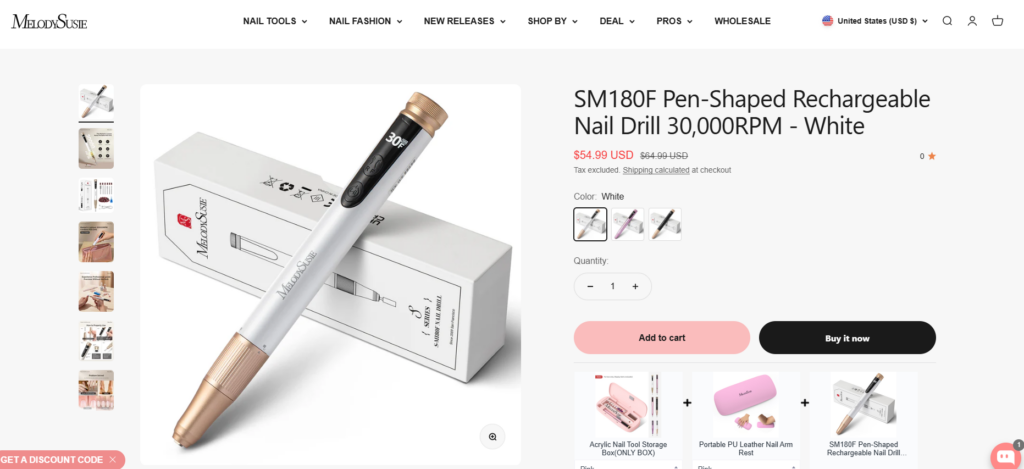
A key part of the design strategy was ensuring that products are not just shown—but presented in a way that encourages purchase.
Thiết kế thẻ sản phẩm
We refined product cards to balance clarity and attractiveness:
- Simplified layouts to avoid clutter
- Consistent image framing for visual harmony
- Clear pricing and key information
We also ensured that:
- Product names remain readable without overwhelming space
- Visual focus stays on the product itself
- Hover interactions enhance engagement without distraction
Product Page Experience
The product page is where design directly impacts conversion.
Layout Structure
We structured product pages to guide users naturally:
- Left: high-quality product visuals
- Right: key information, pricing, and purchase actions
Visual Storytelling
Instead of relying on technical descriptions, we used:
- Lifestyle images
- Close-up detail shots
- Usage scenarios
This helps users imagine the product in real-life contexts.
Trust Elements
Để tăng cường độ tin cậy, chúng tôi đã tích hợp:
- Benefit-focused highlights
- Clear product categorization
Supporting Pages Design
While the homepage drives initial engagement, supporting pages complete the user journey.
Collection Pages
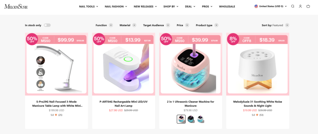
We designed collection pages to enhance browsing efficiency:
- Grid layouts with strong visual consistency
- Filters and sorting options that feel intuitive
- Balanced spacing to avoid visual fatigue
The goal was to make exploration effortless while maintaining a premium feel.
Trang Giới thiệu và Câu chuyện Thương hiệu
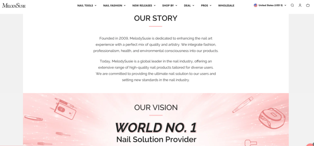
Brand storytelling plays a crucial role in trust-building.
We approached this with:
- Structured content blocks
- Visual storytelling elements
- Clear messaging about brand values
Instead of long paragraphs, we used:
- Short sections
- Visual breaks
- Strategic imagery
This keeps users engaged while communicating authenticity.
Navigation and User Flow
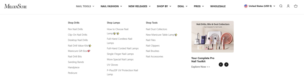
Navigation design is often underestimated, but it directly affects conversion.
We optimized:
- Menu structure for clarity
- Category grouping for intuitive browsing
- Sticky navigation for continuous accessibility
The result is a smoother user journey from entry to checkout.
Quy trình thiết kế của chúng tôi
A strong outcome requires a structured approach. Our process focused on clarity, iteration, and alignment.
1. Research and Analysis
We studied:
- Hành vi của đối tượng mục tiêu
- Competitor design patterns
- Industry visual trends
This helped us identify opportunities to differentiate while meeting user expectations.
2. Wireframing and Structure Planning
Before final visuals, we mapped out:
- Thứ tự trang
- Content placement
- Luồng người dùng
This ensures that design decisions are purposeful rather than decorative.
3. Visual Design Execution
We then translated structure into visuals:
- Typography selection for readability and brand tone
- Color systems aligned with emotional appeal
- Image direction to elevate product perception
4. Iteration and Refinement
Design is not a one-step process. We refined based on:
- Visual balance
- Consistency across pages
- Alignment with brand identity
Những thách thức và giải pháp thiết kế
Every project comes with challenges. The key is how design solves them.
Challenge 1: Balancing Professional and Lifestyle Appeal
Vấn đề:
The brand needed to appeal to both professionals and everyday users.
Giải pháp:
We combined:
- Clean, professional layouts
- Lifestyle imagery that feels relatable
This created a hybrid visual language.
Thử thách 2: Tránh tình trạng quá tải thị giác
Vấn đề:
Beauty websites often become cluttered with too many elements.
Giải pháp:
Chúng tôi tập trung vào:
- Khoảng trắng
- Clear section separation
- Minimalist design principles
This improved readability and user focus.
Challenge 3: Highlighting Product Value Without Technical Detail
Vấn đề:
We needed to communicate value without relying on technical explanations.
Giải pháp:
Chúng tôi đã sử dụng:
- Kể chuyện bằng hình ảnh
- Benefit-focused sections
- Real-life usage imagery
Design Advantages and Impact
The final design delivers several key benefits:
Trải nghiệm người dùng được cải thiện
- Clear navigation reduces friction
- Structured layout guides user flow
- Visual hierarchy improves readability
Stronger Brand Identity
- Ngôn ngữ hình ảnh nhất quán trên tất cả các trang.
- Premium look and feel
- Emotional connection through imagery
Higher Conversion Potential
- Clear calls-to-action
- Focused product presentation
- Trust-building design elements
Our Methodology in Shopify Design
Although the platform is Shopify, our focus remains purely on design.
Design-First Approach
We prioritize:
- Visual clarity over complexity
- User experience over unnecessary features
- Branding consistency across all touchpoints
Conversion-Oriented Thinking
Every design decision answers one question:
Does this help the user move closer to purchase?
If not, it gets simplified or removed.
Scalable Design Systems
We ensure that:
- The design can expand with product lines
- New pages maintain visual consistency
- The brand stays cohesive as it grows
Kết quả cuối cùng
The redesigned MelodySusie website achieves:
- A modern and professional brand presence
- A seamless browsing and shopping experience
- A strong balance between aesthetics and functionality
Most importantly, the design aligns business goals with user expectations—turning visitors into customers through clarity, trust, and visual appeal.
Phần kết luận
Design is not just about how a website looks—it’s about how it works for the user and the business. This project demonstrates how a strategic, design-focused approach can transform a Shopify store into a powerful conversion tool.
From homepage storytelling to product presentation and navigation flow, every element was carefully crafted to support user experience and brand growth. By focusing on visual clarity, structured layouts, and emotional engagement, the website becomes more than a storefront—it becomes a brand experience.
Tại AIRSANG, we specialize in this kind of design-driven transformation. We help brands build Shopify experiences that are not only visually compelling but also strategically aligned with growth, conversion, and long-term success.