


소개
In today’s competitive beauty eCommerce landscape, a website must do more than simply display products—it needs to communicate brand identity, build trust, and guide users seamlessly toward purchase. When working on the design of the MelodySusie website built on 쇼피파이, the goal was clear: create a visually engaging, user-centered experience that reflects professionalism while driving conversions.
This project was not about development or coding. Instead, it focused entirely on design strategy—how layout, visual hierarchy, typography, and storytelling come together to shape user perception and behavior. From the homepage to product pages and supporting sections, every element was crafted to align aesthetics with business goals.
| 배송 시간 | 범주 | 애플리케이션 플랫폼 |
| 24일 | Nail Art | shopify |
| 참여 디자이너 | 비용 | 효과 |
| 린 장 | $2600 | Sales📈265% |
Understanding the Brand and Design Objectives
Before any design work began, we focused on understanding the essence of the brand.
Brand Positioning
MelodySusie operates in the professional manicure and nail care space, targeting both individual consumers and salon-level users. This dual audience required a careful balance:
- Elegant yet accessible visuals
- Professional credibility without feeling overly technical
- A design that appeals to both beginners and experts
핵심 설계 목표
We defined several key objectives:
- Build a clean, modern, and trustworthy visual identity
- Highlight product functionality through design, not technical explanation
- Improve navigation clarity and reduce friction in the buying journey
- Strengthen emotional engagement through lifestyle-driven visuals
- Increase conversion through structured layout and visual cues
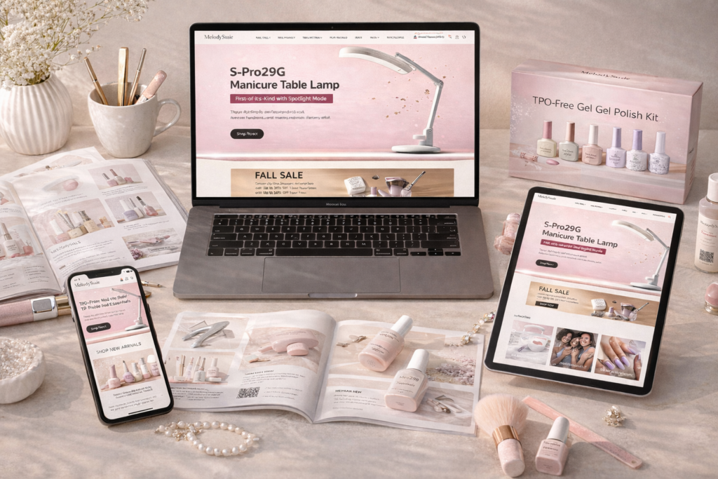
홈페이지 디자인 전략
The homepage serves as the first impression and the foundation of the entire user experience. Our approach was to combine storytelling with clarity.
Visual Direction and Layout
We adopted a minimalist yet polished aesthetic:
- Soft, feminine color palettes combined with neutral tones
- Generous white space to reduce cognitive load
- High-quality imagery to elevate perceived product value
The layout follows a clear visual hierarchy:
- Hero section (brand statement + key product visuals)
- Category navigation (quick access to core collections)
- Featured products (conversion-focused display)
- Brand storytelling and trust-building sections
Hero Section: First Impact Matters
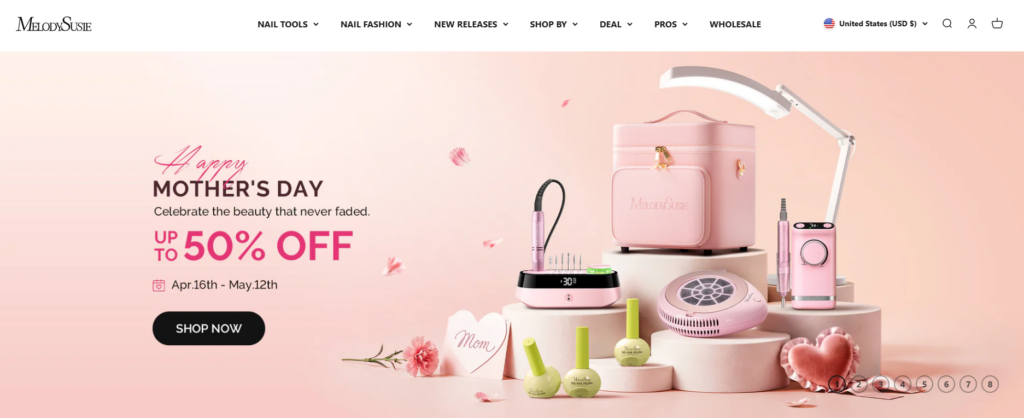
The hero section was designed to immediately communicate:
- 브랜드가 제공하는 것
- 누구를 위한 것인가요?
- Why it’s worth exploring
Instead of overwhelming users, we kept messaging concise and visually driven. The focus was on:
- 깔끔한 타이포그래피
- Strong product imagery
- Clear call-to-action buttons
This ensures users understand the brand within seconds.
Product Display and Conversion Design
A key part of the design strategy was ensuring that products are not just shown—but presented in a way that encourages purchase.
제품 카드 디자인
We refined product cards to balance clarity and attractiveness:
- Simplified layouts to avoid clutter
- Consistent image framing for visual harmony
- Clear pricing and key information
We also ensured that:
- Product names remain readable without overwhelming space
- Visual focus stays on the product itself
- Hover interactions enhance engagement without distraction
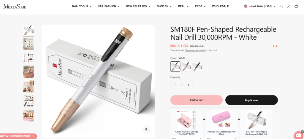
Product Page Experience
The product page is where design directly impacts conversion.
Layout Structure
We structured product pages to guide users naturally:
- Left: high-quality product visuals
- Right: key information, pricing, and purchase actions
Visual Storytelling
Instead of relying on technical descriptions, we used:
- Lifestyle images
- Close-up detail shots
- Usage scenarios
This helps users imagine the product in real-life contexts.
Trust Elements
To reinforce credibility, we integrated:
- Benefit-focused highlights
- 명확한 제품 분류
Supporting Pages Design
While the homepage drives initial engagement, supporting pages complete the user journey.
컬렉션 페이지
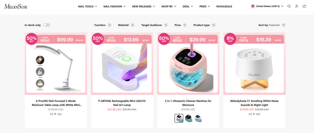
We designed collection pages to enhance browsing efficiency:
- Grid layouts with strong visual consistency
- Filters and sorting options that feel intuitive
- Balanced spacing to avoid visual fatigue
The goal was to make exploration effortless while maintaining a premium feel.
About and Brand Story Pages
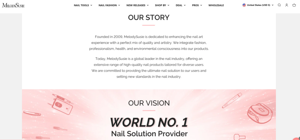
Brand storytelling plays a crucial role in trust-building.
We approached this with:
- Structured content blocks
- Visual storytelling elements
- Clear messaging about brand values
긴 문단 대신 다음과 같은 방법을 사용했습니다.
- Short sections
- Visual breaks
- Strategic imagery
This keeps users engaged while communicating authenticity.
Navigation and User Flow
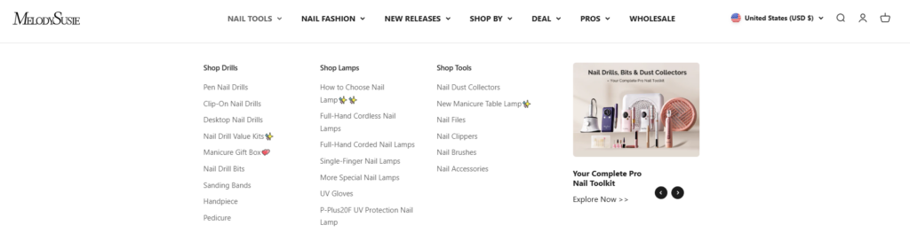
Navigation design is often underestimated, but it directly affects conversion.
We optimized:
- Menu structure for clarity
- Category grouping for intuitive browsing
- Sticky navigation for continuous accessibility
The result is a smoother user journey from entry to checkout.
우리의 디자인 프로세스
A strong outcome requires a structured approach. Our process focused on clarity, iteration, and alignment.
1. Research and Analysis
We studied:
- 타겟 고객 행동
- Competitor design patterns
- Industry visual trends
This helped us identify opportunities to differentiate while meeting user expectations.
2. Wireframing and Structure Planning
Before final visuals, we mapped out:
- 페이지 계층 구조
- Content placement
- 사용자 흐름
This ensures that design decisions are purposeful rather than decorative.
3. Visual Design Execution
We then translated structure into visuals:
- Typography selection for readability and brand tone
- Color systems aligned with emotional appeal
- Image direction to elevate product perception
4. Iteration and Refinement
Design is not a one-step process. We refined based on:
- Visual balance
- Consistency across pages
- Alignment with brand identity
과제 및 설계 솔루션
Every project comes with challenges. The key is how design solves them.
Challenge 1: Balancing Professional and Lifestyle Appeal
문제:
The brand needed to appeal to both professionals and everyday users.
해결책:
우리는 다음을 결합했습니다:
- Clean, professional layouts
- Lifestyle imagery that feels relatable
This created a hybrid visual language.
과제 2: 시각적 과부하 피하기
문제:
Beauty websites often become cluttered with too many elements.
해결책:
우리는 다음 사항에 집중했습니다:
- 여백
- Clear section separation
- Minimalist design principles
This improved readability and user focus.
Challenge 3: Highlighting Product Value Without Technical Detail
문제:
We needed to communicate value without relying on technical explanations.
해결책:
우리는 다음을 사용했습니다:
- Visual storytelling
- Benefit-focused sections
- Real-life usage imagery
Design Advantages and Impact
The final design delivers several key benefits:
사용자 경험 개선
- Clear navigation reduces friction
- Structured layout guides user flow
- Visual hierarchy improves readability
Stronger Brand Identity
- 페이지 전체에 걸쳐 일관된 시각적 언어를 사용합니다.
- Premium look and feel
- Emotional connection through imagery
Higher Conversion Potential
- Clear calls-to-action
- Focused product presentation
- Trust-building design elements
Our Methodology in Shopify Design
Although the platform is Shopify, our focus remains purely on design.
Design-First Approach
We prioritize:
- Visual clarity over complexity
- User experience over unnecessary features
- Branding consistency across all touchpoints
Conversion-Oriented Thinking
Every design decision answers one question:
Does this help the user move closer to purchase?
If not, it gets simplified or removed.
Scalable Design Systems
We ensure that:
- The design can expand with product lines
- New pages maintain visual consistency
- The brand stays cohesive as it grows
Final Results
The redesigned MelodySusie website achieves:
- A modern and professional brand presence
- A seamless browsing and shopping experience
- A strong balance between aesthetics and functionality
Most importantly, the design aligns business goals with user expectations—turning visitors into customers through clarity, trust, and visual appeal.
결론
Design is not just about how a website looks—it’s about how it works for the user and the business. This project demonstrates how a strategic, design-focused approach can transform a 쇼피파이 store into a powerful conversion tool.
From homepage storytelling to product presentation and navigation flow, every element was carefully crafted to support user experience and brand growth. By focusing on visual clarity, structured layouts, and emotional engagement, the website becomes more than a storefront—it becomes a brand experience.
에서 AIRSANG, we specialize in this kind of design-driven transformation. We help brands build Shopify experiences that are not only visually compelling but also strategically aligned with growth, conversion, and long-term success.


완전한 전자상거래 시스템을 갖춘 워드프레스 웹사이트 또는 기업 사이트를 디자인하고 구축하세요.
가격 범위: $200.00~$2,500.00custom-requirements-or-special-quotations
원래 가격: $2.00.$1.00현재 가격: $1.00. 아마존 가정용 물리치료 기기 메인 이미지 디자인 설명
소개 소개: 아마존에서 홈 테라피 기기의 신뢰할 수 있는 이미지 구축 아마존에서 홈 테라피 기기의 기본 이미지를 디자인할 때 기본 ...

아마존 립스틱 전환을 위한 메인 이미지 디자인
소개: 소개: 아마존에서 판매되는 립스틱 메인 이미지 디자인하기 아마존 립스틱의 메인 이미지를 디자인할 때 우리의 책임은 그 이상입니다.

해커들이 워드프레스 관리자 이메일을 훔치는 방법(그리고 이를 막는 방법)
불편한 진실부터 말씀드리자면, 워드프레스 관리자 이메일은 생각보다 훨씬 더 많이 공개되어 있습니다. 그들은 그것을 좋아합니다. 해커에게 여러분의...

아마존 리퀴드 파운데이션 메인 이미지 변환의 특징은 무엇일까요?
서론 아마존 리퀴드 파운데이션의 메인 이미지 디자인은 단순히 제품을 아름답게 보이게 하는 것만이 아닙니다. 아마존에서 메인 이미지와...

필터 카트리지 제품을 위한 효과적인 아마존 메인 이미지 디자인하기
서론 아마존 메인 이미지 디자인은 단순히 제품을 매력적으로 보이게 하는 것만이 아닙니다. 명확성, 신뢰, 그리고 즉각적인 이해를 제공하는 것이 중요합니다. 특히...

워드프레스에 대한 리플레이 공격: 실제 위협인가, 과장된 신화인가?
먼저 한 가지를 분명히 해두죠. 리플레이 공격은 겉보기에 무섭지 않습니다. 비밀번호를 날려버리지도 않고, 초록색 해커 텍스트가 사방에 흩날리는 악성 코드를 주입하지도 않습니다. 그저 교묘하게 이루어질 뿐입니다.

WordPress 페이지를 손상 없이 복제하는 방법
솔직히 말해봅시다. 때로는 새 페이지를 만들고 싶지 않을 때가 있죠. 그냥 기존 페이지를 약간만 다르게 하고 싶을 때가 있어요. 레이아웃도, 블록도, 설정도 그대로요. 왜냐하면...

반려동물 관련 워드프레스 테마 5가지 비교
서론 반려동물 관련 워드프레스 테마를 선택하는 것은 단순한 디자인 결정 이상의 의미를 지닙니다. 사용성, 확장성, 그리고 장기적인 비즈니스 성장에 직접적인 영향을 미치기 때문입니다. 반려동물 관리 및 관련...

수영복 온라인 쇼핑몰 테마 5가지 비교
서론 수영복이나 란제리 독립 매장에 적합한 테마를 선택하는 것은 단순히 시각적인 결정에 그치는 것이 아니라, 전환율, 확장성, 그리고 장기적인 성공에 직접적인 영향을 미칩니다.

워드프레스에서 댓글 기능을 끄는 방법 (정신줄 놓지 않고)
워드프레스 댓글에 대해 이야기해 봅시다. 이론적으로 댓글은 훌륭합니다. 토론을 장려하고, 커뮤니티를 형성하며, 웹사이트에 생동감을 불어넣습니다. 하지만 현실은 어떨까요? 댓글은 종종 문제를 야기하기도 합니다...

과학 중심 브랜드를 위한 확장 가능한 워드프레스 웹사이트 구축: 아미노USA 프로젝트
서론 오늘날의 디지털 환경에서 웹사이트는 단순히 제품을 나열하는 공간 이상의 의미를 지닙니다. 규제 산업이나 연구 중심 산업에서 활동하는 과학 기반 브랜드에게 웹사이트는 더욱 중요한 역할을 합니다.

글로벌 블레이드 브랜드를 위한 확장 가능한 쇼피파이 스토어 구축: 쿨카타나 프로젝트
서론: 국경을 넘나드는 전자상거래에서 Shopify 웹사이트는 단순한 매장 이상의 의미를 지닙니다. 특정 문화권에서 사업을 운영하는 브랜드의 경우, 웹사이트는 단순한 판매 공간을 넘어 훨씬 더 많은 기능을 수행해야 합니다.

포켓몬 카드 판매를 위한 높은 전환율을 자랑하는 쇼피파이 스토어 디자인하기
서론 수집품 전자상거래, 특히 포켓몬 트레이딩 카드 게임(TCG) 시장에서 웹사이트는 단순히 제품 목록을 나열하는 것 이상의 역할을 해야 합니다.

맞춤형 오프라인 브랜드에 최적화된 전환율 높은 쇼피파이 디자인
서론 오늘날 경쟁이 치열한 전자상거래 환경, 특히 맞춤형 선물 및 수집품 분야에서 Shopify 웹사이트는 단순히 제품을 전시하는 것 이상의 역할을 해야 합니다. ...

Shopify 고객 지원팀에 문의하는 방법: 간단하고 스트레스 없는 가이드
쇼피파이 스토어 운영은 흥미진진해야지 혼란스러워서는 안 됩니다. 궁금한 점이 생기거나 문제가 발생하여 진행이 늦어질 때, 쇼피파이는 상황에 따라 다양한 지원 경로를 제공합니다.

쇼피파이 스토어 비활성화 방법: 명확하고 실용적인 가이드
쇼피파이 스토어를 비활성화하는 것은 복잡하지 않지만, 많은 판매자가 간과하는 몇 가지 결과가 따릅니다. 이 가이드에서는 비활성화 과정을 간단하고 유익하게 설명합니다.

프리미엄 꽃집 브랜드를 위한 쇼피파이 웹사이트 디자인 사례 연구
서론 오늘날 경쟁이 치열한 전자상거래 환경에서 Shopify 웹사이트는 단순히 제품을 보여주는 것 이상의 역할을 해야 합니다. 브랜드 가치를 즉시 전달하고 사용자를 안내해야 합니다...

Shopify 디자인 사례 연구: 레트로 게임 스토어
서론: 경쟁이 치열한 전자상거래 환경에서 시각적 명확성과 감정적 연결은 방문자가 고객이 될지 여부를 결정짓는 중요한 요소입니다. 특히 다음과 같은 경우에 더욱 그렇습니다...