Project overview
Scotty is a brand specializing in fishing and outdoor equipment. Its products include fishing rod holders, Downriggers, boat accessories and a variety of fishing equipment. As the product line continues to expand, the original website is gradually unable to meet business needs in terms of product classification, information search, mobile browsing and brand image presentation. Therefore, the customer came to us and hoped to rebuild an official website that is more professional, clearer and easy to expand in the long term.
This project is based on WordPress platform During the design and construction, the client focused on optimizing the overall structure of the website, product category navigation, homepage visual hierarchy, category pages and product detail pages, while taking into account loading speed and mobile experience. Focusing on Scotty’s professional, durable and reliable brand positioning, we re-planned the website information structure and page visuals so that a large number of fishing equipment can be clearly displayed, while helping users find products that suit them more quickly, and establishing a stable website foundation for the brand’s subsequent content updates and product expansion.
| บริการ | Industry | แพลตฟอร์ม |
| Website design and decoration | Sports and outdoor | วordpress |
| Project requirements | target market | design style |
| Create an international official website that meets the aesthetics of overseas markets | ระดับโลก | Tough, professional and outdoorsy |
| project budget | Delivery content | Delivery time |
| ¥13000 | Website construction and full-site page design | 19 working days |
Project Challenges
Scotty’s product system is relatively large, covering Downrigger, fishing rod holders and various fishing accessories. How to ensure the professionalism of the brand while allowing users to quickly understand product classification and find the target products is the first problem that needs to be solved in this project. At the same time, the website also needs to take into account the needs of mobile browsing, page loading speed, and continued expansion in the future. In the early stage of the project, we first sorted out the brand positioning, product structure and user purchase path, and analyzed the navigation methods and conversion logic of similar fishing and outdoor brand websites. Then re-plan the information hierarchy of the homepage, category pages and product pages, sort out the product categories, navigation system and content modules, and determine the visual direction, white space specifications and mobile display logic in advance to establish a clear and unified foundation for subsequent WordPress page design and construction.
Home page: the core experience of the website
The homepage is the first stop for most users after entering the website, so we focus on designing it around clarity and browsing fluency.
Above the fold area
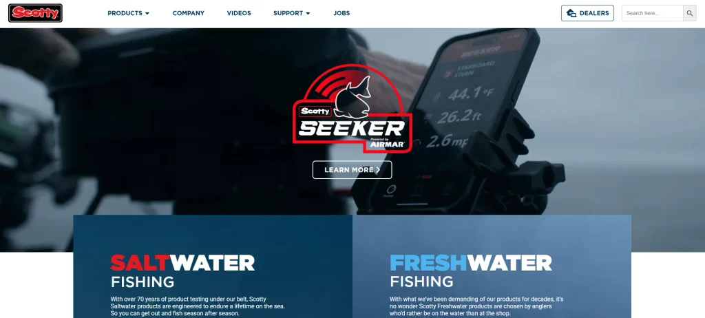
We designed a visually prominent but simple above-the-fold area to achieve the following goals:
Highlight core product categories
Through clear visual focus, users can quickly understand what products the brand mainly offers.
Use strong visual images to connect with outdoor users
Use high-quality images with an authentic outdoor feel to strengthen the brand’s connection to fishing and the outdoor lifestyle.
Keep your copy simple and direct
Avoid accumulating too much information on the first screen and allow users to quickly understand the products and values provided by the brand in a short period of time.
This design method can communicate the brand positioning more directly than displaying a large amount of content at once.
Category navigation
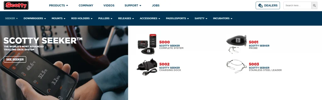
We have re-planned the product browsing path on the homepage to allow users to enter the target category more quickly.
Seawater and Freshwater Product Classification
According to different usage scenarios, saltwater fishing and freshwater fishing products are clearly distinguished.
Key product portfolio display
Highlight core product series and key products through the homepage module to increase the exposure of important products.
Quick access to navigation module
Set up an intuitive classification entrance to reduce the steps required for users to find products.
This structure can reduce users’ selection pressure while improving overall browsing efficiency and potential conversion rate.
Trust and brand elements
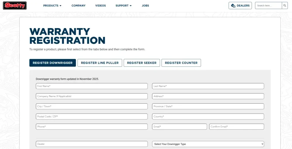
To further enhance brand credibility, we incorporated multiple pieces of content into the page that reflect the strength of the brand.
Brand history and heritage
Through the brand development process and long-term accumulation, users’ awareness of the brand’s professionalism will be strengthened.
Warranty and Reliability Information
Highlight product warranty, quality and reliability, allowing users to gain more confidence before purchasing.
A visual expression of durability and performance
Communicate the product’s ruggedness, durability, and high performance through images, typography, and visual details.
For professional fishing equipment, users’ trust in the brand will directly affect purchase decisions, so these contents are very important.
Category page and product page optimization
The homepage is mainly responsible for attracting users, but what really affects purchasing decisions is often the deeper category pages and product detail pages.
Category page
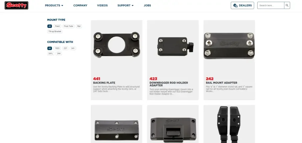
The design of category pages focuses on browsing efficiency and ease of use.
Clear product grid layout
Help users quickly browse a large number of products through neat and unified product arrangement.
Explicit filtering capabilities
Provide clear filtering conditions so users can quickly narrow down their choices based on their needs.
Reasonable product grouping
Classify according to product type, function or usage scenario to avoid mixing a large number of products together.
Such a design can help users find suitable products more quickly and reduce confusion during the browsing process.
Product product detail page
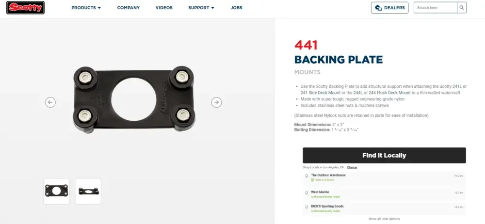
Each product detail page is designed around helping users fully understand the product and make purchasing decisions.
High-quality product and scene pictures
Through clear product pictures and real usage scenarios, we help users understand product details and practical applications.
Clear product descriptions and specifications
Structured display of product functions, features and technical parameters makes key information easier to understand.
Organized information content module
Improve page readability and browsing efficiency through reasonable information partitioning.
The overall page structure eliminates the need for users to repeatedly search for key information, and important content will be presented in a more intuitive way.
The balance between website construction and visual design
An important feature of this project is that we effectively combined website construction logic with design thinking.
Why website structure affects design
Excellent website design not only depends on visual effects, but also requires a stable and clear website structure as the foundation.
We focus on controlling the following aspects:
Page layout
Establish a unified page structure to maintain a consistent browsing experience between different pages.
spacing system
Through unified white space and spacing specifications, the page is cleaner and the overall visual quality is improved.
content hierarchy
Reasonably arrange the importance of titles, pictures, product information and functional content to guide users to browse the page in the correct order.
Through these infrastructures, we ensure that the entire website remains unified and consistent from page to page.
Let design serve function
Every visual decision in the website serves a clear functional role.
White space improves readability
Appropriate white space can reduce the feeling of crowding on the page and make it easier for users to read and understand the content.
Fonts enhance message clarity
Help users quickly identify titles, main text, and important information through reasonable font sizes and levels.
Image layout directs user attention
Guide users to browse the page according to the preset path through the position, size and proportion of the image.
This design method keeps the overall website simple and clear, while focusing more on user experience and conversion.