Project overview
The client is a beauty brand targeting overseas consumers. It specializes in liquid foundation and other makeup products and sells them through the Amazon platform. As competition among similar products continues to intensify, the customer’s original product images gradually lack advantages in selling point communication, visual quality, and conversion performance. Therefore, AIRSANG was approached and hoped to re-optimize the design of the entire set of Amazon primary and secondary product images. Customers hope that on the premise of complying with the platform specifications, the core selling points such as comfort on bare skin, long-lasting makeup, oil control, skin tone matching and natural concealer will be highlighted, while the professionalism, trust and brand tone of the product will be strengthened, and click-through rates and purchase conversions will be increased through clearer visual hierarchy and scene-based expression.
| บริการ | Industry | แพลตฟอร์ม |
| E-commerce main product image design | Beauty | AmazonAmazon |
| Project requirements | target market | design style |
| Improve click-through rate | USA | Soft and high-end|Cream texture|Luxurious beauty |
| project budget | Delivery content | Delivery time |
| ¥400 | 6 primary and secondary product images | 3 working days |
Project Challenges
We believe that Amazon product images are not just about “making the product beautiful”, but they need to play a role similar to that of a salesperson. Consumers typically look at pictures first before looking at bullet points, reviews, and details, so pictures must tell consumers in a short time: what product it is, who it’s for, what problem it solves, and why it’s trustworthy.
The core design goals for this liquid foundation project include:
- Comfortable as naked skin
- Makeup lasts a long time
- Oil control
- Intelligent adaptation to skin color
- Environmental protection concept
- At the same time, it complies with the visual habits of Amazon’s beauty category.
The entire set of pictures does not repeat the selling point in each picture, but gradually unfolds according to the consumer’s purchasing decision-making process.
Picture 1: Comfortable on bare skin
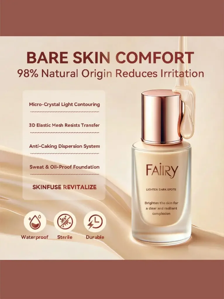
Comfortable experience like naked skin
The first picture is responsible for establishing the first impression of the product.
The core message is:
Bare Skin Comfort | Bare skin comfort
Visually, the extensive use of warm beige, nude skin tones and the color of the foundation itself reminds consumers of a natural, light and skin-friendly makeup effect at first glance.
The addition of a dripping and flowing texture similar to that of essence on the side of the product bottle also hints that this foundation is not a heavy foundation, but has a certain skin care and moisturizing feel.
The main design ideas include:
The big title highlights the core benefit points, allowing users to see “Bare Skin Comfort” at first glance.
Also add something like:
98% Natural Origin
This type of information about natural ingredients is used to reduce consumers’ concerns about irritation.
In addition, a small number of simple icons are used to express properties such as waterproofing, durability, and hygiene.
This one does not emphasize many technical parameters, but prioritizes solving the most basic problems of consumers:
Will this foundation be heavy? Will it irritate the skin? Is it comfortable for daily use?
Therefore it serves as the “emotional entrance” to the entire set of images.
Picture 2: Beauty and environmental protection
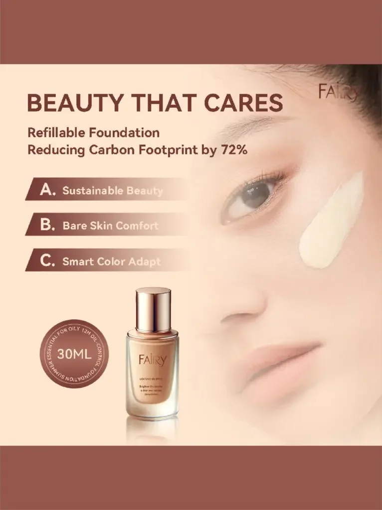
Not just beauty, but also caring about the environment
The second one started to shift from “product experience” to “brand value”.
Highlights:
Refillable Packaging
and environmental protection concepts such as reducing carbon emissions.
The use of close-ups of real faces in the picture allows consumers to see the real skin texture instead of excessive skin polishing.
At the same time, use a foundation paste or color block to show the spreadability and blending effect of liquid foundation.
This composition actually conveys two messages at the same time:
On the one hand, it is the makeup effect of the product;
On the other hand is the brand’s environmental positioning.
The layout adopts a relatively obvious information hierarchy.
ตัวอย่างเช่น:
Beauty That Cares
as the main title.
Next, through modules such as A / B / C, environmental protection, packaging and product features are disassembled, allowing users to browse quickly.
Among them:
Reducing Carbon Footprint by 72%
It is displayed as a more eye-catching digital selling point.
This approach can attract consumers who value environmental protection while not making the product lose the high-end feel that beauty products should have.
Picture 3: Passed 24-hour makeup test
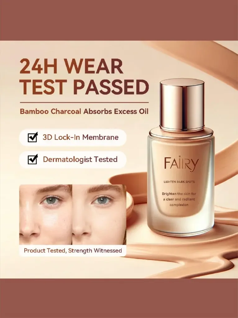
Proved by tests to last 24 hours
Liquid foundation consumers are very concerned about:
Can I wear makeup?
So instead of just saying “Long Lasting”, the third one tries to use test results to enhance credibility.
Core title:
24H Wear Test Passed
That is:
Passed 24-hour makeup test
Add some auxiliary information next to it, such as:
- Bamboo charcoal absorbs oil
- Dermatology test
- Oil control
- Keep makeup on
And reinforce the “tested/certified” feeling with ✓ check-like visual symbols.
This picture also adds before and after comparison.
Special emphasis is placed on:
Don’t do an over-the-top Before/After.
A better way is to show:
- More even skin tone
- Reduced shine
- Skin texture is more delicate
This makes it easier for consumers to believe it.
Especially in the Amazon beauty category, overly exaggerated visual effects can easily make users suspicious.
So the key words for this one are:
Proof Over Promise
That is:
Rather than promise, prove.
Picture 4: Intelligent skin color adaptation
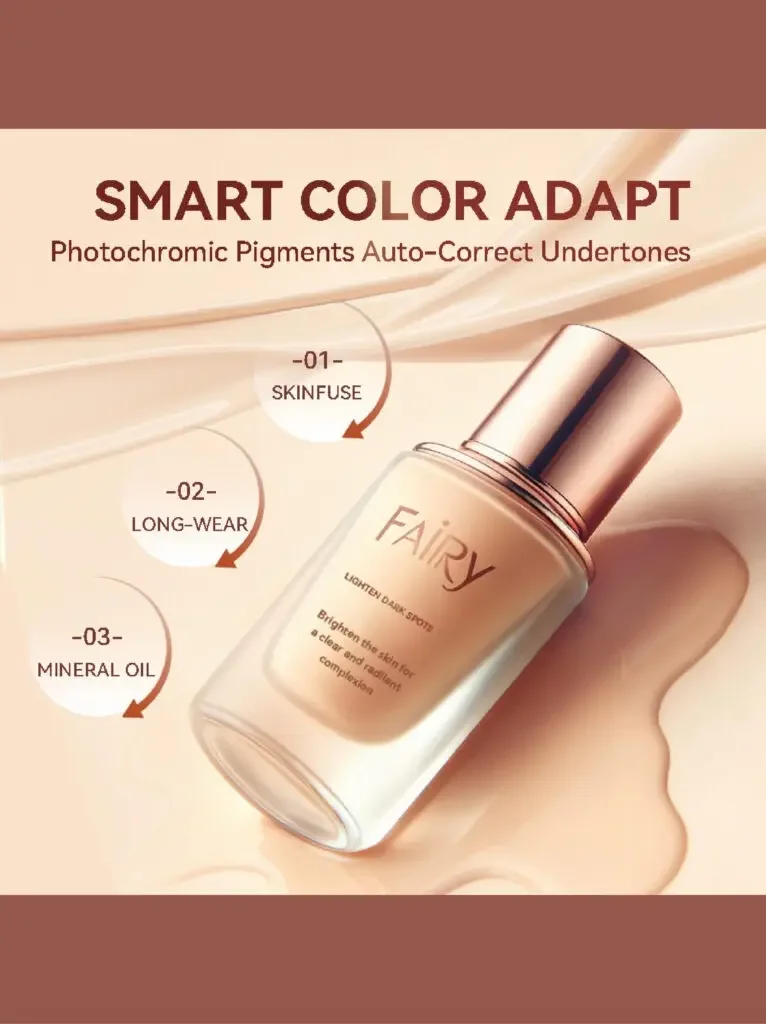
Intelligent skin color adaptation
One of the biggest obstacles to purchasing liquid foundation online is:
What shade should I choose?
Consumers cannot try colors directly like offline, so they are very prone to color anxiety.
This picture is specifically designed to solve this problem.
Main selling point:
Smart Color Adapt
That is, intelligently adapt to skin color.
In terms of visual design, the product bottle adopts an inclined composition instead of being placed upright.
This will make the entire set of images look more varied and dynamic.
Adding the flowing liquid foundation texture to the background also strengthens:
- flow
- Fusion
- adapt
concepts.
At the same time, add several technical selling points, such as:
Skinfuse
Long-Wear
Mineral Oil
etc., so that consumers can understand why the product can achieve this effect.
The importance of this picture does not just tell consumers:
“It adapts to skin tone.”
What’s more important is to tell consumers:
Why it adapts to skin tone.
This turns an ordinary product selling point into a “technical advantage.”
What this one actually does is:
Education → Confidence
That is:
Build purchasing confidence by educating consumers.
Picture 5: Flawless coverage / natural coverage
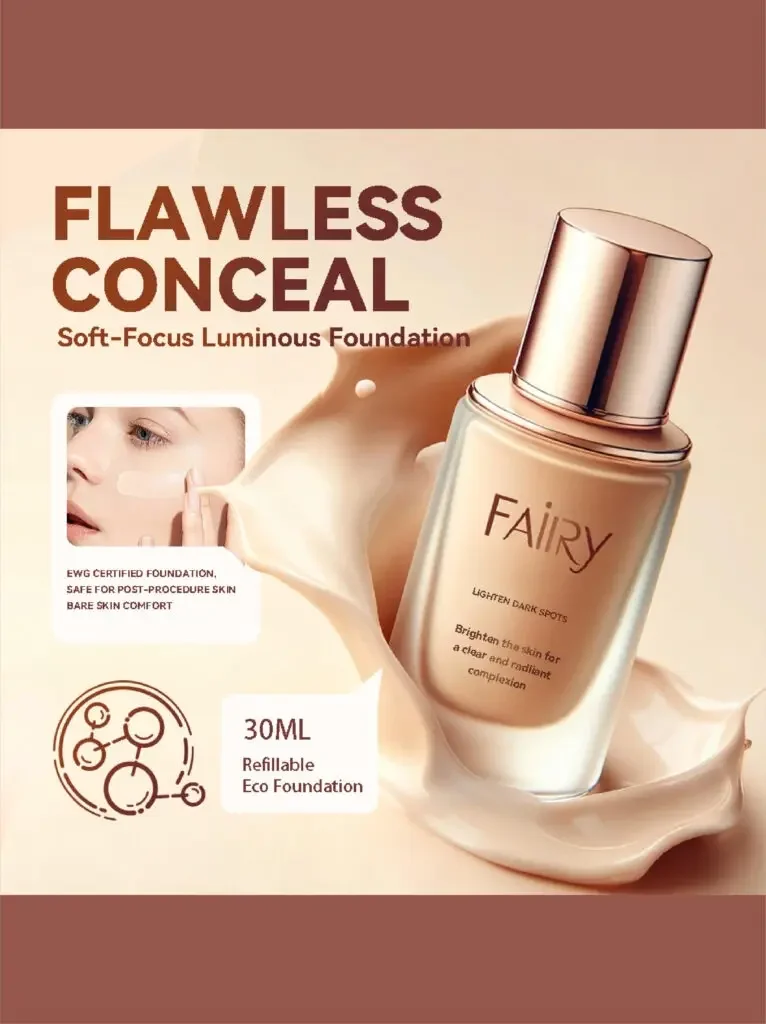
Natural concealer + skin feel expression
The fifth picture returns to the actual makeup effect that consumers are most concerned about.
Core title:
Flawless Conceal
That is:
Flawless coverage / natural coverage
The picture uses a lot of soft light, cream texture and liquid foundation flow effect.
These visual elements mainly convey three feelings:
- soft focus concealer
- natural luster
- Gentle and skin-friendly
Adding the visual effect of cream or foundation splash around the product can also allow consumers to visually “imagine” the texture of the product before actually experiencing the product.
This is typical:
Sensory Marketing|Sensory Marketing
This picture adds safety-related information such as EWG, as well as information related to sensitive skin or skin after care.
The purpose is to attract more attention from those who:
- Recipe
- Ingredients
- Skin safe
- Sensitive skin experience
of consumers.
So it’s not just about concealer, but about:
Concealer effect + skin feel + sense of security
Three directions simultaneously build a reason to buy.
Picture 6: Core advantages
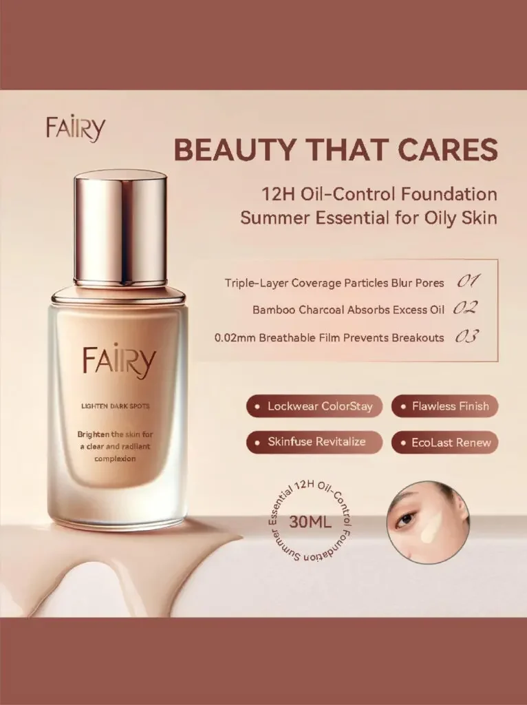
Summarize the core selling points and complete the final conversion
The last one is responsible for:
Conversion Closer
That is the role of “promoting purchase”.
Because when users slide to the end, they usually already have a certain interest in the product.
At this time, the picture no longer needs to tell a complicated story, but should quickly help users confirm:
What are the core advantages of this product?
So this page will focus on:
12H Oil Control
12 hours of oil control.
Triple-Layer Coverage Particles
Three layers of concealer particles.
Breathable Film Technology
Breathable film forming technology.
The information is presented in a very structured format.
Consumers can also quickly obtain information when swiping quickly on their mobile phones.
At the same time, local skin renderings are added to allow users to reconfirm the actual facial effects.
The product bottle still serves as the central visual subject of the picture to ensure the recognition of the brand and product.
The most important function of this one is:
Solve consumers’ last few purchasing concerns.
Why does the entire set of pictures look uniform?
A set of high-converting Amazon product images cannot each look like it was created by a different designer.
This set of foundation images is kept unified mainly through several elements:
1. Uniform warm colors
Used extensively:
Beige, nude, cream, skin tones.
Naturally matches the liquid foundation category.
2. The product bottle always maintains a high-grade metal texture
Enhance product class with highlights, reflections and metallic edges.
3. Use lots of soft gradients
Avoid backgrounds that are too harsh.
4. Use foundation fluid elements
Let the entire visual language relate to “Liquid Foundation”.
5. Unify font hierarchy
The main title, big selling points, and description text all have fixed font sizes.
Especially considering that a large number of Amazon users come from mobile phones, the text must:
Large, clear, and easy to scan.